The network for creativity
Join 1.25M professional creatives like you
Connect with clients, get discovered, and run your business 100% commission-free
Creatives on Contra have earned over $150M and we are just getting started
Back to feedPost
Taste Test

Holographic is back, so I built the same concert ticket two ways in code. Which one would you keep after the show?
Foil: the rainbow shifts as it tilts. Silver: embossed type, one clean light sweep.
Vote, and tell me what you'd print on yours.
10 votes
Ends in 1d

Foil. the rainbow moving over FRONT ROW is the bit you'd actually keep after the show

Holographic looks amazing!

holographic foil

Holographic foil — the rainbow tilt wins.
The network for creativity
Join 1.25M professional creatives like you
Connect with clients, get discovered, and run your business 100% commission-free
Creatives on Contra have earned over $150M and we are just getting started





Related posts

When working on essential animations like carousels, there's always an inner drive to take things to the next level.
This time, it's a carousel animation for Juice Agency and their project with Metlok.
Which one do you think looks best?

5 voted
31%
11 voted
69%
16 votes
Closed


Same lettering, two color directions. Which one would you pick?
I got nostalgic this week looking at this lettering design. About 8 years ago I was deep into it and drew every day. Little by little I lost that rhythm, and now I only do it once in a while for gifts and small things.
Back then I could spend a lot of time choosing colors and comparing options. A taste test like this would have saved me so much time. 😅 I keep wondering how much I would have improved if I had never stopped practicing.
Is there something you used to practice a lot and would love to get back to? I had my lettering, illustration AND tufting phase.
37 voted
61%
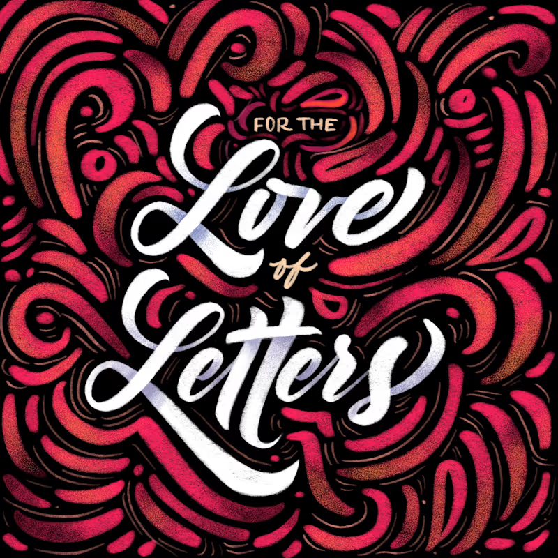
24 voted
39%
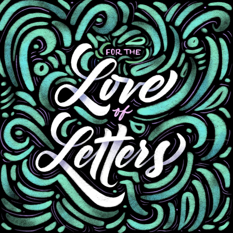
61 votes
Closed


8 years later and the lettering still holds up

Which vibe do you prefer — moody Periwinkle or clean Magenta? Cast your vote! 🪄
2 voted
67%
1 voted
33%
3 votes
Closed

Great work