The network for creativity
Join 1.25M professional creatives like you
Connect with clients, get discovered, and run your business 100% commission-free
Creatives on Contra have earned over $150M and we are just getting started
Back to feedPost

How do you brand a ritual instead of a product?
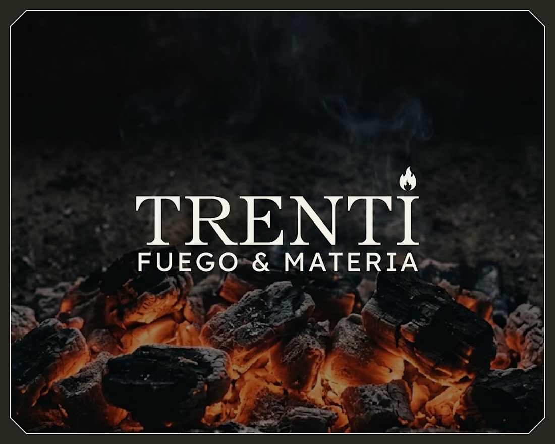
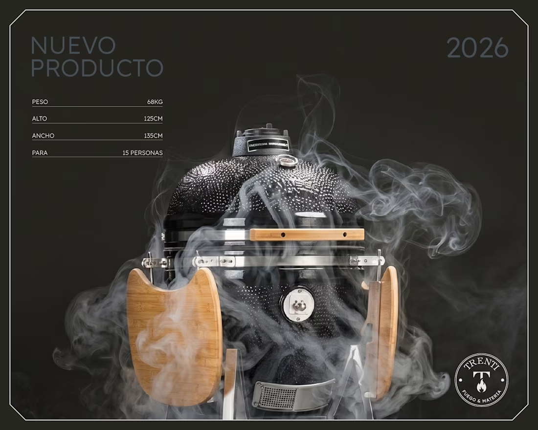
Trenti is a premium concept store in Buenos Aires. Fire pits, artisan cutlery, curated gifts. Not a restaurant, not a BBQ brand. A store built around one idea: Fuego & Materia. Fire and matter.
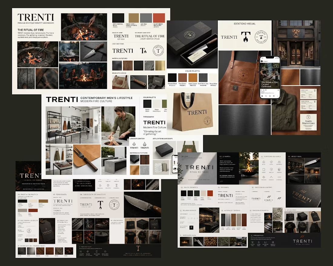
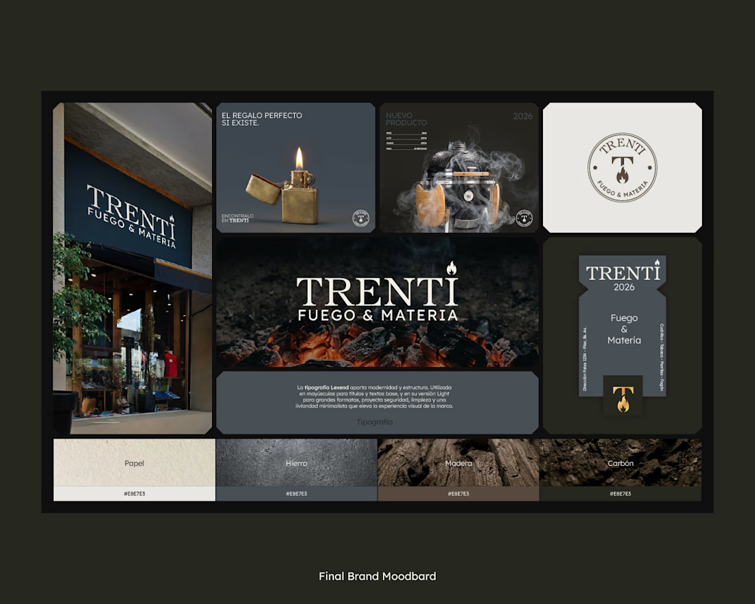
So the identity is literal about it. Embers on raw concrete, a restrained serif, a palette pulled from the materials themselves (paper, iron, wood, charcoal) instead of the saturated orange every fire brand defaults to.
The exploration ran across Nano Banana, ChatGPT and Claude for prompt-building. Three engines to generate directions fast. But the final moodboard was curated and composed by hand.
AI made generating moodboard directions free. So where does our value actually live now? Do you let clients see your raw explorations? 👇

Thanks Harish! 👌

One of the best designs I’ve seen today. Really solid work 👏 keep pushing. The typography choices are so sophisticated. Building an editorial-style web layout around this brand story would be a dream project.

Agree🙌
Really appreciate that, Boluwatife! Glad the typography resonated with you 🙌

So atmospheric design 🔥🚀
Thank you Olha! That was exactly the feeling we were after 🔥
The palette choice is my favorite part. Avoiding the obvious orange makes the identity feel much more premium and timeless. 🔥
Exactly the goal! So glad the palette landed for you. Thanks! 🔥
Brilliant shift from product to ritual. Your focus on curation over generation is where true value lives.👍
That's the heart of it, Rashid. Curation is everything. Thank you! 🙏

This is massive
Thanks Esther! 🙏

The material-first palette instead of default fire-orange is such a smart call — it immediately reads as more premium. Curious how you'd pitch "restraint" like this to a client who's expecting something louder for a launch?
Great question, Maty! The client actually wanted something quiet and premium, and quiet feels premium and ages well. Thanks! 🙌

wow, amazing
Thanks Koonj! 🙏

This is amazing
The network for creativity
Join 1.25M professional creatives like you
Connect with clients, get discovered, and run your business 100% commission-free
Creatives on Contra have earned over $150M and we are just getting started
Related posts


I created a social post generator made in Wonder and the Claude MCP!
I know that Wonder is great for app or web design, but I wanted to use it in a different way.
Why? Because Wonder can create assets, templates, can follow guidelines, and be way more creative than a simple AI environment.
Here are the steps by step of what I did:
1- I created a template using Wonder. I used my brand assets, chose the font style, and general look.
2- I connected Claude MCP and created a small web platform to generate a good prompt.
3- I used the prompt on Claude, connected to Wonder, to generate the post. Wonder/Claude can choose the text, post length, which design of specific slides to take from the template, and also decide which image fits best!
4- I directly worked in Wonder to fix some small stuff and export!
Here you can find the link to my Wonder file where you can find some other tests (I would love to do more tests, but I finish the credits!!)
Youtube video (for 4K quality):
https://youtu.be/cLZiffEFq5A
Have a Wonder-ful challenge 🚀

Looks great 🔥🔥

FIRST TIME ON GROUND — a fashion film shot across Egypt, except nobody went to Egypt.
The reference: a real brand film that took 7 days of shooting across the country. I reverse-engineered its edit down to the frame — one 4.5-second opening hold, cuts accelerating from 1s to 0.5s, a one-second strobe burst on the drop, then two seconds of stillness to close. That rhythm is why those films feel expensive.
Then I rebuilt the whole thing from zero:
• 14 scenes, directed from a full shotlist before generating a single frame
• Keyframes in Nano Banana Pro — one locked style system (crimson-amber silhouettes + high-contrast B/W for negative flashes)
• Motion in Seedance 2.0 — one decisive camera move per shot, the cutting rhythm lives in the timeline, not the prompt
• Title cards generated too, projector flicker included, in a single multishot pass
• Graded and cut in Premiere
Solo. Zero flights. The edit does 60% of the work — the footage does 40%.
This is the production model I bring to launch films and brand films: a real location shoot's craft, without the location. If you're launching something and want a film like this, Lets Talk!
AI Content CreationAI Video ProductionVideo EditingAdobe Premiere ProHiggsfield AIClaudeaivideoaigold



Wow 😍
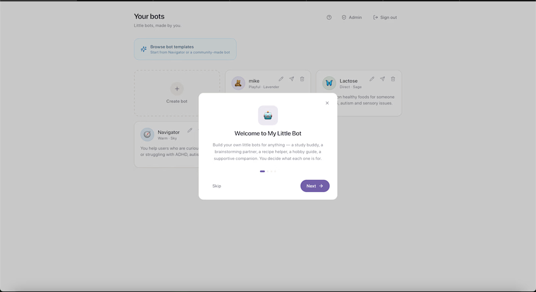
I built My Little Bot — a playful custom AI bot platform where users can create, personalize, and chat with their own bots. 🤖✨
What started as a fun idea turned into a working mini SaaS-style app with:
• Custom bot creation
• Bot personalities and instructions
• Saved conversations
• Voice options
• Premium upgrade features
• Bot templates
• Authentication
• Admin tools
• Stripe subscription flow
• Netlify deployment
The goal was to make AI feel more personal, creative, and approachable — something users can shape around their own routines, ideas, projects, or support needs.
People can create bots like:
study buddies, brainstorming partners, creative assistants, accountability bots, character-style companions, or task-specific helpers.
This project brings together a lot of the work I love doing: AI product design, user experience, playful interfaces, prompt systems, automation, and creative technology.
I’m currently inviting people to test it and share feedback on what feels intuitive, what breaks, and what could make it more useful.
Try it here: https://mylittlebot.netlify.app
Built with Fable 5, Supabase, Stripe, Anthropic, and Netlify.


This deserves more than just liking, this deserves to be featured! 🏆 Building out a fully functional custom AI playground with individual personalities is such a brilliant concept. The UI styling is great translating a playful product dashboard like this into an interactive landing page would be an absolute blast.








Trending

Claude
Claude has entered the design space. How are you using Claude Design?

Contra University
Learn from expert creatives how to earn more using next-gen AI tools.
fifaworldcup2026
The World Cup is here and the whole world's watching. How are you designing for the world stage?
creativeaiflow
Creative AI workflows are evolving. What tools do you use, and what are their strengths and weaknesses?
freelancerlife
Freelancer life is wins, pivots, and everything in between. What’s yours right now?