The network for creativity
Join 1.25M professional creatives like you
Connect with clients, get discovered, and run your business 100% commission-free
Creatives on Contra have earned over $150M and we are just getting started
Back to feedPost

How do you brand a ritual instead of a product?
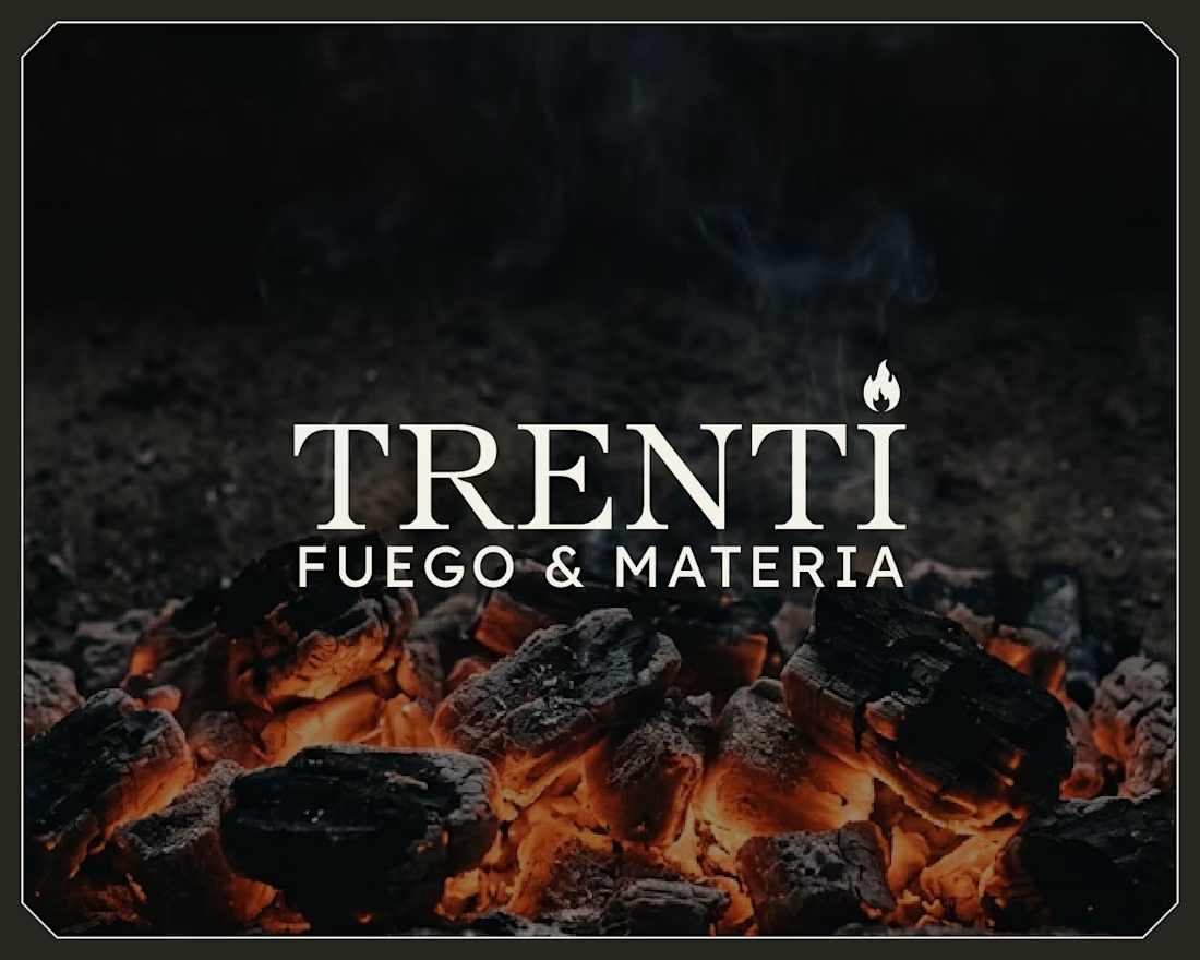
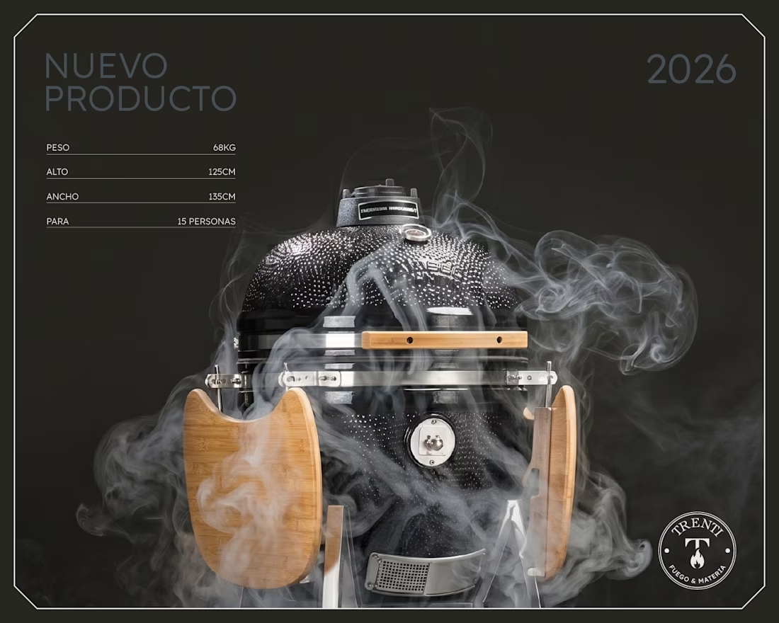
Trenti is a premium concept store in Buenos Aires. Fire pits, artisan cutlery, curated gifts. Not a restaurant, not a BBQ brand. A store built around one idea: Fuego & Materia. Fire and matter.
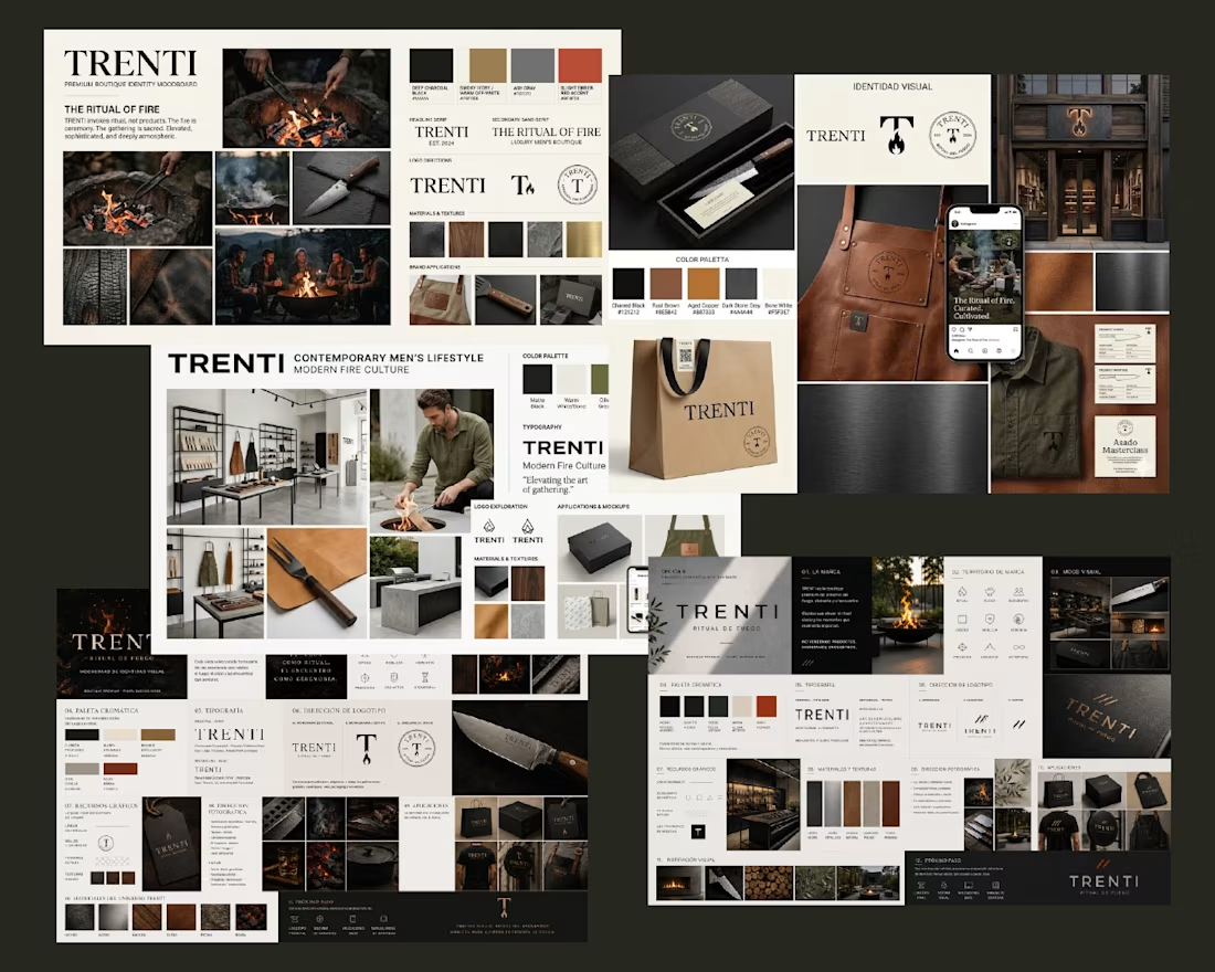
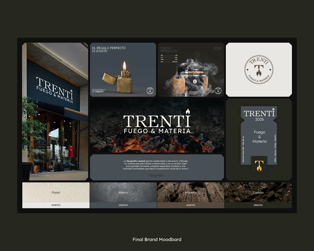
So the identity is literal about it. Embers on raw concrete, a restrained serif, a palette pulled from the materials themselves (paper, iron, wood, charcoal) instead of the saturated orange every fire brand defaults to.
The exploration ran across Nano Banana, ChatGPT and Claude for prompt-building. Three engines to generate directions fast. But the final moodboard was curated and composed by hand.
AI made generating moodboard directions free. So where does our value actually live now? Do you let clients see your raw explorations? 👇

One of the best designs I’ve seen today. Really solid work 👏 keep pushing. The typography choices are so sophisticated. Building an editorial-style web layout around this brand story would be a dream project.
Really appreciate that, Boluwatife! Glad the typography resonated with you 🙌

So atmospheric design 🔥🚀
Thank you Olha! That was exactly the feeling we were after 🔥

The palette choice is my favorite part. Avoiding the obvious orange makes the identity feel much more premium and timeless. 🔥
Exactly the goal! So glad the palette landed for you. Thanks! 🔥

Thanks Harish! 👌

This is massive
Thanks Esther! 🙏

The material-first palette instead of default fire-orange is such a smart call — it immediately reads as more premium. Curious how you'd pitch "restraint" like this to a client who's expecting something louder for a launch?
Great question, Maty! The client actually wanted something quiet and premium, and quiet feels premium and ages well. Thanks! 🙌

wow, amazing
Thanks Koonj! 🙏

This is amazing

Insane


Amazing !

Pulling the palette from the actual materials instead of defaulting to fire orange is the right call, it reads more like an atelier than a restaurant brand. To your question, I do show clients a curated slice of the exploration, raw AI output on its own usually just causes decision fatigue without context.

Cool

Nice work


oh my days!!!🔥 💯 This is awesome

Nice design and aesthetic structure

this is really worth of giving my both 2 goats

This is a great work

You did a great job

Very nice

The network for creativity
Join 1.25M professional creatives like you
Connect with clients, get discovered, and run your business 100% commission-free
Creatives on Contra have earned over $150M and we are just getting started





Related posts


We just made this for a client in a day. Shooting it would've meant weeks of planning and about 10x the budget.
The concept is the asset. It's a structure built to repeat: new characters, a new situation, and the same payoff every time.
I come from production and I still think real shoots are some of the most valuable work we do.
A founder telling their story, a documentary, an event that happened in a real place on a real day. As AI content fills the feed, that stuff is going to stand out more.
Everything else is changing fast. When producing a concept gets this cheap and fast, the hard part (and valuable part) is deciding what to make and why.


Deciding what's worth making matters more now that generating is cheap. Good take.

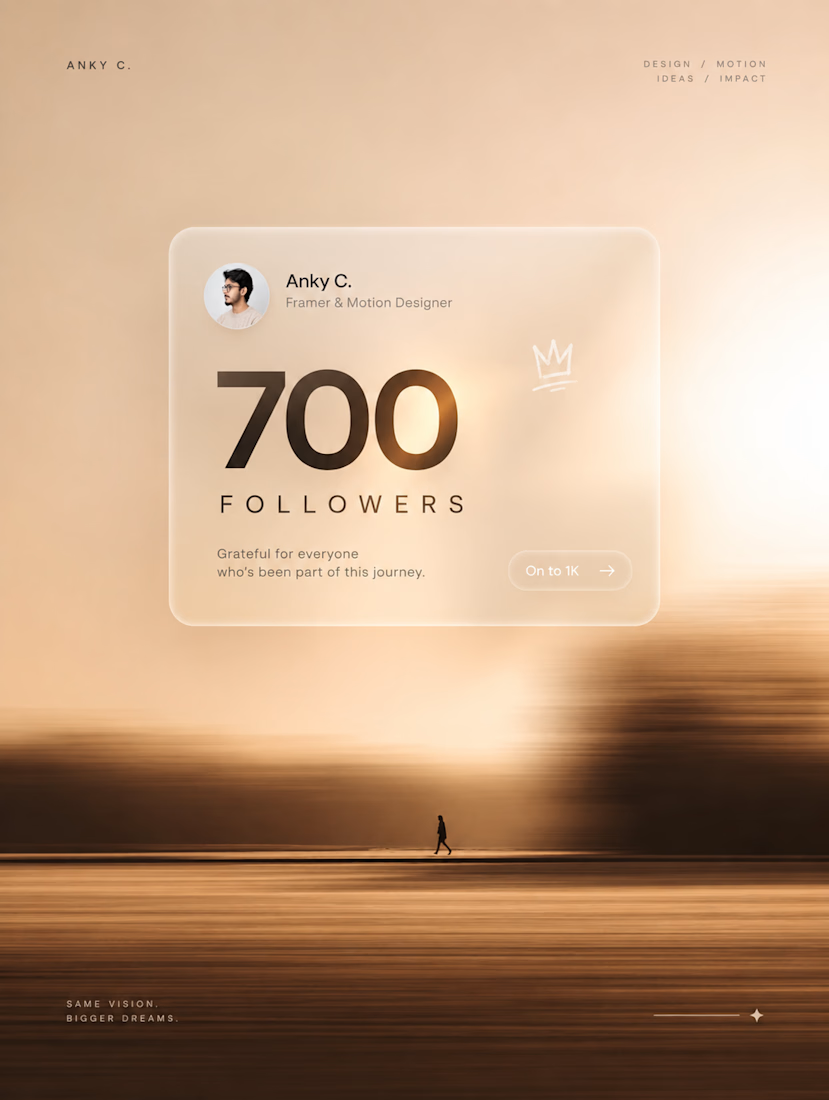
700 followers on Contra. 🫶
A small number, but a big milestone for me.
700 → 1K. Let’s keep going. ⚡
PS: Yes, the post is AI-generated.
At this point, I’m just supervising. 😂


Vintage Map Ad — Two Creative Directions
I’ve been testing two ways to reveal the product.
In one version, the space builds around it, creating a more magical feel.
In the other, I went for a more restrained approach — pulling back to reveal the setting without any transformation.
Which one would you go for?
4 voted
44%
5 voted
56%
9 votes
Closed

Pull back has it