The network for creativity
Join 1.25M professional creatives like you
Connect with clients, get discovered, and run your business 100% commission-free
Creatives on Contra have earned over $150M and we are just getting started
Back to feedPost

An Amazon account can produce sales and still destroy margin.
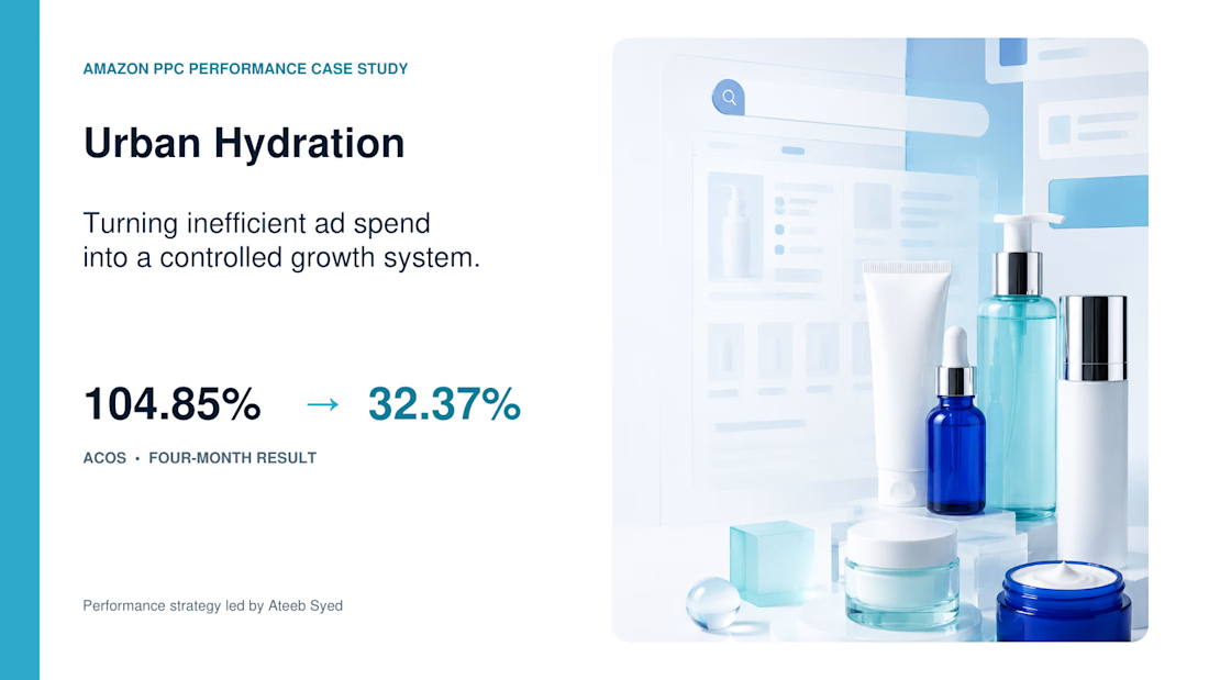
Urban Hydration entered this engagement with an ACOS of 104.85%. That meant advertising spend exceeded the sales attributed to those campaigns—before product costs, Amazon fees, and operating expenses were considered.
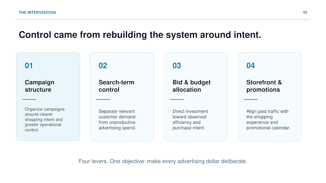
The fix was not a larger budget. I rebuilt the account around four controllable levers:
• Campaign structure — organized campaigns around clearer shopping intent and stronger control
• Search-term control — separated relevant customer demand from unproductive spend
• Bid and budget allocation — directed investment toward observed efficiency and purchase intent
• Storefront and promotion alignment — connected paid traffic with a more coherent shopping journey
The operating model was simple:
Diagnose → Restructure → Optimize → Reinforce
Within four months:
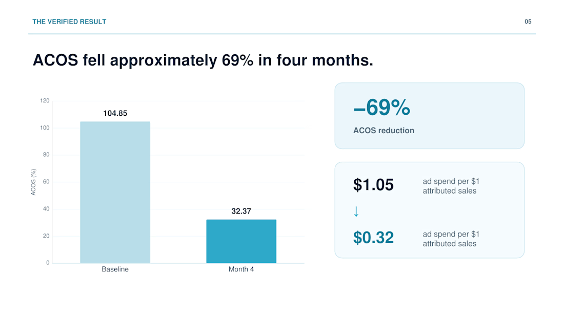
• ACOS fell from 104.85% to 32.37%
• Advertising efficiency improved by approximately 69%
• Ad spend per $1 of attributed sales moved from roughly $1.05 to $0.32
This result does not independently claim overall revenue growth. It demonstrates that paid acquisition became materially more efficient—creating stronger control, clearer campaign decisions, and more room for disciplined scaling.
The full case study breaks down the intervention and operating system:
The takeaway: performance improves when every lever has a clear commercial role.
The network for creativity
Join 1.25M professional creatives like you
Connect with clients, get discovered, and run your business 100% commission-free
Creatives on Contra have earned over $150M and we are just getting started



Related posts


New case study - tash.cards, a Y Combinator backed platform for investing in graded sports cards. Identity design, commissioned by baked.design
The heart of the system is a pattern language taken from security printing. Every letter of the wordmark becomes a guilloché tile, like the engraving on banknotes and certificates, and tiles combine into endless patterns.

Nice!

How do you make a construction brand feel consistent from a business card to a building site?
Brixon’s identity brings angular lettering, an assembled geometric symbol, and a lime, black, and white palette together.
I carried those elements into stationery, brand guidelines, team identification, social graphics, and site signage, then brought the system into motion with Adobe After Effects.
The connecting decision: keep the geometry and layout structure consistent while the logo details, messages, and application previews change within the animated panels.
My contribution covered brand design, graphic design, and motion design.
What draws your attention first: the wordmark, the lime palette, or the rotating symbol?
See the full Brixon case study. If you’re shaping a construction or development brand, I’m available for brand identity and motion projects.

Incomparable work!

A migration is not complete when the pages have moved. It is complete when the customer journey still makes sense.
For DVA, the work brought a Wix website, two lead funnels, a client portal, and segmented nurture automations into a clearer Kajabi experience.
Five checks I use before launch:
Map every public page and redirect.
Rebuild forms, tags, and follow-up paths.
Test offers and product access with a real user journey.
Check mobile pages and portal navigation.
Document what the client will manage after handoff.
#Kajabi #PlatformMigration #CourseCreator


two funnels, a portal, and nurture in one move. thats a lot of moving parts