The network for creativity
Join 1.25M professional creatives like you
Connect with clients, get discovered, and run your business 100% commission-free
Creatives on Contra have earned over $150M and we are just getting started
Back to feedPost

Hero section I designed for Orbital 🫴
Crazy to think this redesign helped them land 10+ enterprise clients in NYC and hit record sales within just a few weeks.
Never underestimate the difference great design can make!


That's a bold claim to trace back to a hero section redesign. How did you and the client actually connect the new design to the sales bump, was it clear from analytics or more anecdotal from the sales team?

I love this!!! Learning framer development too now ❤️

The client-logo row and star review sit inside the hero itself, right next to the CTA, instead of a separate trust section further down — for an enterprise catering pitch that's the one thing worth seeing before a single scroll.

well done!

The food imagery sets the mood immediately, while the light Order Now button stays easy to spot against it. Bringing the testimonial and client logos into that first view gives the atmosphere some useful proof. How did you adapt that trust block for mobile?


the dark hero looks sharp. 10+ clients is huge!

Outstanding
The floating review card sits directly on the hero photo instead of in a separate testimonials section, so the trust signal shows up before the visitor has to keep scrolling for proof.

Professional and impressive design work ! Good job

Congrats on the results. Full bleed food photography paired with that clean CTA button is doing a lot of the conversion work here, it's an easy site to trust.


Crazy results. Great reminder that design isn’t just about aesthetics, it can directly impact business growth.


Premium look !

Love the simplicity here, it gives the brand such a nice feel

Nice work🔥


10+ enterprise clients off a hero, wild

Wooow!

Love how the video background works with the text and button. Layout looks great.

Sleek design and insane conversion results! Really shows the true power of a high-converting hero section.


the order now button looks small under a headline that big.. did a wider one test better

nice work

Every headline, every transition, every word choice controls how fast information lands. Tight tracking feels premium.
The network for creativity
Join 1.25M professional creatives like you
Connect with clients, get discovered, and run your business 100% commission-free
Creatives on Contra have earned over $150M and we are just getting started











Related posts

Exploring a clean, modern SaaS dashboard UI. Focused on simple layouts, smooth interactions, and a better user experience 🚀


i had to like this, it got my attention, very nice build mate.

Design Exploration: Hero Section of Architecture Website. Which one do you think much better?

12 voted
43%
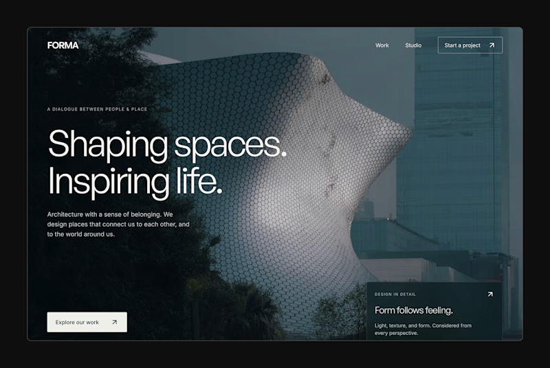
16 voted
57%
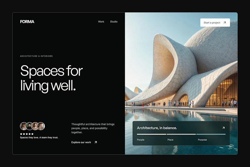
28 votes
Closed


My portfolio, reimagined in Framer
The goal was simple: bring everything together in one place, from client projects and case studies to Framer templates and project videos, while keeping the experience clean and easy to navigate.
The entire portfolio fits within a strict 100vh viewport, so you can explore everything without scrolling.
Would love to hear your thoughts and feedback!
Portfolio link in the comments.