The network for creativity
Join 1.25M professional creatives like you
Connect with clients, get discovered, and run your business 100% commission-free
Creatives on Contra have earned over $150M and we are just getting started
Back to feedPost
Taste Test
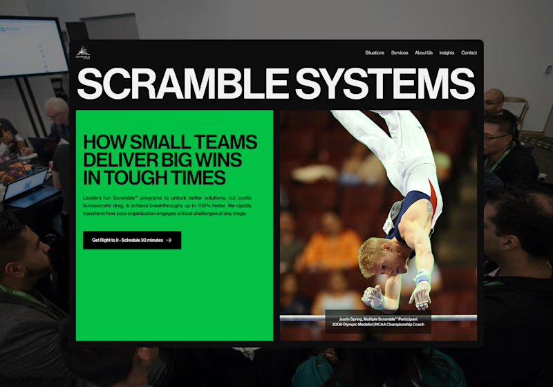
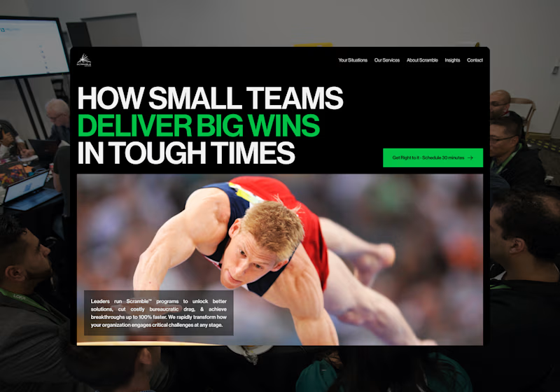
I’m exploring two homepage hero directions for a Scramble Systems concept and testing which layout communicates the message more effectively.
Both directions use the same core idea: helping small teams deliver big wins in tough situations.
Direction 1 feels more structured and modular.
The large brand title creates a strong first impression, while the green content block makes the key message feel direct and contained.
Direction 2 feels more dynamic and action-driven.
The headline becomes the main focus, the green emphasis adds more energy, and the large athlete image makes the concept feel more immediate.
Direction 1: bold, structured, brand-forward
Direction 2: dynamic, focused, action-driven
Which direction feels stronger for a consulting/leadership website?

13 voted
30%
30 voted
70%
43 votes
Closed



Thanks

Direction 2

Great exploration, Luis! Direction 2 feels more impactful for a leadership brand the energy is incredible! 🚀🔥
Thank you! I agree — Direction 2 feels more energetic and action-driven, which fits the leadership/performance angle really well.

Lovedd D2!!! Amazing work
Thank you! D2 definitely brings more energy and impact, which feels right for this concept.

Direction 1 reads cleaner to me, that green accent against the black really makes the headline pop. Is Scramble Systems locked into that palette already or are you still testing color direction too?
Good point. Direction 1 does read cleaner, and the green against black gives the headline a really strong punch.
The palette is still being tested, but I like how the green adds energy and momentum to the brand.

Direct 2 👍 . Drirection 1 is giving retro vibes
I see that. Direction 2 feels more modern and action-driven, while Direction 1 has more of a retro/poster feel. That’s helpful feedback.

Love it my man
Thanks

I will lean towards directions 2
Thank you! Direction 2 definitely feels more energetic and focused, which fits the leadership/performance angle well.

Direction 2

Direction 2 👍
Thanks

Direction 2
Thanks

Same

Direction 2 . It is an attractive angle.
Thank you! Direction 2 definitely has a more attractive and dynamic angle. It feels stronger for the concept.
Hi everyone, the website is now live for testing: https://www.scramblesystems.com/

i like your style, amazing
The network for creativity
Join 1.25M professional creatives like you
Connect with clients, get discovered, and run your business 100% commission-free
Creatives on Contra have earned over $150M and we are just getting started
Related posts


Sharing another milestone from our work with Focal Dystonia Method 🚀
After completing the initial Kajabi migration, we continued improving the platform with a complete website redesign. We refreshed the existing pages in Figma, designed new ones, and brought everything to life in Kajabi.
Beyond the design and development, we streamlined the enrollment experience, implemented automations, migrated contacts, and made sure the transition was seamless for both existing and new students.
It's always rewarding to work on projects that continue to evolve. Seeing a platform grow from a migration into a polished, user-friendly experience is exactly why we enjoy building in Kajabi.

Migrating contacts and automations without disrupting existing students is often the part clients worry about most, glad it sounds like it stayed seamless. Was the Kajabi automation setup (enrollment, contact migration) something you handled directly, or did that require looping in a Kajabi specialist?

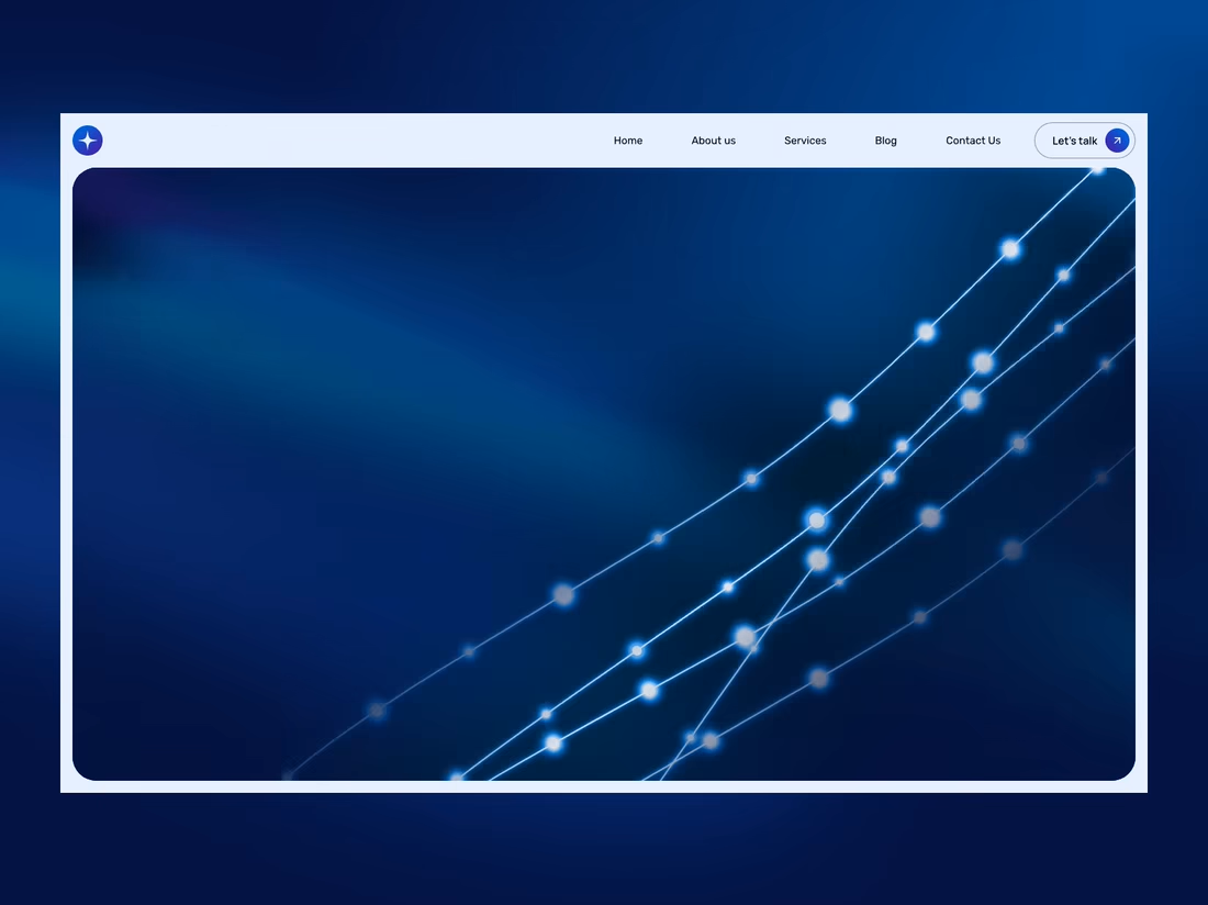
Just shared a new website concept for a telecom infrastructure company.
The design uses an animated fiber-optic background, clear typography, and a simple layout to present the company’s services in a modern way.
Would love to hear your thoughts.🙌 😊



I love your concept, @ruslana! Literal and straight forward. That's how communication should be. The fiber optic motion remind me with DNA link. Is this intentionally? Or it just me? 😃
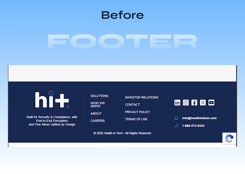
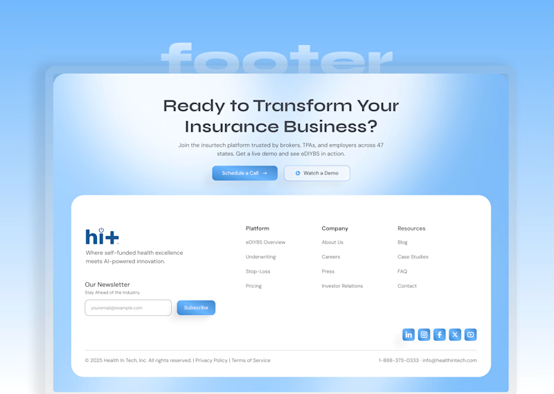
A small preview from my redesign of Health In Tech.
This is the footer
Before and After.
One section, but a good example of how stronger hierarchy, cleaner structure, and better visual communication can change the way a product feels.
The full homepage and case study are coming soon.
7 voted
11%
59 voted
89%
66 votes
Closed

After








Trending

Claude
Claude has entered the design space. How are you using Claude Design?

Contra University
Learn from expert creatives how to earn more using next-gen AI tools.
creativeaiflow
Creative AI workflows are evolving. What tools do you use, and what are their strengths and weaknesses?
freelancerlife
Freelancer life is wins, pivots, and everything in between. What’s yours right now?