The network for creativity
Join 1.25M professional creatives like you
Connect with clients, get discovered, and run your business 100% commission-free
Creatives on Contra have earned over $150M and we are just getting started
Back to feedPost
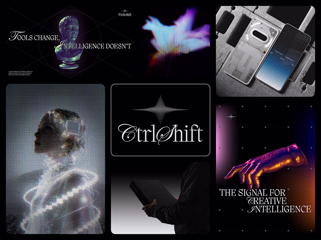
The concept that didnt make it through the selection process but majority of the brand language, imagery and the visual identity system were adopted and harmonized with the selected one to create one unity and expand the entire design system.
The logo features a modern, intelligent logomark built around a three-phased star symbolizing curiosity, signal throught the noise, and transformation. Constructed from sharp vertical lines with varying stroke weights, it creates a subtle optical illusion that reflects the brand’s core idea of clarity emerging from complexity. The three phases are conceptually tied to the brand name - Ctrl, Shift, and the final outcome: taste. This is paired with a confident, taste-led wordmark blending script and serif typography to spark intrigue and character.
The overall identity is editorial, bold, and creative-first slightly irreverent yet refined. It is opinionated rather than instructional, community-driven and culture-forward, designed to feel like a living platform rather than a one-off campaign.
The visual system combines pitch-black foundations with shades of grey, accented by subtle color tints, glowy gradients, grainy 3D elements, visual distortions, and futuristic AI-generated imagery, creating a rich, expressive language for rooms filled with artists, technologists, and builders.
You can see full project here
You can see the final selected direction.
Thanks for the feedback in advance, much appreciate your support.
these are beautiful!
Thanks!
wow, the visual identity is absolutely flawless. this work is fire! 🔥
Thanks buddy, much appreciated ✊🏻
This is really inspiring. I've been exploring emotional and atmosphere-driven digital experiences lately, so it's interesting to see a different perspective.
Thanks a lot, appreciated!
The logomark concept is strong. Using the three-phase star to map directly to the name (Ctrl, Shift, outcome) gives it real conceptual integrity beyond just looking sharp. The mix of script and serif in the wordmark adds character without losing the editorial tone.
Thanks a lot
The network for creativity
Join 1.25M professional creatives like you
Connect with clients, get discovered, and run your business 100% commission-free
Creatives on Contra have earned over $150M and we are just getting started
Related posts
Tern Key is a contemporary environmental organization focused on building structured conservation partnerships through strategy, research, and visual communication.
The identity system combines cinematic environmental storytelling with a refined editorial approach, creating a visual language that feels both institutional and emotionally immersive.
From motion direction to typography, every element was designed to reflect clarity, scale, and long-term environmental impact.
Now live on @behance — Full project in my bio.
2026©AMNE Studio.
Enmanuel Jimenez V.
Jv®Studio. —
All rights reserved.
This is insane
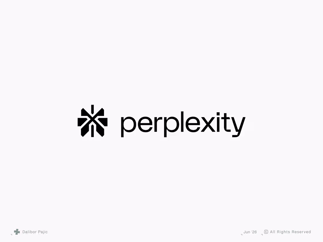
Perplexity AI logo redesign concept
A fast-growing AI company with a visual identity that felt somewhat generic relative to the sophistication of its product. My goal was to build upon the existing visual DNA while introducing greater clarity, authenticity, and distinctiveness. The result is a more scalable and reproducible identity system that better reflects the brand's innovative nature across digital and physical touchpoints.
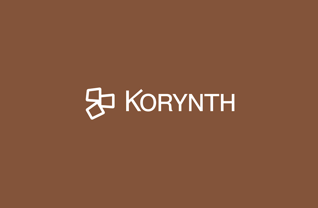
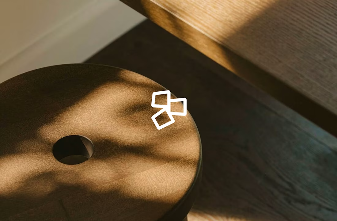
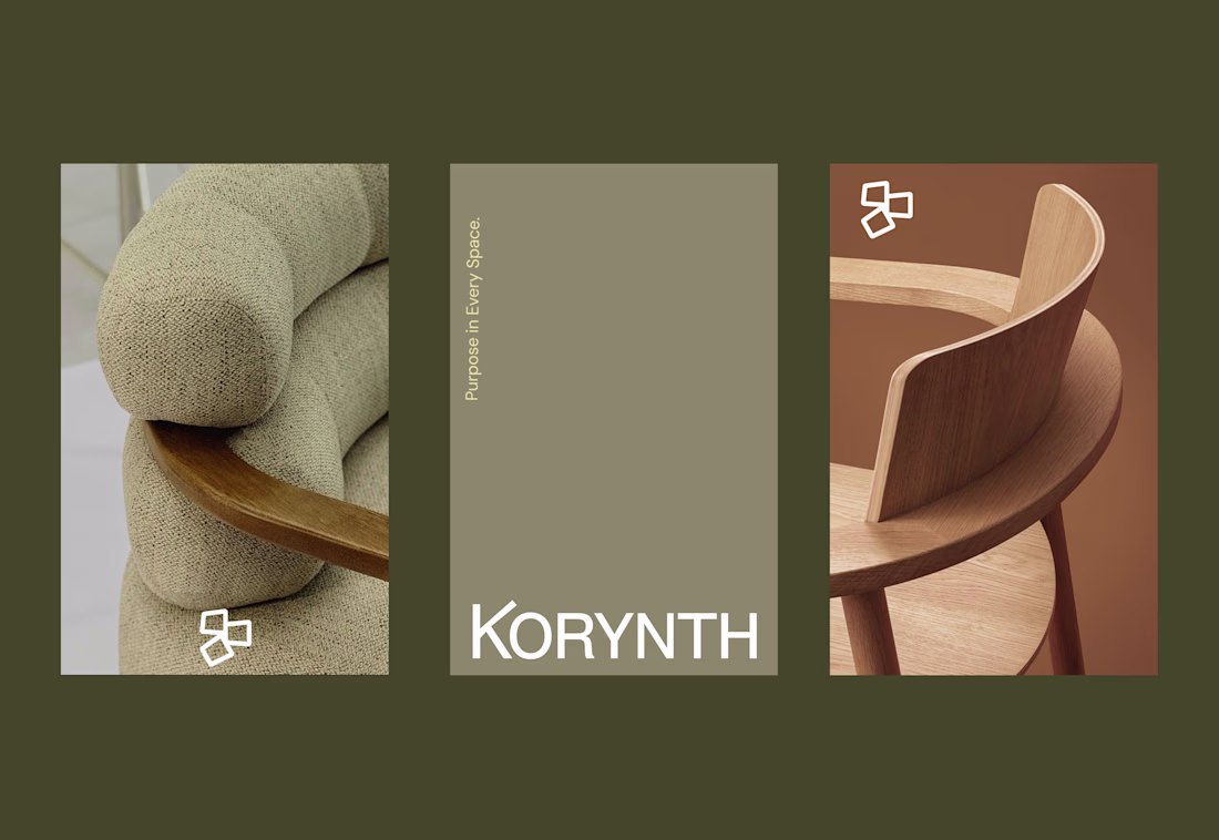
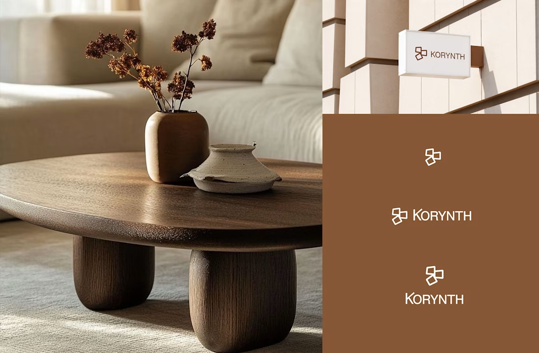
Exploring a brand identity concept for KORYNTH, an architecture and interior design studio.
Focused on structure, balance, and timeless simplicity through a geometric symbol and warm, neutral brand system.
I'd love some honest feedback
• Does the logo feel appropriate for the industry?
• What emotions does the identity communicate?
• What would you improve?
Open to all critiques.
Challenges
View allTrending
Claude
Claude has entered the design space. How are you using Claude Design?
Contra University
Learn from expert creatives how to earn more using next-gen AI tools.
MagicPath
The canvas is infinite, and exploration is becoming the workflow. How are you using MagicPath?
creativeaiflow
Creative AI workflows are evolving. What tools do you use, and what are their strengths and weaknesses?
freelancerlife
Freelancer life is wins, pivots, and everything in between. What’s yours right now?