The network for creativity
Join 1.25M professional creatives like you
Connect with clients, get discovered, and run your business 100% commission-free
Creatives on Contra have earned over $150M and we are just getting started
Back to feedPost
Exploring a brand identity concept for KORYNTH, an architecture and interior design studio.
Focused on structure, balance, and timeless simplicity through a geometric symbol and warm, neutral brand system.
I'd love some honest feedback
• Does the logo feel appropriate for the industry?
• What emotions does the identity communicate?
• What would you improve?
Open to all critiques.
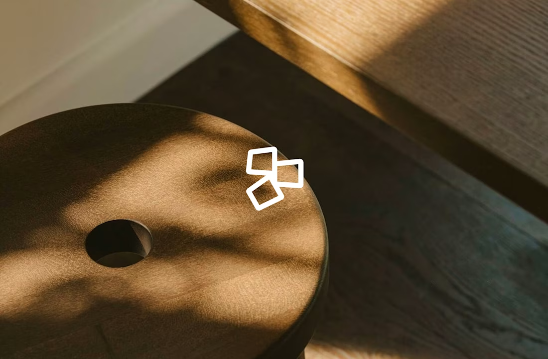
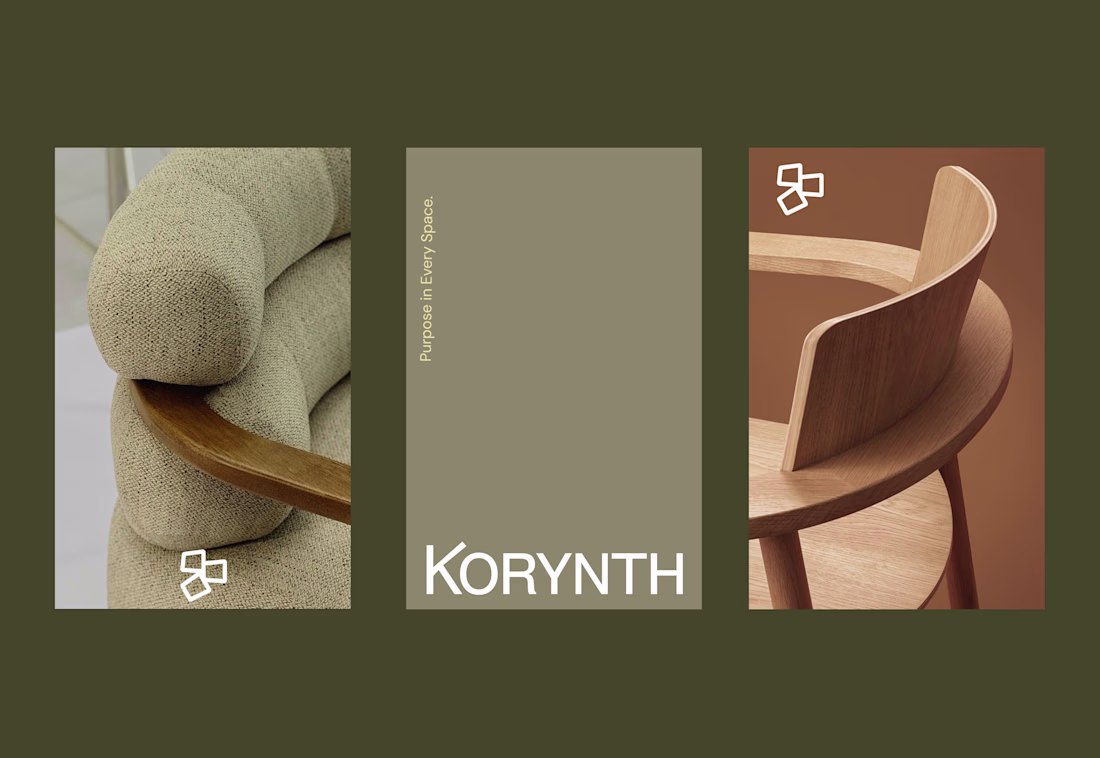
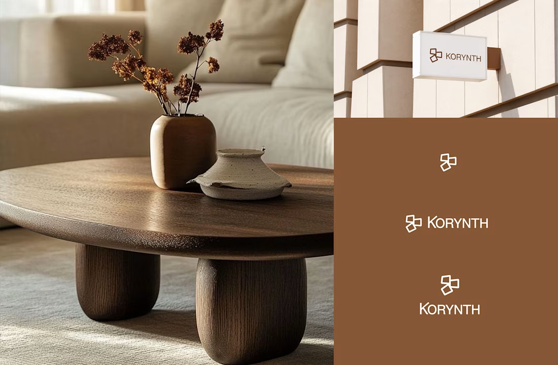
The warm terracotta brown and the geometric cross mark feel right for architecture. It communicates solidity and restraint without going cold. The mark works well at small scale on the furniture mockups too. If anything the wordmark spacing could breathe a little more to match the premium tension of the symbol.
thank you for the honest feedback Rafee. I will work on the wordmark spacing
Looks great
thanks En
The network for creativity
Join 1.25M professional creatives like you
Connect with clients, get discovered, and run your business 100% commission-free
Creatives on Contra have earned over $150M and we are just getting started
Related posts
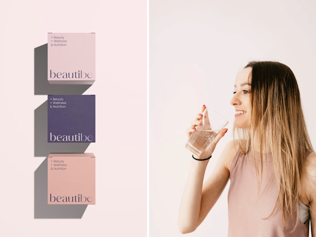
Sharing a rebranding project I'm really proud of, a wellness brand specializing in health & beauty supplements for women who care about their well-being. Would love to hear your thoughts. Feedback is always welcome 😊🤍✨
Check it out
Lovely concept
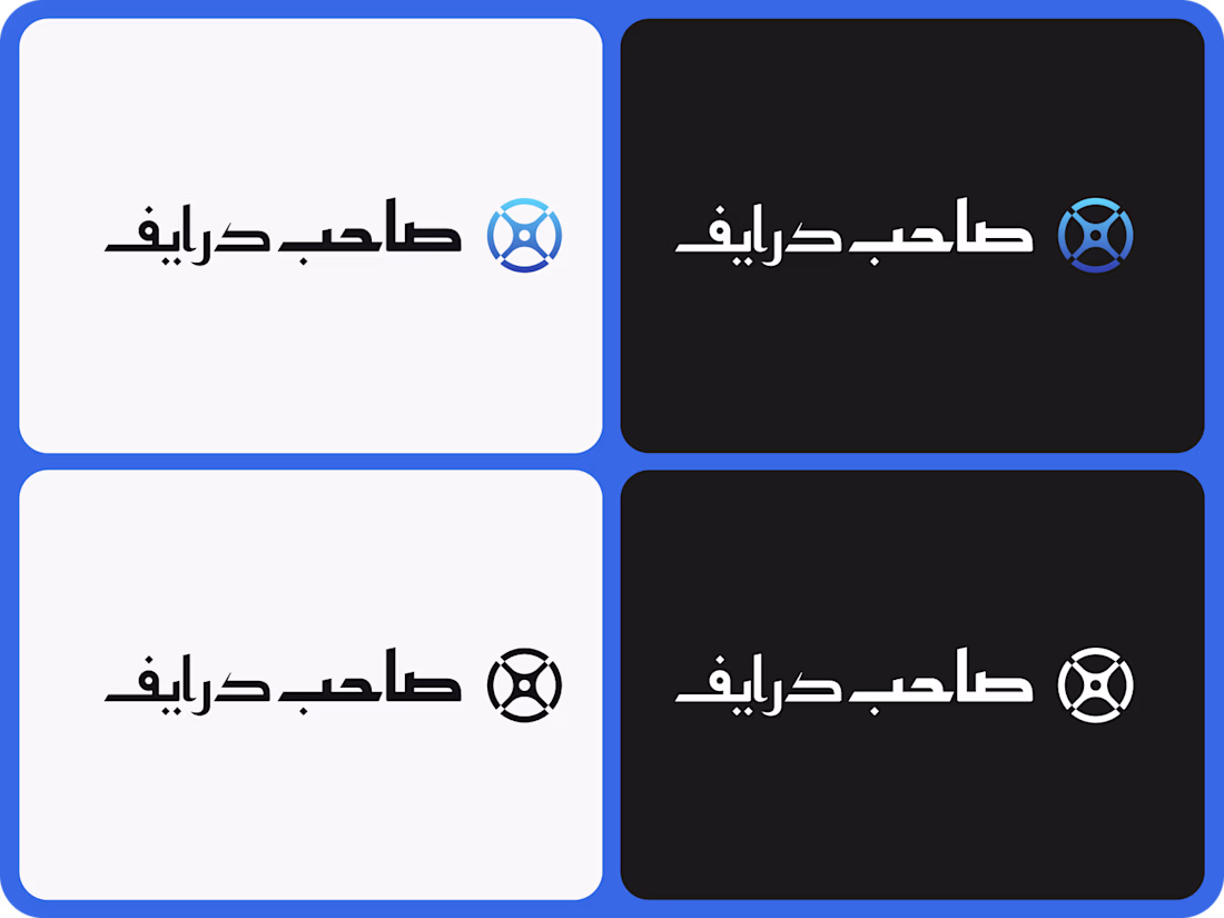
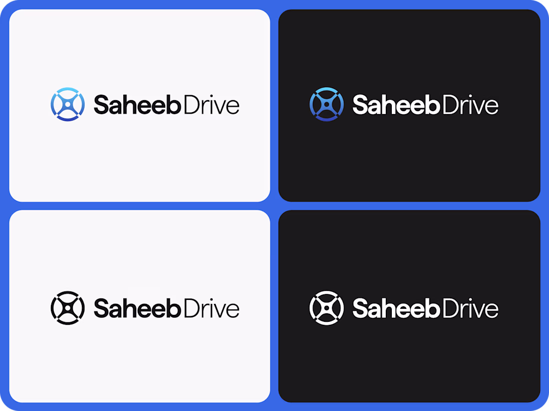
Something different for a change! I had the pleasure this year to work for the first time on a project in Arabic! It was really interesting to understand how arabic calligraphy works, especially when applied to product design. More to follow!
Amazing!
Cool
Trending
Claude
Claude has entered the design space. How are you using Claude Design?
Contra University
Learn from expert creatives how to earn more using next-gen AI tools.
MagicPath
The canvas is infinite, and exploration is becoming the workflow. How are you using MagicPath?
creativeaiflow
Creative AI workflows are evolving. What tools do you use, and what are their strengths and weaknesses?
freelancerlife
Freelancer life is wins, pivots, and everything in between. What’s yours right now?