The network for creativity
Join 1.25M professional creatives like you
Connect with clients, get discovered, and run your business 100% commission-free
Creatives on Contra have earned over $150M and we are just getting started
Back to feedPost


The network for creativity
Join 1.25M professional creatives like you
Connect with clients, get discovered, and run your business 100% commission-free
Creatives on Contra have earned over $150M and we are just getting started





Related posts

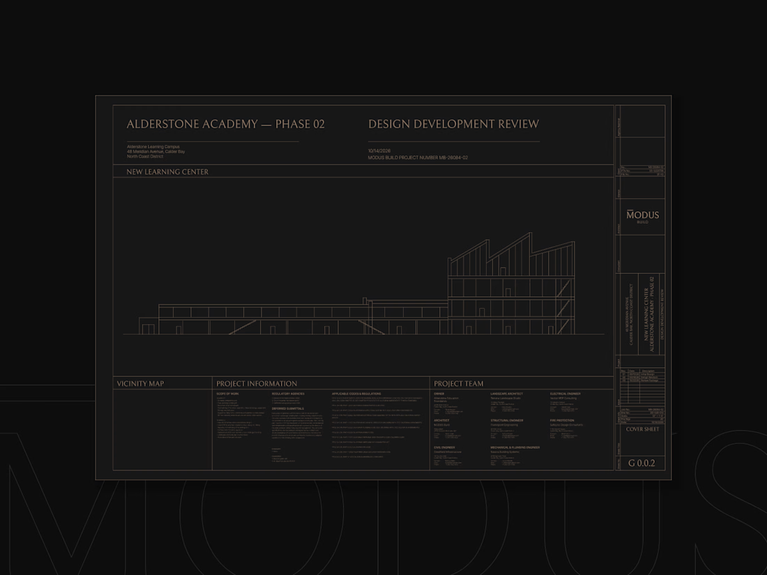
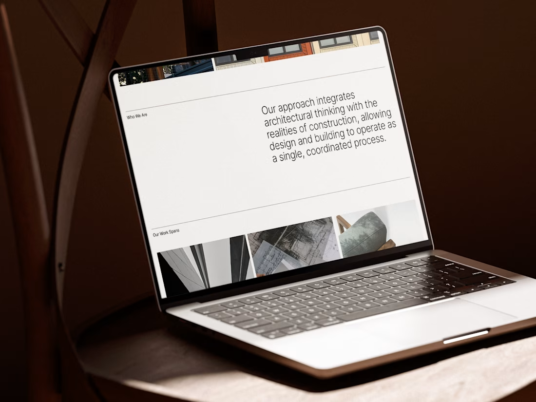
MODUS Build - Brand Identity & Web Design
Coming from an architectural background, I approached MODUS Build with a particular appreciation for precision, proportion, and thoughtful design.
The challenge was to create a distinctive identity that communicates these values without relying on conventional construction imagery.
The concept was built around a simple typography idea: “The Measure of Good Building.” A small detail above the letter M represents a reference measure - a fixed length against which other dimensions can be measured. This subtle intervention gives the logo its meaning and connects it directly to the brand's philosophy.
I carried this idea into a cohesive visual system, bringing together typography, graphic patterns, brand applications, and website design.
For me, the most rewarding part was creating something visually refined yet purposeful, where even the smallest detail has a reason to exist, keeping the same principle as in architecture.
#branding #logodesign #webdesign


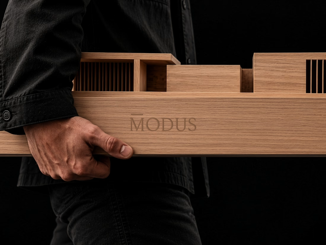
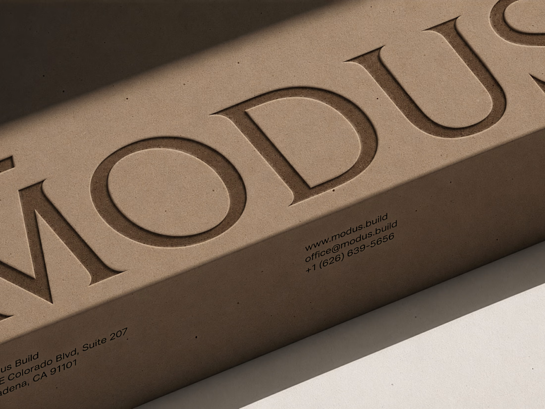

Great brand design Alexandar wooden style is so premium🔥🔥

Customers never measure a logo. They still notice when it's off.
For Magnus, a barber supply brand, I built the whole mark on one unit: x, the width of a single letter stem.
The gap between the icon and the wordmark: 3x.
The icon rises above the letters: 0.5x.
Why it matters for the business: one rule instead of a hundred decisions. Whoever puts the logo on packaging, the shop or other spaces - doesn't have to guess spacing. It always comes out the same.
Barbering is a craft of precision. The brand should be built the same way.

That opening line is brilliant. Customers never measure a logo, but they notice when it's off. The x-unit system is such an elegant way to make the brand self-governing, no more guessing on spacing. Did the client buy into the system straight away, or did you have to sell them on why the spacing rules matter?

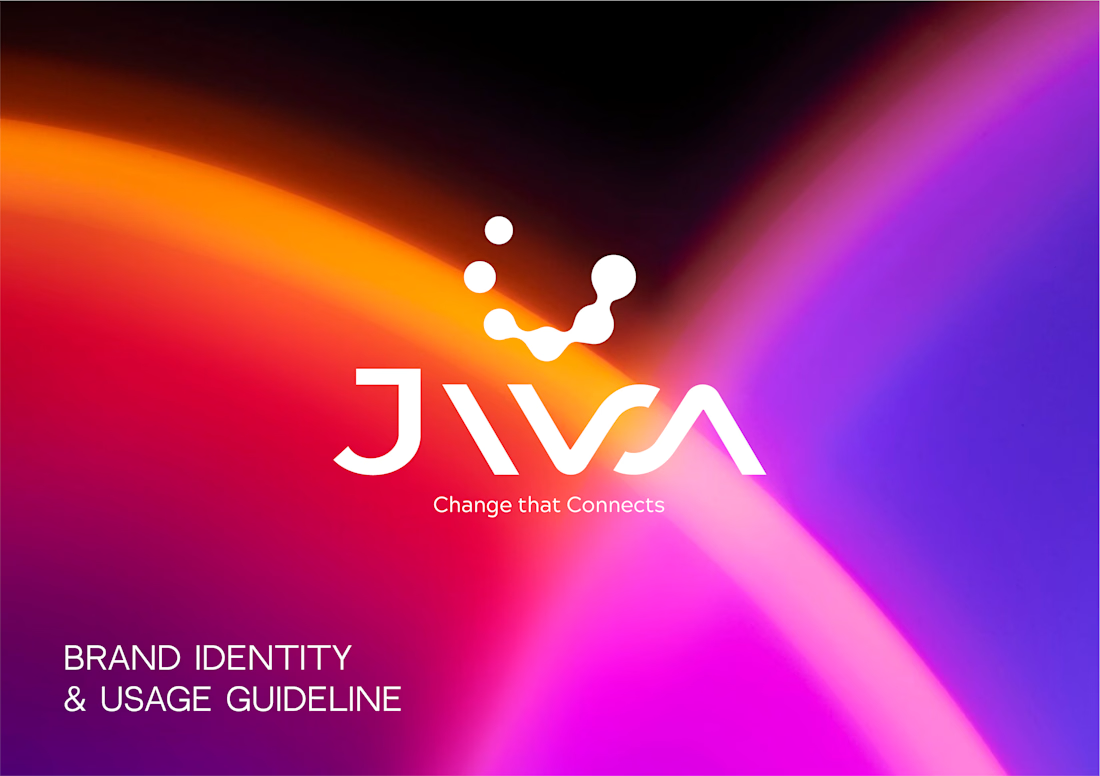
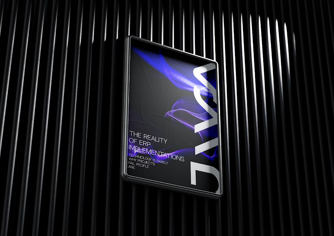
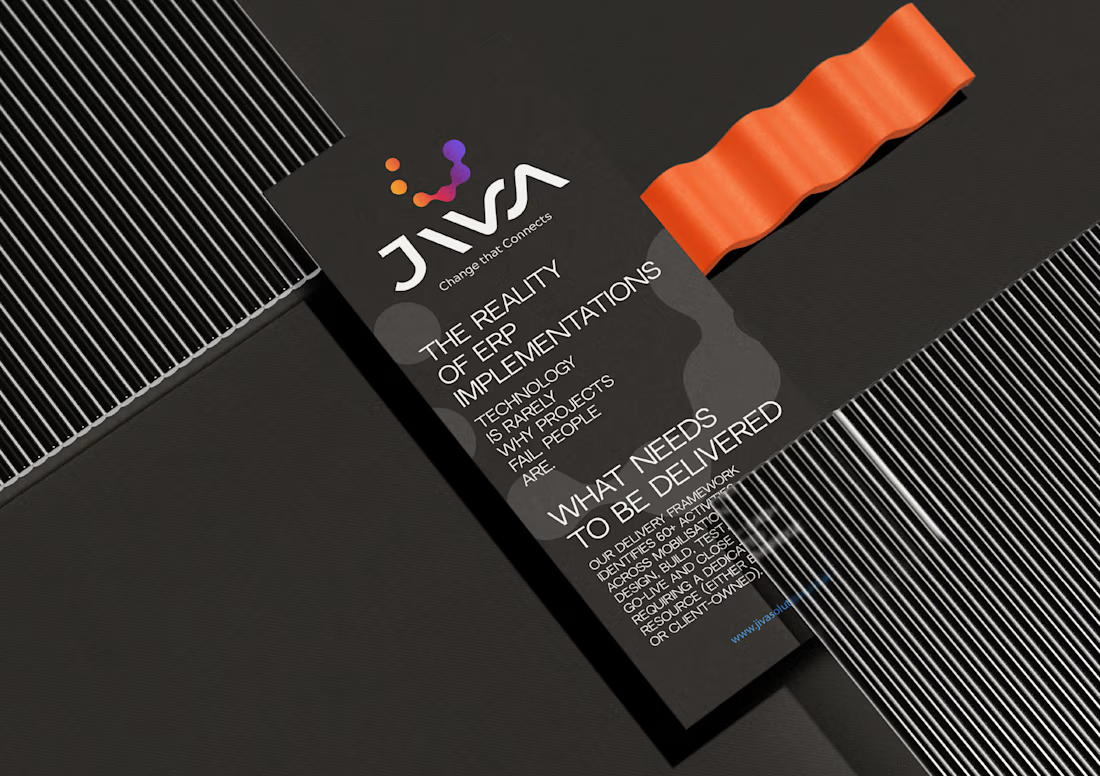
Just published a new case study for Jiva, a business automation agency.
I explored three different logo concepts based on the idea of step-by-step business growth, deliberately avoiding the usual symbols of money and arrows.
The chosen direction was the geometric sign of the circles in the circle by zoom, which is supported by an exquisite word mark, flexible variations of the logo, an icon, a favicon, a color palette and digital programs.
If you need a distinctive logo and corporate identity for your company, feel free to send me a message.
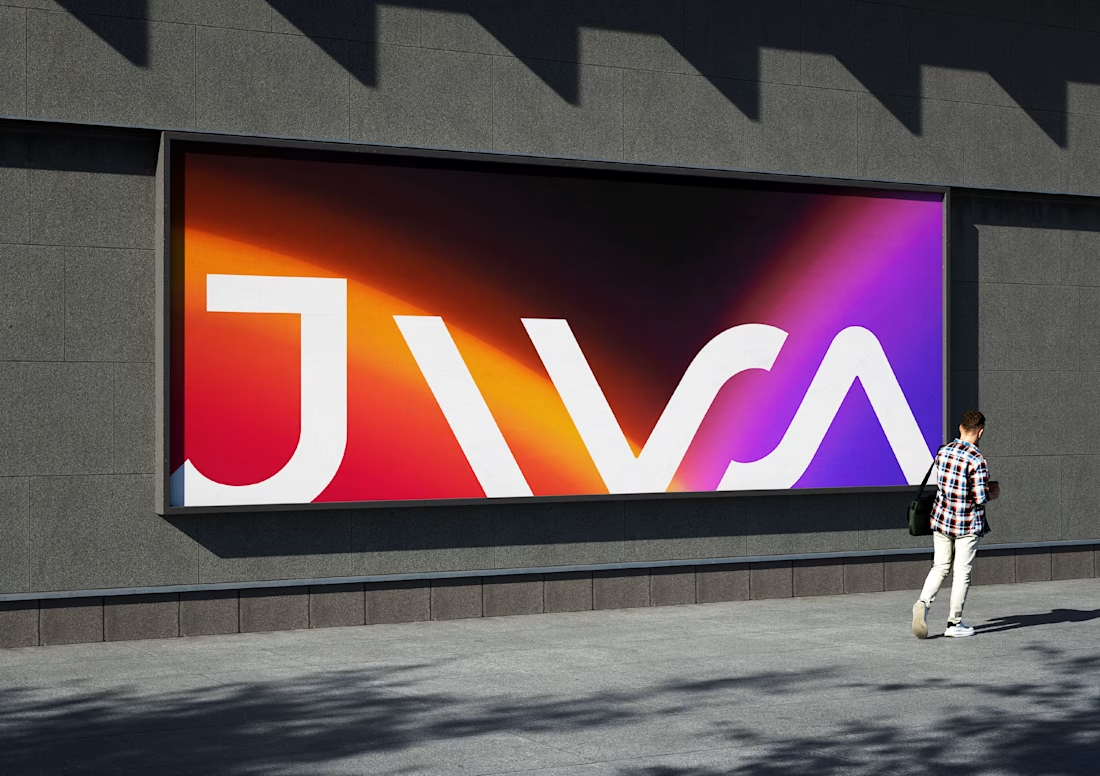

This logo do look distinctive. Nowadays every other brand designer is aiming for same minimal repetitive kinda logo. This is something fresh!