The network for creativity
Join 1.25M professional creatives like you
Connect with clients, get discovered, and run your business 100% commission-free
Creatives on Contra have earned over $150M and we are just getting started
Back to feedPost
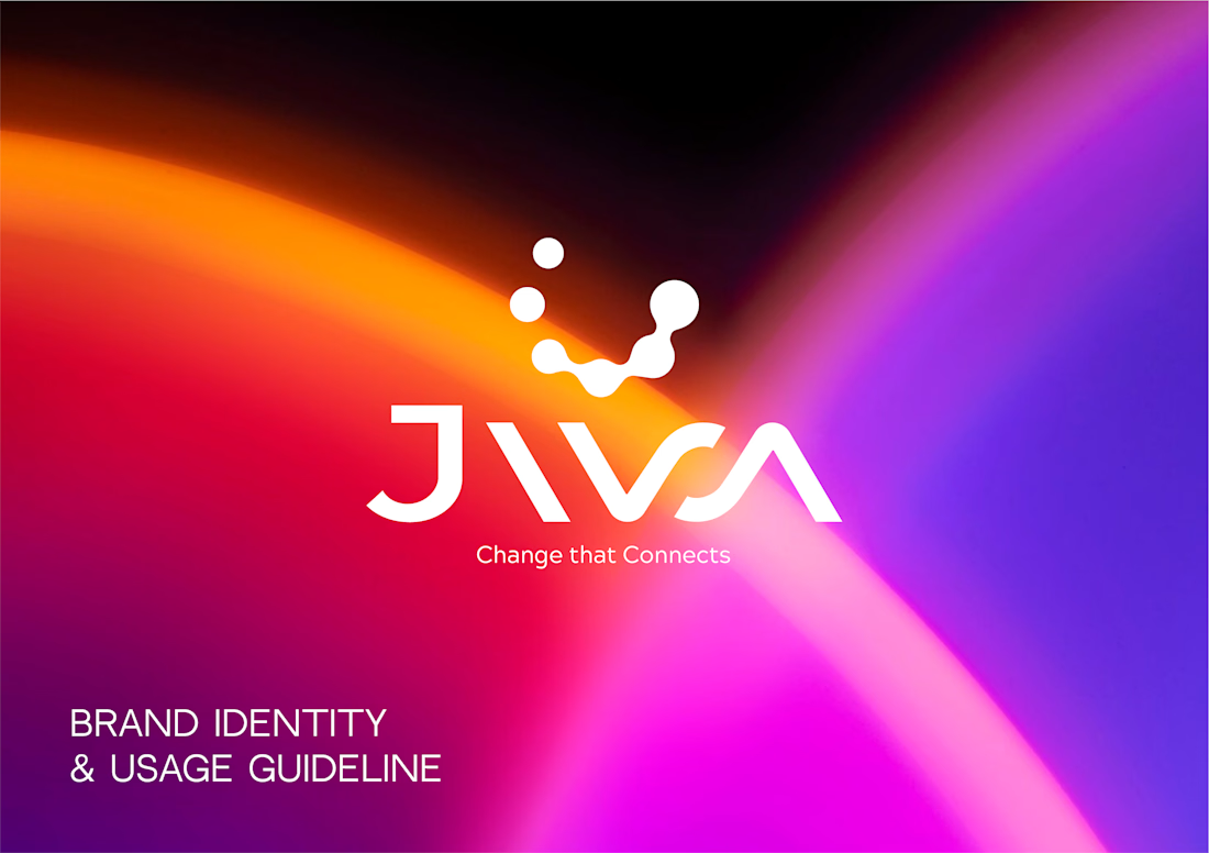
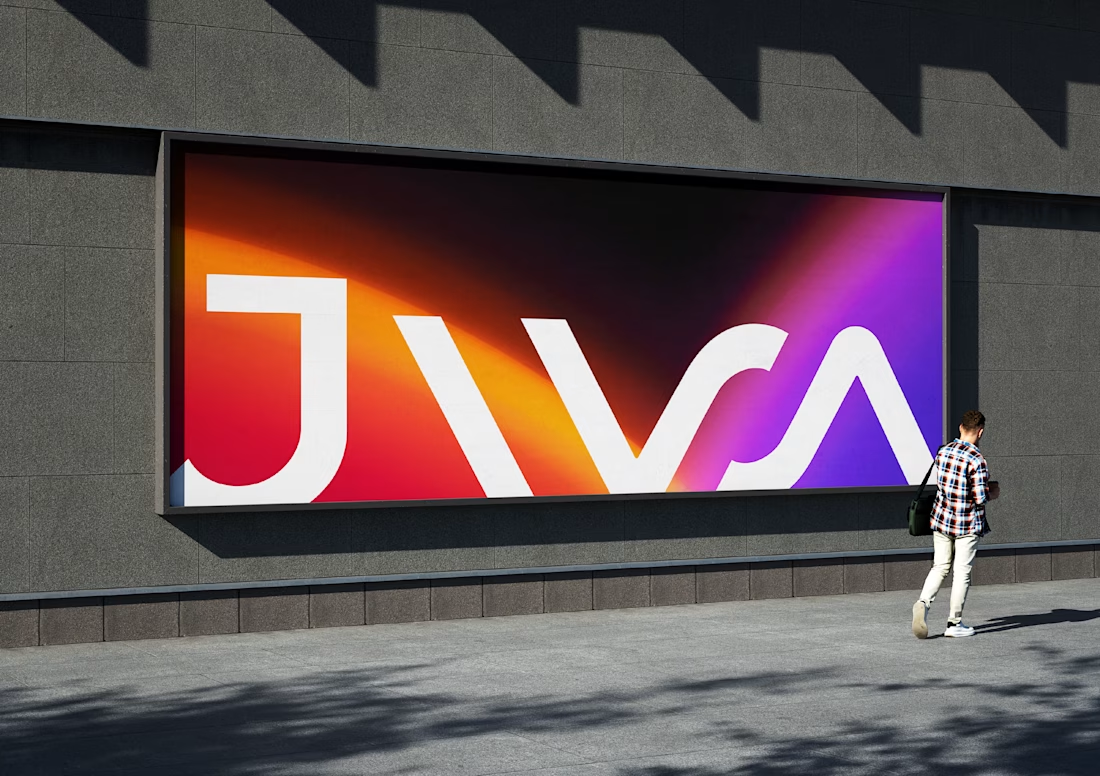
Just published a new case study for Jiva, a business automation agency.
I explored three different logo concepts based on the idea of step-by-step business growth, deliberately avoiding the usual symbols of money and arrows.
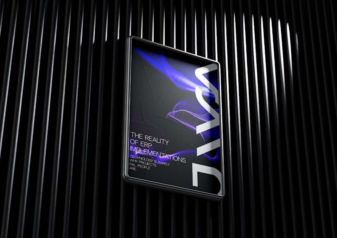
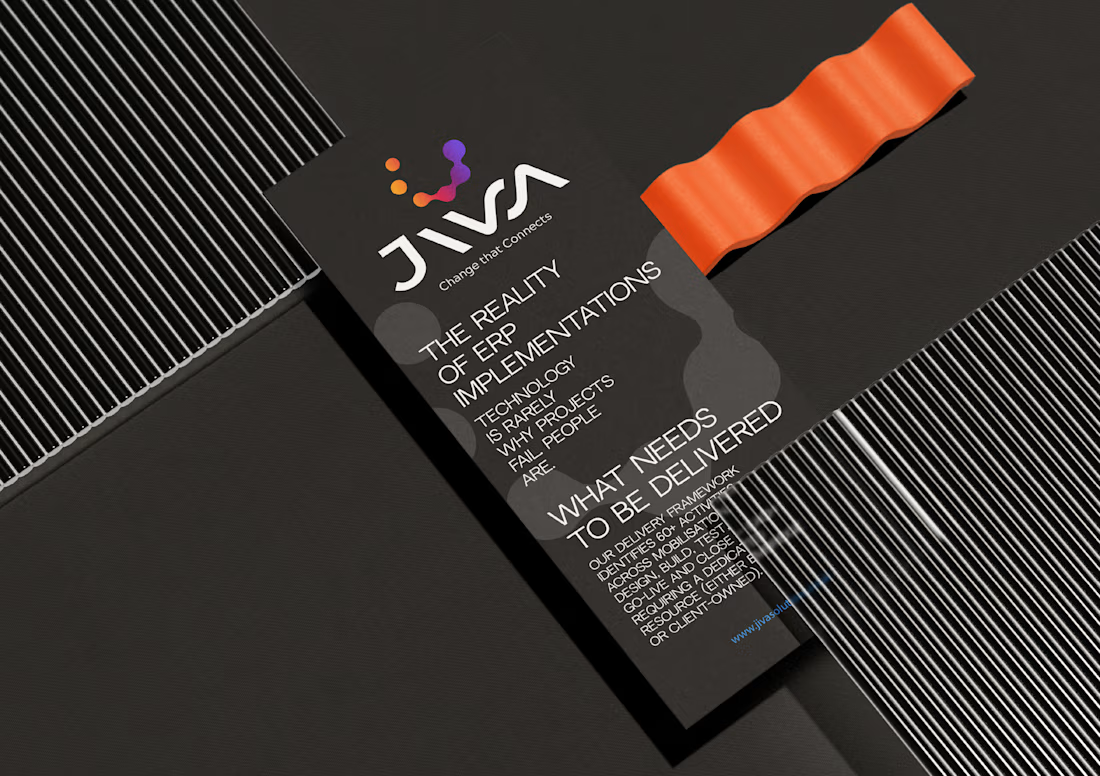
The chosen direction was the geometric sign of the circles in the circle by zoom, which is supported by an exquisite word mark, flexible variations of the logo, an icon, a favicon, a color palette and digital programs.
If you need a distinctive logo and corporate identity for your company, feel free to send me a message.



Deliberately avoiding the money and arrows cliches for an automation agency is such a good call, the whole industry reaches for them. The circles in circle by zoom is a clean way to show step by step growth without saying it literally. Of the three concepts you explored, which one was the runner up?

thank you, oh, now I'm looking for the first concepts, this work was done quite a long time ago)

This logo do look distinctive. Nowadays every other brand designer is aiming for same minimal repetitive kinda logo. This is something fresh!

Agree with Gayathri below—so tired of every automation brand going for the identical ultra-thin geometric font. The chunky custom type here actually looks like an established enterprise agency rather than a 2-person freelance setup.
Thank you

The gradient on that wordmark really pops on the dark mockups.
Thank you
The network for creativity
Join 1.25M professional creatives like you
Connect with clients, get discovered, and run your business 100% commission-free
Creatives on Contra have earned over $150M and we are just getting started


Related posts

Can AI create a professional-looking logo?
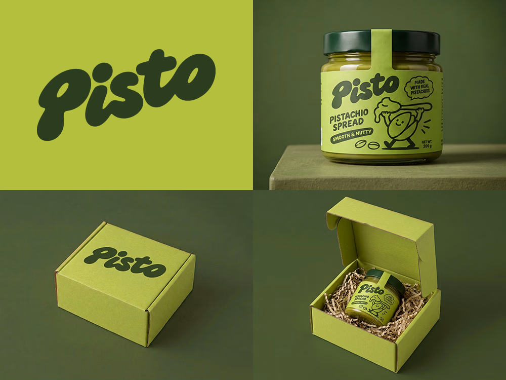
I tried to create a logo concept for a pistachio spread brand using Recraft Logo Maker.
After answering a few questions about the brand and going through several variations, I finally landed on a logo that felt right and captured the fun, fresh personality I had in mind.
But I didn't want to stop at just the logo.
I took it a step further by exploring how the identity could come to life through product packaging and a branded mailer box.
A quick process video is included in the comments.
What do you think?


A few months ago I got to work with Coderhouse, one of the leading education brands in Argentina, and the place where I took several courses myself.
So this one feels like a full circle. A brand that shaped my career and helped me grow as a designer, and now I got to design for it.
The funny part is Chris had no idea I was a former student when he reached out. I was really happy when that message came in.
I built a visual system for their 60+ course covers, made so their team can keep producing them on their own. Today it lives across their app, website and Meta ads.
Thanks Chris for trusting my work and for the opportunity 🧡 And thanks @Contra HQ for making connections like this one possible.


This looks great

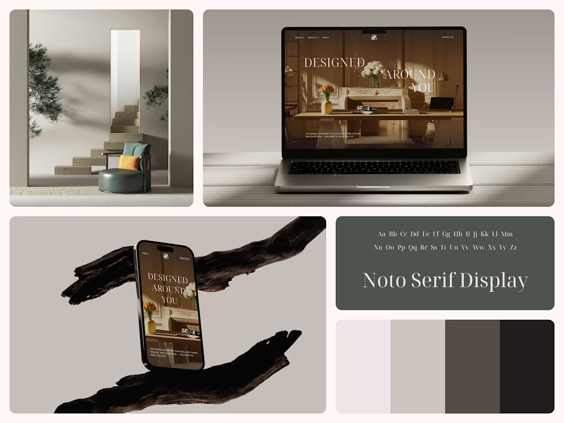
Interior Design Website
The white flowers on the mantel overlap the headline.
Thin Noto Serif Display capitals step down across one warm photo of a paneled room, so the space stays in view between the words. On the phone, the three words stack in a centered column, with Menu and Contact on either side of the monogram.
The palette runs from soft white to near black, which leaves the color to the photo: orange tulips and warm light on the walls.
The headline reads "Designed Around You", and the hero takes it literally, with the wall behind the type and the flowers in front of it.
Designed by the Hue & Machine team.
#InteriorDesign #InteriorStudio #WebsiteDesign #HomepageDesign #WebDesign #ResponsiveDesign #Typography #EditorialDesign #UIDesign #FigmaDesign


Nice!