The network for creativity
Join 1.25M professional creatives like you
Connect with clients, get discovered, and run your business 100% commission-free
Creatives on Contra have earned over $150M and we are just getting started
Back to feedPost


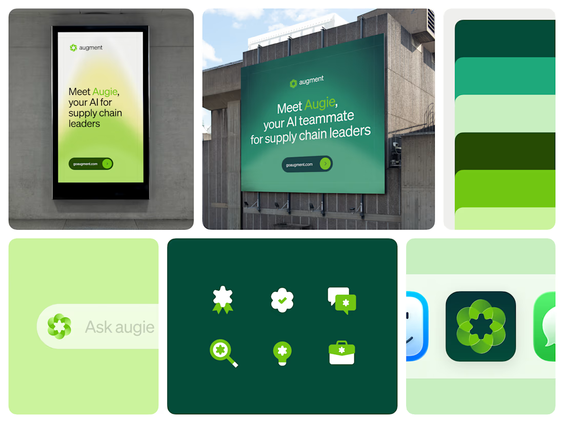
A good brand mark has to work everywhere the product shows up.
The mark was designed to adapt across every medium it appears in. Digital surfaces, product interfaces, and large format interactive billboards at logistics industry events all require different things from a logo. The mark holds up across all of them without modification.
Because the mark is translucent, it reads differently depending on where it sits, lighter and more open on white, denser on dark, bold at large format, and the adaptation works without changing anything about the shape itself.



Love this!

Lovely concept

I love the icons!

Love the layout!

Very polished design

Nice design !

Impressive brand applications! 🤩

This is beautiful


This is incredible and amazing 🤩 😍 🤩 😍

Good work

Love this


So nice 👍


Awesome work

Clean & Creative Work 😍

Translucency as the adaptation strategy is smart, most brand systems just swap colorways and call it flexible. Seeing it hold up on that dark billboard next to the app icon grid is a good stress test.
Couldn't agree more. The best logos aren't just recognizable, they're flexible enough to work wherever the brand shows up.

Cool 🧡

This is well done


Polished!

The billboard-to-app jump is the real test for a mark like this, most logos fall apart at that scale difference. What was the hardest surface to design for out of the ones you listed?
The network for creativity
Join 1.25M professional creatives like you
Connect with clients, get discovered, and run your business 100% commission-free
Creatives on Contra have earned over $150M and we are just getting started
Related posts

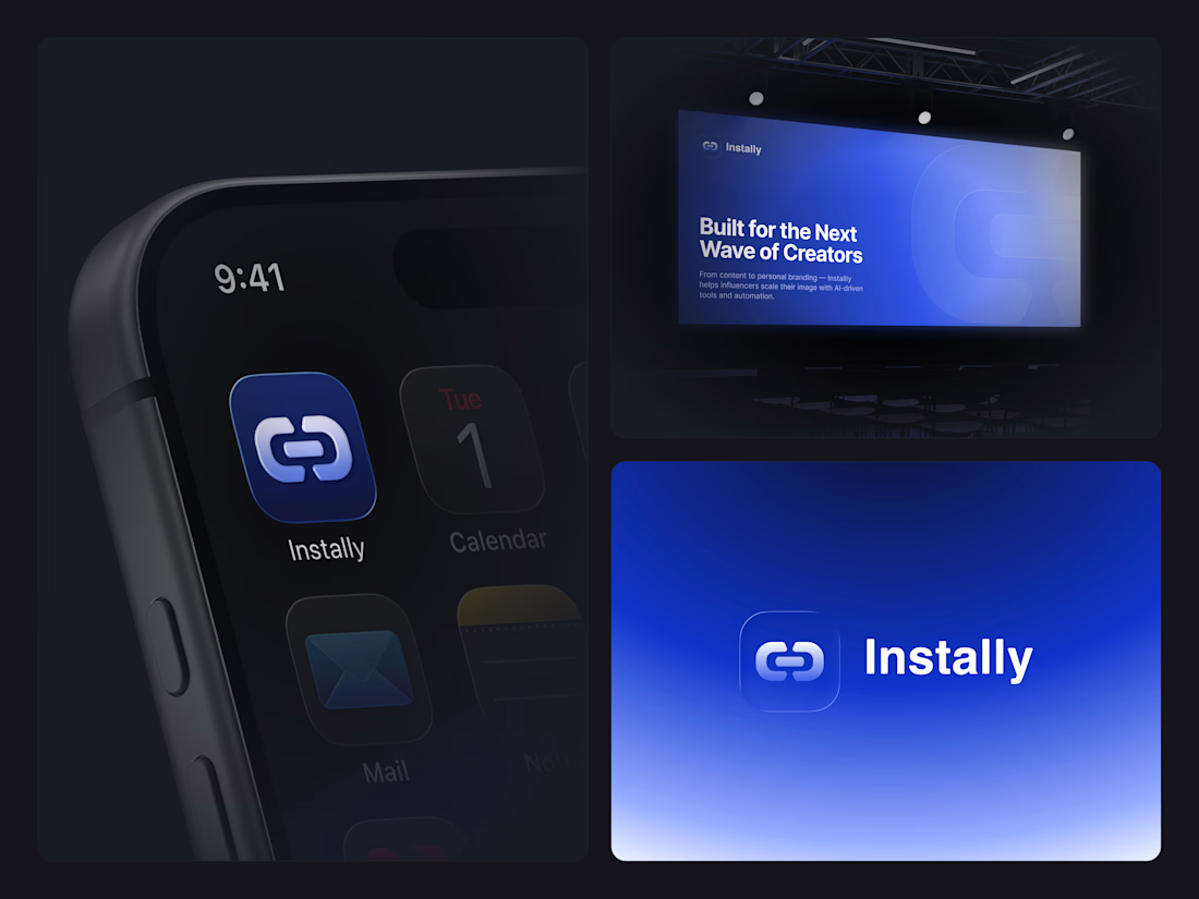
Modern identity concept for an AI-powered platform built for creators, influencers, and digital personalities ready to scale their online presence
🚀 The goal was to craft a sleek, premium, and instantly recognizable visual system that feels native to the new generation of creator-focused AI products 🤖⚡️ 📱 From the polished app icon and cinematic gradients
🎨 to the clean typography and Apple-inspired presentation style — every detail was designed to feel modern, elevated, and effortlessly digital.



Nice work

Turning logo geometry into animated 3D brand worlds in Spline is my guilty pleasure.
For this Muzim exploration, every 3D element grows from the logo itself, creating a cohesive visual language instead of standalone motion.


Top notch
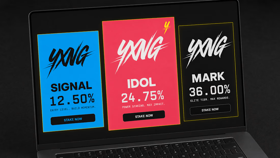
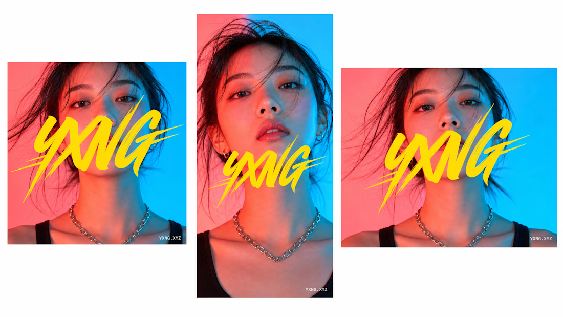
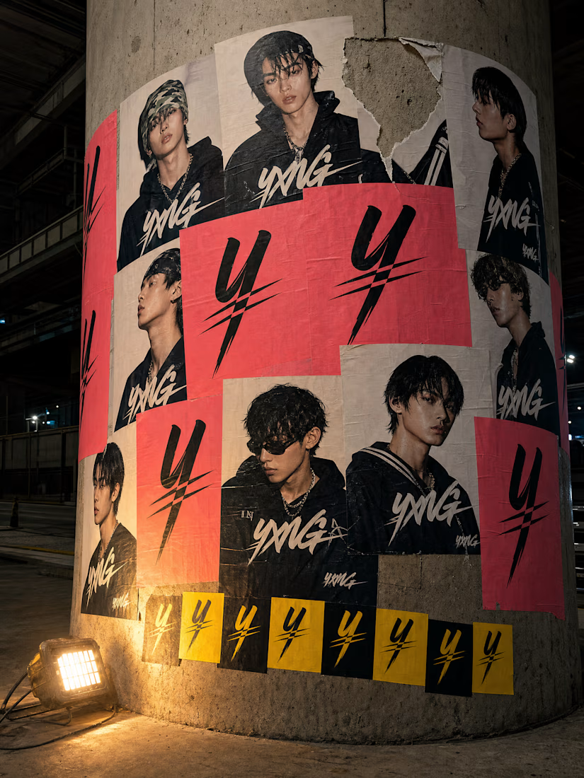
built a crypto protocol that looks like a K-pop idol's comeback.
the rule was simple: yellow only touches the mark. nowhere else. that's it. that's the whole system.
20 touchpoints. one gesture. zero whitepaper energy.
YXNG case study is live.

That's outstanding work, revolte. Keep up the great work




Trending

Claude
Claude has entered the design space. How are you using Claude Design?

Contra University
Learn from expert creatives how to earn more using next-gen AI tools.
fifaworldcup2026
The World Cup is here and the whole world's watching. How are you designing for the world stage?
creativeaiflow
Creative AI workflows are evolving. What tools do you use, and what are their strengths and weaknesses?
freelancerlife
Freelancer life is wins, pivots, and everything in between. What’s yours right now?