The network for creativity
Join 1.25M professional creatives like you
Connect with clients, get discovered, and run your business 100% commission-free
Creatives on Contra have earned over $150M and we are just getting started
Back to feedPost

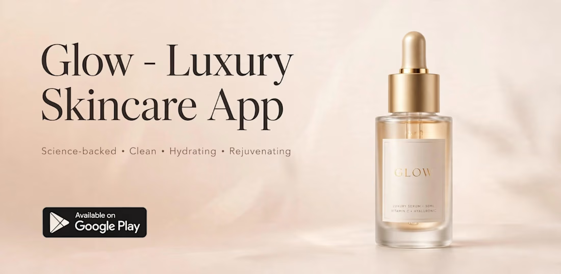
A premium branding and UI concept designed for GLOW, a luxury skincare app. Focused on clean, science-backed aesthetic with gold accents to reflect premium beauty. Designed for modern skincare users.
Tools: CorelDraw, Adobe XD
Skills: App Design, Branding, Packaging

The network for creativity
Join 1.25M professional creatives like you
Connect with clients, get discovered, and run your business 100% commission-free
Creatives on Contra have earned over $150M and we are just getting started




Related posts


Some logos try to say everything.
The best ones say just enough.
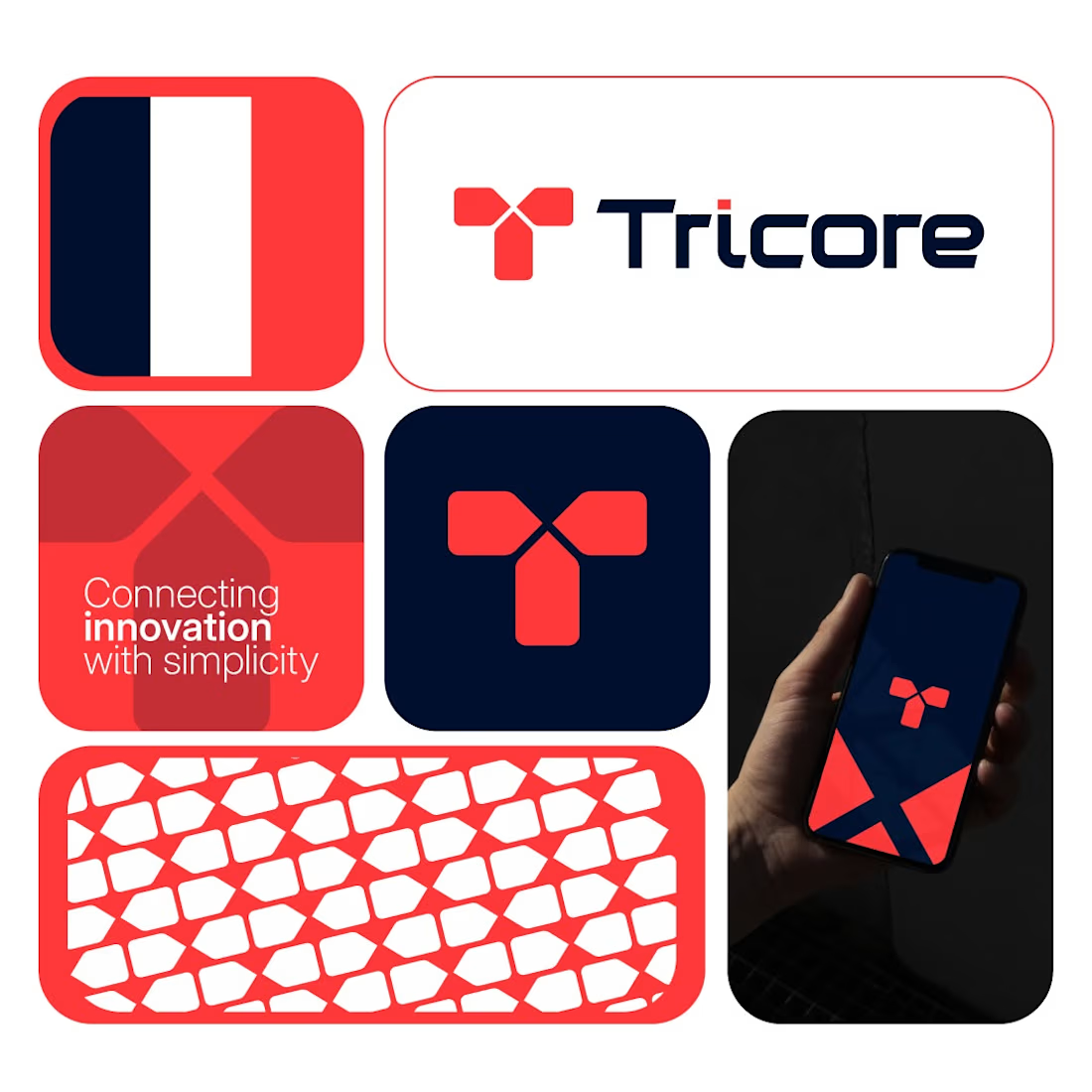
Tricore was built around a simple visual concept:
three connected elements working together as one system.
No unnecessary details.
No visual noise.
Just a clean identity designed to be memorable across screens, products, and future brand applications.
A strong logo should still be recognizable when:
• Scaled down
• Viewed quickly
• Seen from a distance
That's the standard I try to design for.
What's your first impression of this identity?
👇 One word only.



Cohesive.

nts):
Scoopi 🍦 – The Happiest Ice Cream Brand!
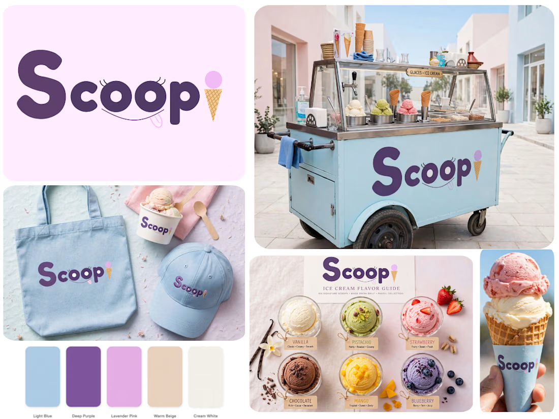
I created Scoopi – a playful & dreamy ice cream brand that smiles back at you!
Concept: The double oo are sparkling eyes with lashes, a cheeky smile with tongue out, and the dot of the i is a mini ice cream cone! The logo itself is happy!
Palette: Sky Blue #A6D9F2, Deep Purple #4B2E7A, Lavender, Waffle Beige & Cream – soft, sweet & super Instagrammable.
Designed in Figma from scratch – logo, cart mockup, flavors chart & packaging.
Scoopi is not just ice cream, it's a moment of joy!
If you want a design like this, DM me

The cone replacing the tittle on the i is the bit that has to carry the whole idea once this shrinks to a cup lid or a scoop tag — the eyes and smile will close up long before it does. Did you draw a reduced mark for those sizes, or does the full wordmark go everywhere?

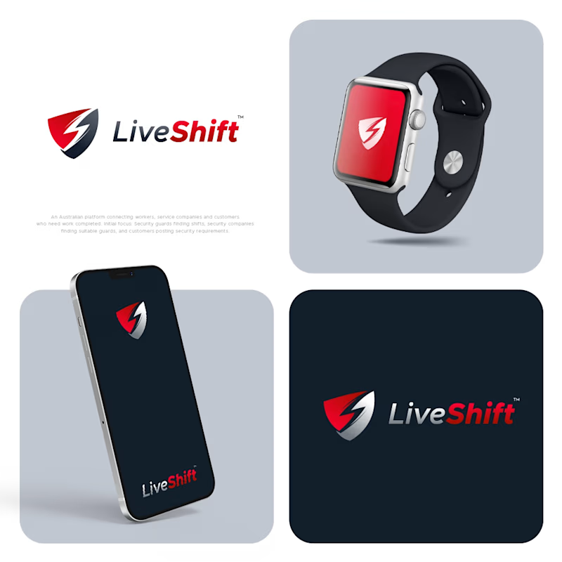
I designed four concepts for this logo. The client likes one of them, while another is my personal choice. I would love to hear your opinion. Which one do you think works better?
3 voted
60%
2 voted
40%
5 votes
Closed