The network for creativity
Join 1.25M professional creatives like you
Connect with clients, get discovered, and run your business 100% commission-free
Creatives on Contra have earned over $150M and we are just getting started
Back to feedPost


Some logos try to say everything.
The best ones say just enough.
Tricore was built around a simple visual concept:
three connected elements working together as one system.
No unnecessary details.
No visual noise.
Just a clean identity designed to be memorable across screens, products, and future brand applications.
A strong logo should still be recognizable when:
• Scaled down
• Viewed quickly
• Seen from a distance
That's the standard I try to design for.
What's your first impression of this identity?
👇 One word only.


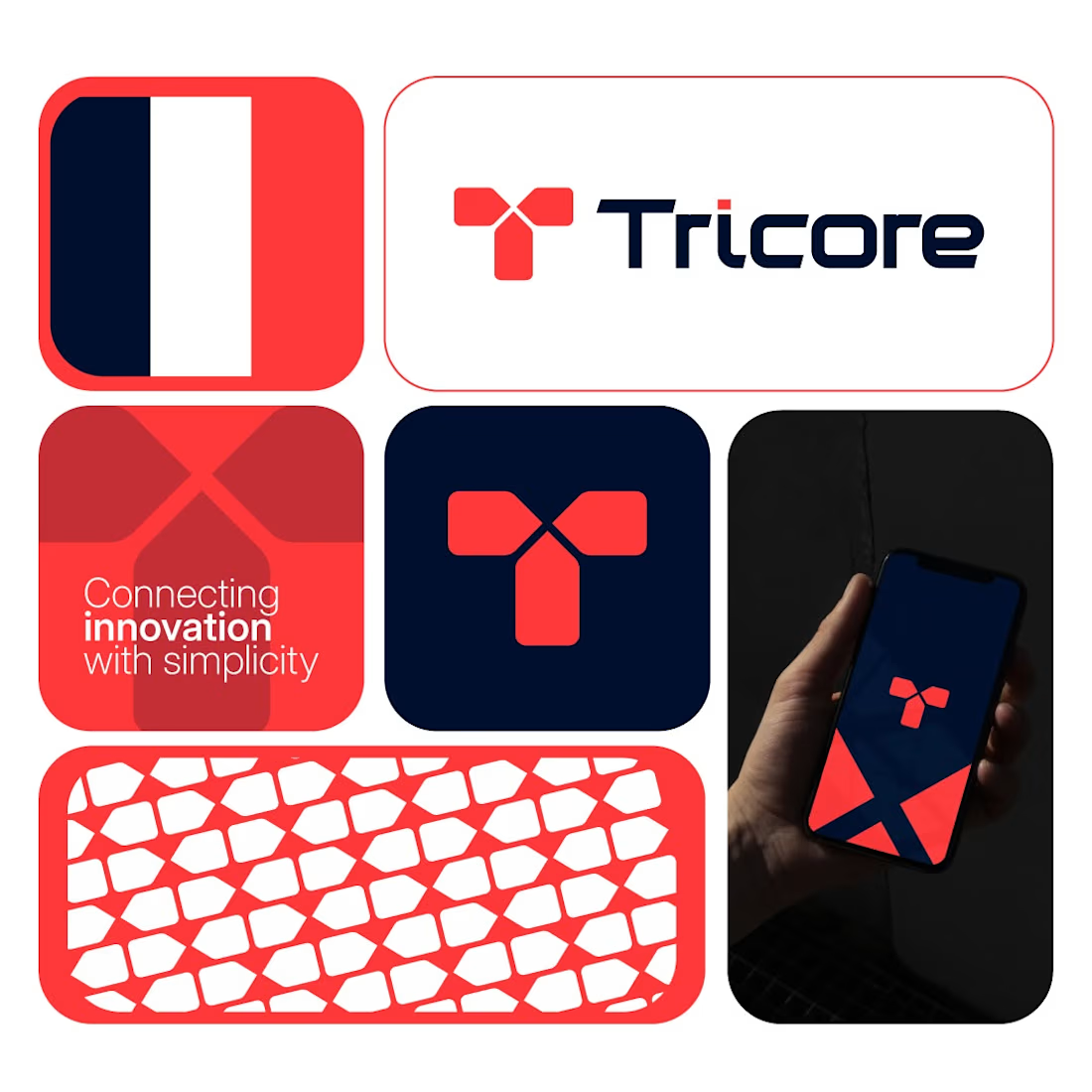


System. The three pieces lock into one mark, and it still reads clean when scaled down.

Cohesive.
The network for creativity
Join 1.25M professional creatives like you
Connect with clients, get discovered, and run your business 100% commission-free
Creatives on Contra have earned over $150M and we are just getting started







Related posts

Created the complete brand identity for Nerada, a natural tea brand — developing the visual direction and design elements that shape how the brand looks and feels across every touchpoint. The goal was a clean, organic aesthetic that reflects the brand's natural positioning and builds a consistent, recognizable identity.
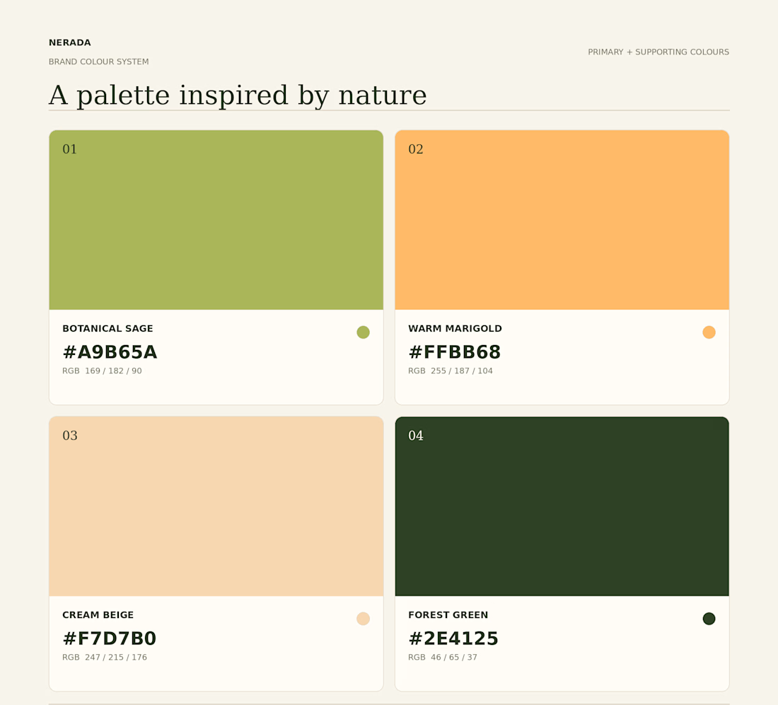
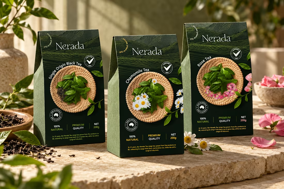
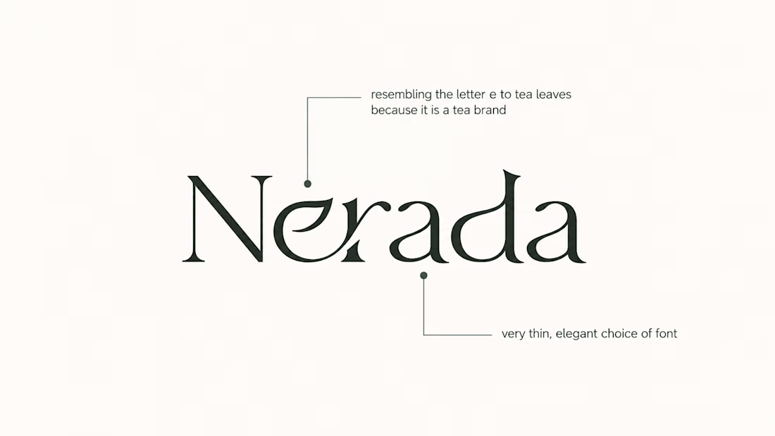
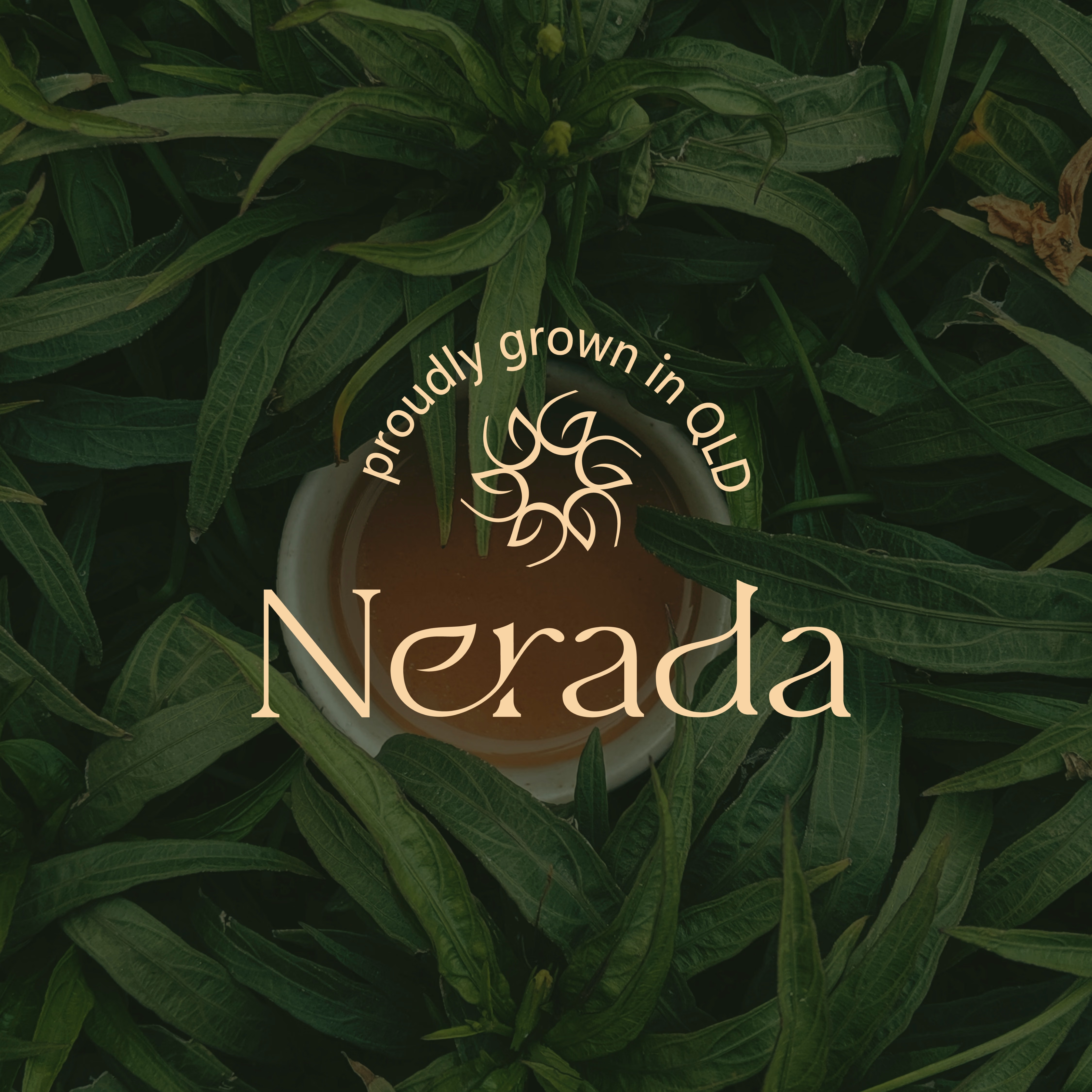

The mark feels grown rather than drawn, which is exactly right for a natural tea brand. Packaging is where tea brands win or lose. Does the identity change tone across blends, or stay one voice with different colours?


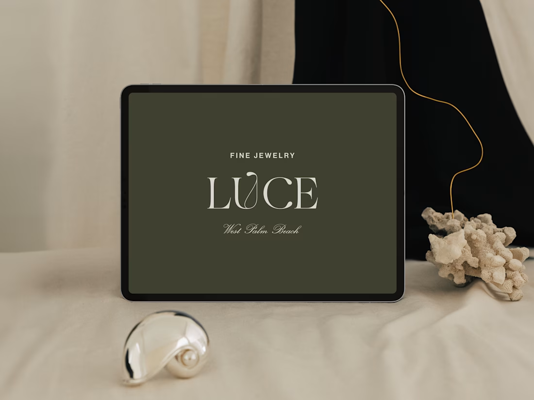
Introducing LUCE, a fresh chapter in four generations of fine jewelry.
Earthy greens, expressive typography, and thoughtful packaging bring warmth and personality to a brand rooted in heritage.
I worked with LUCE across brand strategy, visual identity, packaging experience, and full Shopify website design and development, bringing every detail into one cohesive world.


NEAT

GIANT — Move Different.
Built around a bold gorilla mark, oversized typography, and an electric purple + neon-lime palette.
A streetwear identity designed to feel bold, rebellious, and instantly recognizable — from hoodies and caps to packaging, tags, and everyday brand details.
Concept branding project | Open for custom projects


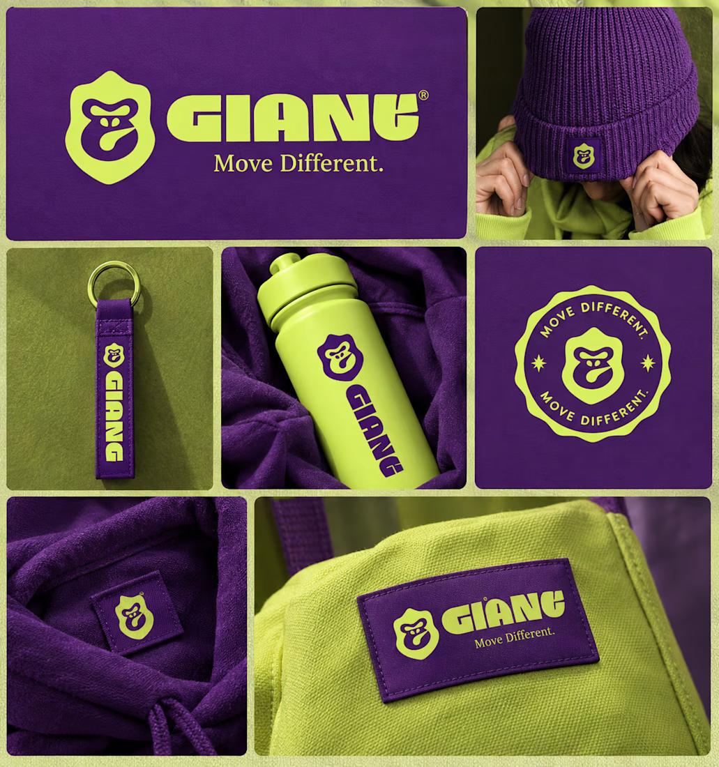
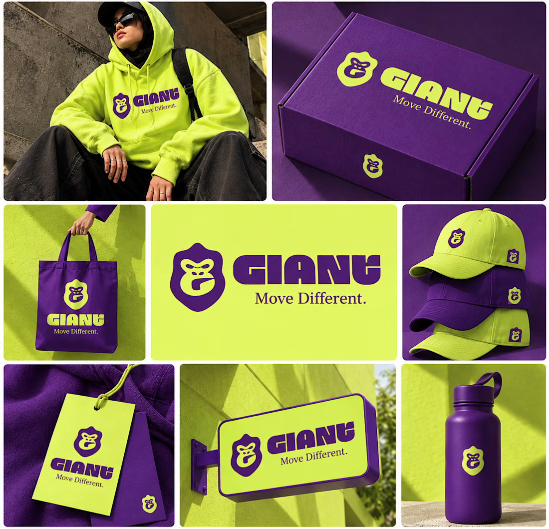

Using electric purple paired with neon lime is a high risk color choice that demands exceptional contrast management. Getting that balance right across different fabrics and lighting conditions is often where streetwear brand identities actually fail.