
Husnain Ali
Logo | Brand | Thumbnails | Social Media Designer


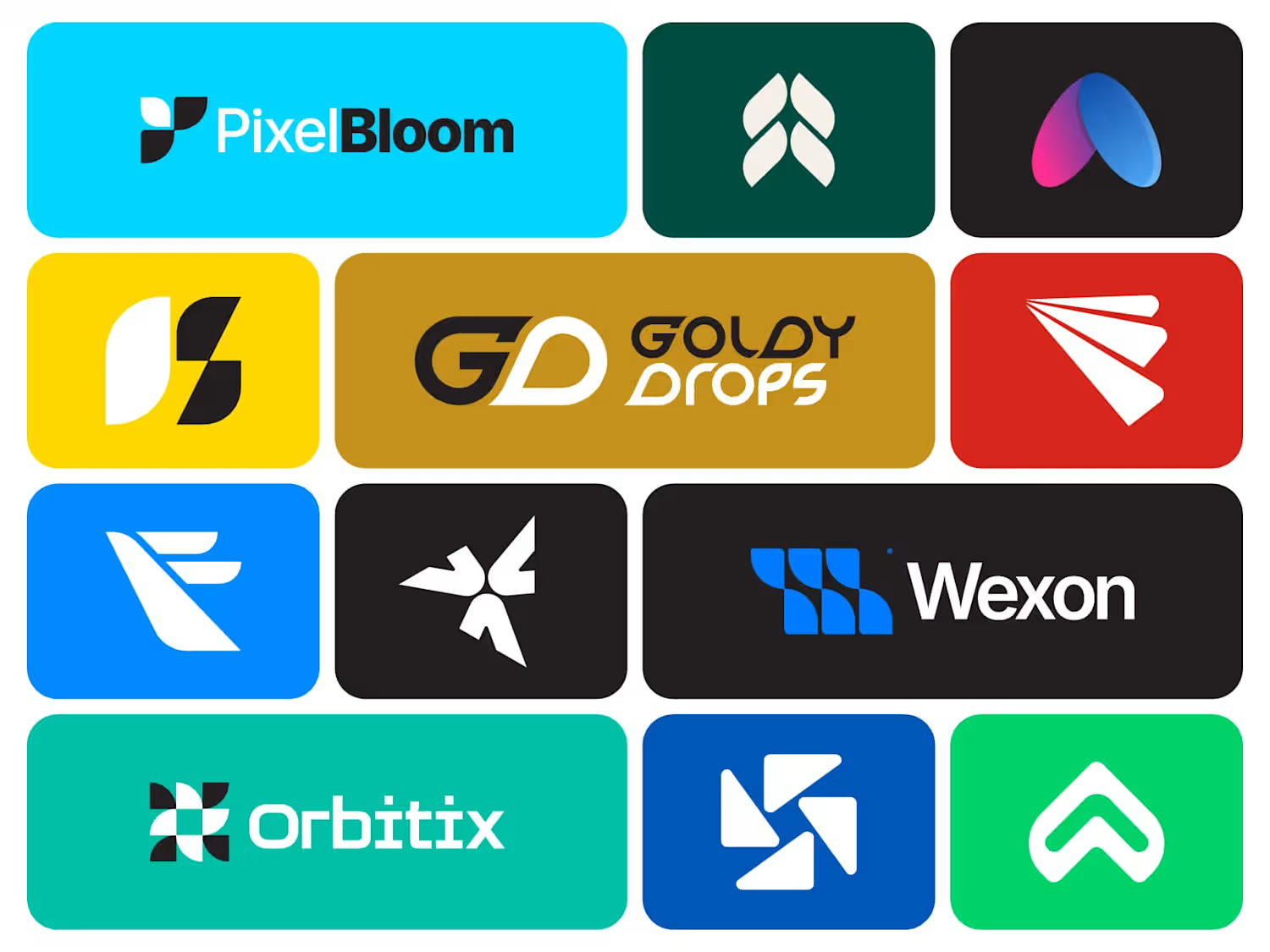
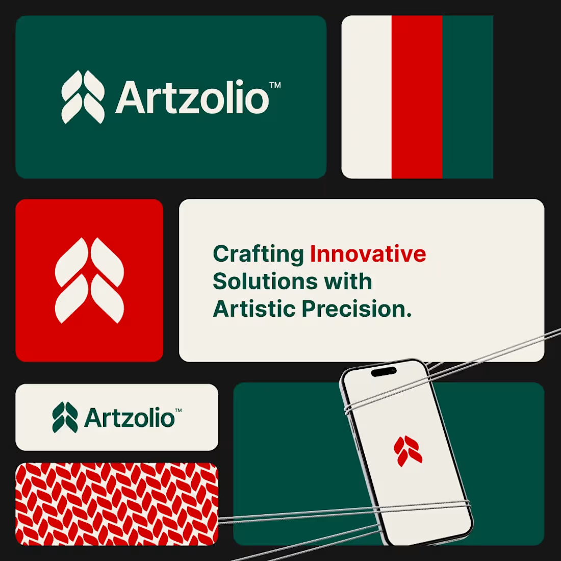
A strong brand isn't just seen... it's remembered.
Artzolio was designed with a simple goal:
Create a modern identity that feels creative, memorable, and professional across every touchpoint.
From the logo mark to the color palette and brand applications, every element was crafted to build a recognizable visual presence.
Which part stands out the most?
A) Logo Symbol
B) Color Palette
C) Typography
D) Brand Pattern
👇 Let me know in the comments.
1
36
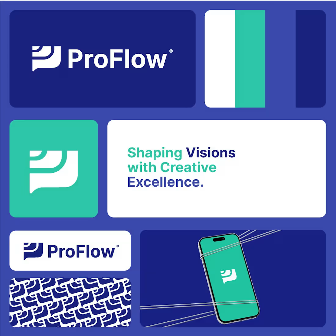
A logo should communicate trust before a single word is spoken.
ProFlow was built around a simple idea:
Create a clean, modern, and memorable identity that feels professional across every platform.
From the symbol to the color system, every detail was designed to help the brand stand out while staying simple and recognizable.
What's your favorite part of this identity?
🔹 Symbol
🔹 Colors
🔹 Typography
🔹 Brand Pattern
Drop your answer below 👇
1
6
173
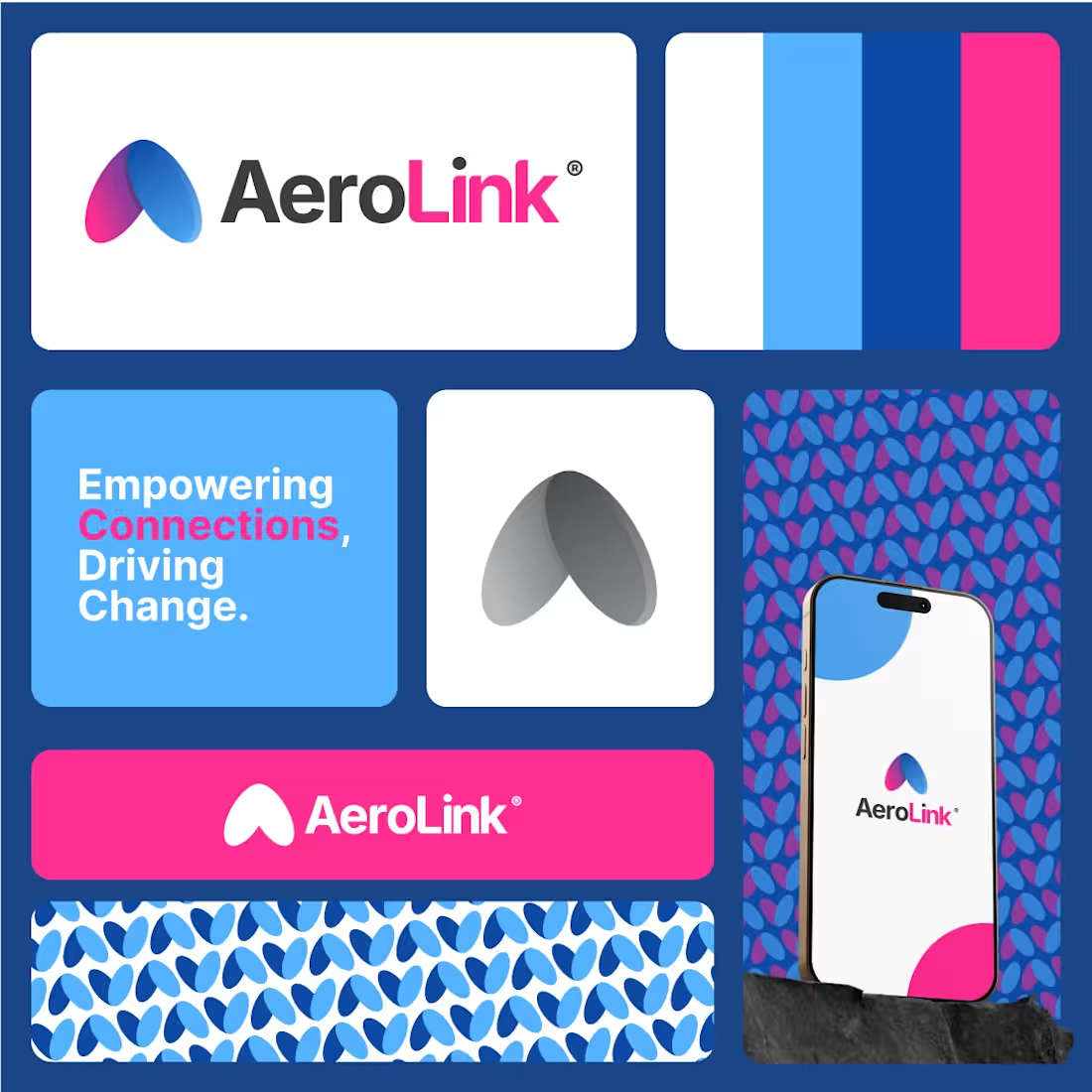
Strong brands connect people before they sell anything.
AeroLink was designed for a modern brand focused on communication, connectivity, and growth.
The goal was to create an identity that feels:
• Modern
• Memorable
• Scalable
• Instantly recognizable
From the symbol to the color palette, every element was crafted to reflect movement, connection, and progress.
A strong visual identity helps brands stand out long before the first interaction happens.
What's your favorite element of this branding?
🔹 Logo Symbol
🔹 Color Palette
🔹 Typography
🔹 Brand Pattern
Drop your answer below 👇
#LogoDesign
#BrandIdentity
#VisualIdentity
#Branding
#GraphicDesign
#LogoDesigner
#CreativeDesign
#BrandStrategy
#DesignInspiration
#Designsburner
2
56
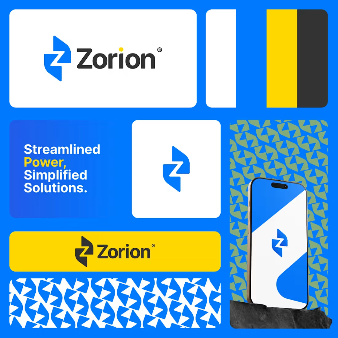
The strongest brands are often the simplest.
Zorion was designed to communicate power, reliability, and forward movement through a clean and memorable visual identity.
The goal was to create a mark that feels:
⚡ Modern
⚡ Confident
⚡ Scalable
⚡ Instantly recognizable
From the geometric symbol to the bold color palette, every element was crafted to create a strong visual presence across digital and physical platforms.
A good logo doesn't need complexity.
It needs clarity.
What's your favorite part of this identity?
🔹 Symbol
🔹 Colors
🔹 Typography
🔹 Pattern System
👇 Let me know below.
#LogoDesign
#BrandIdentity
#VisualIdentity
#Branding
#GraphicDesign
#LogoDesigner
#CreativeDesign
#BrandStrategy
#DesignInspiration
#Designsburner
1
56