The network for creativity
Join 1.25M professional creatives like you
Connect with clients, get discovered, and run your business 100% commission-free
Creatives on Contra have earned over $150M and we are just getting started
Back to feedPost


A logo should communicate trust before a single word is spoken.
ProFlow was built around a simple idea:
Create a clean, modern, and memorable identity that feels professional across every platform.
From the symbol to the color system, every detail was designed to help the brand stand out while staying simple and recognizable.
What's your favorite part of this identity?
🔹 Symbol
🔹 Colors
🔹 Typography
🔹 Brand Pattern
Drop your answer below 👇


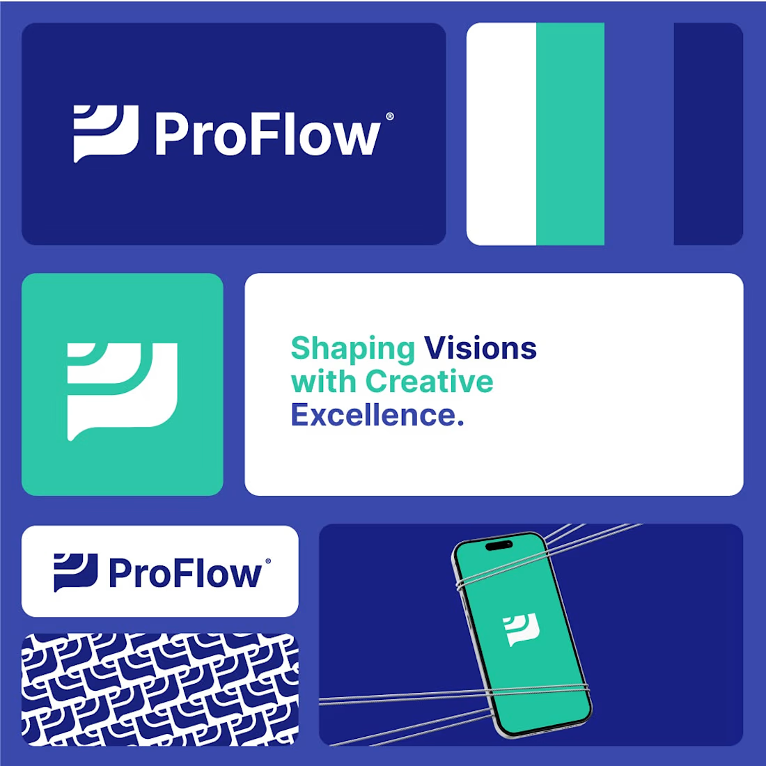

The brand pattern, because it is the part that still works when the logo isn't in frame - it gives you a surface for decks and packaging without repeating the mark. On the trust line, a new identity mostly avoids breaking trust; it is that pattern showing up consistently over months that actually earns it.
The network for creativity
Join 1.25M professional creatives like you
Connect with clients, get discovered, and run your business 100% commission-free
Creatives on Contra have earned over $150M and we are just getting started







Related posts

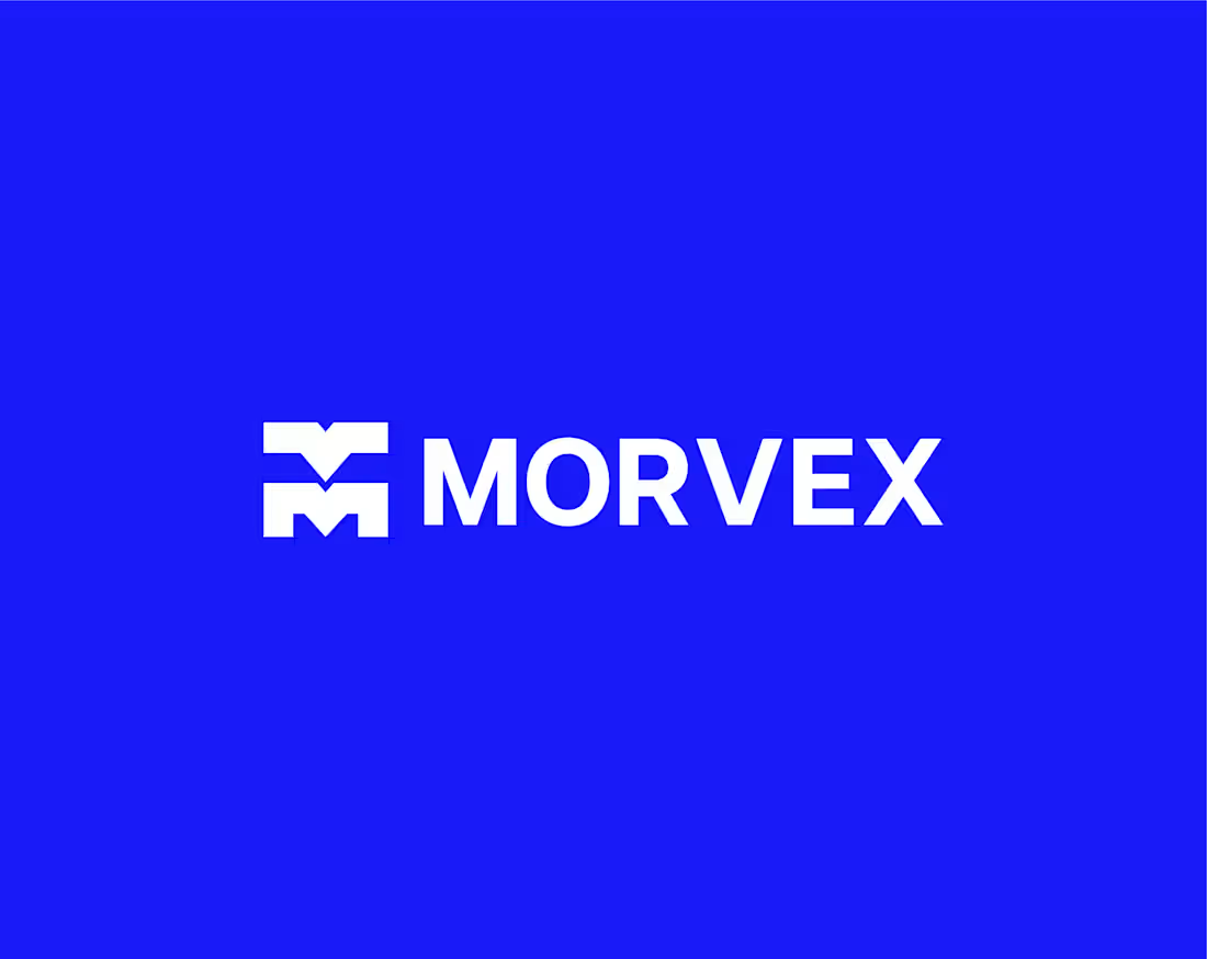
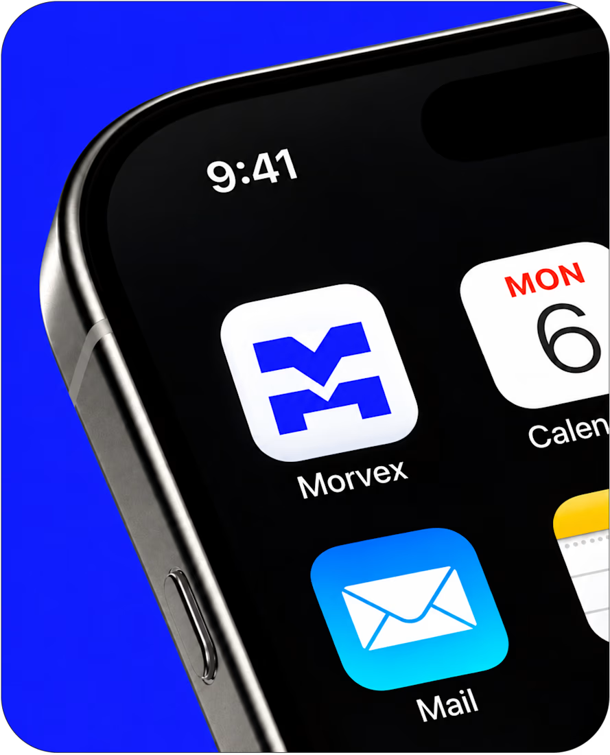
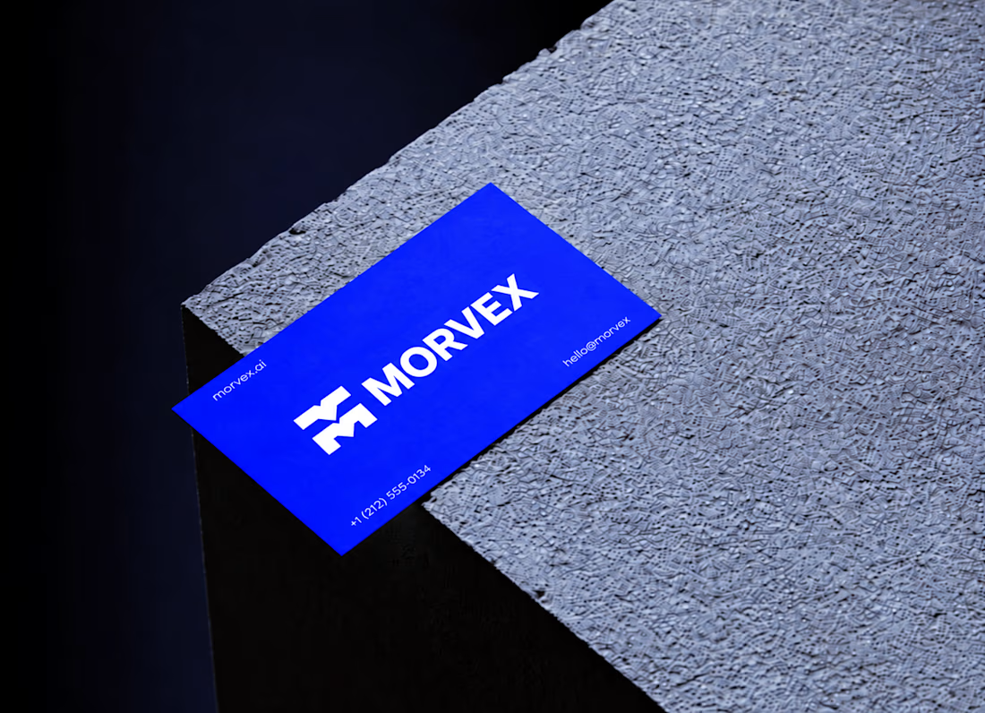
Morvex is a cybersecurity brand with a strong, bold visual identity. The idea behind the logo was to create something simple but recognizable, using a custom geometric M with sharp angles and carefully balanced shapes.
The identity brings together electric blue, bold typography, and a dark visual style to give the brand a modern, confident look. I carried the same design approach across the brand applications, keeping everything clean, consistent, and easy to recognize.


This is a really creative piece! I love how the visual elements come together to create something that feels distinctive rather than predictable. The composition, the overall visual direction, and the way the idea has been executed all contribute to making this stand out. It’s a...

Refreshing my portfolio and revisiting one of my favorite projects from 2025 🧡💙
Bilsoft has made accounting software for over 20 years, and 100,000+ businesses use it every day. When we started, the trust was there, but the brand had grown piece by piece until it looked like several different companies.
The tricky part was a tension most fintech brands face. The software has to feel precise and serious, but the people using it are small business owners who just want things to be simple. So I drew the wordmark on a strict grid and softened every corner. The name does the rest: “Bil” means knowing, “Soft” means steady. Then I built it into a system the team could use without a designer in the room.
While putting the case study together, I added something new: a motion piece where the logo builds itself letter by letter.
Curious how others here handle this: when a client’s product is serious but their users want simple, which way do you lean? 👇
Full case study on my Contra profile.


I lean simple on the surface, serious underneath — and your grid-plus-softened-corners move is exactly that split. The structure carries the precision, the corners carry the approachability, so a small business owner isn't intimidated before they've even logged in. With 100,000+...

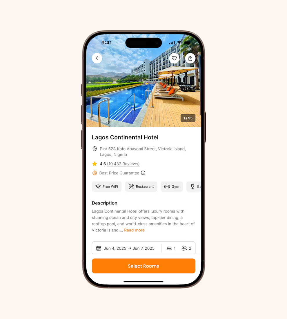
Hotel details screen for a booking app I’ve been designing.
Focused on clear information hierarchy, visual comfort, and helping users make quick booking decisions.
Excited to start sharing my work here 🚀

It's basic design but it's great❤️