The network for creativity
Join 1.25M professional creatives like you
Connect with clients, get discovered, and run your business 100% commission-free
Creatives on Contra have earned over $150M and we are just getting started
Back to feedPost
nts):
Scoopi 🍦 – The Happiest Ice Cream Brand!
I created Scoopi – a playful & dreamy ice cream brand that smiles back at you!
Concept: The double oo are sparkling eyes with lashes, a cheeky smile with tongue out, and the dot of the i is a mini ice cream cone! The logo itself is happy!
Palette: Sky Blue #A6D9F2, Deep Purple #4B2E7A, Lavender, Waffle Beige & Cream – soft, sweet & super Instagrammable.
Designed in Figma from scratch – logo, cart mockup, flavors chart & packaging.
Scoopi is not just ice cream, it's a moment of joy!
If you want a design like this, DM me
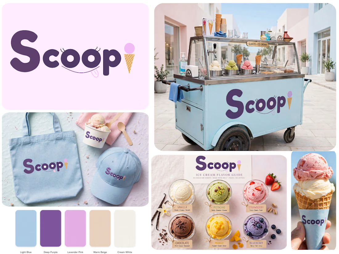

The cone replacing the tittle on the i is the bit that has to carry the whole idea once this shrinks to a cup lid or a scoop tag — the eyes and smile will close up long before it does. Did you draw a reduced mark for those sizes, or does the full wordmark go everywhere?

Great point, thank you! You're absolutely right - the tittle/cone is designed to be the hero at small sizes. The full wordmark is for the cart and hero applications, but I did build a reduced system: a simplified 'i + cone' icon for cup lids/tags where the eyes/smile would close...
The network for creativity
Join 1.25M professional creatives like you
Connect with clients, get discovered, and run your business 100% commission-free
Creatives on Contra have earned over $150M and we are just getting started











Related posts

Same design. Which palette? 👀
You picked your favorite preview last time. This time, I’m putting the colors to the vote.
One body-care packaging concept, with the same typography and composition:
A · Rose Cream, Strawberry Sorbet + Plum Jelly
B · Lime Mousse, Coconut Cream + Plum Jelly
Which would you choose and what does it make you feel about the brand?
Both palettes use colors and matching ingredient textures from DCS 654, my library of 654 dessert-inspired colors.
Take a closer look: dcs.mariya.design

7 voted
44%
9 voted
56%
16 votes
Closed

B is absolutely stunning 🎉🎉🎉🎉
Great job Mariya❤️

A flower that inflates arrives in the mail.
Next month, a phone made of shell.
STILL LIFE SERVICE. Case study dropping soon.
Which object earns your shelf? Reply below.
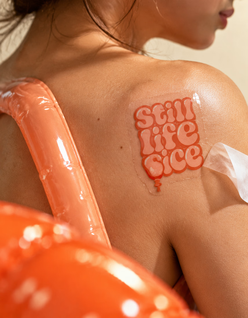
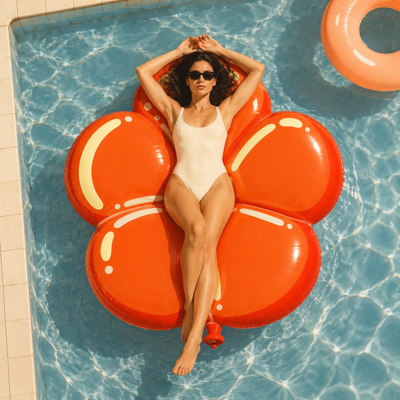
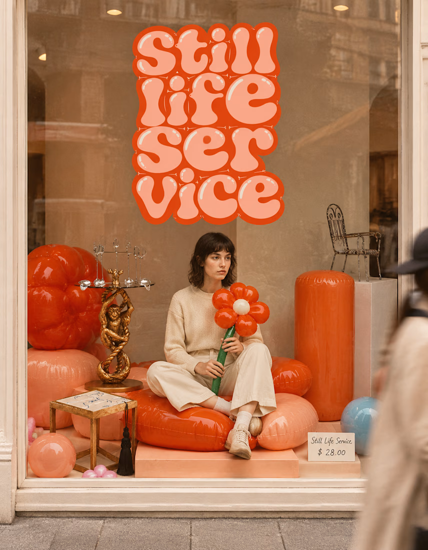

The inflatable flower. Only houseplant I'm guaranteed not to kill. Also, a new object every month is a sneaky good retention hook, people will stay subscribed just to see what's next.

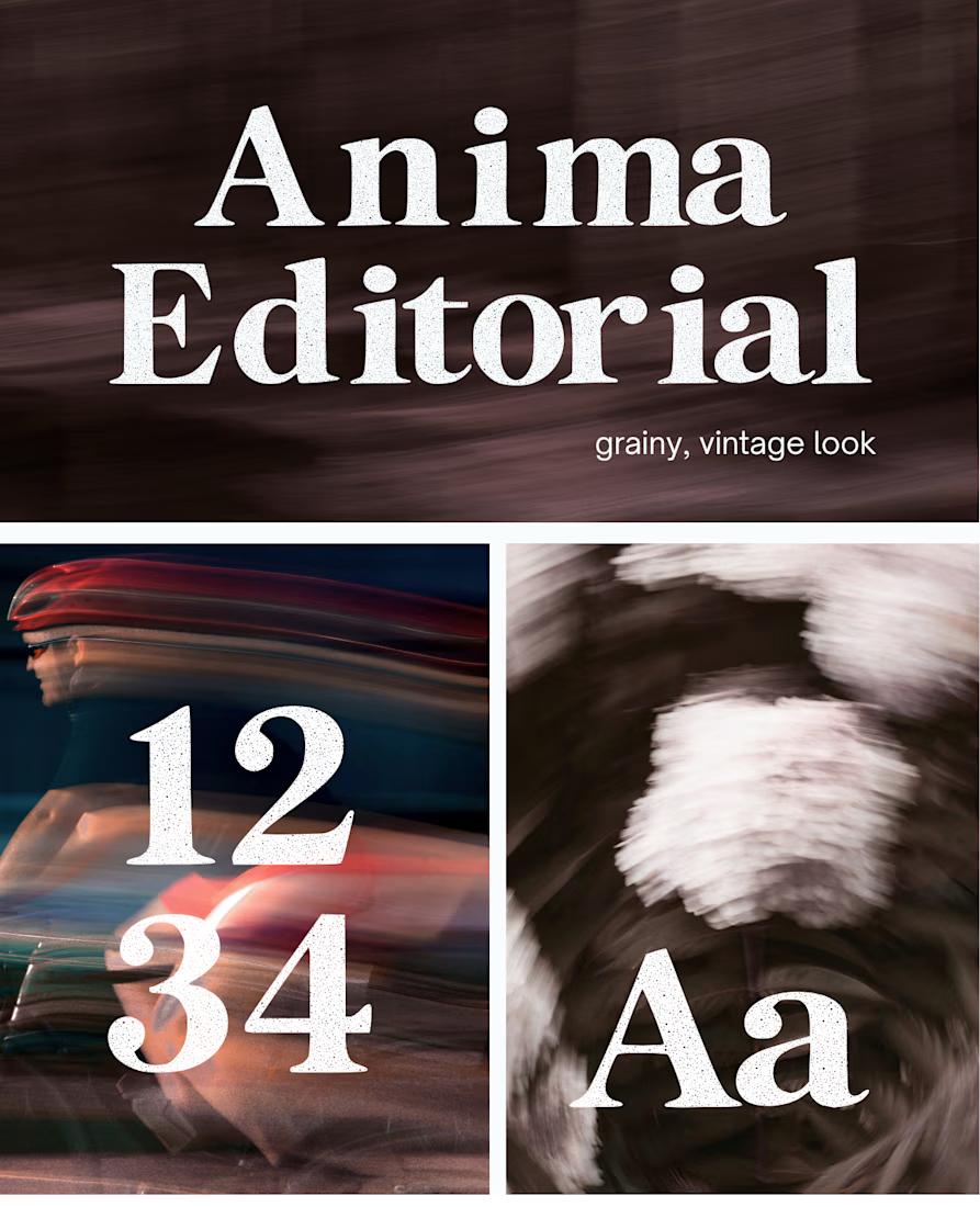
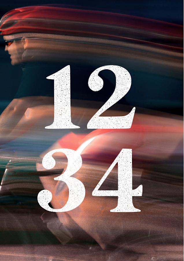
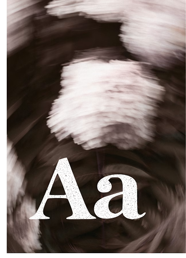
I created this font & it is free to download and use in your free or paid projects. Enjoy 🚀 find it at https://twaperdigital.com/anima-editorial



I like this font