The network for creativity
Join 1.25M professional creatives like you
Connect with clients, get discovered, and run your business 100% commission-free
Creatives on Contra have earned over $150M and we are just getting started
Back to feedPost

Built this landing page directly in Replo based on a design provided by the agency.
My role was focused on bringing the design into a fully functional, responsive Replo page while maintaining the intended layout, visual hierarchy, spacing, and interactions across both desktop and mobile devices.
The goal was to ensure the final build stayed faithful to the provided design while being properly implemented and ready for use on Shopify.
Development by me. Built in @Replo


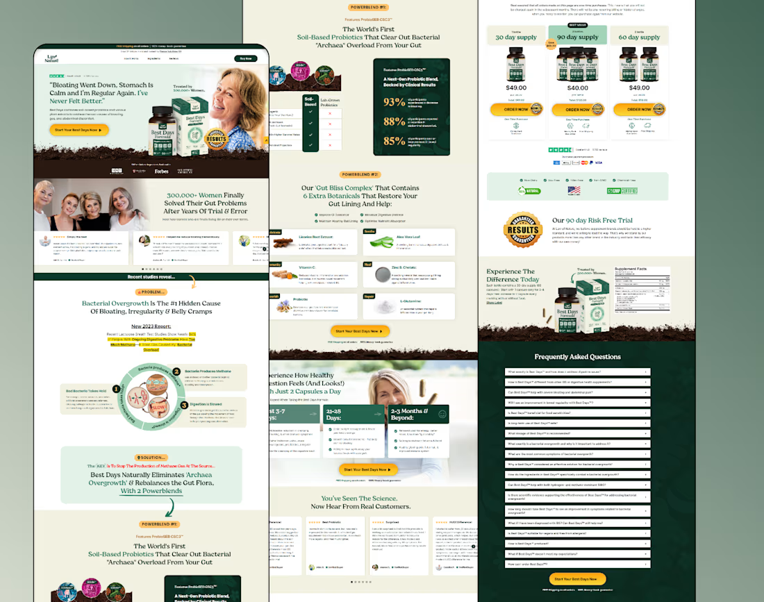

There’s a lot of content to carry through this build, and the repeating yellow CTAs give the page a clear visual thread. Which section took the most adjustment to preserve the agency’s design on mobile?
The network for creativity
Join 1.25M professional creatives like you
Connect with clients, get discovered, and run your business 100% commission-free
Creatives on Contra have earned over $150M and we are just getting started

Challenges
View all


Related posts

In recent days I’ve been practicing designing around an image.
Sometimes an image can have great potential and reinforce the message we want to convey. I’m not saying this is the correct way to prepare a strategy, it’s simply an exercise. As a result, I created these three hero section designs, which I’ve published in the Figma community where they can be freely used for experimentation.
If you use them, I’d love to see the outcome, so make sure to tag me!


So beautiful

A little bit of the work I did for an agency in Australia some time ago.
I hope you like it.
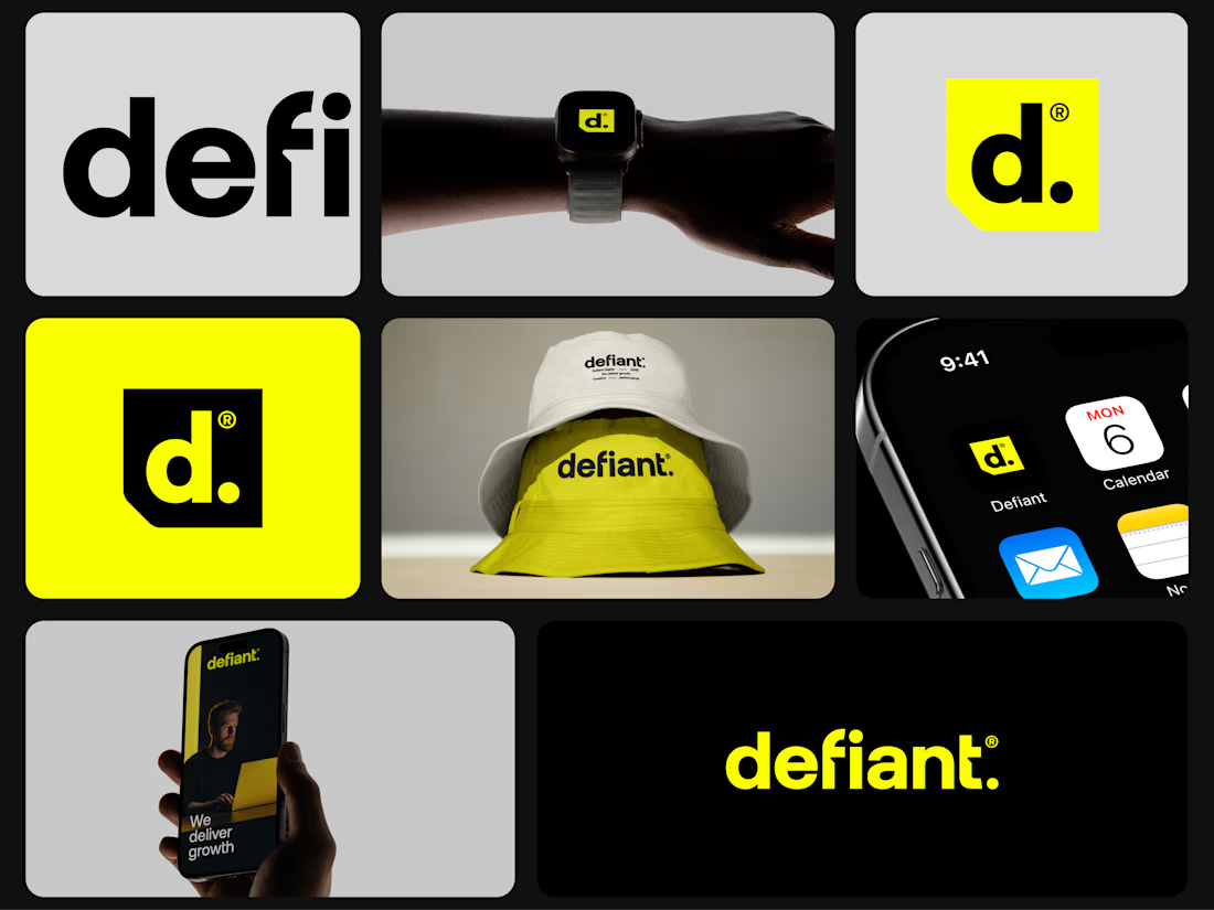
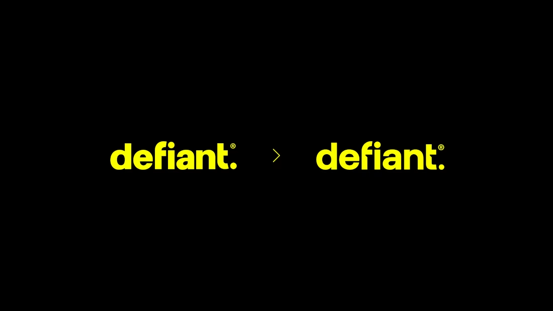

Amazing


