The network for creativity
Join 1.25M professional creatives like you
Connect with clients, get discovered, and run your business 100% commission-free
Creatives on Contra have earned over $150M and we are just getting started
Back to feedPost

Northwind Coffee Co. Brand Identity & Logo Animation
A thoughtful brand deserves a memorable first impression. For Northwind Coffee Co., I paired a refined serif wordmark and organic leaf mark with a warm, earthy palette to capture the care behind every cup.
The logo comes to life piece by piece, with a subtle steam detail and a smooth transition from soft cream to deep espresso tones. The result is a simple, atmospheric brand moment built around one idea: good coffee, good company.
#BrandIdentity #LogoDesign #LogoAnimation #MotionDesign #CoffeeBrand #BrandDesign


The network for creativity
Join 1.25M professional creatives like you
Connect with clients, get discovered, and run your business 100% commission-free
Creatives on Contra have earned over $150M and we are just getting started



Related posts

Earlier, I shared just the hero. Now here's the whole world. 🌍
ElseWhere is growing into a full packed Framer template, with immersive layouts, custom motion, and thoughtful details.
Launching soon. 👀
PS: This is my first template. More to come. 👀


Great Job man. Good Luck

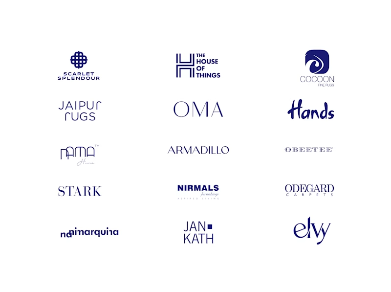
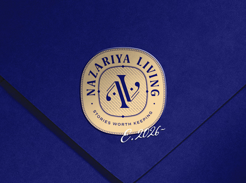
A little look at how Nazariya Living stands apart from its category.
On one side, familiar visual conventions. On the other, an identity with its own character, rooted in stories worth keeping.
We chose not to blend in. :)
Which side catches your eye?

3 voted
30%
7 voted
70%
10 votes
Closed

That side with all the competitor logos in one grid is the slide I'd steal for a client presentation. Nothing explains "why this direction" faster than showing the sea of sameness first. The navy seal wins easily after that.

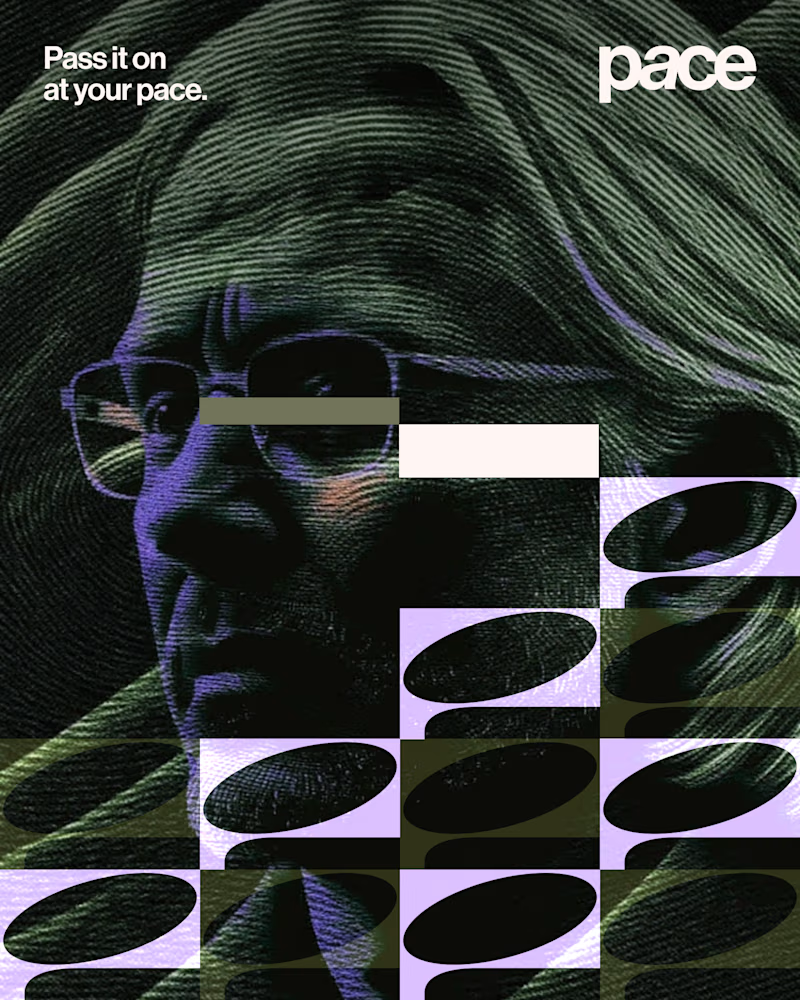
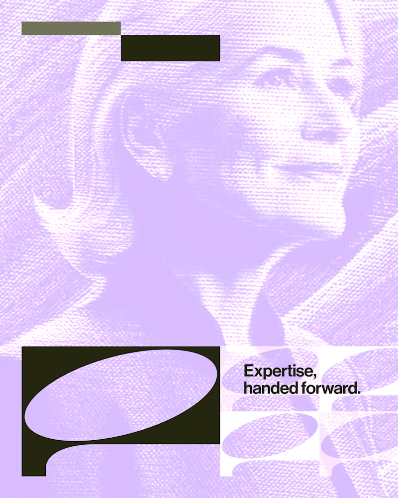
Experimental layouts for Pace. Which one do you like?
23 voted
52%
21 voted
48%
44 votes
Closed

Looks cool.