The network for creativity
Join 1.25M professional creatives like you
Connect with clients, get discovered, and run your business 100% commission-free
Creatives on Contra have earned over $150M and we are just getting started
Back to feedPost


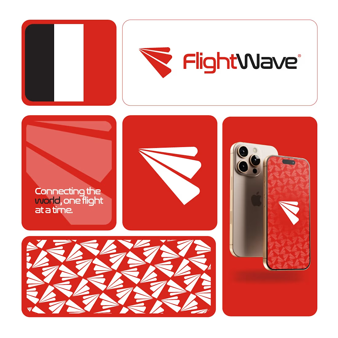
The best travel brands make movement feel effortless.
FlightWave was designed to represent speed, connection, and seamless travel through a clean and modern visual identity.
The goal was simple:
Create a brand that feels dynamic, memorable, and ready for takeoff.
Every element was built around:
✈️ Movement
✈️ Simplicity
✈️ Recognition
✈️ Scalability
From the logo mark to the visual system, the identity was designed to work consistently across digital platforms, mobile applications, and marketing materials.
Strong branding isn't about being louder.
It's about being remembered.
Which element works best for you?
🔹 Logo Symbol
🔹 Color Palette
🔹 Typography
🔹 Pattern System
👇 Share your thoughts below.
#LogoDesign
#BrandIdentity
#Branding
#VisualIdentity
#GraphicDesign
#LogoDesigner
#CreativeDesign
#BrandStrategy
#DesignInspiration
#Designsburner


The network for creativity
Join 1.25M professional creatives like you
Connect with clients, get discovered, and run your business 100% commission-free
Creatives on Contra have earned over $150M and we are just getting started

Challenges
View all


Related posts

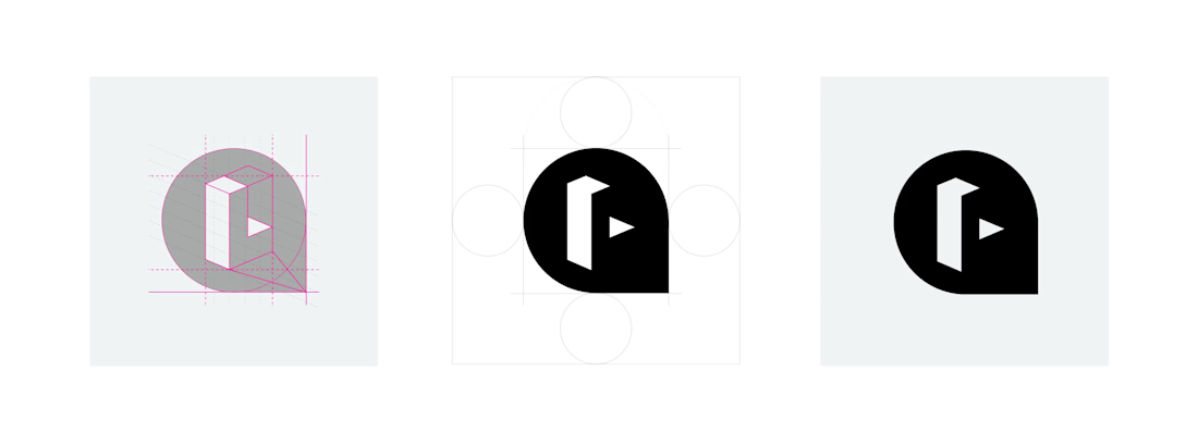
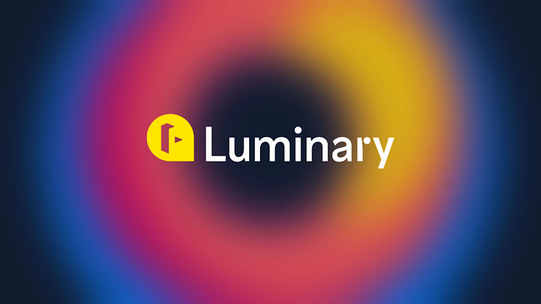
The Luminary brand needed a refresh – brand equity was lacking, and while the company hurdled staffing changes, much of the original branding had been nearly wiped away.
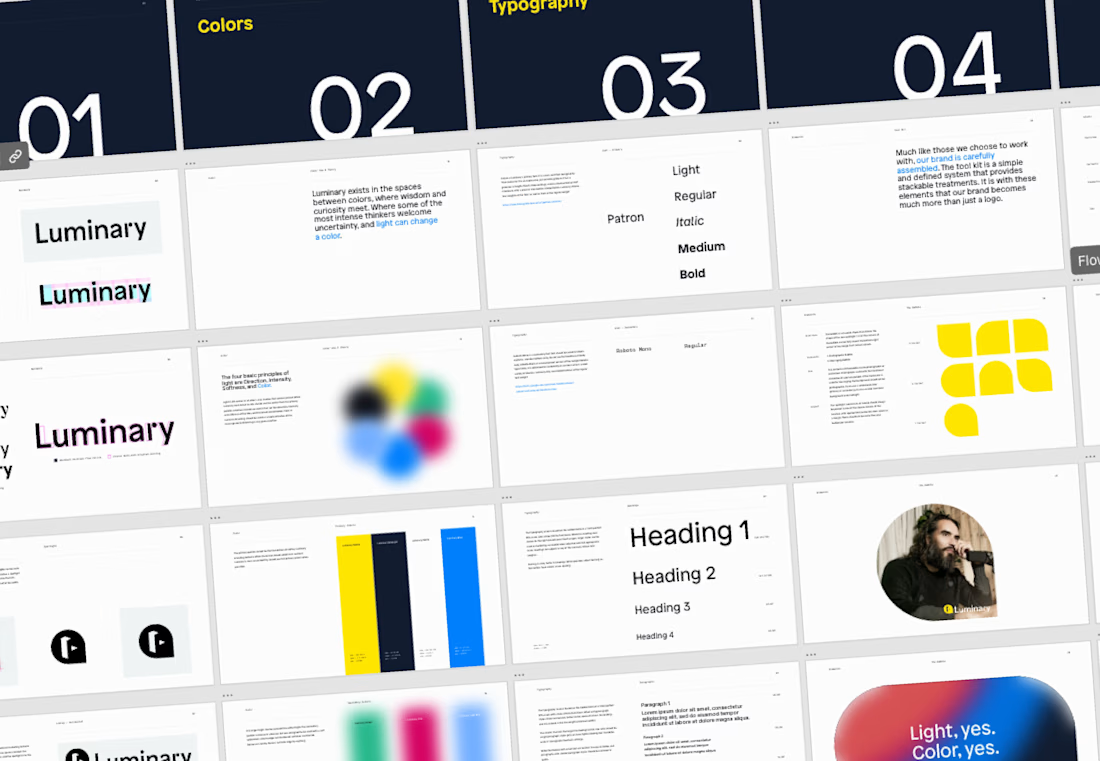
Soon after joining, it was clear that the design team would need some guidelines to lean up against to uphold quality and consistency in the brand.


Amazing work!

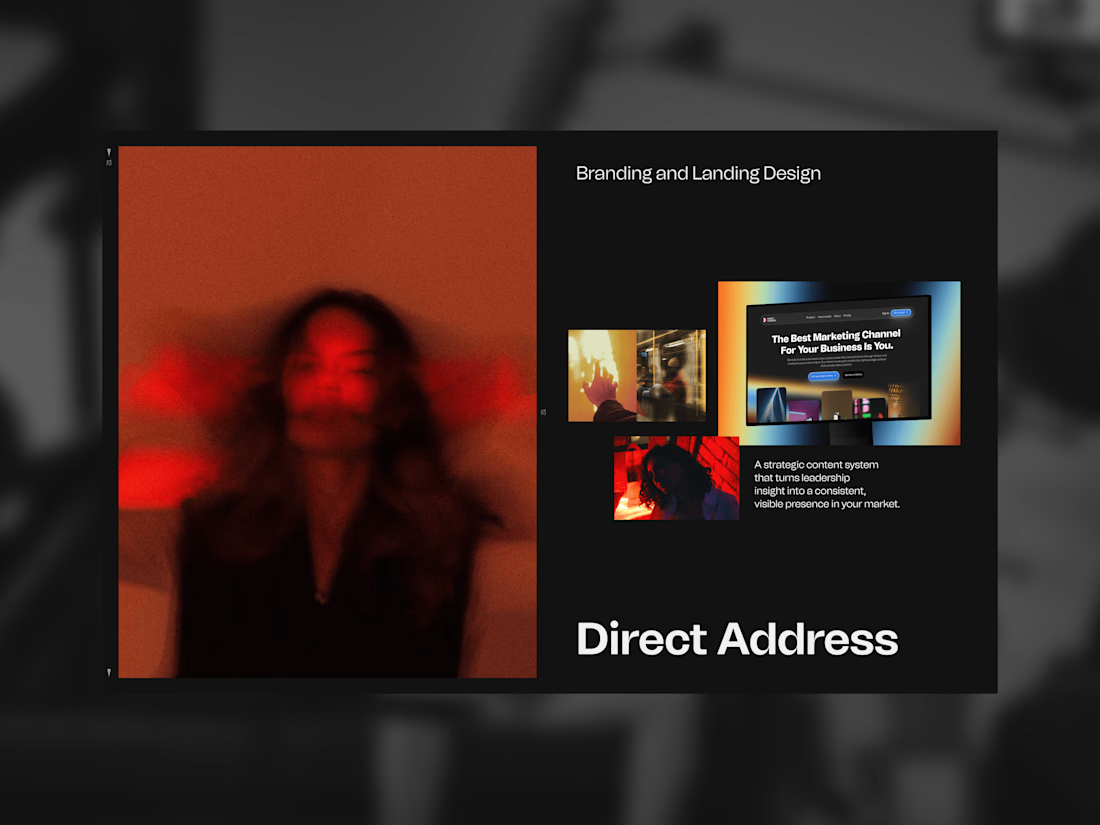
Direct Address makes thought leadership video for B2B companies. Their whole argument is that your best marketing asset is the person who founded the thing, and most companies bury them behind a brand voice.
So the mark is a spotlight. Not a camera, not a play button — those describe the equipment. A spotlight describes the effect: you point it at one person and everyone looks.
Two cones meeting at a point, one half carrying a full-spectrum gradient, one solid. Color system named after directors, because the product is direction rather than footage. Then the landing page carrying all of it.

The line about the mark being a spotlight instead of a camera reframes the whole pitch. Do most founders resist being on camera at first, or does that argument get them comfortable fast?

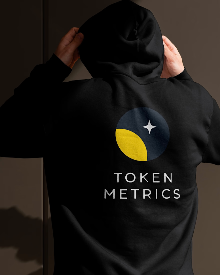
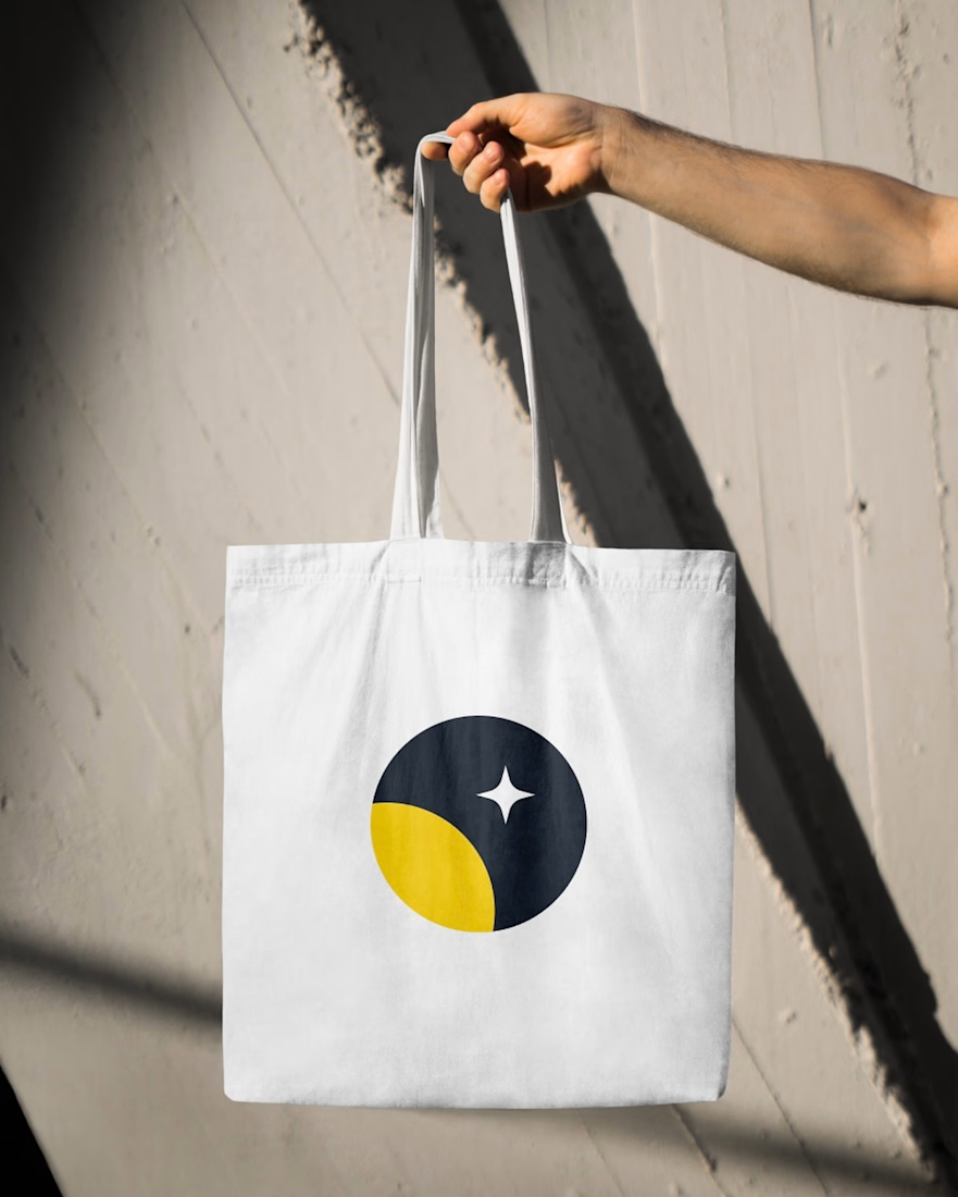
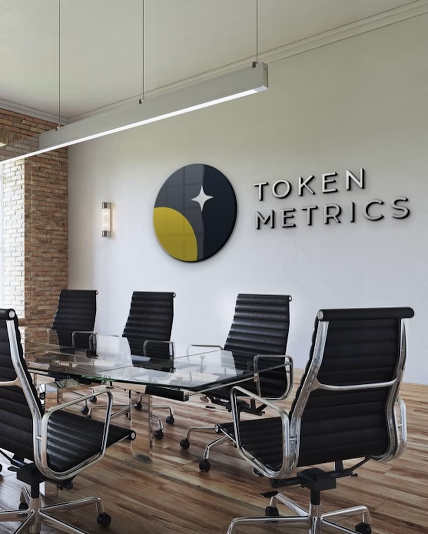
An older project from our archives, built around an existing crypto brand and its real visual identity.
We explored how the brand could translate across a data-focused digital experience, keeping token metrics, market data, and performance information clear and easy to scan.
Also revisited the identity through physical applications, including branded merchandise.