The network for creativity
Join 1.25M professional creatives like you
Connect with clients, get discovered, and run your business 100% commission-free
Creatives on Contra have earned over $150M and we are just getting started
Back to feedPost
5:54 AM. Mid-run. I stopped because of a tree.
That tree became this mark.
Two books. Three months of studying process, strategy, and what makes a logo actually last. Then I gave myself a real brief - Tierra Clay, a ceramic studio rooted in the mountains of Himachal.
Sketched for hours. Nothing came. Called it a night.
Next morning, mid-run - Y-shaped branches catching early light. Stopped, opened Notes, drew the roughest sketch you've ever seen on the road.
Got home. Paper. Illustrator. Done.
The block wasn't a wall. It was a signal to step away.
What's a project that only clicked after you walked away from it?


Amazing

The mid-run sketch origin is a good reminder that the best ideas don't come from staring at the brief. The Y-branch mark reading as a tree rooted to the earth works really naturally for a Himachal ceramic studio.

I agree, for a brand rooted in earth and craft, it almost felt right that the mark had to be found outside rather than forced at a desk.
The network for creativity
Join 1.25M professional creatives like you
Connect with clients, get discovered, and run your business 100% commission-free
Creatives on Contra have earned over $150M and we are just getting started






Related posts


The sharp V pops against that vivid gradient.

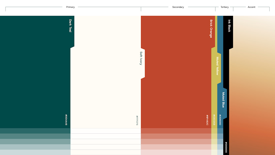
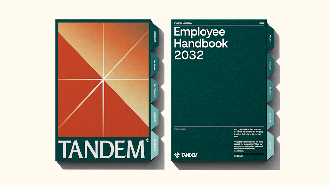
The new brand identity for Tandem is live!
Quite a lot of thought and work went into building this one, and I'm excited to finally share it. Would love to hear your thoughts!
We developed a complete brand experience for Tandem, covering:
1. Brand Strategy
2. Brand Naming
3. Logo Desig
4. Visual Identity
5. Brand Collaterals
6. Brand Guidelines
7. Motion Design
The complete project is now live. Take a look and explore the full identity here


Great work!!

How long can you sit on a brand before it starts to look different to you?
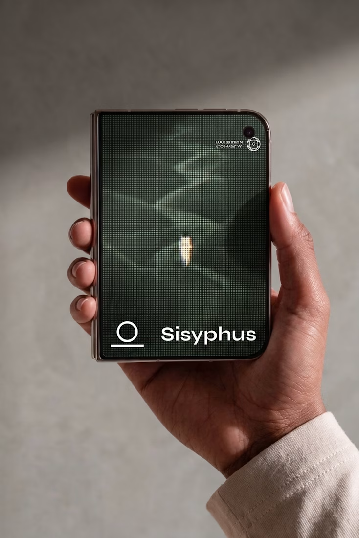
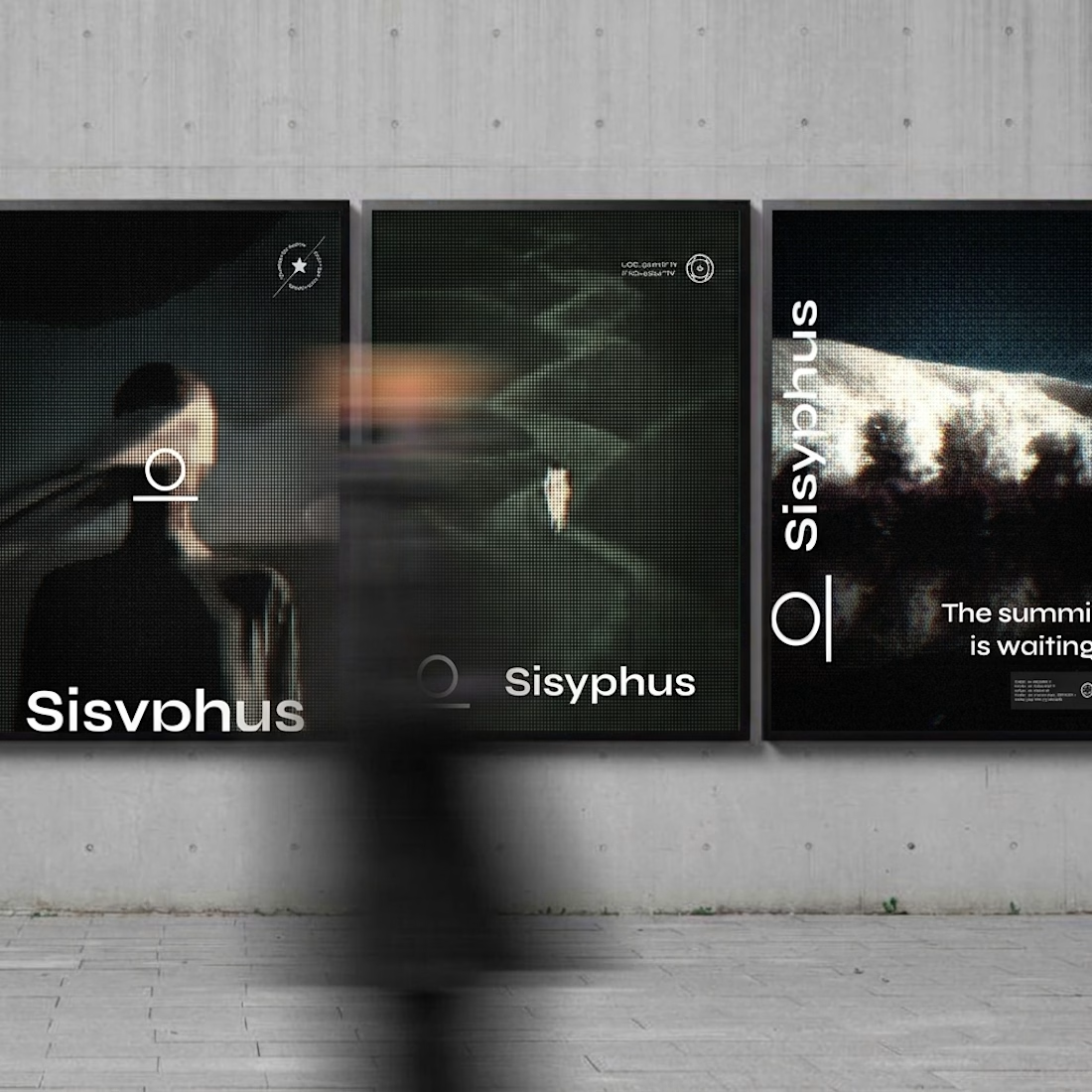
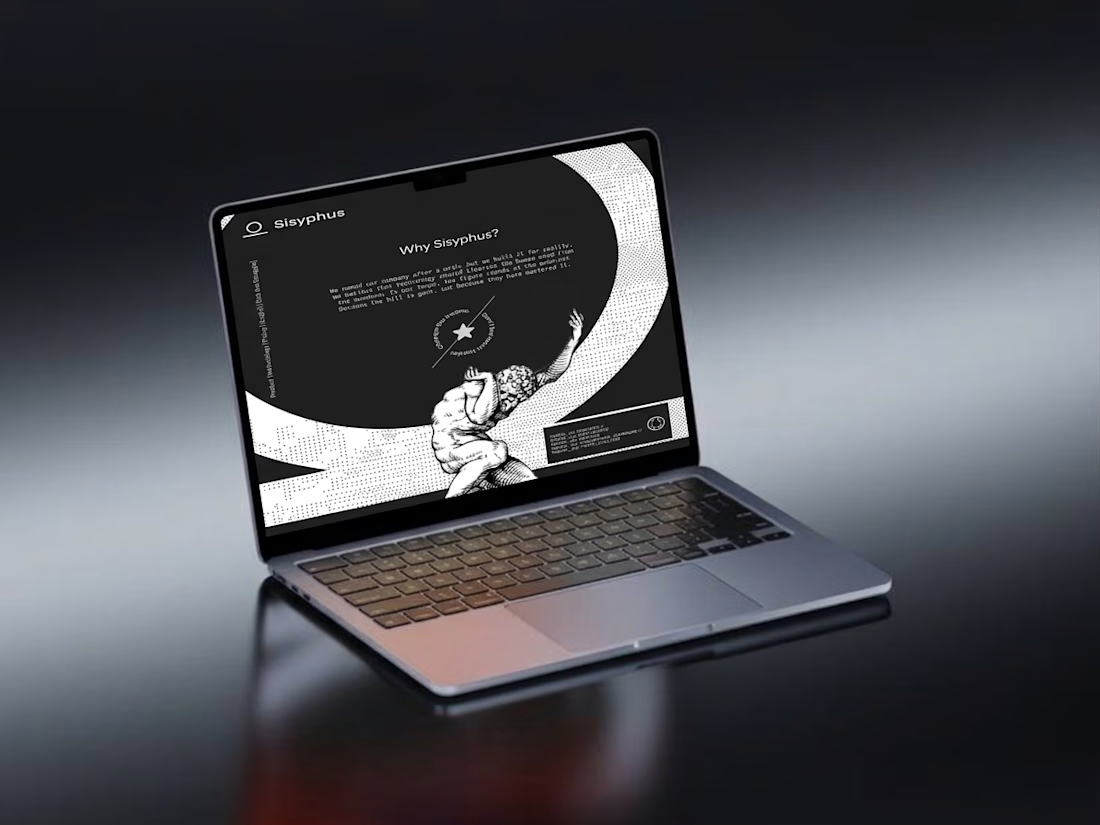
Sisyphus: identity, landing page and campaign for a workflow engine I made up.
Took a break, came back, cut half of it. The boulder is still the logo.
Cutting half after a break is underrated. Was the boulder always the mark or did it show up in the cuts?