The network for creativity
Join 1.25M professional creatives like you
Connect with clients, get discovered, and run your business 100% commission-free
Creatives on Contra have earned over $150M and we are just getting started
Back to feedPost

Why Design is Your Best Salesperson.
"One wrong move in design can cost you a client, but the right visual can build an empire.
This McLaren project was an exercise in balancing 'The King' status of the brand with a modern, sleek aesthetic.
I’m currently open for new collaborations! Whether you're a startup or an established brand, I’m here to help you dominate your market.
📩 DM for inquiries.

The network for creativity
Join 1.25M professional creatives like you
Connect with clients, get discovered, and run your business 100% commission-free
Creatives on Contra have earned over $150M and we are just getting started



Related posts

How do you make a construction brand feel consistent from a business card to a building site?
Brixon’s identity brings angular lettering, an assembled geometric symbol, and a lime, black, and white palette together.
I carried those elements into stationery, brand guidelines, team identification, social graphics, and site signage, then brought the system into motion with Adobe After Effects.
The connecting decision: keep the geometry and layout structure consistent while the logo details, messages, and application previews change within the animated panels.
My contribution covered brand design, graphic design, and motion design.
What draws your attention first: the wordmark, the lime palette, or the rotating symbol?
See the full Brixon case study. If you’re shaping a construction or development brand, I’m available for brand identity and motion projects.

Incomparable work!


ESE GIN — Between the Dunes | Visual Identity & Packaging
ESE GIN draws its curves from the dunes. The signature S catches the light in sculpted olive glass and leaves its imprint in wax.


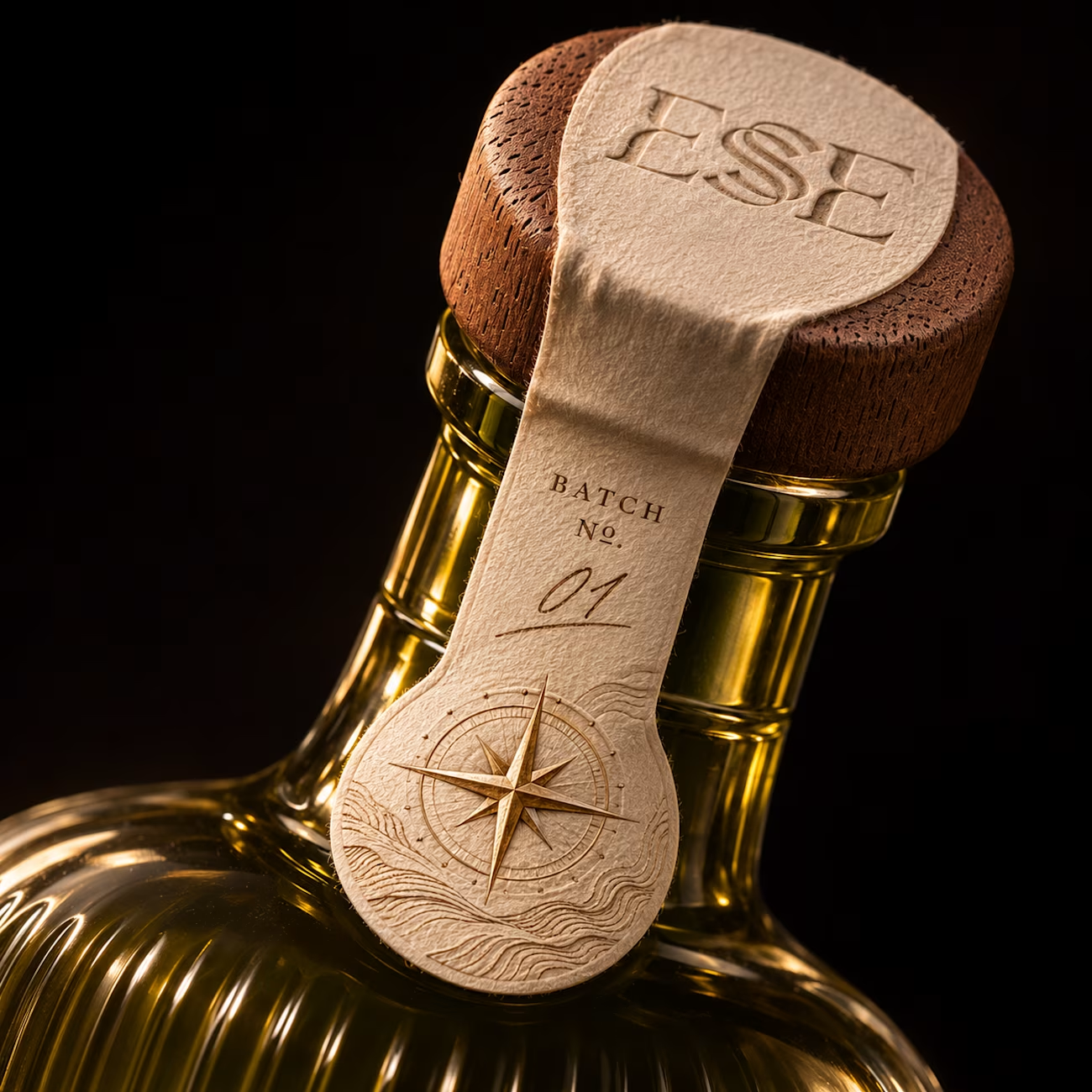
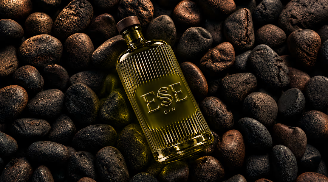
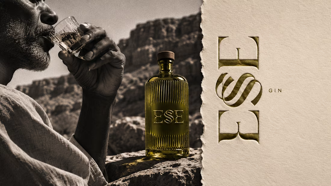
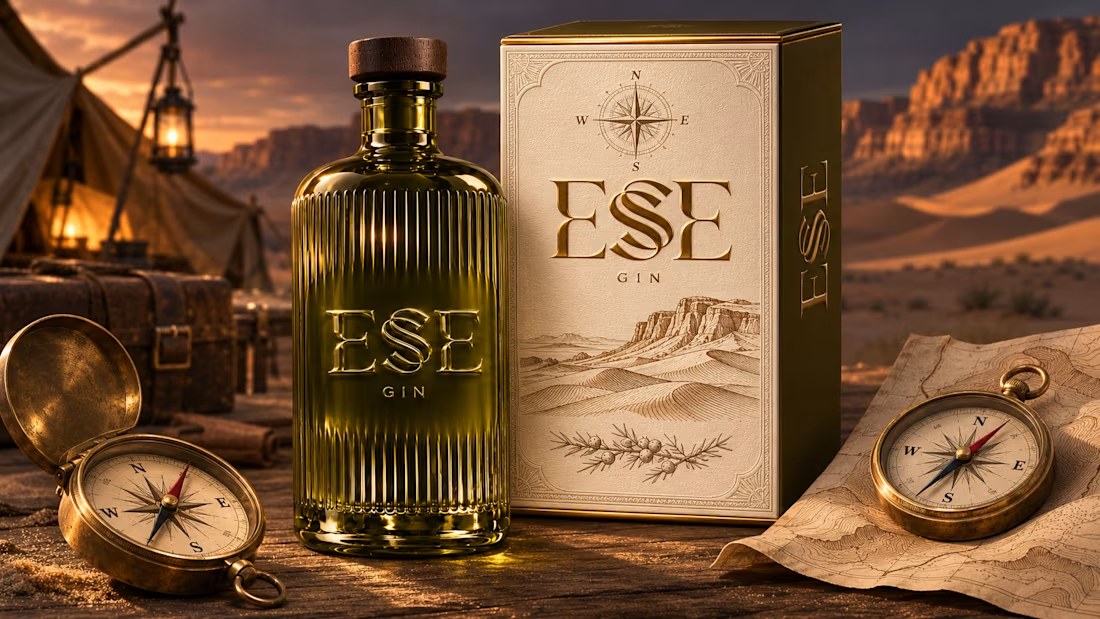

This is gorgeous, Maya — the sculpted olive glass with that S catching the light is such a clever way to carry the dunes into the bottle itself. And the wax seal imprint is a beautiful finishing touch, it gives the whole thing a crafted, almost apothecary feel. Really cohesive...

Two visual directions for one shampoo product. Which one tells the better story?
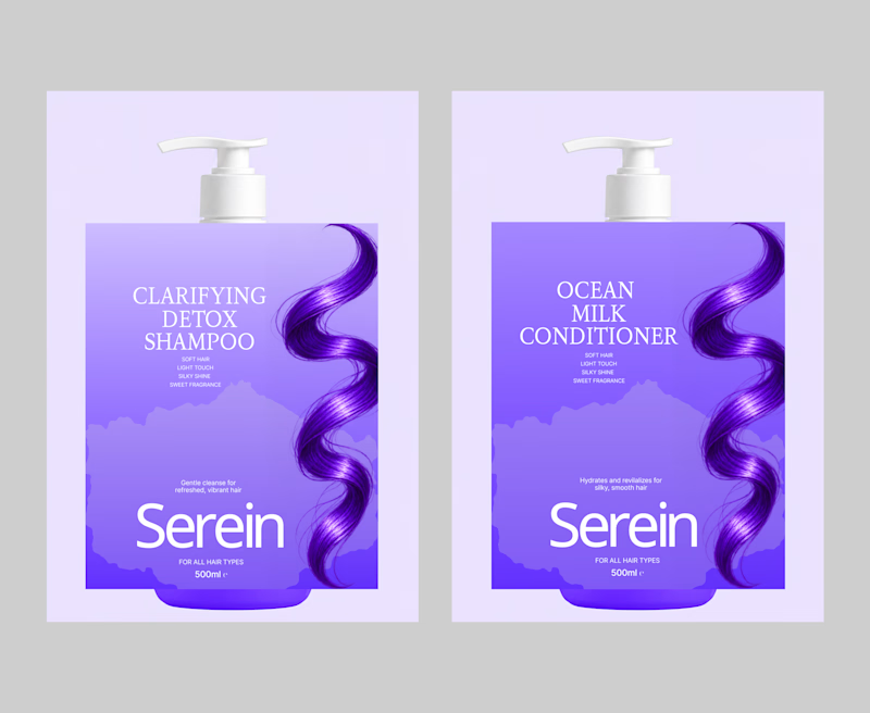
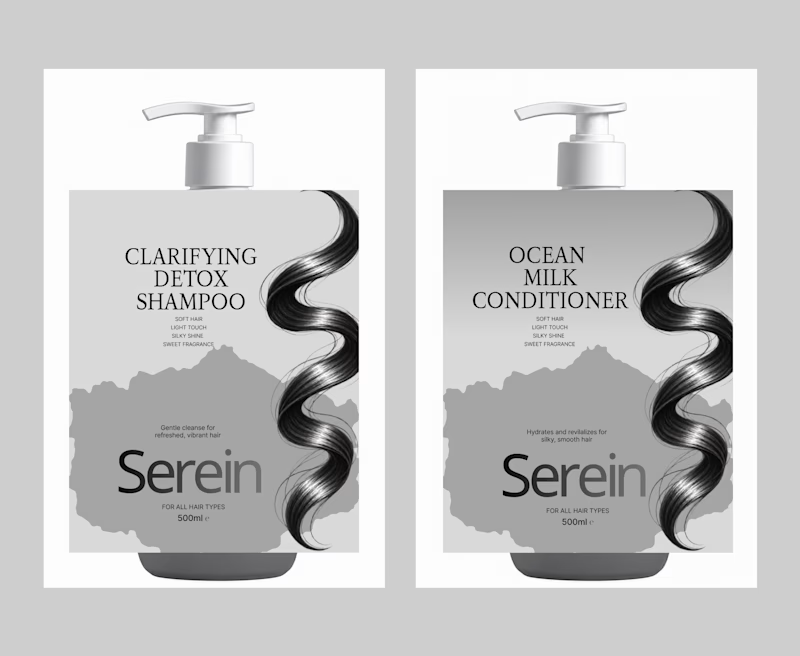
While developing the packaging identity for Serein Clarifying Detox Shampoo I explored two different colour directions.
Purple 💜feels bold, vibrant and expressive.
Grey 🩶feels minimal, refined and sophisticated.
Both directions have their own personality and visual appeal. But they communicate the product differently.
I am interested in your perspective as a designer or brand owner.
Which direction would you push forward and more importantly what makes it work better for the product?
Purple or Grey?

4 voted
100%
0 voted
0%
4 votes
Closed

I am a big fan of dark colors but the purple goes better with the product so option 1 it is 💜