The network for creativity
Join 1.25M professional creatives like you
Connect with clients, get discovered, and run your business 100% commission-free
Creatives on Contra have earned over $150M and we are just getting started
Back to feedPost
Greetings. This design was recently developed for Lightbox Studio, and it’s a project that wasn’t just about making something “look pretty”; rather, the intention was always to create an experience that would reflect the branding of the company.
The direction for the project from the outset was to maintain a minimalist, modern, and editorial aesthetic but also premium and intentional. The layouts were clean, typography was balanced, and there was some use of animation and motion, but it wasn’t overused.
One element of this project that I worked very hard on was that of clarity. Rather than trying to make the website visually busy or cluttered with unnecessary items, the intention was that each section serve its intended purpose of establishing authority, telling a story, and guiding the user.
Another aspect of this design was that of improving responsiveness and performance.
Overall, it’s a project that shows how effective simplicity can be when implemented correctly.
Let me know what you think.
The network for creativity
Join 1.25M professional creatives like you
Connect with clients, get discovered, and run your business 100% commission-free
Creatives on Contra have earned over $150M and we are just getting started
Trending
Claude
Claude has entered the design space. How are you using Claude Design?
Contra University
Learn from expert creatives how to earn more using next-gen AI tools.
creativeaiflow
Creative AI workflows are evolving. What tools do you use, and what are their strengths and weaknesses?
freelancerlife
Freelancer life is wins, pivots, and everything in between. What’s yours right now?
Related posts
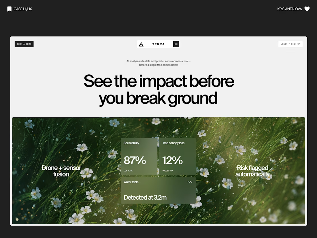
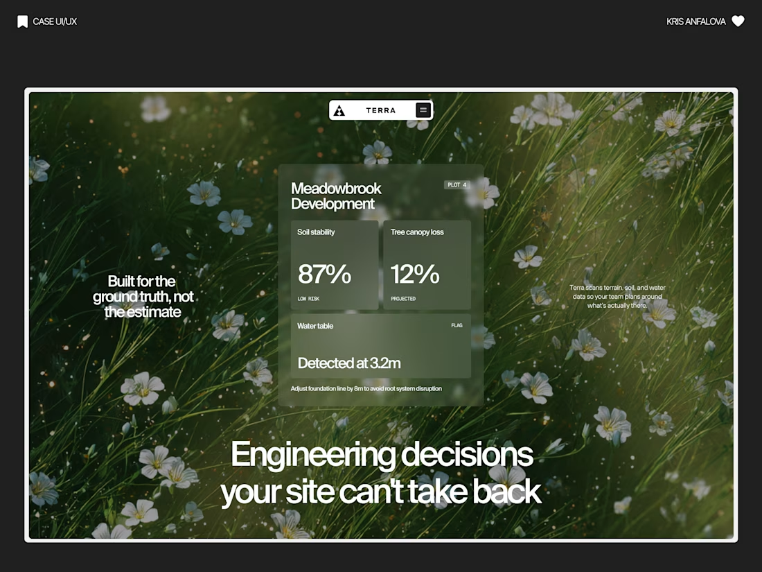
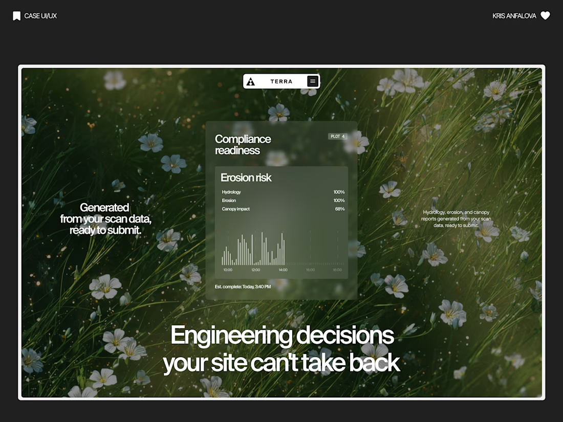
Terra — AI Environmental Risk Platform
Designed the landing page and product UI for Terra — a platform that helps land developers and engineering teams see environmental risk (soil stability, tree canopy loss, water table depth) before breaking ground.
The challenge:
Development decisions are usually based on estimates, not real ground data — and by the time issues show up, it’s often too late to reverse them. The interface needed to make complex sensor/AI data feel immediate and trustworthy, without losing emotional weight.
The solution:
Raw, organic photography (wildflowers, grass, natural terrain) paired with clean glass-panel data cards — creating a visual tension between “nature” and “precision engineering.” Bold editorial typography carries the emotional message, while translucent metric cards surface real numbers: soil stability, canopy loss %, water table depth.
A strong example of turning dense environmental data into something a non-technical stakeholder can understand in seconds.
Nice one
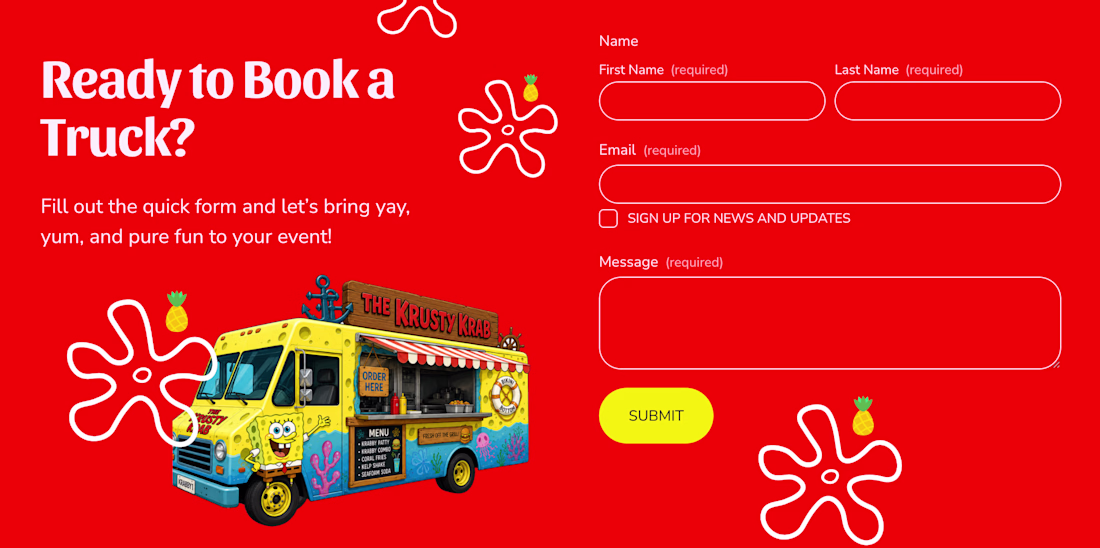
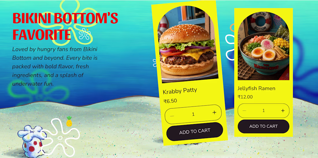
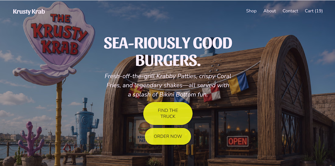
What if the Krusty Krab hit the road? 🍔🛻
I reimagined the iconic Krusty Krab as a real-world food truck and brought the idea to life with Squarespace. From playful visuals and custom illustrations to an immersive scrolling experience, every section was designed to capture the charm and nostalgia of Bikini Bottom. I also used Finish Layer to add animations, hover interactions, layered visuals, and smooth transitions that make the experience feel more dynamic and engaging.
🔗 Website: https://cardioid-helicon-94jp.squarespace.com
🔒 Password: square
squarespacedesignwebsitedesignUI DesignUX DesignSquarespaceSquarespace Website Designsquarespacechallenge
Love this!