The network for creativity
Join 1.25M professional creatives like you
Connect with clients, get discovered, and run your business 100% commission-free
Creatives on Contra have earned over $150M and we are just getting started
Back to feedPost
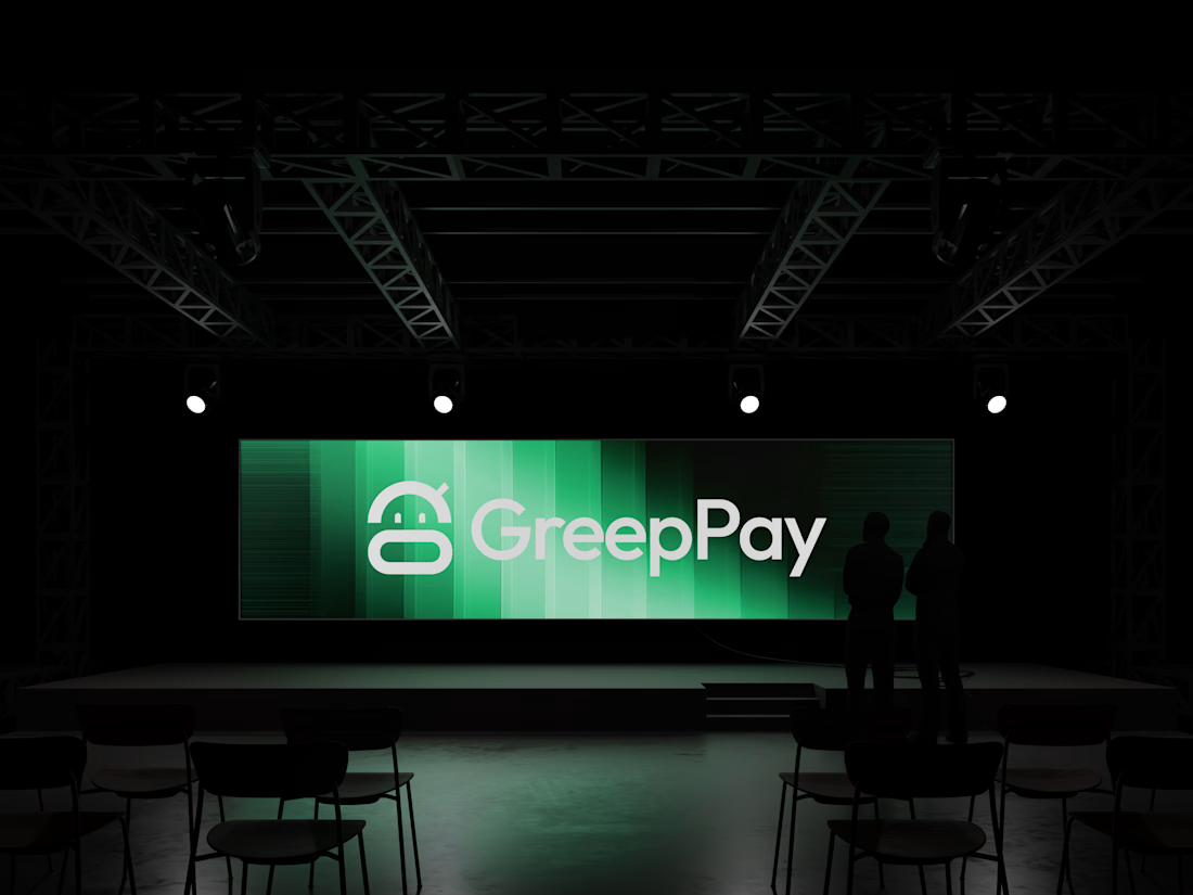
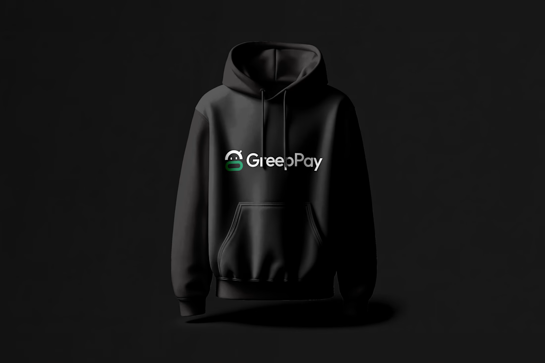
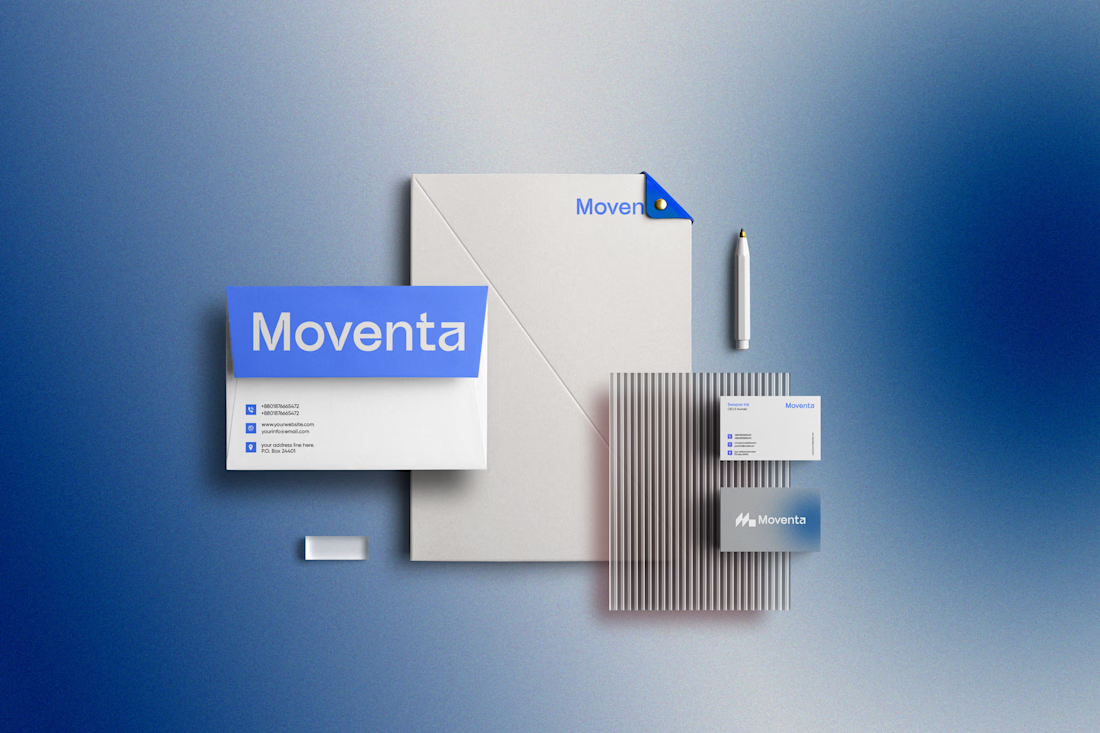
Brand visuals for a SaaS brand I recently worked on.
For this project, I took a premium and minimalist approach, focusing on creating a visual system that feels modern, polished, and intentional without doing too much. The goal was to let the product and message breathe while using strong typography, clean layouts, subtle details, and refined visual elements to communicate trust and sophistication.
I wanted the final direction to feel like a SaaS brand that understands its audience, simple enough to be accessible, but distinctive enough to stand out in a crowded digital space.






Sleek work!

Thank you

Lit👌

Love this!

Amazing work

nice design

This is lovely, Emmanuel!

Super work

Nice work as usual! Giving the visual system room to breathe makes the entire SaaS experience feel ultra-polished.

Looks nice

Lovely design

Love the design and color combo!


Great work👏🔥🔥


The minimal approach works really well here. It feels polished without trying too hard, and the visuals let the product stay front and center.

great job i like it

The restraint works really well here. Premium SaaS branding is hard to pull off without making it feel too cold or generic.

The design choices make the brand instantly recognizable. 😍

Thank you
Mine too

thats look amazing

This is Superb

Awesome!

Great concept man

Nicely thought out

Nice 👍

Really like the restraint in this direction. Premium SaaS design often comes from knowing what to leave out—strong typography, clean structure, and subtle details can communicate trust without overwhelming the user. Great work!
The network for creativity
Join 1.25M professional creatives like you
Connect with clients, get discovered, and run your business 100% commission-free
Creatives on Contra have earned over $150M and we are just getting started








Related posts



I like the Clarity and neatness in your work

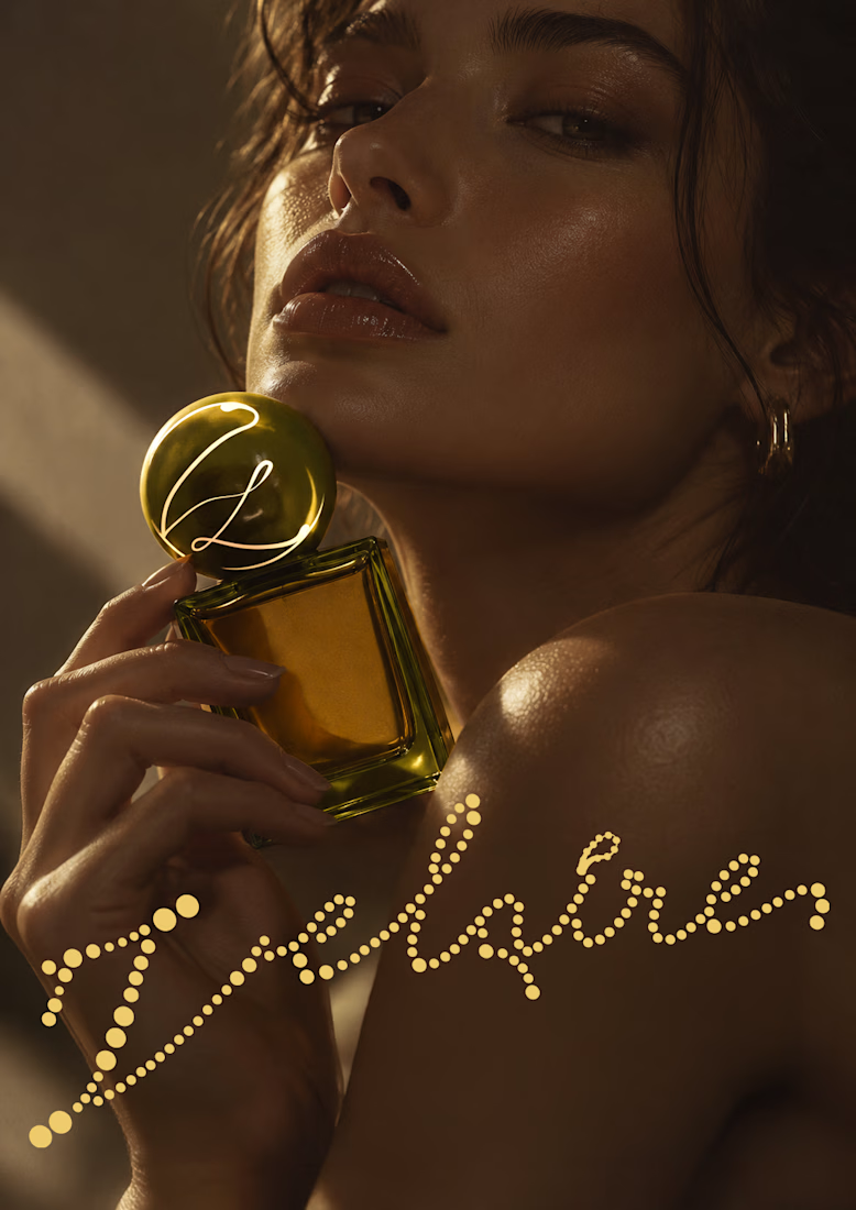
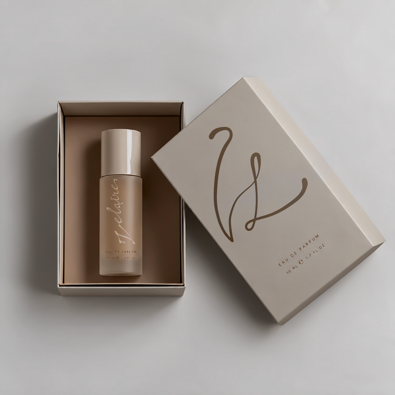
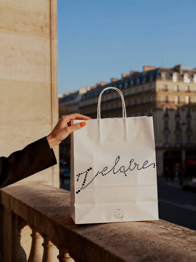
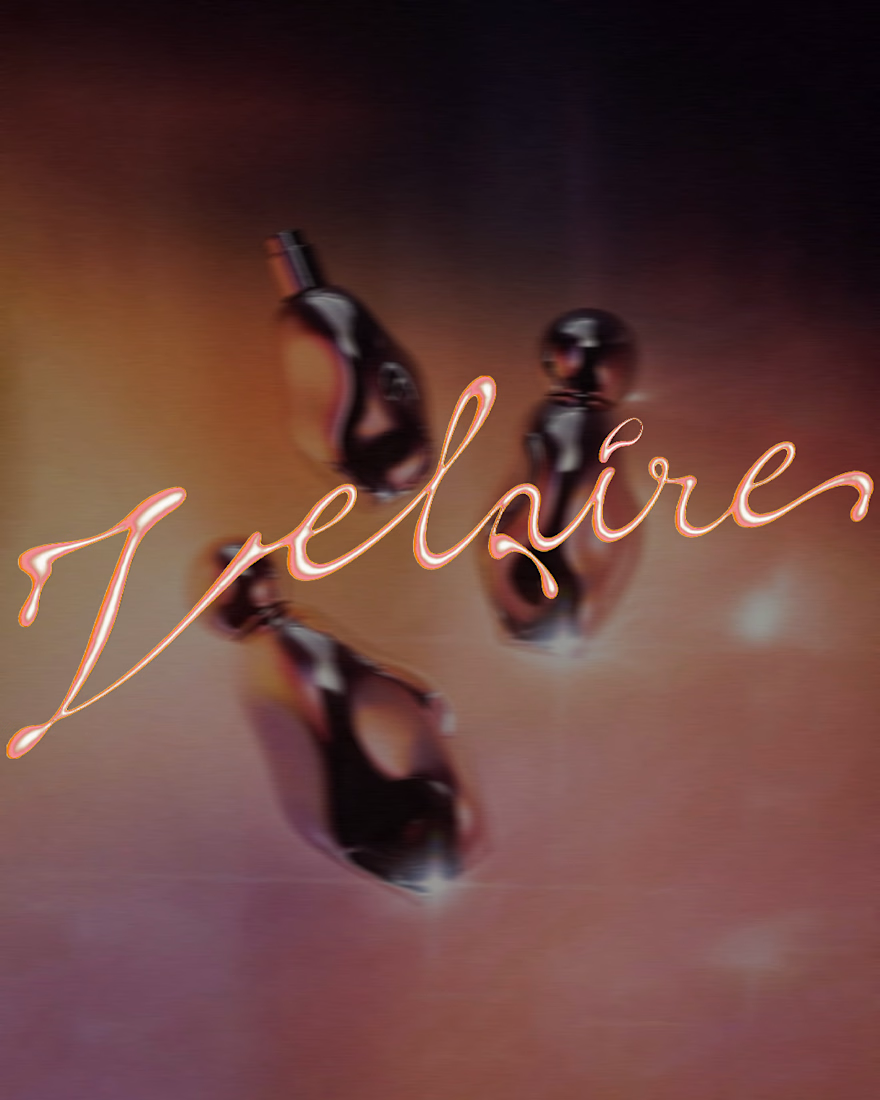
VELAIRE — Beauty & Fragrance Visual Identity
A self-initiated identity exploring custom lettering, sensual art direction and a refined visual system across packaging, editorial and digital applications.
Currently open to freelance and remote collaborations in branding, music, fashion and culture.
Visual Identity · Art Direction · Logo Design · Campaign Design
#VisualIdentity #ArtDirection #BrandDesign #LogoDesign #GraphicDesign


Great brand identity Yaren that's really luxury 🔥🔥

Juice & Beverage Shopping App UI/UX Design
A fresh and modern juice and beverage shopping app designed to deliver a smooth and engaging shopping experience. Featuring vibrant product visuals, intuitive navigation, interactive animations, and a clickable prototype, this design makes it easy for users to explore beverages and enjoy a seamless ordering journey.
The project combines clean UI, thoughtful UX, and engaging micro-interactions to create a visually appealing and user-friendly mobile shopping experience.

