The network for creativity
Join 1.25M professional creatives like you
Connect with clients, get discovered, and run your business 100% commission-free
Creatives on Contra have earned over $150M and we are just getting started
Back to feedPost

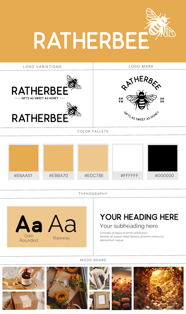
Here is a brand guideline I put together for a business called RatherBee that specializes in laser engraving.
The guidelines include:
Logo: Detailed but scalable bee paired with Odin Rounded. For this it was okay to loose the detailing when scaling down as the bee could always become become a silhouette and still get the point across.
Colors: Multiple yellows paired with white and black.
Fonts: Finding a great pairing for Odin Rounded with was already the primary font used.
Mood board: Something to focus on more on socials to keep the brand consistent.



The network for creativity
Join 1.25M professional creatives like you
Connect with clients, get discovered, and run your business 100% commission-free
Creatives on Contra have earned over $150M and we are just getting started





Related posts

Winder is a bold brand identity built around a geometric W-inspired symbol, combining sharp angles and forward movement to represent progress, speed, and direction.
The identity uses a striking red and deep burgundy palette, supported by clean typography and a consistent visual system across brand guidelines, digital applications, and product mockups.
Progress in Motion.




Great logo it feels it really has an identity 🎉🎉


Rejected logo concepts 2026 - Which one did you like the most?
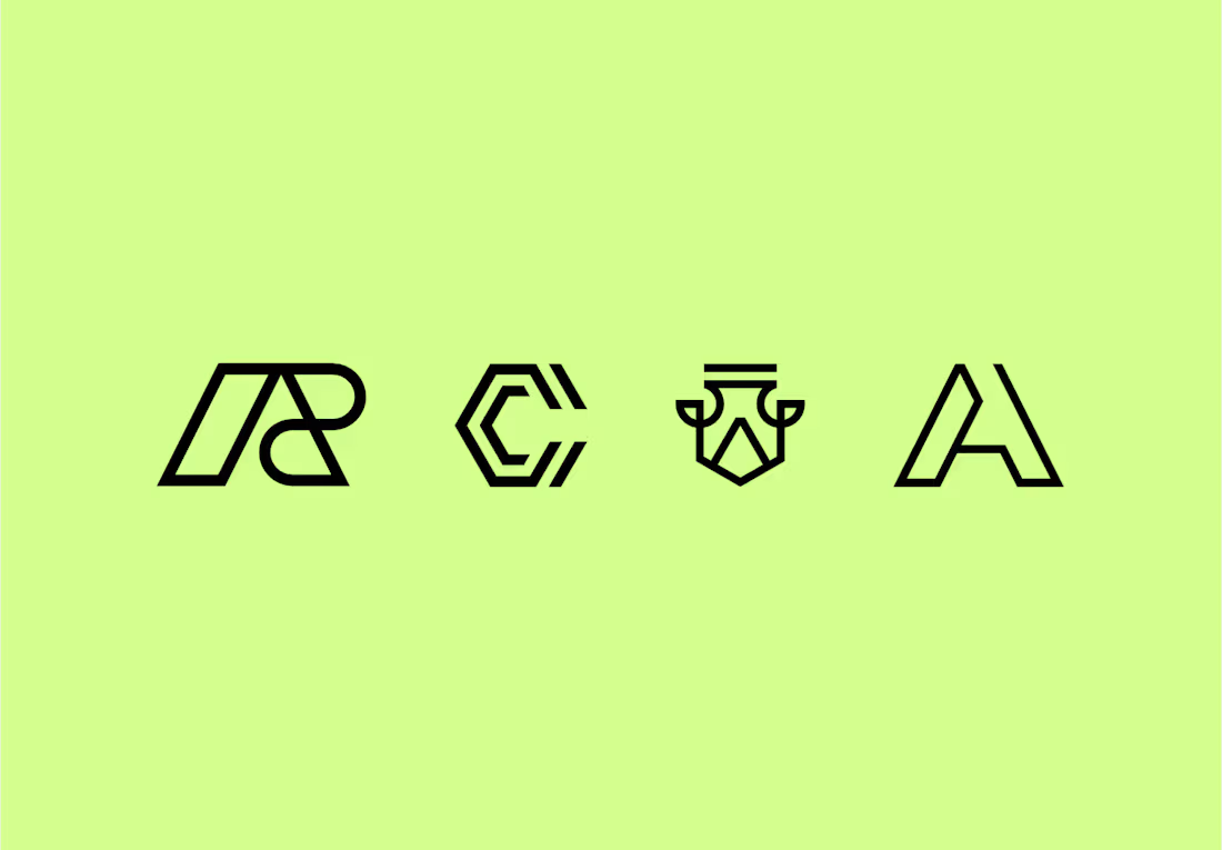

The C-shaped mark is my pick. The notched outline stays readable even when it gets small. Did the rejections come down to concept, or to how they held up at tiny sizes?


I’m so excited to finally share this one and hear what you all think.
When Team Cook approached me to create their branding and logo, I knew I wanted to really push the concept and build something that felt bold, playful, and instantly recognisable.
What do you think?
P.s. their badges and tags have all my 🫶