The network for creativity
Join 1.25M professional creatives like you
Connect with clients, get discovered, and run your business 100% commission-free
Creatives on Contra have earned over $150M and we are just getting started
Back to feedPost


Rejected logo concepts 2026 - Which one did you like the most?

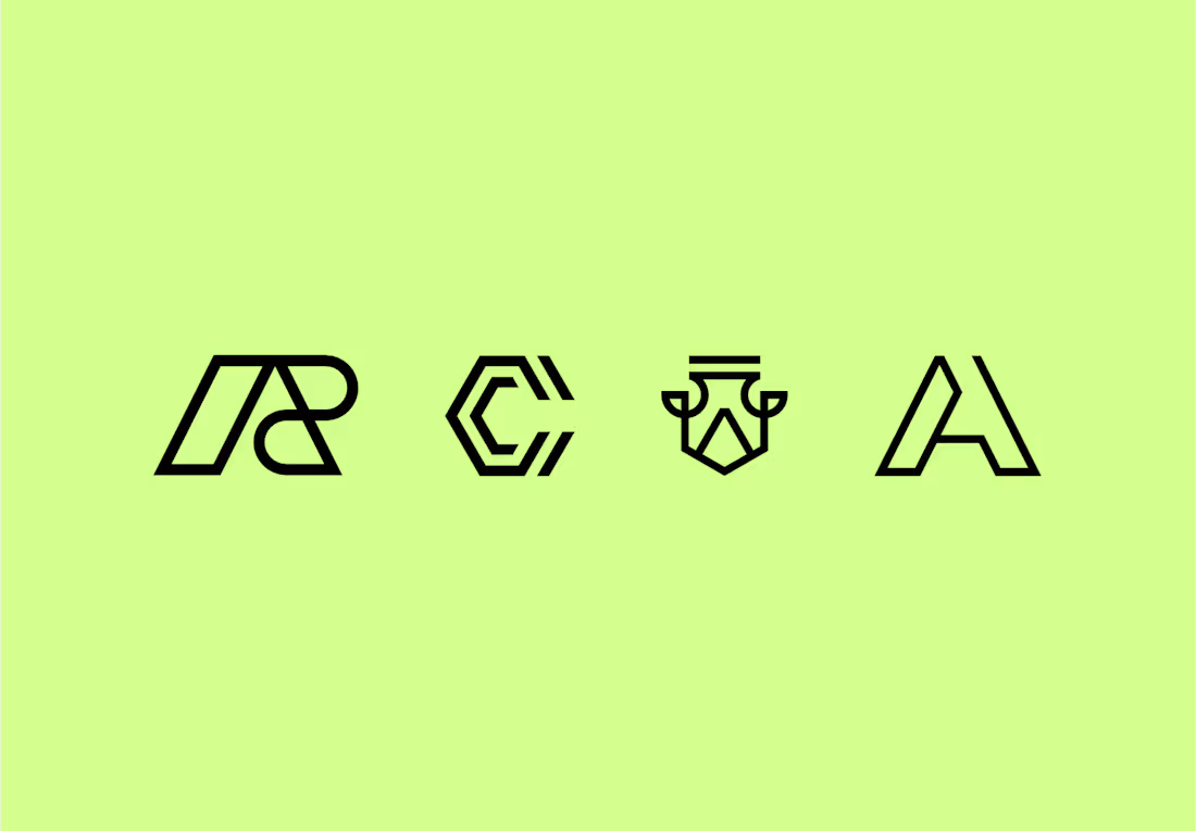

The C-shaped mark is my pick. The notched outline stays readable even when it gets small. Did the rejections come down to concept, or to how they held up at tiny sizes?


Professional work

Like the second one most here.
The network for creativity
Join 1.25M professional creatives like you
Connect with clients, get discovered, and run your business 100% commission-free
Creatives on Contra have earned over $150M and we are just getting started











Related posts


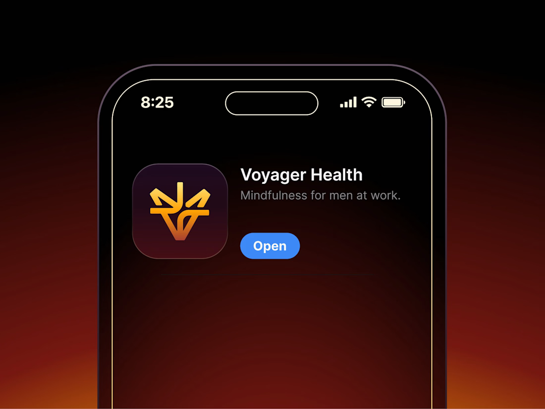

Aryna, that golden symbol pops so nicely against the plum background ✨

The team is cooking
Motion design for the logo we are making for Nation e-commerce


Wou

Finally a Contra Top Independent!
Been part of this community for a few years now, sharing my work, joining challenges, meeting some great people, and even picking up a few wins along the way.
I've genuinely enjoyed being part of Contra and seeing how much the platform has grown.
This one means a lot. Big thanks to the Contra team for the recognition!
More to come!
