The network for creativity
Join 1.25M professional creatives like you
Connect with clients, get discovered, and run your business 100% commission-free
Creatives on Contra have earned over $150M and we are just getting started
Back to feedPost
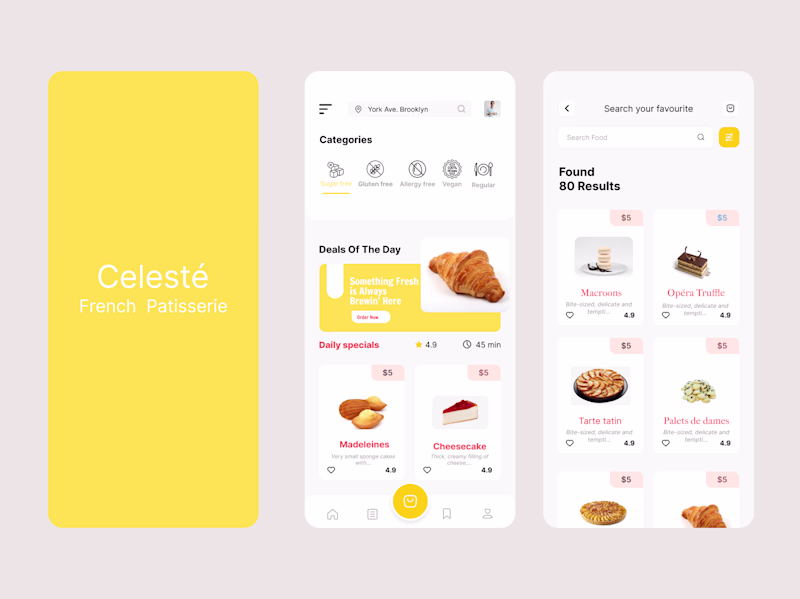
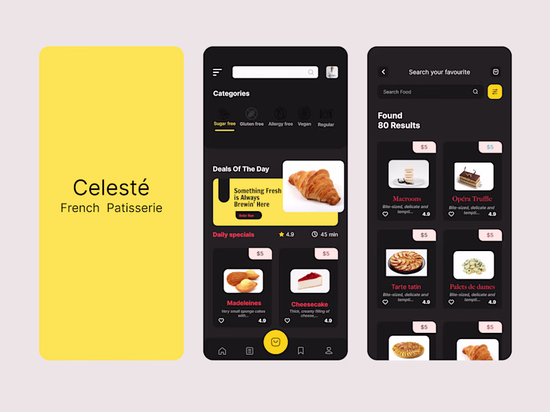
Taste Test
Exploring two visual directions for a French patisserie mobile app concept
Same product, same flow but two completely different moods
11 voted
35%
20 voted
65%
31 votes
Closed
Dark Mode
Light mode all day
Light mode elegant is looking good
It's seems you have your labels wrongly placed
But I'd go for the elegant
Light mode but to improve accessibility a bit I would tweak the white text to black on the yellow background.
Light Mode looks better
The light mode is my pick
Really loving the light mode option. It brings a level of brightness that compliments the color palette well.
Both look good but i go with the light mode
Welldone 👍
The light mode elegant looks unique!
Personally prefer the dark mode version
The network for creativity
Join 1.25M professional creatives like you
Connect with clients, get discovered, and run your business 100% commission-free
Creatives on Contra have earned over $150M and we are just getting started
Related posts
New branding project in the works! 🚀
I'm loving this one, it's giving me such high-energy. ✨
What do we think? 👇
This is superb
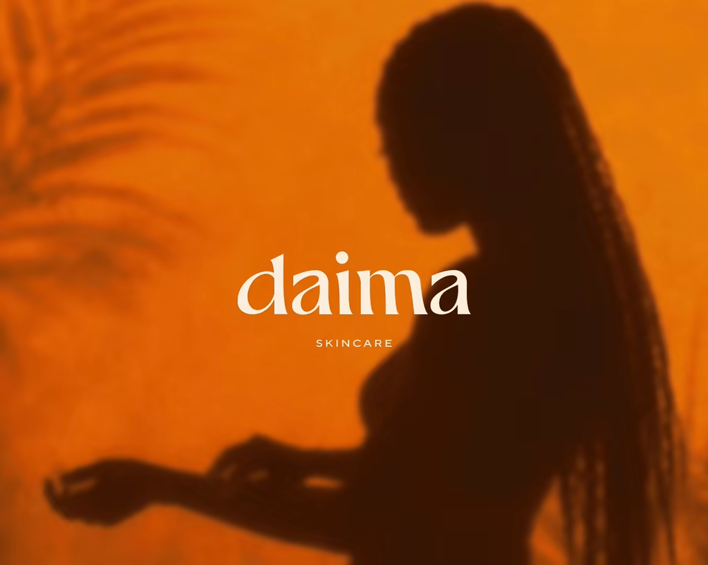
Some projects never make it to launch.
This one went quiet midway.
The work exists though. And I still think about it.
Daima is a body care brand built around water movement, sunset light, the feeling of surrendering to a moment. Every detail designed to be felt as much as seen.
Curious: what do you do with a project you loved that never saw the light? ❤️🔥
book marking this to upgoat it tomorrow
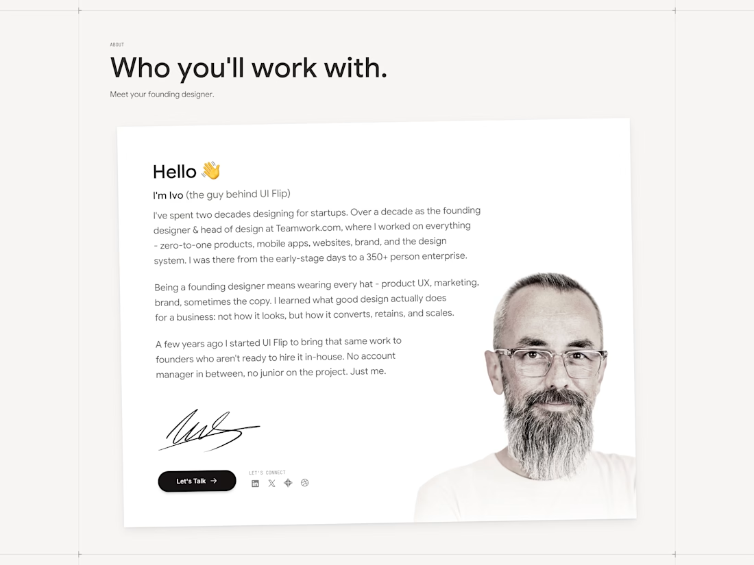
The about section for the new UI Flip website.
It's the section I always hated to work on... just look at this jerk 🤣
You just have to bro 😂
Trending
Claude
Claude has entered the design space. How are you using Claude Design?
Contra University
Learn from expert creatives how to earn more using next-gen AI tools.
creativeaiflow
Creative AI workflows are evolving. What tools do you use, and what are their strengths and weaknesses?
portfolioreview
The best portfolios tell a story, not just show a grid. Share yours for feedback.
freelancerlife
Freelancer life is wins, pivots, and everything in between. What’s yours right now?