The network for creativity
Join 1.25M professional creatives like you
Connect with clients, get discovered, and run your business 100% commission-free
Creatives on Contra have earned over $150M and we are just getting started
Back to feedPost
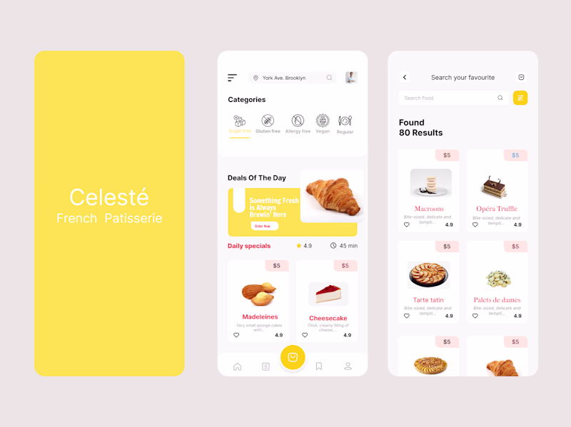
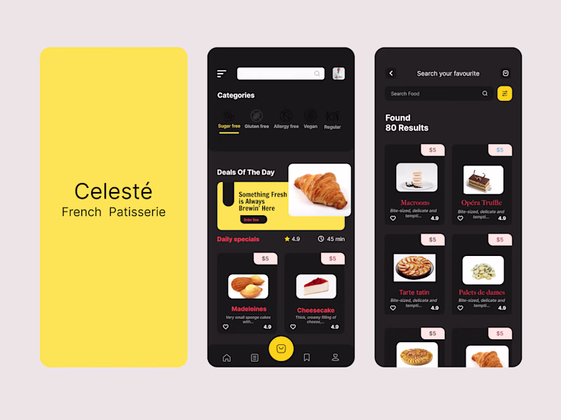
Taste Test
Exploring two visual directions for a French patisserie mobile app concept
Same product, same flow but two completely different moods
11 votes
Ends in 1d
Light Mode looks better
Light mode all day
Light mode elegant is looking good
It's seems you have your labels wrongly placed
But I'd go for the elegant
Light mode but to improve accessibility a bit I would tweak the white text to black on the yellow background.
The light mode is my pick
Really loving the light mode option. It brings a level of brightness that compliments the color palette well.
The network for creativity
Join 1.25M professional creatives like you
Connect with clients, get discovered, and run your business 100% commission-free
Creatives on Contra have earned over $150M and we are just getting started
Related posts
key visual concepts for a mental health app - what do you think?
31 voted
53%
28 voted
47%
59 votes
Closed
Both are beautiful, but 'Waves' feels slightly more rhythmic and meditative, which fits the mental health space perfectly. Great work!
Let's pretend I'm not posting my work late, haha, but I decided to share it anyway 🙌
Glad you shared this anyways! its quite lovely
Energy Central case study now live! If you would love a closer look go Check it out 😃
Super fun logo animation!
Trending
Claude
Claude has entered the design space. How are you using Claude Design?
Contra University
Learn from expert creatives how to earn more using next-gen AI tools.
creativeaiflow
Creative AI workflows are evolving. What tools do you use, and what are their strengths and weaknesses?
portfolioreview
The best portfolios tell a story, not just show a grid. Share yours for feedback.
freelancerlife
Freelancer life is wins, pivots, and everything in between. What’s yours right now?