The network for creativity
Join 1.25M professional creatives like you
Connect with clients, get discovered, and run your business 100% commission-free
Creatives on Contra have earned over $150M and we are just getting started
Back to feedPost

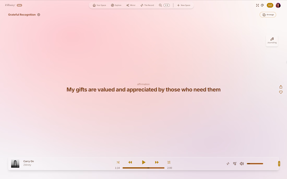
Most wellness apps are built on streaks, badges, and guilt-driven engagement loops. Zillinity is built on the opposite premise: "be and become" — presence over performance, with no gamification mechanics designed to make you feel behind.
I designed and built the entire product solo, end to end. Core features include:
- mood-based ambient spaces
- two distinct journaling modes (Float for free-flow, Swim for guided depth), -- an AI insight layer called The Mirror that synthesizes patterns across spaces, journal entries, moods, and wins tracked
On the technical side, I migrated the app from Next.js to React + Vite for improved performance, architected the backend on Supabase, and built out the marketing site separately on Astro. UI/UX was designed in tandem with the engineering. Every interaction pattern was built to reinforce the product's anti-gamification philosophy rather than work against it.
My role:
Solo founder & full-stack developer — product engineering, system architecture, UI/UX design
Tools/Tech:
React, Vite, Supabase, Astro, Claude


The network for creativity
Join 1.25M professional creatives like you
Connect with clients, get discovered, and run your business 100% commission-free
Creatives on Contra have earned over $150M and we are just getting started







Related posts


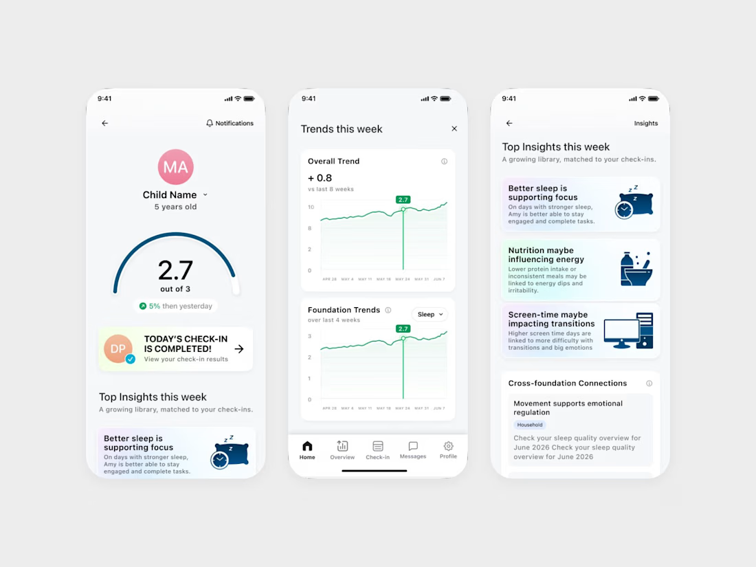
We designed an ADHD app that keeps the word ADHD off its daily screens.
It's Coastal Neuro Group's parent app. The everyday screens use words like attention, focus and regulation, and the ADHD framing stays in onboarding.
Ami Hansji, the founder, then used the same rule for the patient headers in the practitioner portal.


love this framing rule. keeping adhd in onboarding only makes it feel less clinical day to day. smart

Real eggs. No apologies 🥚
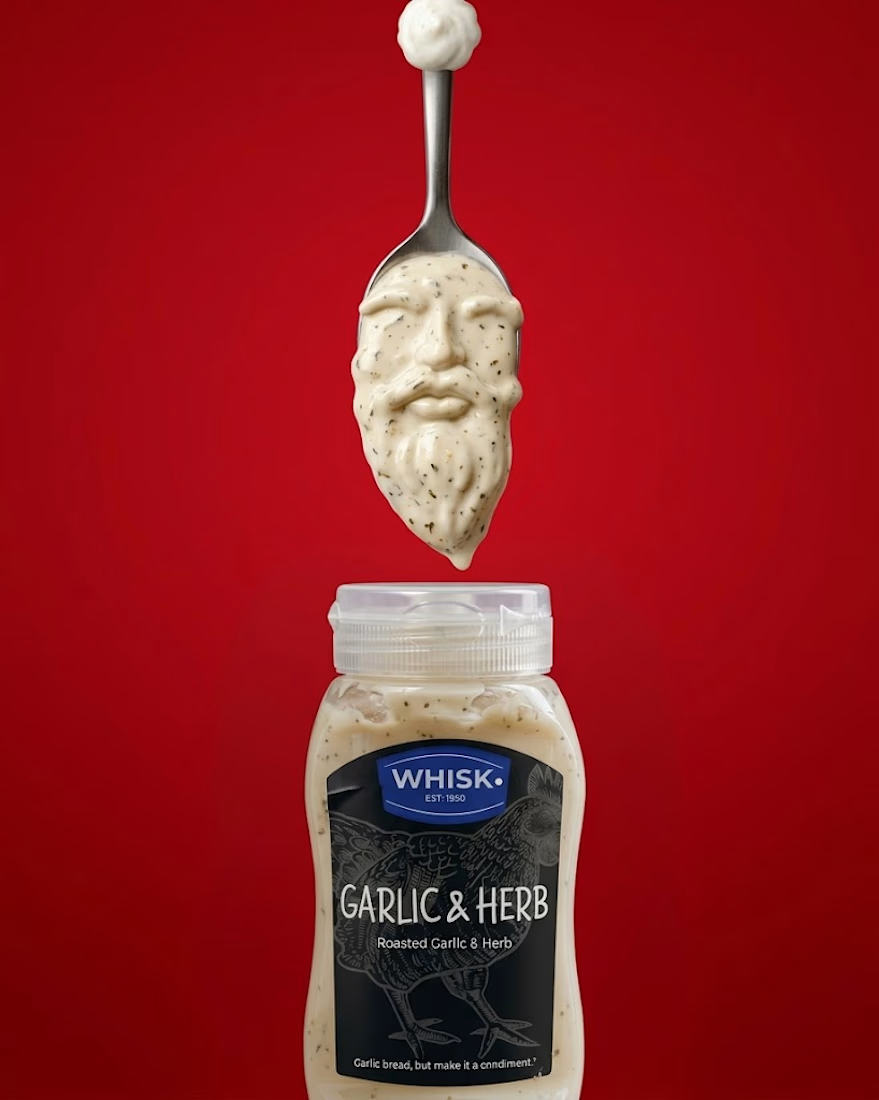
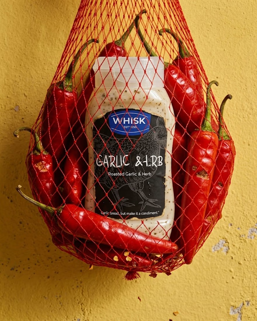
Spent the past week designing WHISK, an artisan mayonnaise brand built on one idea: even the most overlooked item in the fridge deserves a brand that takes it seriously.
No squeeze bottle, no label built to disappear into the shelf. Just a glass jar, a short ingredient list, and four flavors told apart by one accent color each. Classic, garlic and herb, smoked chili, vegan. 🫙
Sometimes the boldest thing a condiment can do is be particular about itself.


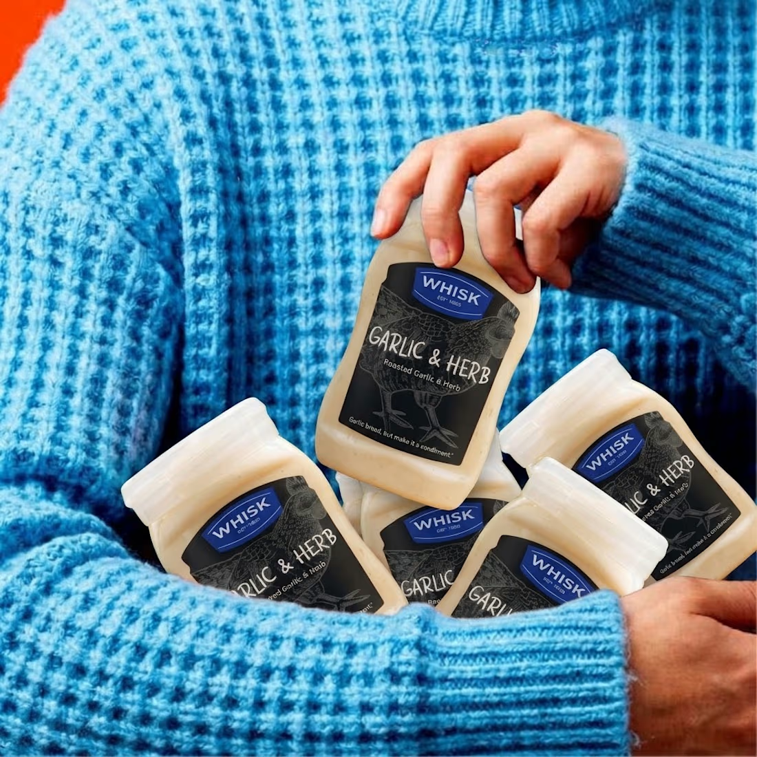

The animation looks top tier! Nice work

Thanks to everyone who weighed in on my last post.
The consensus was clear; healthcare apps need to feel human, not cold and transactional.
Now for the final polish.
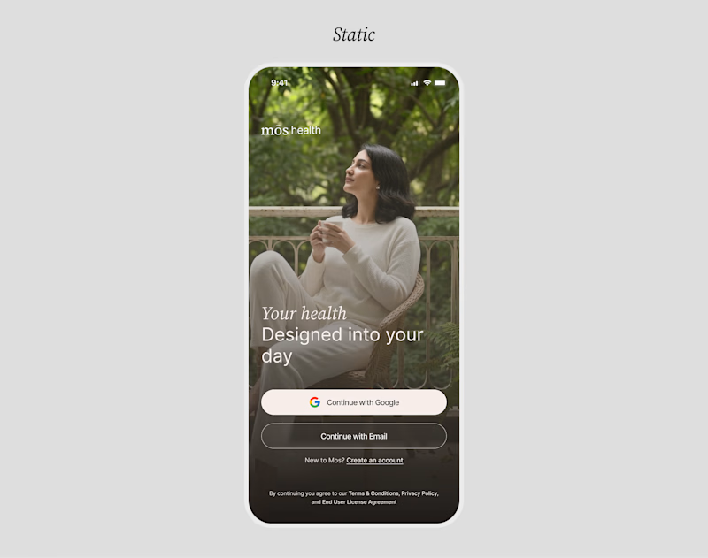
I put together a Motion version and a Static version of the redesign.
Motion can bring an interface to life, but static layouts often feel grounded and direct.
When it comes to building immediate user trust during sign-up, which direction do you think works best?
MOTION or
STATIC
12 voted
100%
0 voted
0%
12 votes
Closed

Motion make the UI alive. nice touch