The network for creativity
Join 1.25M professional creatives like you
Connect with clients, get discovered, and run your business 100% commission-free
Creatives on Contra have earned over $150M and we are just getting started
Back to feedPost
Taste Test
Thanks to everyone who weighed in on my last post.
The consensus was clear; healthcare apps need to feel human, not cold and transactional.
Now for the final polish.
I put together a Motion version and a Static version of the redesign.
Motion can bring an interface to life, but static layouts often feel grounded and direct.
When it comes to building immediate user trust during sign-up, which direction do you think works best?
MOTION or
STATIC

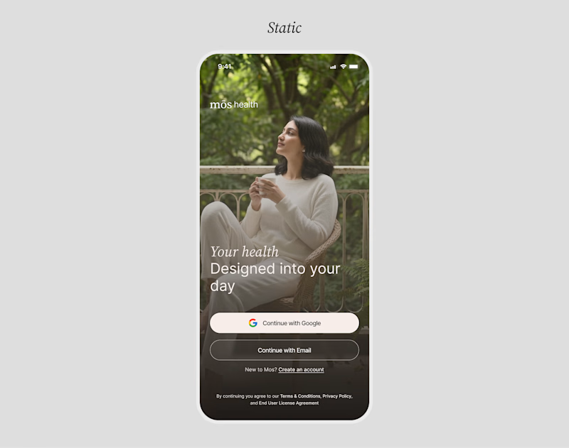
8 votes
Ends in 16h


I love motion

Motion absolutely it feels alive 🎉🎉🔥🔥
we all love motion
thanks man
Absolutely
Pardon Emmanuel❤️

Motion make the UI alive. nice touch
Thank you much much

The right call here usually depends on who reads the app. If the patients are older and the key task is scanning an appointment list, the static version will feel more trustworthy because every control has a fixed position and nothing is moving while they decide. Motion is worth...
Noted

Motion for sure!
I think Motion wins
Thanks man
The network for creativity
Join 1.25M professional creatives like you
Connect with clients, get discovered, and run your business 100% commission-free
Creatives on Contra have earned over $150M and we are just getting started

Challenges
View all


Related posts

Which one works better for you — Light or Dark? 👀
11 voted
46%
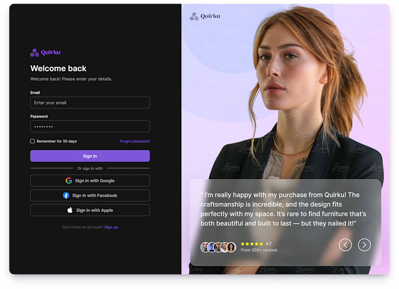
13 voted
54%
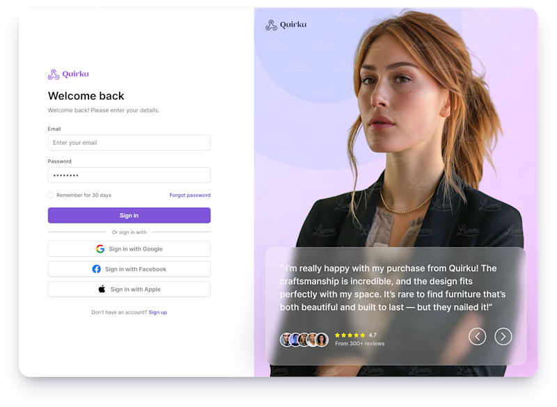
24 votes
Closed
Both of them are great ❤️❤️

Both on-brand. Just two different sides of the same story.
Which color would make you trust "better spaces, a healthier you" more? 👇

44 voted
100%
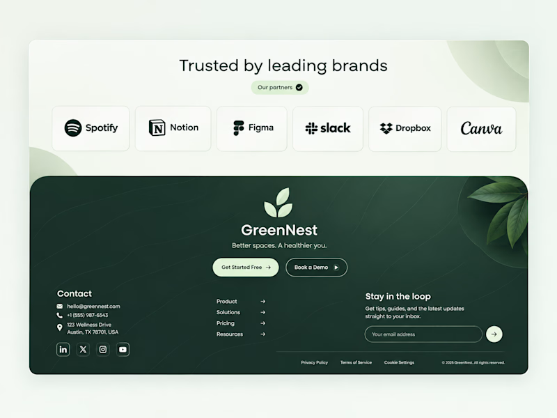
0 voted
0%
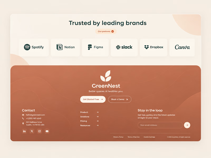
44 votes
Closed