The network for creativity
Join 1.25M professional creatives like you
Connect with clients, get discovered, and run your business 100% commission-free
Creatives on Contra have earned over $150M and we are just getting started
Back to feedPost
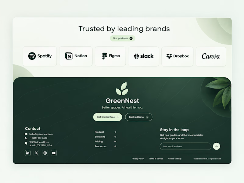
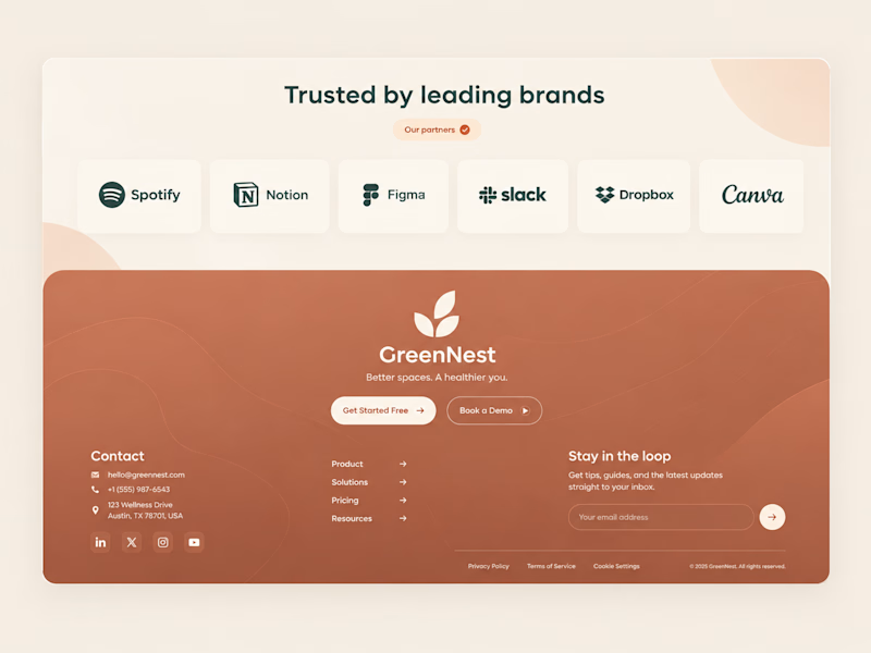
Taste Test
Both on-brand. Just two different sides of the same story.
Which color would make you trust "better spaces, a healthier you" more? 👇


17 votes
Ends in 1d

Calm ✨

Green for me. Warm is lovely, but green feels like a deep breath.

😍 Great choice


Wonderful !
Thank you

Thanks for the feedback🙌

The green tone gives this design such a fresh and natural feel.

I like both color combinations; it's hard to choose. Which one do you personally like?


Green for trust terracotta for warmth. But for "healthier you" green wins instantly.

why no one voted for warm one? it's looking clean too, but the green one stands out better ig

Calm and expected gets my trust for a health brand, but the warm one is more memorable. Tough call

Calm
The network for creativity
Join 1.25M professional creatives like you
Connect with clients, get discovered, and run your business 100% commission-free
Creatives on Contra have earned over $150M and we are just getting started





Related posts

Swiss-inspired web design exploration. Which one would you go with?
11 voted
37%
19 voted
63%
30 votes
Closed
expanded for user convinience

Booking a fitting shouldn’t take more messages than the alteration itself.
Meet Tivora Atelier, a fictional clothing alterations studio in Bucharest. The problem: a solo owner spends too much time asking every customer the same questions and coordinating appointments by hand.
I designed and built a booking experience in @Lovable that takes a customer from “Can I book?” to a confirmed fitting. They share garment details, choose an available time and receive a confirmation email. They can add the fitting to their calendar or use a private link to manage it later.
On the other side, the owner has one view for appointments, garment notes and availability.
This is an exploratory demo, not a real booking service. The video walks through the customer and owner experiences in under a minute.
Explore the public project: https://tivoraatelier.lovable.app/
#lovablechallenge


Great job, Anca

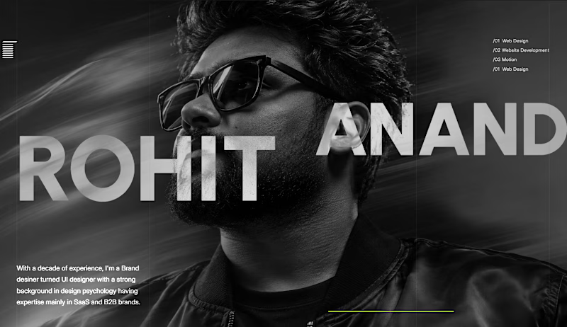
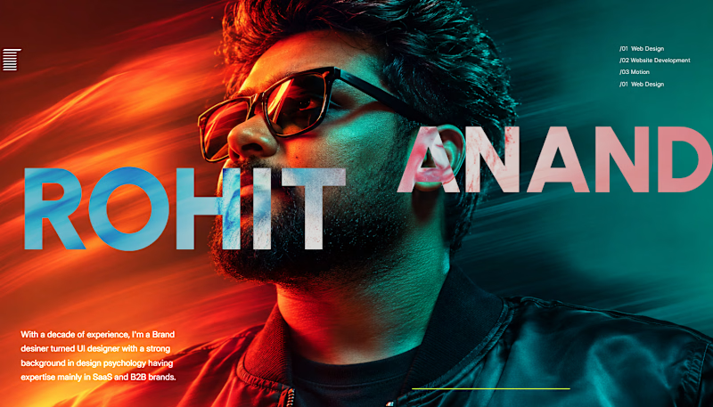
Which one is better? Grey or color?

2 voted
18%
9 voted
82%
11 votes
Closed

The Grey one looks better to me, as for the coloured version if the Text colours are tweaked a bit , it would look even better.