The network for creativity
Join 1.25M professional creatives like you
Connect with clients, get discovered, and run your business 100% commission-free
Creatives on Contra have earned over $150M and we are just getting started
Back to feedPost

Venn Bakes – Brand Identity & Packaging:
The Goal: Build a modern bakery brand for young professionals in Nigeria. The client specifically requested to avoid industry clichés like whisks or chef hats.
The Solution: I created a "fun and playful" visual identity that feels authentic.
Logo: A custom icon merging a heart with a satisfied expression to visualize "tasty".
Style: A soft pastel palette paired with bold, rounded typography.
Deliverables: Logo, Social Media Kit, and Packaging Design.
brandingvisualidentityGraphic DesignAdobe PhotoshopbakerybrandingBrand DesignLogo DesignAdobe Illustrator


The network for creativity
Join 1.25M professional creatives like you
Connect with clients, get discovered, and run your business 100% commission-free
Creatives on Contra have earned over $150M and we are just getting started



Related posts


New case study - tash.cards, a Y Combinator backed platform for investing in graded sports cards. Identity design, commissioned by baked.design
The heart of the system is a pattern language taken from security printing. Every letter of the wordmark becomes a guilloché tile, like the engraving on banknotes and certificates, and tiles combine into endless patterns.

Nice!

New project! Me and @Mary Delaney helped out the folks at Balloon with a rebranding a redesign of their mascot! Check out the new appstore listing and stay tuned for much more!

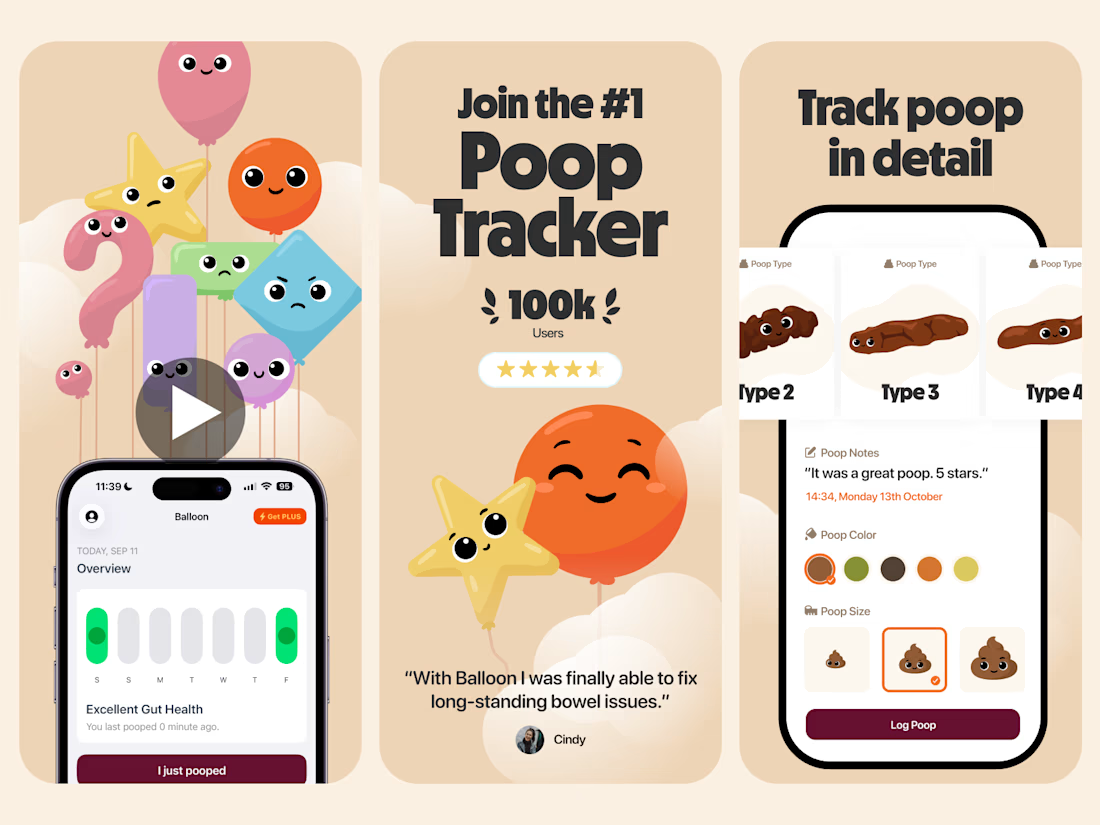

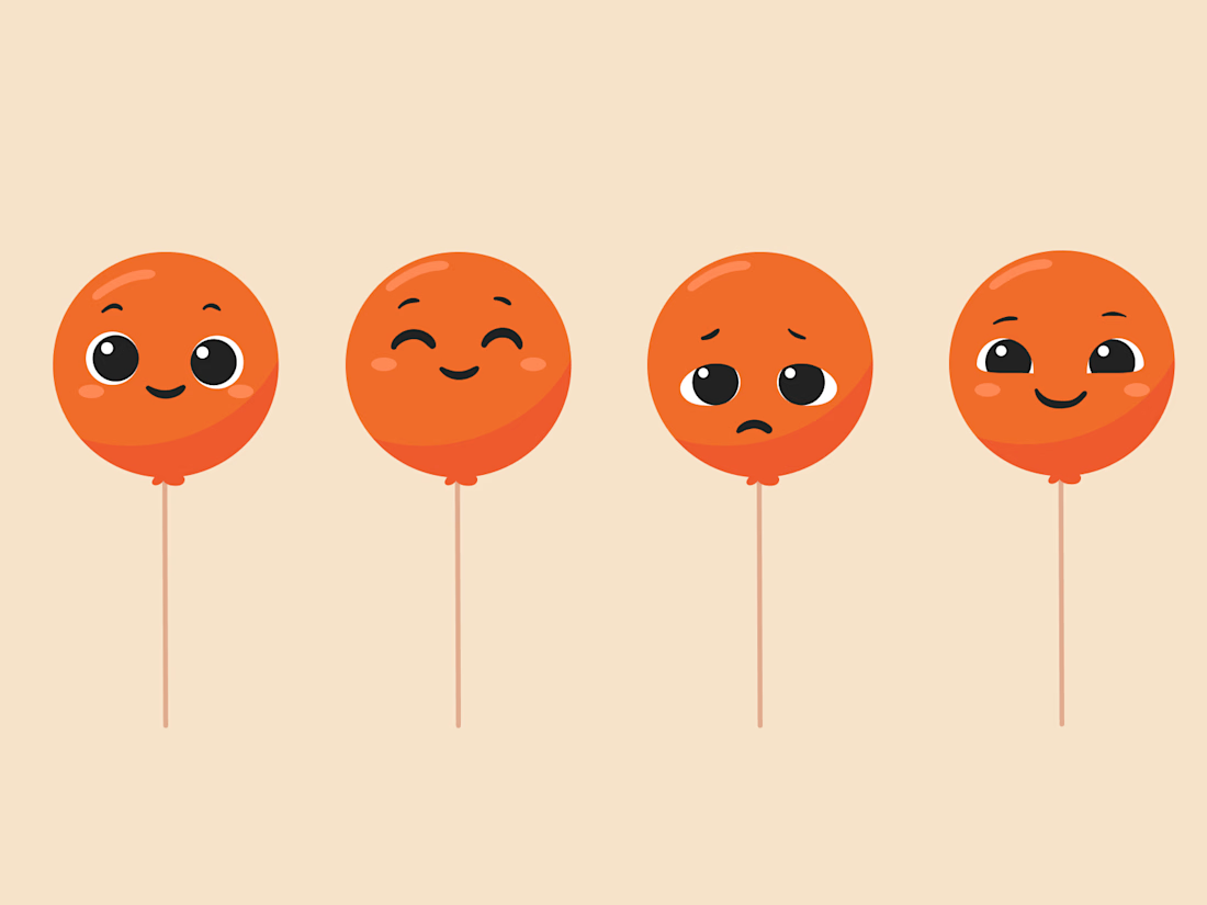

Everything has character! Good job. I like the little faces on the terds 🤣

How do you make a construction brand feel consistent from a business card to a building site?
Brixon’s identity brings angular lettering, an assembled geometric symbol, and a lime, black, and white palette together.
I carried those elements into stationery, brand guidelines, team identification, social graphics, and site signage, then brought the system into motion with Adobe After Effects.
The connecting decision: keep the geometry and layout structure consistent while the logo details, messages, and application previews change within the animated panels.
My contribution covered brand design, graphic design, and motion design.
What draws your attention first: the wordmark, the lime palette, or the rotating symbol?
See the full Brixon case study. If you’re shaping a construction or development brand, I’m available for brand identity and motion projects.

Incomparable work!