The network for creativity
Join 1.25M professional creatives like you
Connect with clients, get discovered, and run your business 100% commission-free
Creatives on Contra have earned over $150M and we are just getting started
Back to feedPost

Moments in Time - Award-winning public art


The network for creativity
Join 1.25M professional creatives like you
Connect with clients, get discovered, and run your business 100% commission-free
Creatives on Contra have earned over $150M and we are just getting started
Related posts

Rofella - Brand Expressions



The serif wordmark against that warm, textured paper feels so confident and timeless, and the deep burgundy gives the whole identity real character. Beautifully restrained work, keep going! Did the paper texture come from a real scan or did you build it digitally?


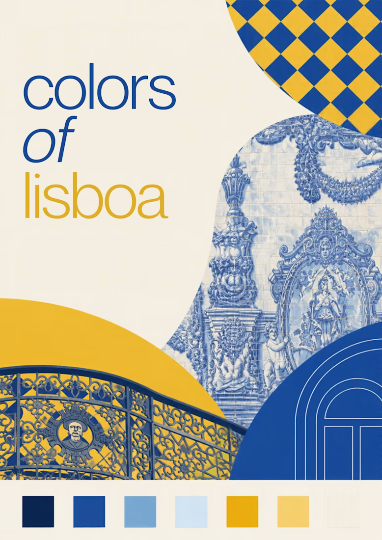
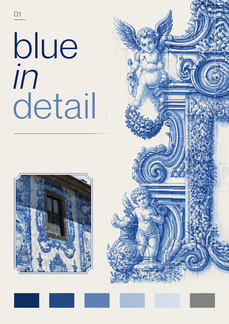
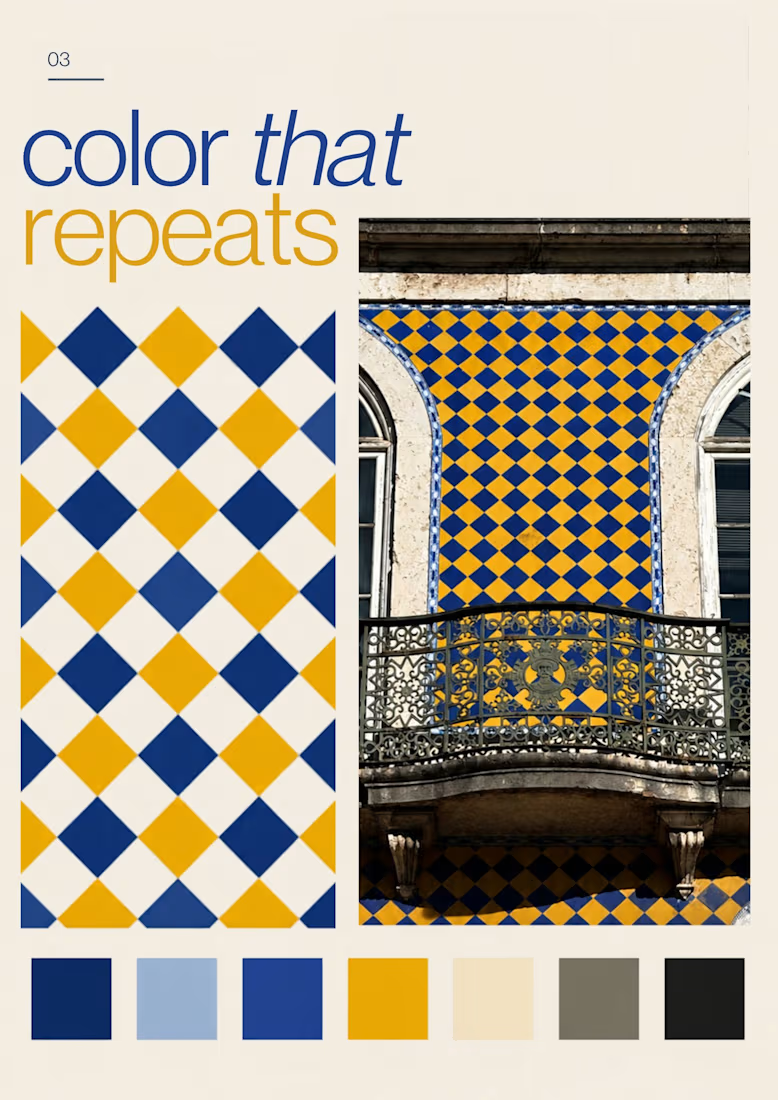
Turning the colors I notice around Lisbon into a series of posters, each inspired by a different photograph.
01 [Blue in Detail] started with the blue Portuguese tiles, exploring their intricate patterns, ceramic tones, and small details.
02 [Color on Repeat] explored the rhythm of blue and yellow tiles, using repetition as the starting point for the design.
I sampled colors from my photographs and used Canva Craft to explore layouts, typography, and graphic elements. Then I refined the designs by hand, adjusting the colors, spacing, and text.



What happens when a poet picks up a pen and remembers she likes to sketch too:)
I write poetry over at @words.bycm on IG and since Inktober is here, I thought it was time to let that side of me out of its little corner of Instagram.
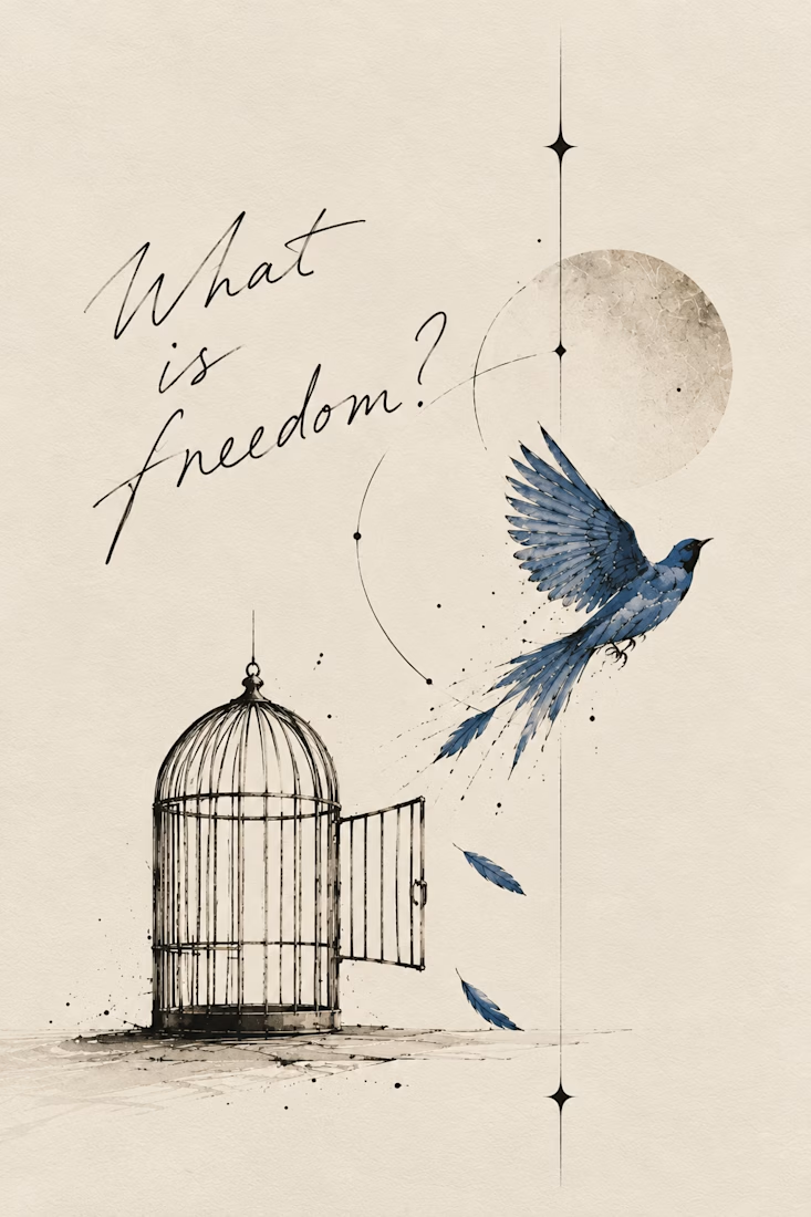
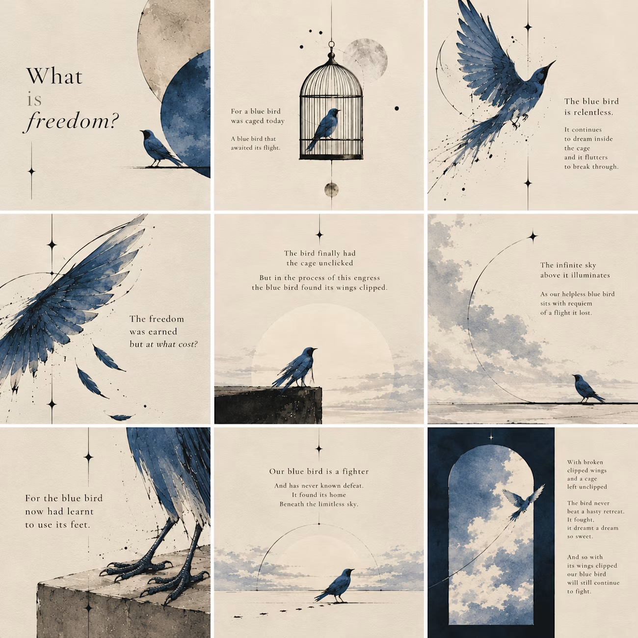
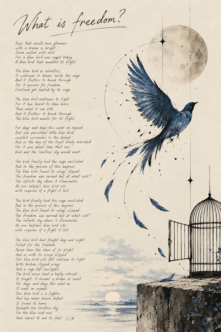
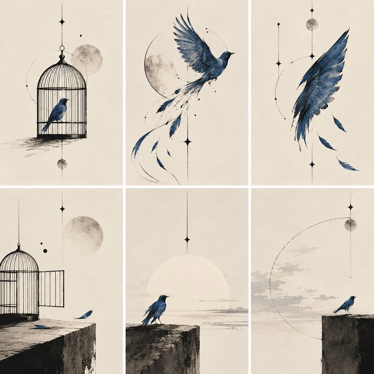
This is 'What Is Freedom?', a poem I wrote about a blue bird that spends its life fighting to escape a cage, only to find its wings clipped when the door finally opens.
A little existential crisis, now available in ink.
I wanted to bring the poem into a visual form, keeping the bird, the open cage, and that big, complicated idea of freedom at the heart of it.
For the writers, designers, and other creative shape-shifters here: what side of your creativity would you bring to Inktober?

this is so gorgeous!