The network for creativity
Join 1.25M professional creatives like you
Connect with clients, get discovered, and run your business 100% commission-free
Creatives on Contra have earned over $150M and we are just getting started
Back to feedPost


Turning the colors I notice around Lisbon into a series of posters, each inspired by a different photograph.
01 [Blue in Detail] started with the blue Portuguese tiles, exploring their intricate patterns, ceramic tones, and small details.
02 [Color on Repeat] explored the rhythm of blue and yellow tiles, using repetition as the starting point for the design.
I sampled colors from my photographs and used Canva Craft to explore layouts, typography, and graphic elements. Then I refined the designs by hand, adjusting the colors, spacing, and text.

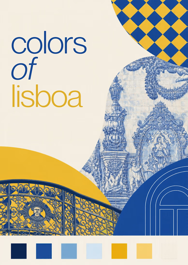
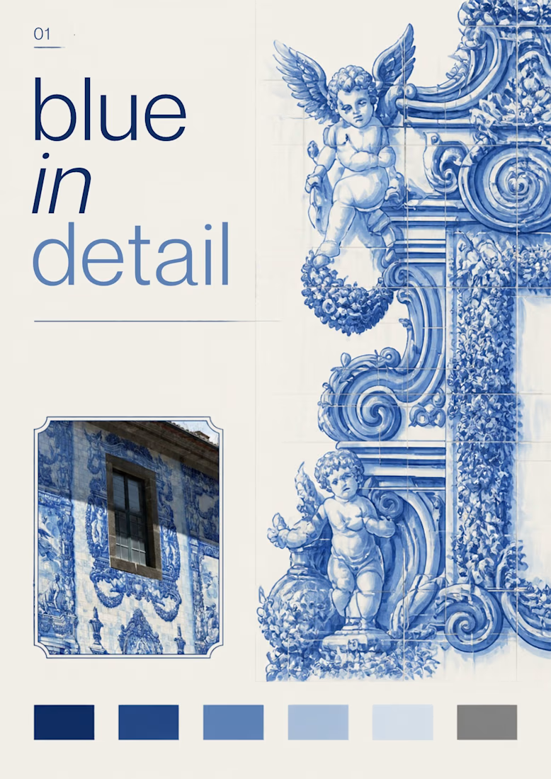
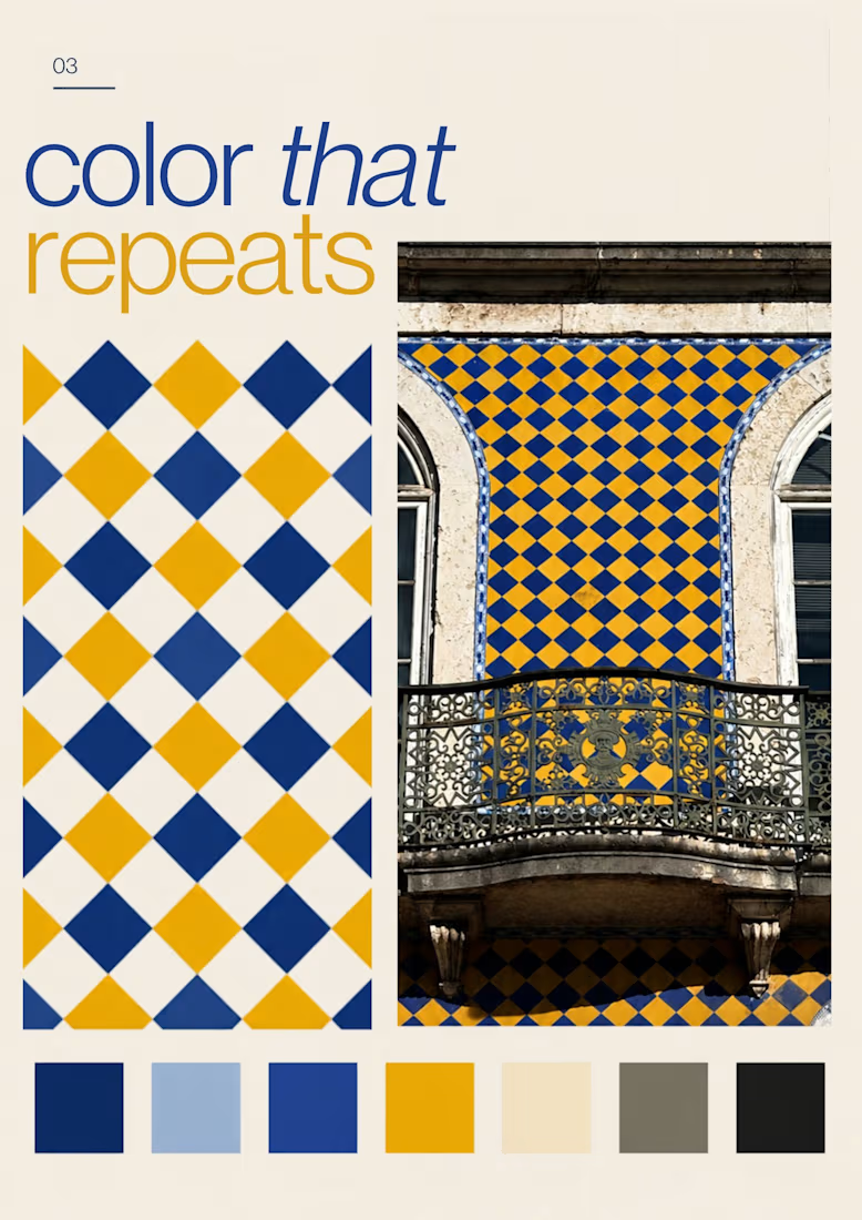

The color palette was great

love the branding colors.

This is so beautiful

Great work, love the layout

Great work

Nice work

Love how the diamond pattern carries from the facade into the graphic. It ties the photograph and layout together.
The network for creativity
Join 1.25M professional creatives like you
Connect with clients, get discovered, and run your business 100% commission-free
Creatives on Contra have earned over $150M and we are just getting started



Related posts

Amazing!

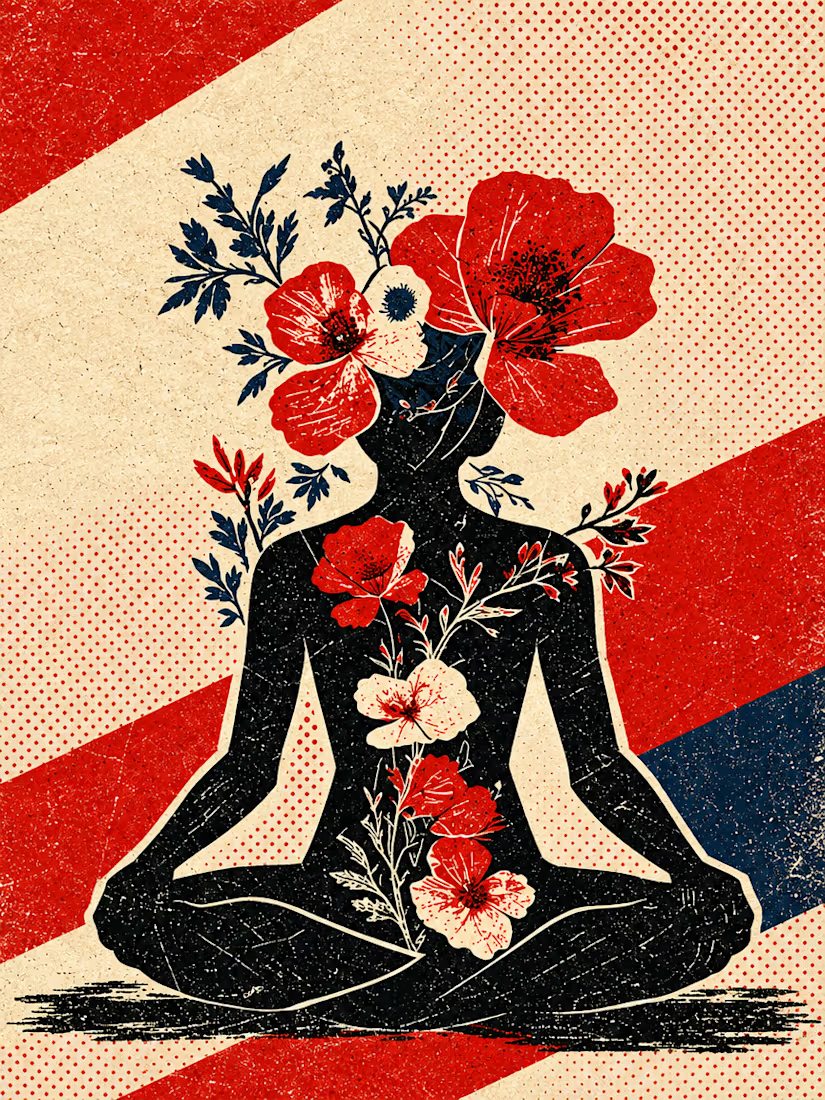
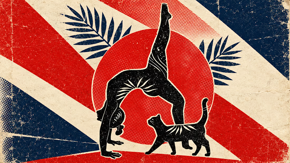
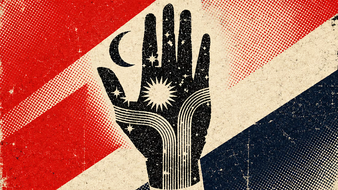
What happens when propaganda designed to erase the self gets pointed at the self instead?
Soviet propaganda spent 70 years trying to erase the individual soul in favour of the collective machine. I pointed that exact visual language at the thing it was built to suppress.
I kept...


Which packaging color catches your eye first?

6 voted
46%
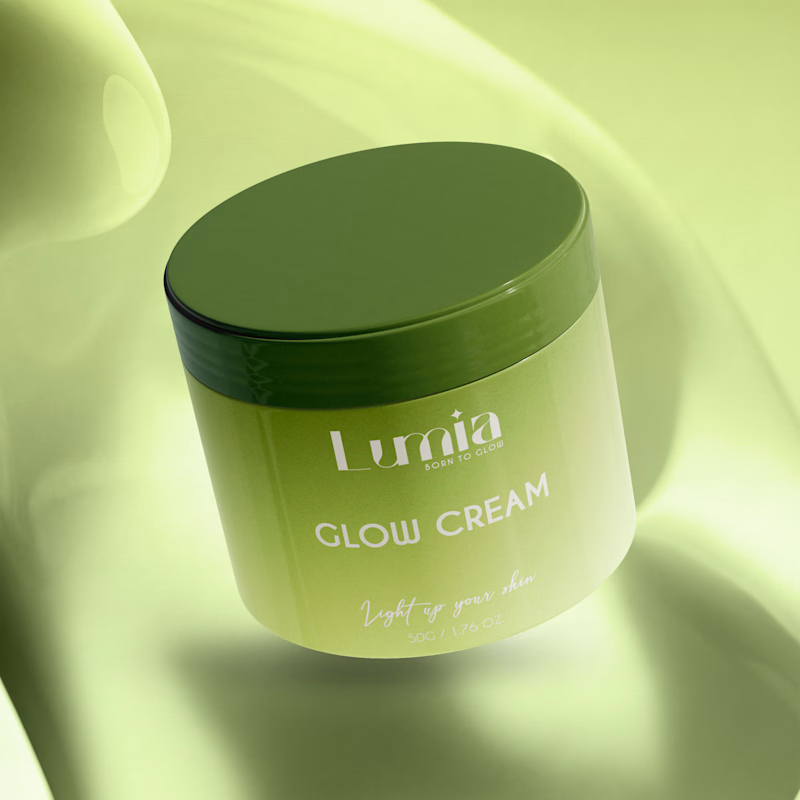
7 voted
54%
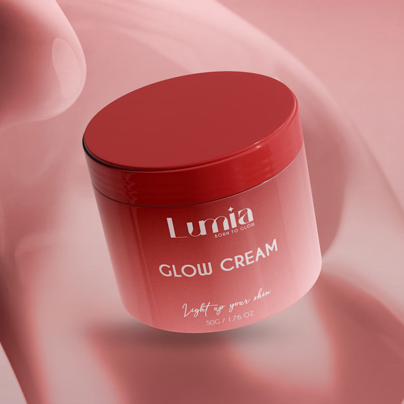
13 votes
Closed
The green version catches my eye first: the dark olive lid gives the lighter jar a clear focal point. I would also test the small white label text at thumbnail size, since the soft lighting reduces its contrast in both versions.

Which business card design makes the strongest first impression — Botanical Elegance or Modern Luxury? ✨
5 voted
100%
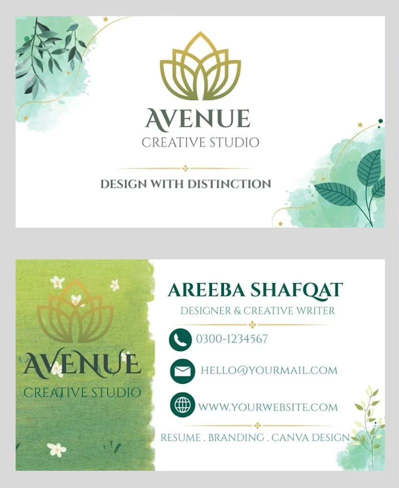
0 voted
0%
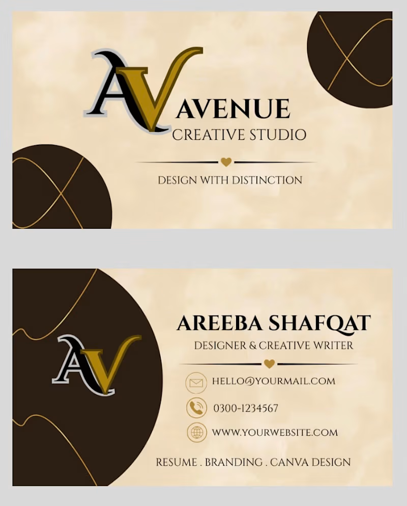
5 votes
Closed

Botanical Elegance for me! The watercolor greens + gold lotus feels so fresh and memorable for Avenue Creative Studio - it really says "Design with Distinction". Modern Luxury is sleek too, but botanical has that soft premium touch that stands out in a stack!