The network for creativity
Join 1.25M professional creatives like you
Connect with clients, get discovered, and run your business 100% commission-free
Creatives on Contra have earned over $150M and we are just getting started
Back to feedPost
Taste Test
Two skincare brands. Two completely different design directions.
Which one would make you stop scrolling? 👀
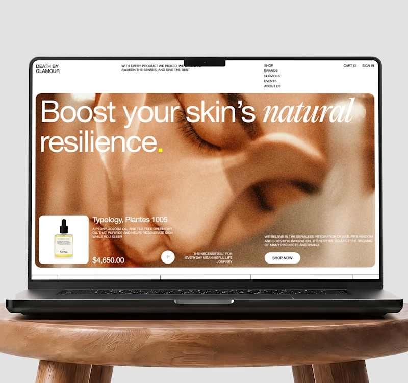
A - Editorial E-commerce
Bold typography, immersive product imagery, unconventional layout, and a fashion-forward visual language designed to make the brand feel premium and distinctive.
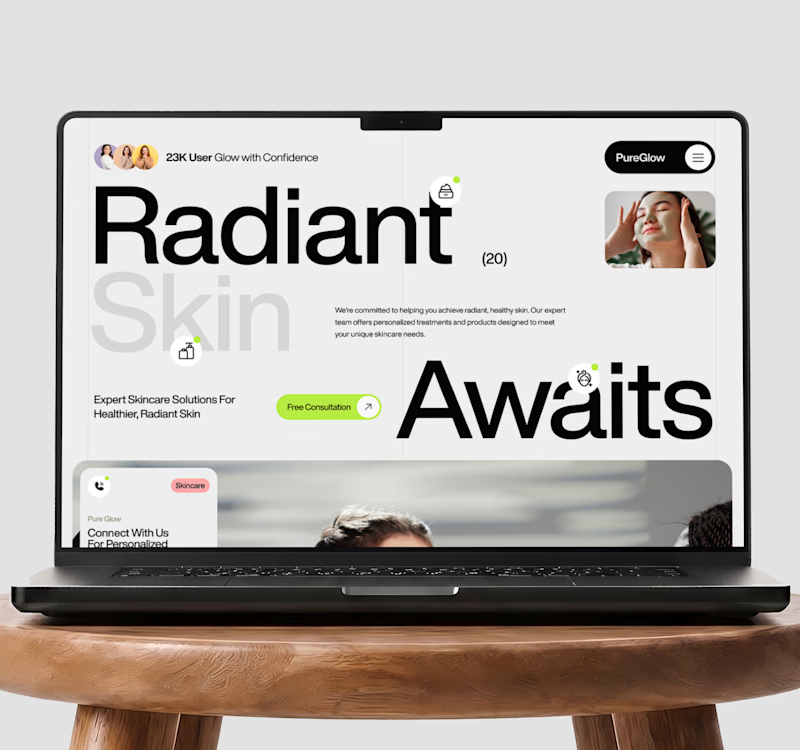
B - Minimal Skincare
Clean hierarchy, generous whitespace, strong messaging, and conversion-focused sections designed around trust, clarity, and action.
I’d love to know which direction you’d choose for a modern beauty brand.
👇 Vote below
A - Bold Editorial Commerce
B - Clean Conversion-Led UX
#WebDesign #UIUXDesign #UXDesign #UIDesign #LandingPageDesign #EcommerceDesign #EcommerceUX #BeautyWebsite #SkincareDesign #ConversionDesign #Figma #ProductDesign #DigitalExperience #WebsiteDesign


26 voted
60%
17 voted
40%
43 votes
Closed

Bold editorial feels more grounded in what the user is actually looking for 😊


Glad you liked it feel free to follow for more product design work.

Thanks! I share more SaaS and product design work here, feel free to follow along.

Bold Editorial for me. The immersive macro photography and elegant serif typography make the brand feel like a luxury brand.
Thanks for detailed feedback appreciate it! I share more SaaS and product design work here, feel free to follow along.

The bold editorial really tells more about the product
Thanks for detailed feedback Sekinat I appreciate it! I share more SaaS and product design work here, feel free to follow along.
contra.com
Sekinat Akinrinde - Graphic Designer | Contra
AI Video Creator & Social Media Content Creator. View Sekinat Akinrinde’s Profile on Contra. The Independent-first, commission-free freelance marketplace shaping the future of work.

The first will keep me hooked to the page but the second will make me stop scrolling
Thanks for feedback Solomon I appreciate it! I share more SaaS and product design work here, feel free to follow along.

Bold option is really strong and better to me because the title is clear, clear image and direction for the user’s eye. But the other option seems very busy and my eyes can’t handle it
Thanks for detailed feedback Mohamed Sharaf I appreciate it! feel free to follow along I share more SaaS and product design work here.
Sure, wish you all the best @Umair Shakeel

Editorial wins on brand recall but risks burying the CTA under the photography. Clean Conversion trades distinctiveness for a faster path to trust. Depends whether this funnel needs memorability or immediate checkout.
Thanks for detailed feedback Mark appreciate it! I share more SaaS and product design work here, feel free to follow along.

Bold Editorial
Thanks for vote Shubhang! I share more SaaS and product design work here, feel free to follow along.

Love the bold one 🔥
Thanks for your feedback Amina! feel free to follow along. I share more SaaS and product design work here.

Both looks amazing but the Bold one stands out in all the ways it should.
Thanks for your feedback Tehreem I appreciate it! feel free to follow along I share more SaaS and product design work here.
Depends where the traffic is coming from: Bold Editorial wins on cold social scroll-stopping, but Clean Conversion probably wins once someone's already searched "skincare for X" and just wants the answer fast.


Outstanding !

Both are the pro level that clients looking for.

I'd go for the first one actually, skincare = luxury, seeing a skincare brand that minimal would make me skeptical to purchase, just the first would need a little tweaking, like putting a dark overlay on the image to bring out the white texts, sub texts especially
The network for creativity
Join 1.25M professional creatives like you
Connect with clients, get discovered, and run your business 100% commission-free
Creatives on Contra have earned over $150M and we are just getting started





Related posts


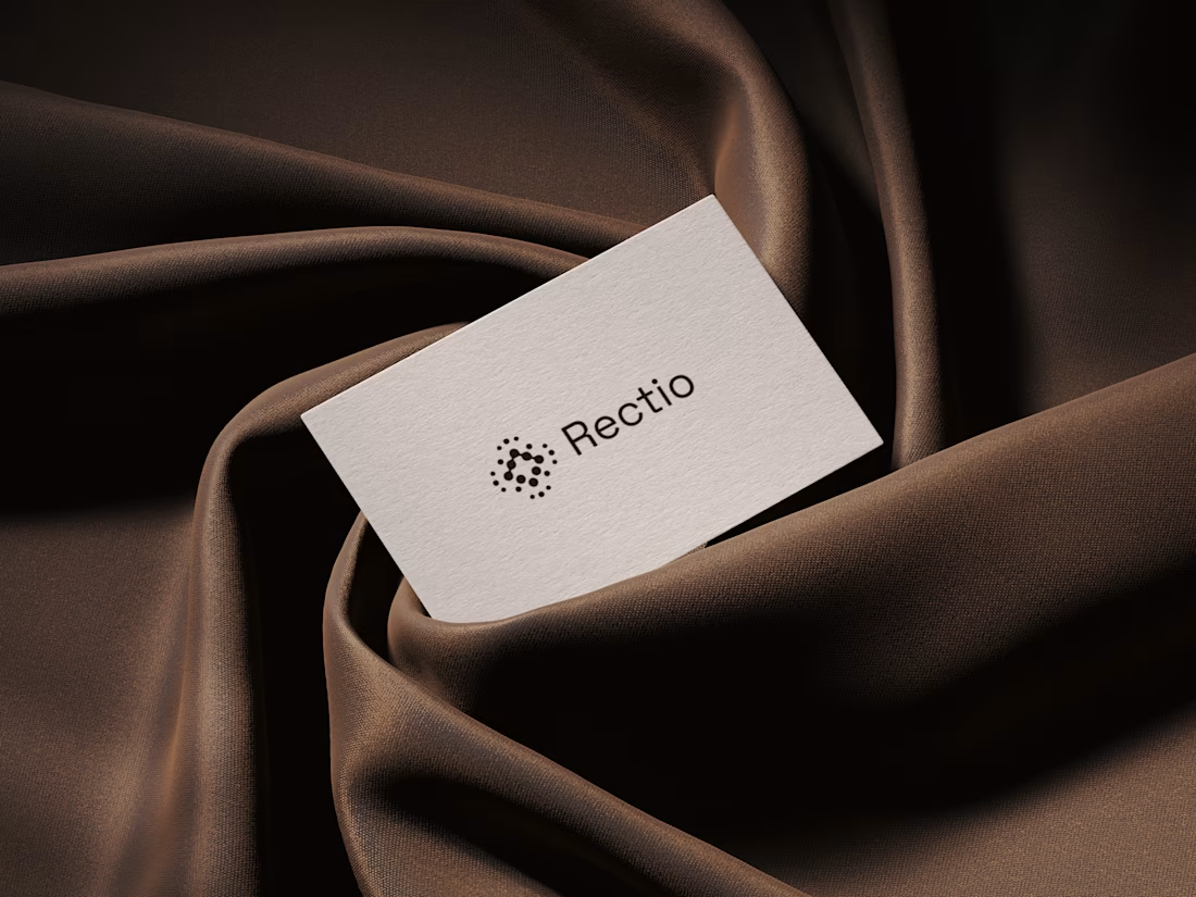
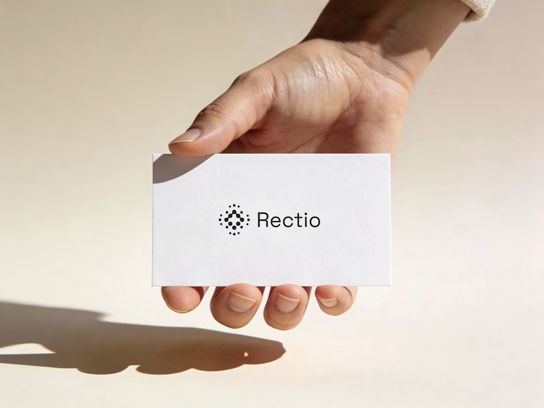
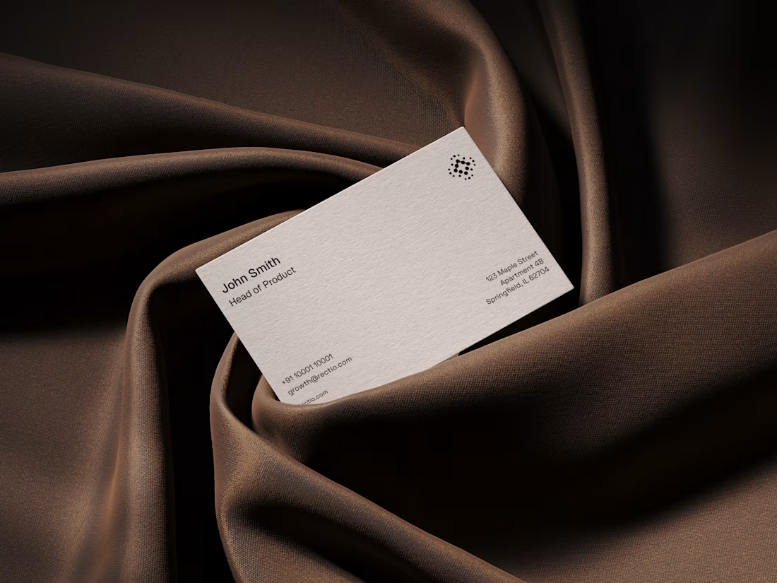
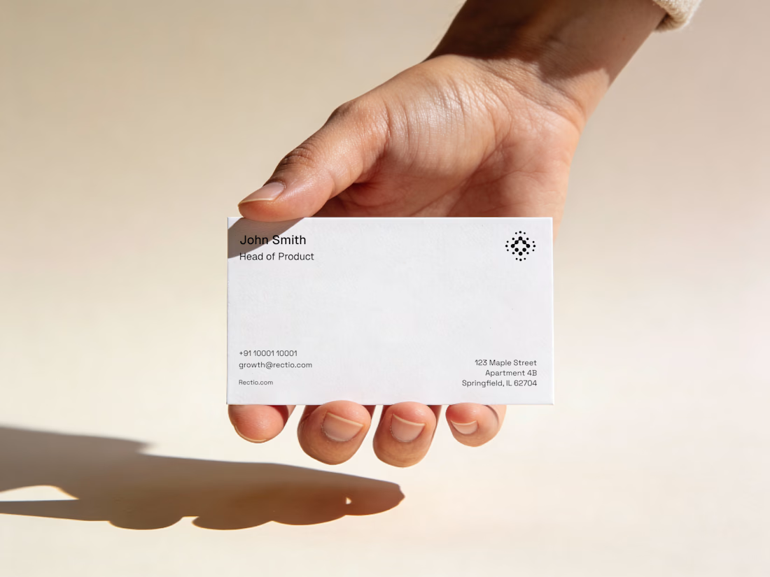
Rectio — Brand Identity
Brand Identity • Visual Direction • Business Cards • Mockups
A modern and minimal branding direction for Rectio, from visual identity to business card applications.
Created by Artonest Design Studio — artonest.design



Recently, I created two designs for my client. One is in dark mode, and the other is in light mode. I love both of them. Which one do you like more?
5 voted
56%
4 voted
44%

9 votes
Closed

fresh light


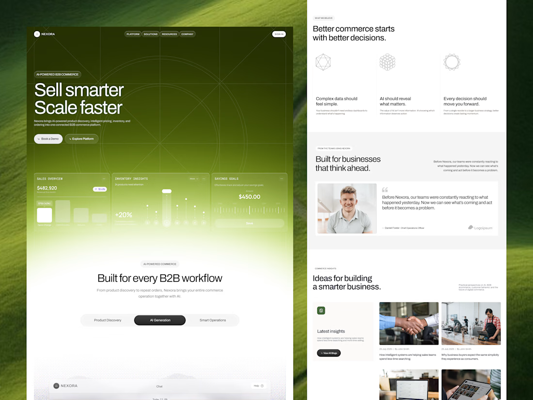
Our goal was to make pricing, inventory and ordering data feel simple and human for an AI-powered B2B commerce platform. We'd love to hear your thoughts!

Engaging background and nice gradient to not make the section look seprate 🔥