The network for creativity
Join 1.25M professional creatives like you
Connect with clients, get discovered, and run your business 100% commission-free
Creatives on Contra have earned over $150M and we are just getting started
Back to feedPost
From an Ordinary Fashion Store to a Standout Digital Experience ✦
✦The Problem
Fashion brands need more than attractive products to stand out online. A cluttered layout, weak visual hierarchy, and an inconsistent brand experience can make it harder for customers to discover products and engage with a collection.
✦The Solution
Bres Fashion brings together bold visuals, clean layouts, striking product imagery, and a modern e-commerce experience that keeps the collection in focus.
✦The Outcome
A polished fashion storefront designed to strengthen brand perception, improve product discovery, and create a smoother path from browsing to buying.
Good design doesn't just showcase products. It creates an experience around them.
Looking to elevate your fashion brand's online presence? DM me to discuss your next project.
#FashionEcommerce #WebDesign #UIDesign #EcommerceWebsite #FashionWebDesign #EcommerceDesign #WebsiteRedesign #UXDesign


creative work bro. Keep it up.

Thanks


This is quite nice, I like it very much

Ye le Jani:
You nailed the core problem here! "More than attractive products to stand out" is so true - that cluttered layout & weak hierarchy kills so many fashion stores. Your solution with Refined Styles / Comfort Meets Confidence sections looks super clean. That bold red +...
Thanks bro
Most welcom bro

That Discover Your Signature Style hero is strong. The bold red background with the model framed dead center makes the storefront feel like a campaign, not a catalog. Was the red a brand call from Bres, or did you push the palette to make it stand out?
The network for creativity
Join 1.25M professional creatives like you
Connect with clients, get discovered, and run your business 100% commission-free
Creatives on Contra have earned over $150M and we are just getting started








Related posts


new work is live. quite proud of this one!
I like this


Fresh case study 🚀🚀🚀
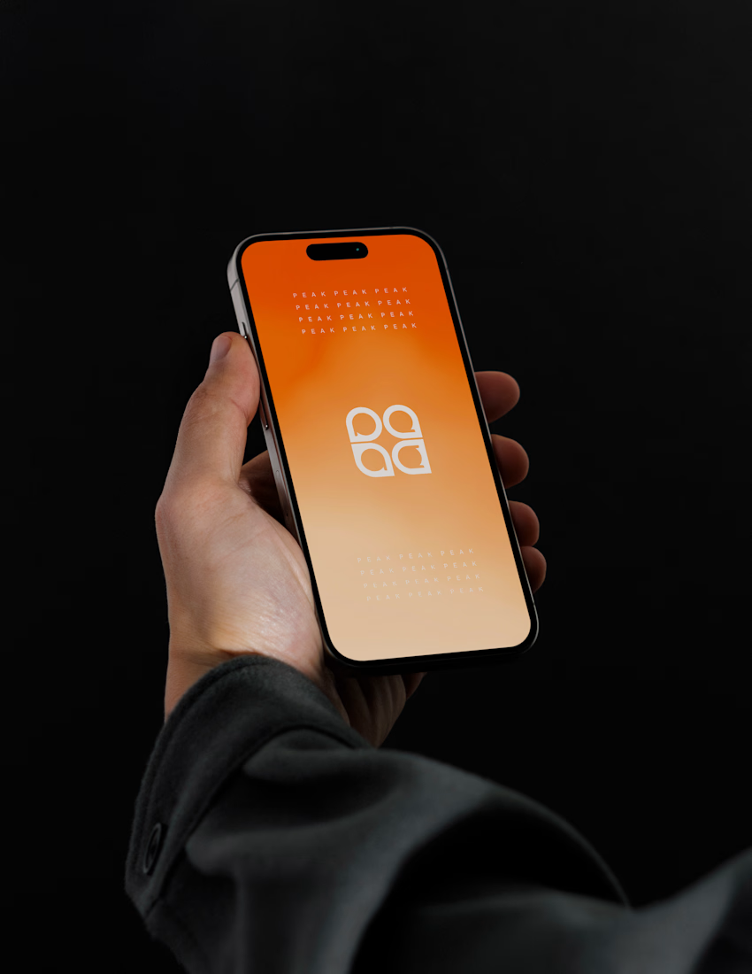
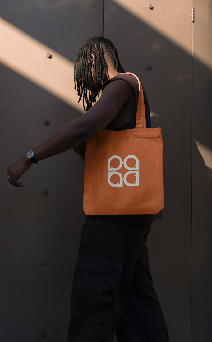
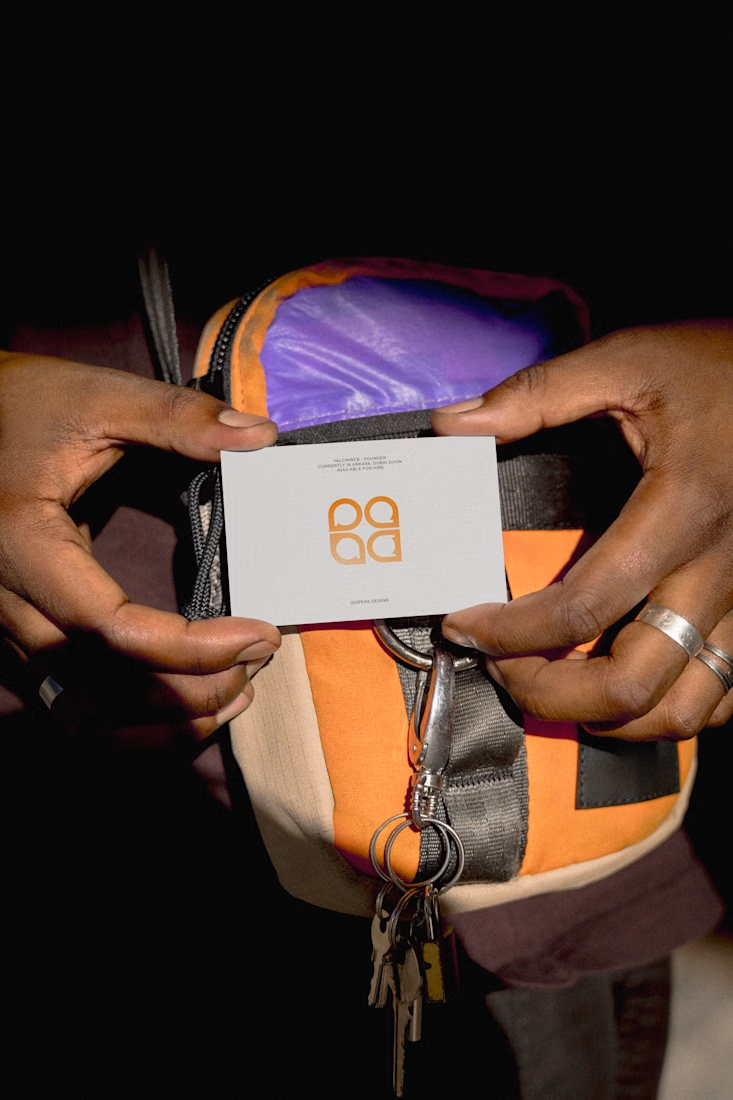
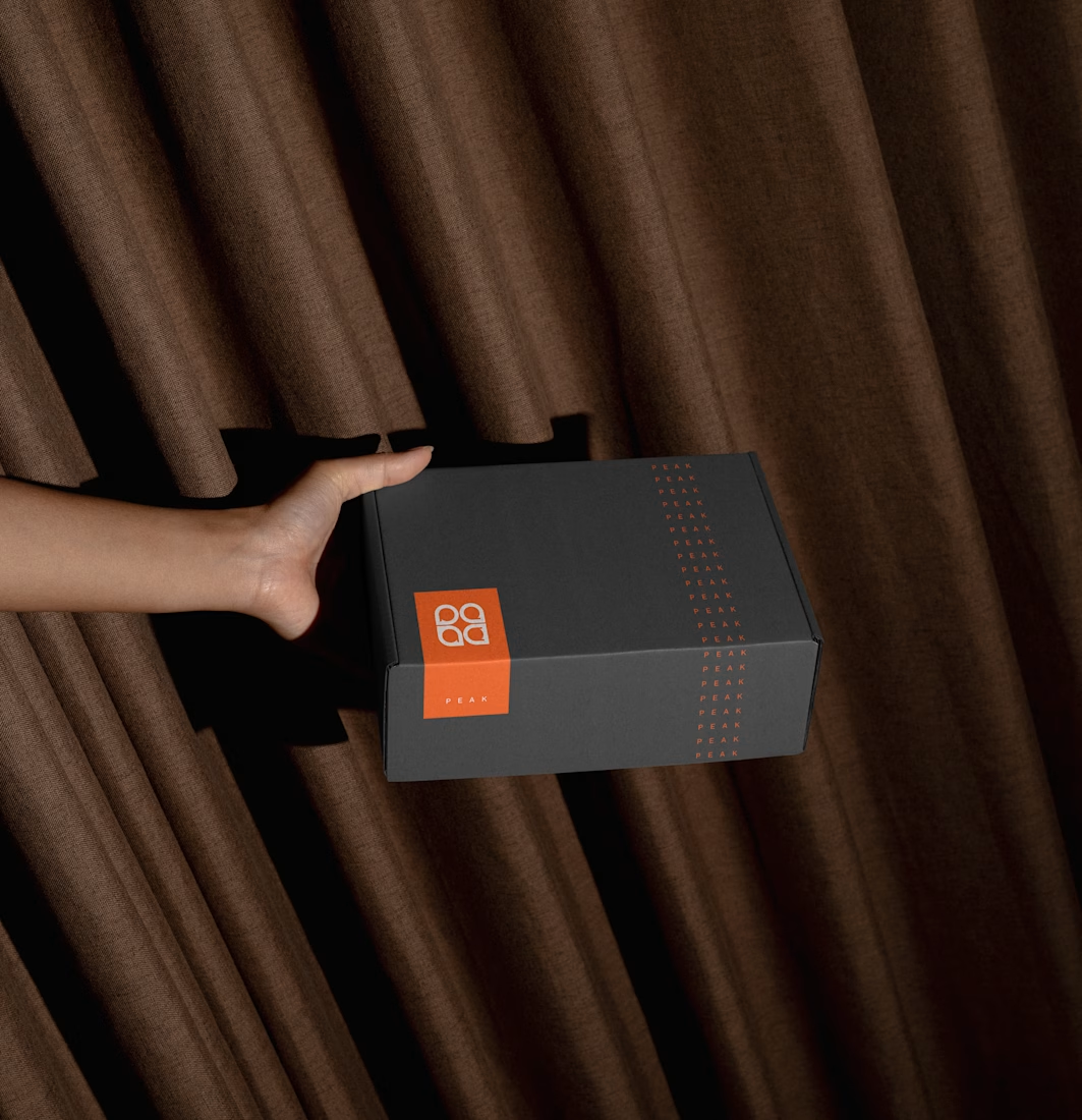
Brand identity for Peak, an all-in-one website builder for WordPress that I design and build. A four-letter mark, a warm paper-and-ember palette and one system that runs from the favicon to the packaging.

A four-letter mark that has to hold from favicon to packaging is a tough constraint. Did you draw one letterform first and build the other three from it, or design them together as a set from the start?
Beautyy


