The network for creativity
Join 1.25M professional creatives like you
Connect with clients, get discovered, and run your business 100% commission-free
Creatives on Contra have earned over $150M and we are just getting started
Back to feedPost
Taste Test

Herbal Supplements E-commerce Website UI — A/B Design Test 🌿
Two visual directions. One herbal wellness brand. Which design would you choose?
I’ve explored two different UI concepts for a herbal supplements e-commerce website, focusing on natural aesthetics, premium product presentation, and a smooth shopping experience.
🌿 Design A: Clean, fresh, and nature-inspired with a bright green palette.
🌱 Design B: Premium, earthy, and elegant with floating product visuals and botanical elements.
Both concepts aim to create a modern, trustworthy, and engaging online shopping experience.
Help me choose! 👇
Which design do you prefer — A or B? And why?
Would love to hear your honest feedback!


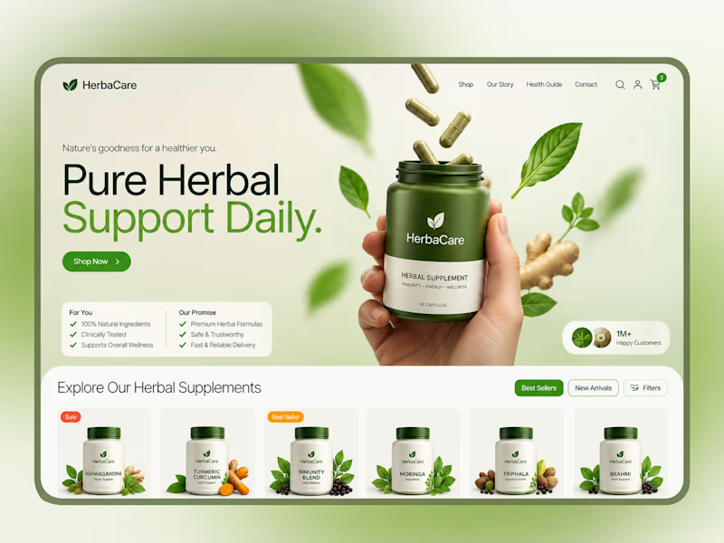
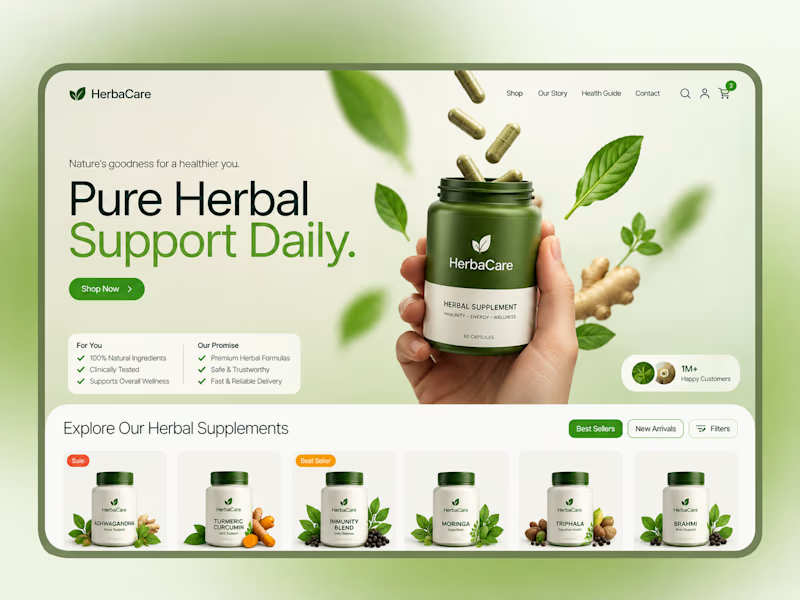
2 votes
Ends in 1d

Looks amazing

I lean toward Design B, Lovepreet. The earthy, premium feel with floating product visuals suits herbal wellness better than bright green. Trust matters most when people buy supplements.


The overall visual direction and earthy green tones look great very fresh and fitting for wellness. That said is it just me or do both designs look the same?
The network for creativity
Join 1.25M professional creatives like you
Connect with clients, get discovered, and run your business 100% commission-free
Creatives on Contra have earned over $150M and we are just getting started








Related posts

From the cover to what’s inside 👀
Thank you to everyone who voted in my cover test. This time, I’m trying two short previews of DCS 654: my library of 654 dessert-inspired colors and matching textures, with ready-made palettes for your own design work.
Which video makes you more curious to explore the library: A or B?
And what made you choose that one?
You can take a closer look here: https://dcs.mariya.design/
36 voted
61%
23 voted
39%
59 votes
Closed


I’d pick B. It makes the colors and textures feel more engaging and makes me want to explore the full library.


Fresh case study 🚀🚀🚀
Brand identity for Peak, an all-in-one website builder for WordPress that I design and build. A four-letter mark, a warm paper-and-ember palette and one system that runs from the favicon to the packaging.

A four-letter mark that has to hold from favicon to packaging is a tough constraint. Did you draw one letterform first and build the other three from it, or design them together as a set from the start?

Covers are my weakest muscle. I can build a whole visual world, and then freeze at one thumbnail 😅
MALA FLORA: a tattoo studio + gallery built from my painting Jardín Turbio. A shows the site on the street, B shows the flow in motion.
Which one makes you want to click?
3 voted
20%
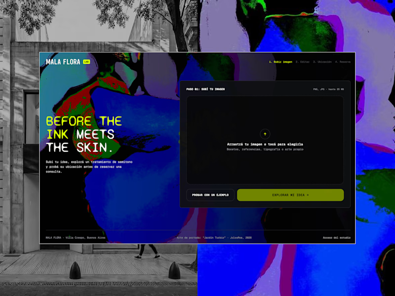
12 voted
80%
15 votes
Closed


B, the tattoo frames moving made me stop scrolling where A reads more like a site screenshot


