The network for creativity
Join 1.25M professional creatives like you
Connect with clients, get discovered, and run your business 100% commission-free
Creatives on Contra have earned over $150M and we are just getting started
Back to feedPost
Taste Test

Covers are my weakest muscle. I can build a whole visual world, and then freeze at one thumbnail 😅
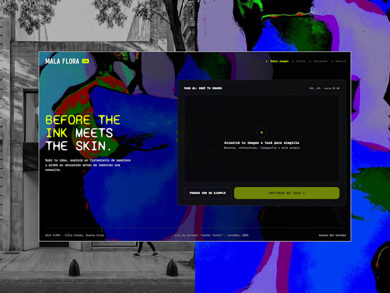
MALA FLORA: a tattoo studio + gallery built from my painting Jardín Turbio. A shows the site on the street, B shows the flow in motion.
Which one makes you want to click?
3 voted
20%
12 voted
80%
15 votes
Closed


B, the tattoo frames moving made me stop scrolling where A reads more like a site screenshot
thanks for input!

Exactly. Motion wins here because it communicates the product faster and gives people a reason to stop scrolling.
Strong observation, Benjamin. We work across SaaS, AI, web, and mobile development at M TECHUB LLC. If TRUEFRAME ever needs a development partner for client projects, happy to collaborate.

The motion one is super cool!!

Very great work!
Thank you!


I’d pick B. Showing the site in motion feels more engaging and makes me curious to explore it.

the one in motion is boom

B for me. Seeing the frames move gives a feel for the whole site before you even click. The painting as the base for the brand is such a cool idea too.

B gets my vote too, Julissa. A motion thumbnail tells the story of the tattoo frames moving, while the static one reads more like a site screenshot. Building the whole visual world from Jardin Turbio is gorgeous either way.
Thank you Timothy!
The network for creativity
Join 1.25M professional creatives like you
Connect with clients, get discovered, and run your business 100% commission-free
Creatives on Contra have earned over $150M and we are just getting started





Related posts

Same 18 seconds, two middles. One pulls you through a tunnel of banners, one lays them out. 1 or 2.
23 voted
55%
19 voted
45%
42 votes
Closed

2 — the laid-out banners read clearer.


Can't decide?
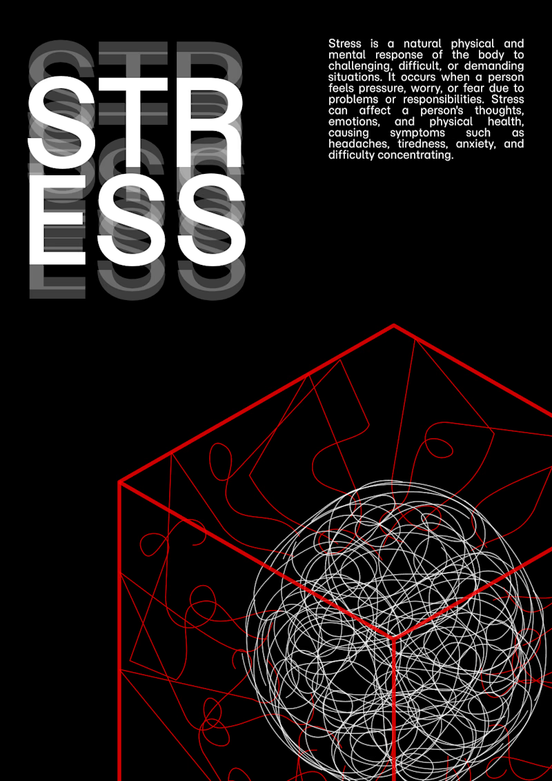
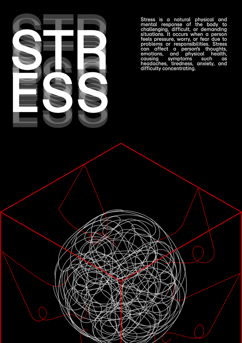
which is better?
3 voted
60%
2 voted
40%
5 votes
Closed
B — the sphere sits cleaner inside the pyramid.


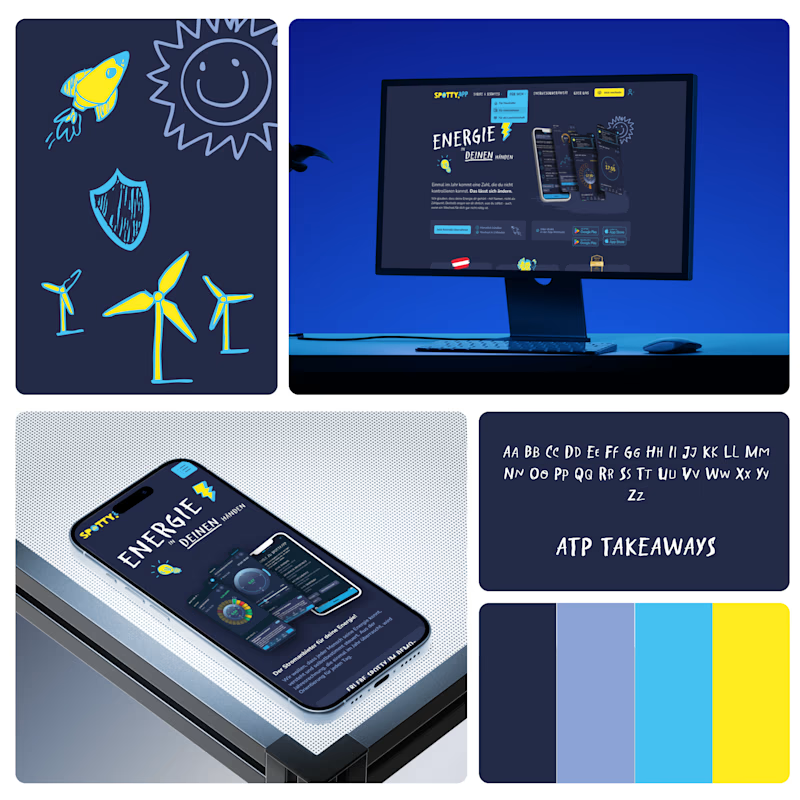
Showcasing your work is a job of its own. Which presentation style converts best: full case studies, clean visual galleries, or short video walkthroughs? Any tips welcome!
3 voted
60%
2 voted
40%
5 votes
Closed
