The network for creativity
Join 1.25M professional creatives like you
Connect with clients, get discovered, and run your business 100% commission-free
Creatives on Contra have earned over $150M and we are just getting started
Back to feedPost

Dharma Rentals | Luxury Car Rental Website | Miami
A car rental website concept for Miami that puts booking first. Dates and location are in the hero, the fleet is easy to browse, and the brand feels like Miami at night.
Introduction
Dharma Rentals is a car rental concept for Miami-Dade and Broward County. The fleet covers everything from economy cars to luxury models. The brief I set myself was a website that feels as premium as the cars, but still lets someone book a rental in under a minute.
The Challenge
Most car rental websites get two things wrong.
First, they make you work before you can book. You land on a big banner, scroll past promotions, and eventually find a booking form halfway down the page. But someone renting a car almost always arrives knowing when and where they need it. Making them hunt for the form is how rental sites lose people.
Second, they hide the local details. A rental is a physical thing you have to go and collect. People want to know where the car is, when the office is open, and whether pickup is close to them. Many sites put all of that in the footer.
The opposite risk is just as real. Luxury rental sites often go so heavy on mood and imagery that they forget to work as a booking tool. I wanted the page to do both jobs.
The Approach
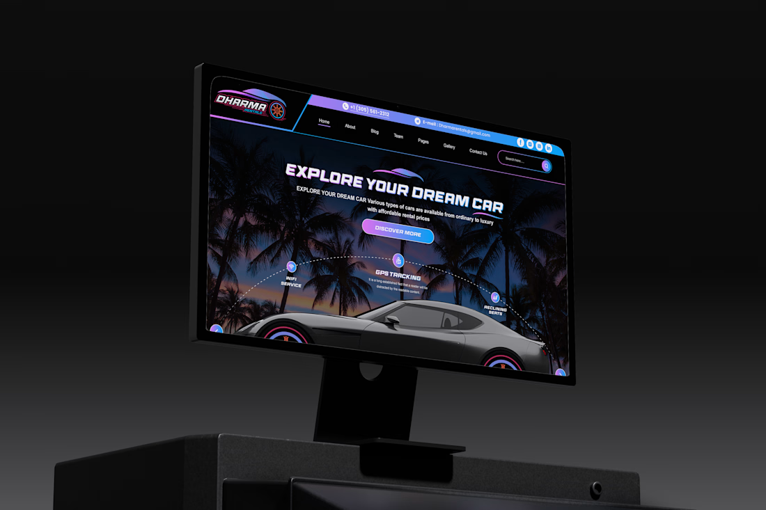
Booking in the hero. The pickup and drop-off search bar sits right in the first screen, on top of the hero image. A returning customer can enter dates and search without scrolling at all. Everything else on the page is there for people who aren't ready to book yet.
Location near the top. Directly below the top-rated cars, there's a map with the pickup route, the address, and business hours for weekdays, weekends and public holidays. For a local business, that information builds trust, so it belongs where people decide, not at the bottom of the page.
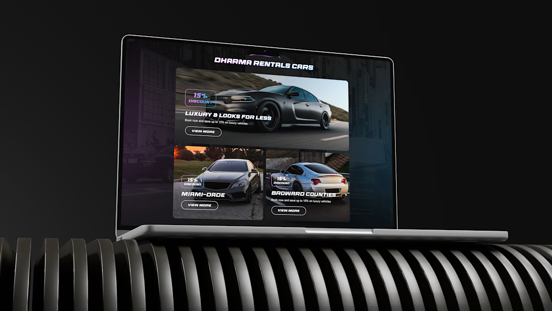
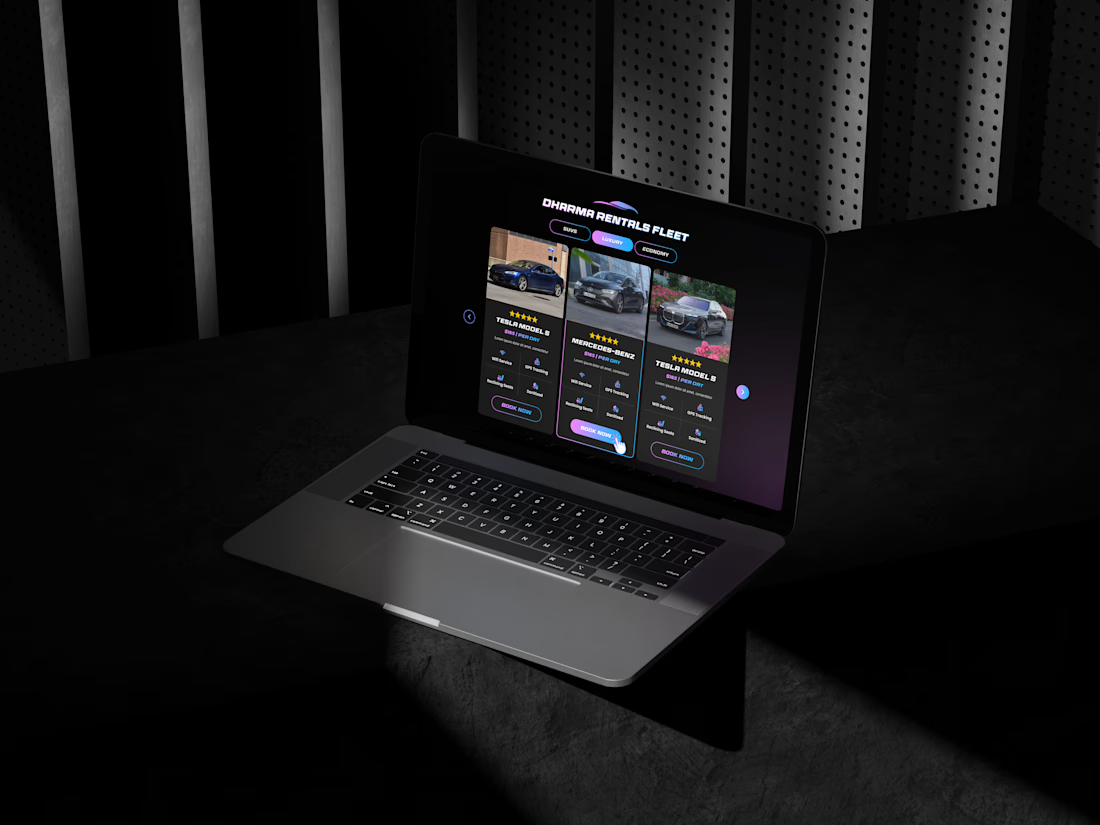
A fleet you can filter. Cars are grouped into SUV, Luxury and Economy tabs. Each card shows the price per day, the rating, and the features people compare: GPS tracking, Bluetooth, seats and mileage. Visitors can narrow the fleet to what they need instead of scrolling through everything.
Answering doubts in order. The lower half of the page follows the questions a first-time renter usually has: how does it work (a three-step process along a winding road), why choose this company, what if something goes wrong (insurance and support), what do other customers say (a 4.7 rating with category scores), and what else do I need to know (FAQ). Each section deals with one hesitation before the next booking prompt.
Visual Direction
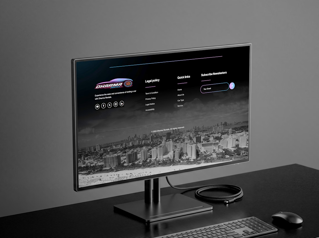
The brand is built around Miami at night: a black sports car with pink rims, palm trees against a dark sky, and neon pink-to-violet gradients. Wide, all-caps display type gives the headings a fast, motorsport feel. The dark background makes the car photos stand out and keeps the page feeling exclusive rather than budget.
The challenge was keeping that mood from overwhelming the functional parts. The booking bar, car cards and FAQ use clean light surfaces and simple layouts, so the neon stays in the atmosphere and doesn't get in the way of the content people need to read.
Outcome
The result is a rental website that feels premium without making booking harder. Someone who knows what they want can book from the first screen. Someone who's still deciding gets the fleet, the location, the process and the reviews in the order they're likely to ask about them.::


The network for creativity
Join 1.25M professional creatives like you
Connect with clients, get discovered, and run your business 100% commission-free
Creatives on Contra have earned over $150M and we are just getting started





Related posts

Created these interactive animation variants for a section in my recent web design project.
Which one do you think grabs users’ attention and keeps them engaged?
Linear ✲ or Dotted⚪?
24 voted
52%
22 voted
48%
46 votes
Closed

dotted one

Cleann🔥

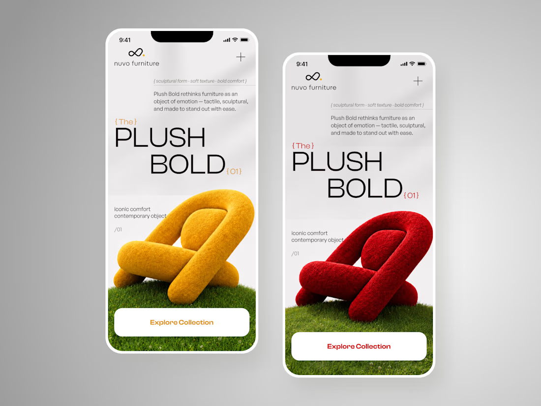
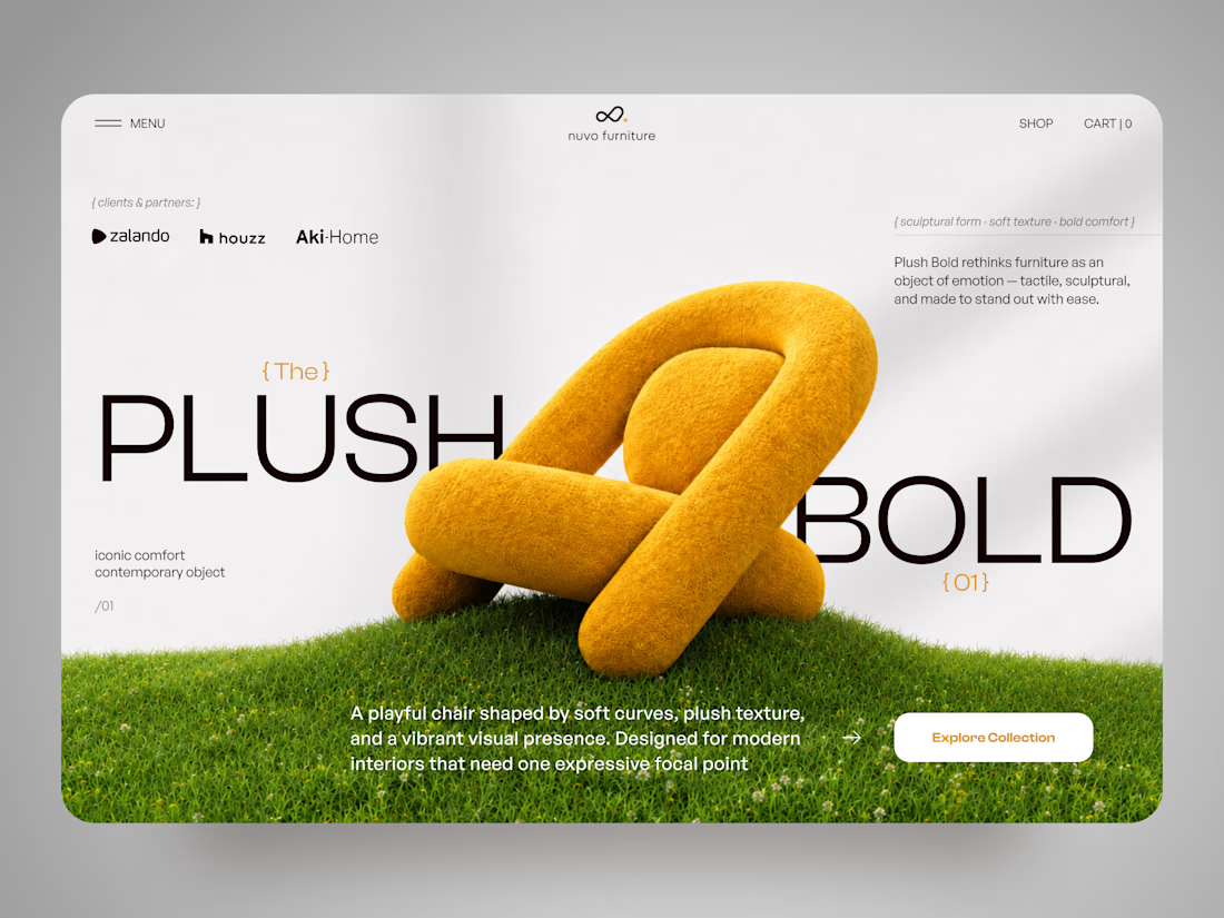
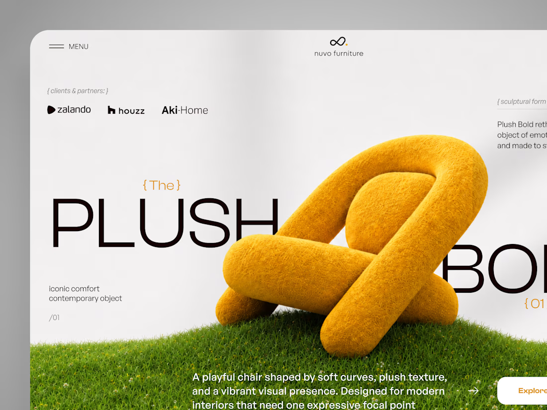
NUVO Furniture — Sculptural Furniture E-commerce Concept 🪑✨
NUVO is a contemporary furniture website concept built around one idea: let the product become the experience.
At the center of the concept is Plush Bold — an expressive statement chair designed to feel more like a...

Which hero direction feels right for this founder-focused brand?
While working on the homepage for Sean Parsons, a brand focused on empowering non-technical founders to launch tech startups, I explored two different visual directions for the hero section. Same message, same structure, just a different mood and color system.
Option 1 - Warm Olive. Dark, grounded, and editorial, giving a warm, established, expert feel.
Option 2 - Light Purple. Clean, modern, and vibrant, giving a fresh, SaaS-like, approachable feel.
Would love your honest UX/UI take, which direction feels more trustworthy, engaging, and aligned with a founder-focused brand, and why?
25 voted
69%
11 voted
31%
36 votes
Closed

I like worm Olive most because it has different personality