The network for creativity
Join 1.25M professional creatives like you
Connect with clients, get discovered, and run your business 100% commission-free
Creatives on Contra have earned over $150M and we are just getting started
Back to feedPost

Built the site for Linea — a boutique rail brand where the whole UI is made of the same rule as the print system.
Every route card's red line isn't decoration, it's that route's actual elevation profile. Fare tiers aren't styled, they're the same data at different density.
The logo's sparkle mark even resolves from the exact same contour-drawing logic, live on the page.
One idea, all the way down → Here

Using the real elevation profile as the route line is the kind of detail that makes a system feel earned. I'd argue that one decision does more branding work than the logo, would you agree or does the sparkle mark carry more weight for you?

Super work

Love that the red line is actual elevation data, not decoration that's the kind of detail that separates a "system" from just a style guide. The logo resolving from the same contour logic is a really nice touch.

One idea all the way down is the whole thing, and having the sparkle mark resolve from the same contour logic is what proves you held that discipline instead of just claiming it. When the data is the decoration, a small brand reads as considered rather than templated.

You nailed the overall mood here. The details just reinforce it nicely.

Looks amazingg

The Animation + Colors is so good🎉


carrying the print rule straight into the UI is the hard part

Using each route's real elevation profile as the red line is such a clever detail. Love when the visuals are actually data and not just decoration.
The network for creativity
Join 1.25M professional creatives like you
Connect with clients, get discovered, and run your business 100% commission-free
Creatives on Contra have earned over $150M and we are just getting started




Related posts

What should a creative agency website actually feel like?
For Orvika, we didn't want another agency site built around the same safe layouts and predictable sections.
We pushed the visual direction further with oversized typography, editorial layouts, bold imagery, and stronger contrast, while keeping the experience structured enough to communicate the agency's work and capabilities clearly.
The goal wasn't just to make it look different.
It was to make the agency feel different.
Designed in Figma and built in Framer.
We're sharing more of the websites and digital experiences we've been working on here over the next few weeks.




Very neat man

ADCB × Shukran - Credit Card Landing Page.
I designed a landing page for the co-branded credit card partnership between ADCB and Shukran, Landmark Group’s loyalty programme.
The page brings together the card’s benefits, participating brands and application entry point, helping visitors understand the offering and explore how to get started.
The design uses a black-and-gold palette, prominent card imagery and distinct content sections to present a wide range of rewards in a cohesive visual experience. The work shown includes the landing-page design, benefits presentation and “How it works” section.

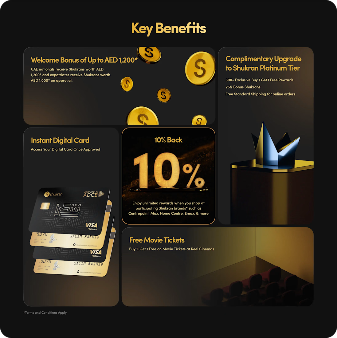
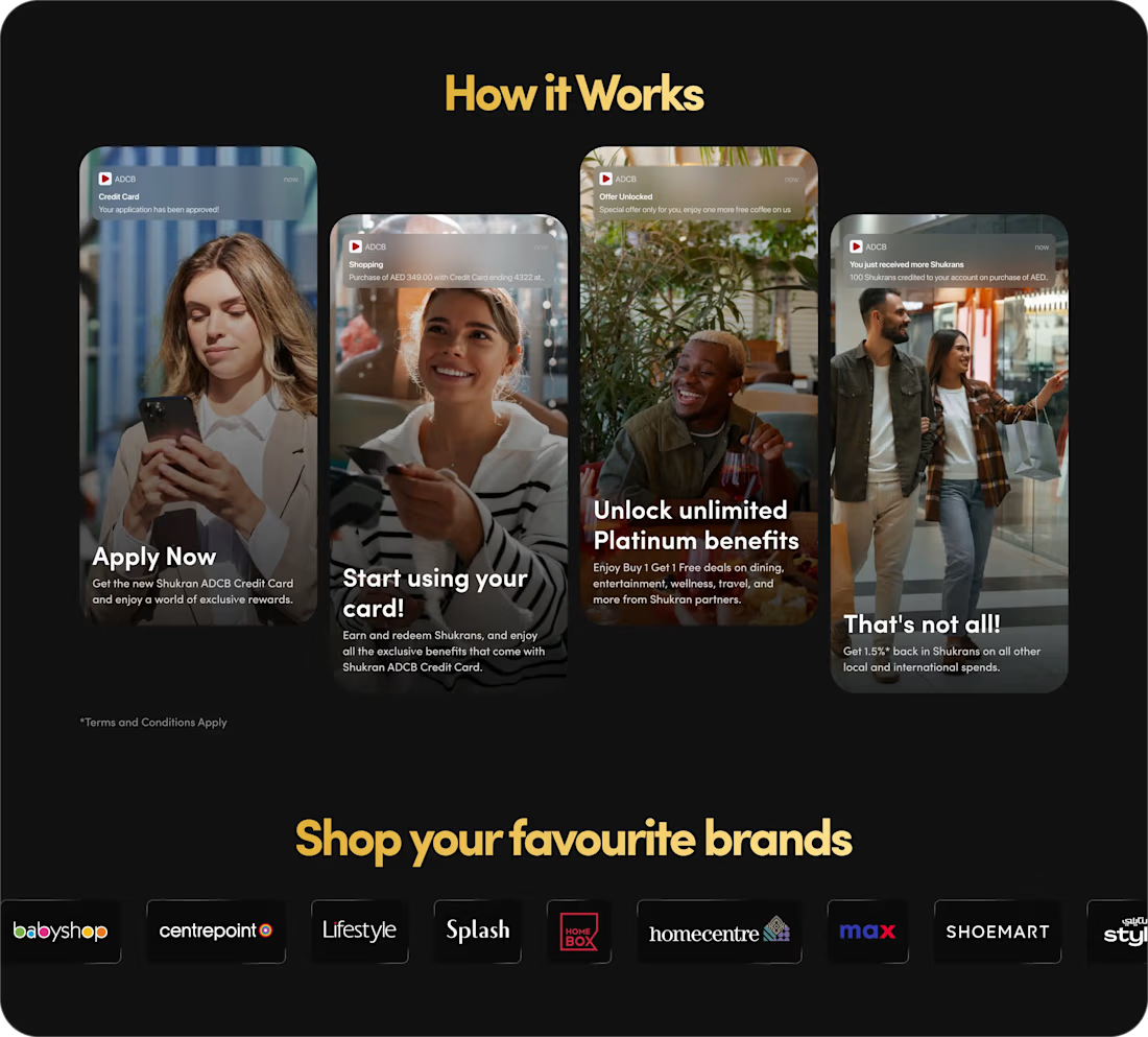
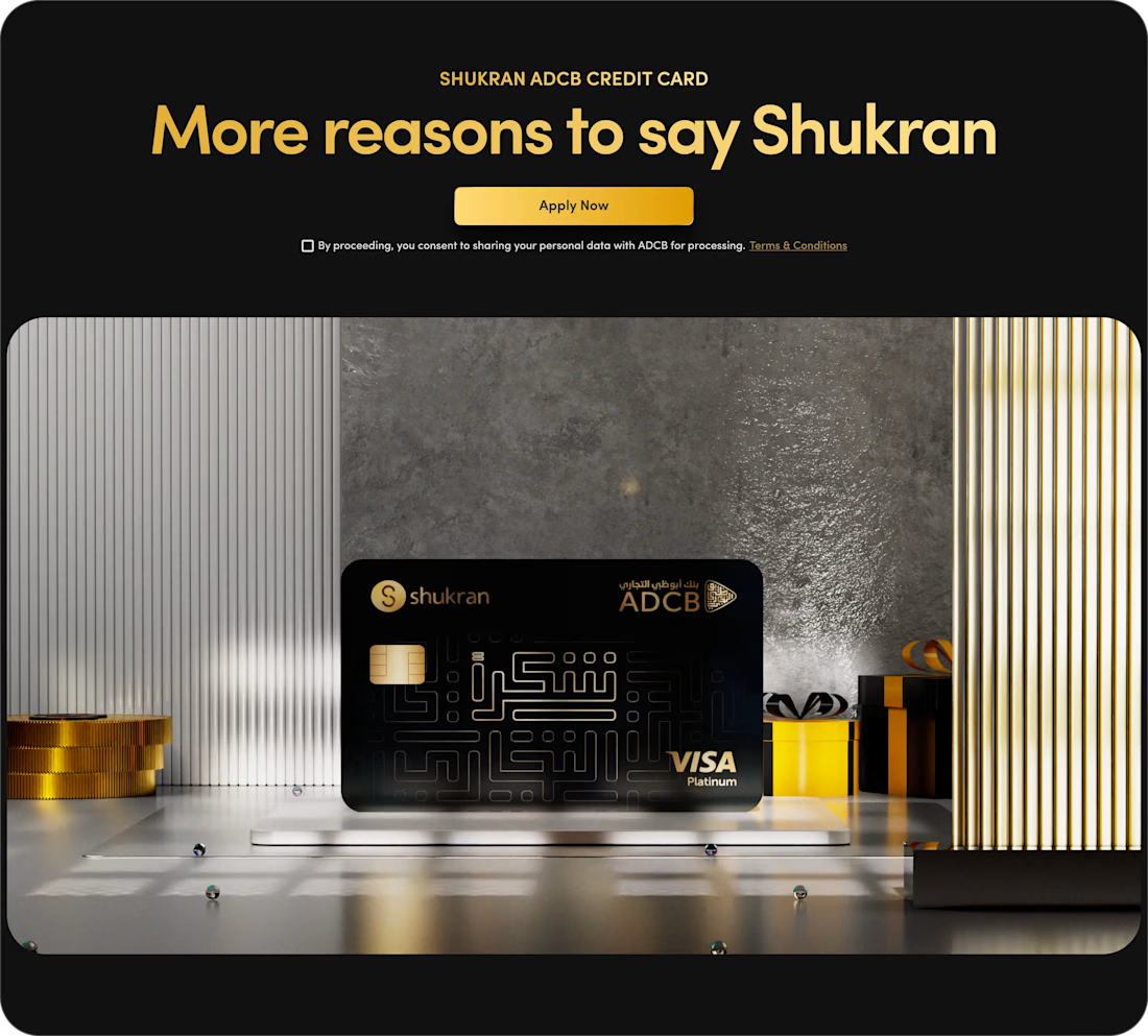
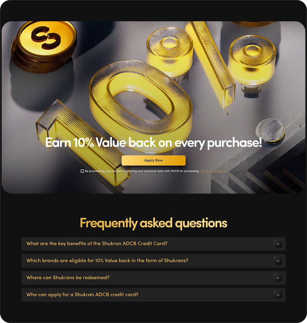

The benefits and application path are presented with clarity.

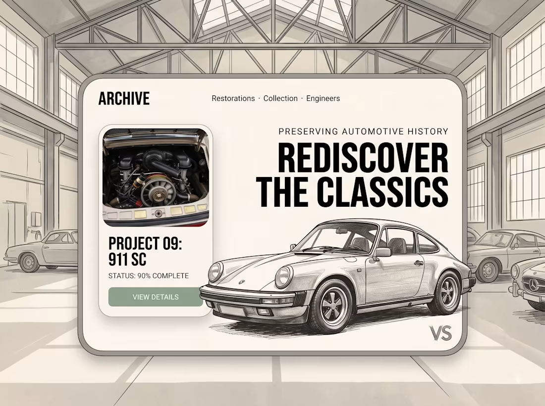
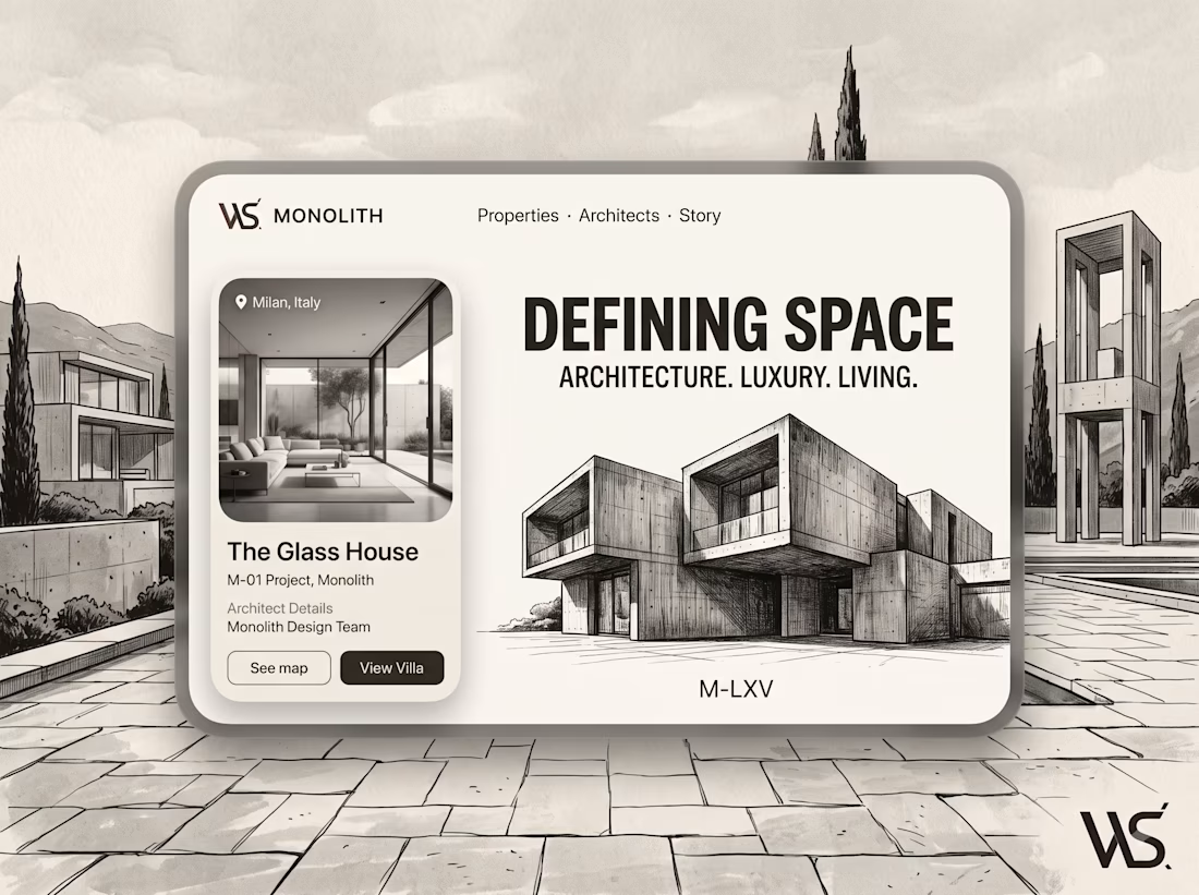
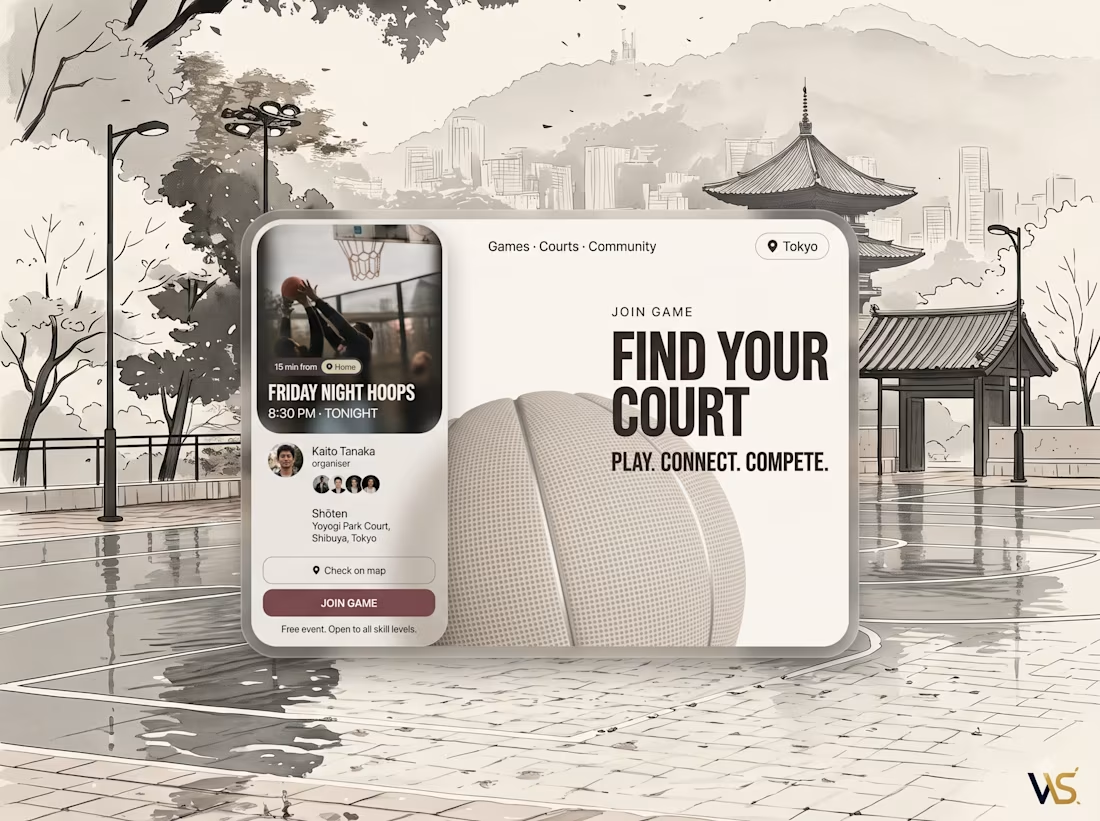
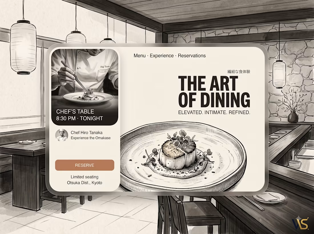
DIFFERENT BUSINESSES. DIFFERENT STORIES. ONE DIGITAL STANDARD. 🌐
From restaurants and cafés to beauty, sports, travel & e-commerce, we create custom digital experiences built around each brand.
Design • Development • UI/UX • AI • Automation
Different industries. Different styles. One goal — make every brand stand out.
Have an idea? Let’s build it. 🚀
#websolutions #webdesign #websitedesign #webdevelopment #digitalagency #uidesign #uxdesign #businesswebsite #branddesign #ecommerce #digitalexperience #ai #automation