The network for creativity
Join 1.25M professional creatives like you
Connect with clients, get discovered, and run your business 100% commission-free
Creatives on Contra have earned over $150M and we are just getting started
Back to feedPost
Taste Test

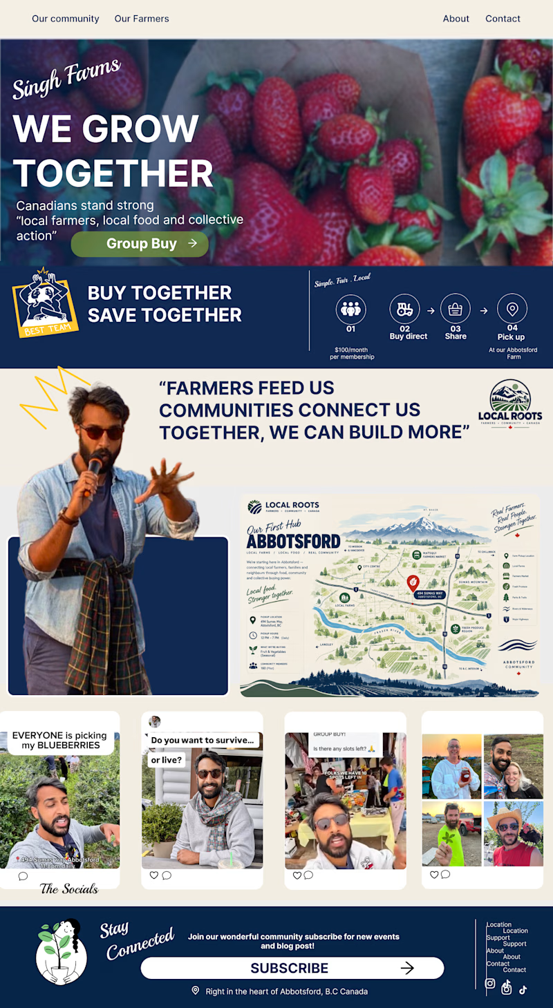
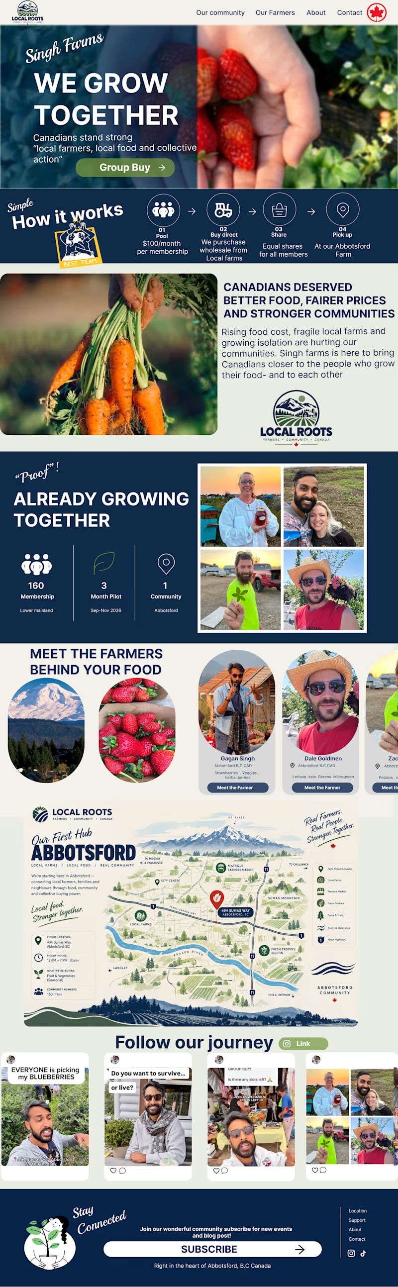
Here is two concept designs for a visual website proposal for a local farmer in Canada Abbotsford
I've done Research regarding what type of style would work and aesthetic to convey his message with his fellow communities and Canadians
What are your thoughts on this concept design ??? would love to hear them.

4 voted
80%
1 voted
20%
5 votes
Closed

Incredible work
Thank you for the kind words 🔥

The "We Grow Together" message comes through clearly in both, feels like it'd land well with a farming community. Did the research point you toward one direction before you even started designing, or did that come out closer to a coin flip?
Yes throughout his socials media's and the message he wanted to convey was this statement. I found to incorporate it into the design this way it stays true to his message and what he stands for ✨, thank you for your keen eye 👀 I'm glad it does

Option 1 wins it for me, the portrait of the farmer right up top makes it feel like a real person's business instead of a template. Curious what the farmer himself said when he saw both?
Thank you ! ✨ The farmer has not read the email just yet but I'll keep it updated. Thank you for your opinion as well ✨
The network for creativity
Join 1.25M professional creatives like you
Connect with clients, get discovered, and run your business 100% commission-free
Creatives on Contra have earned over $150M and we are just getting started











Related posts

Same design. Which palette? 👀
You picked your favorite preview last time. This time, I’m putting the colors to the vote.
One body-care packaging concept, with the same typography and composition:
A · Rose Cream, Strawberry Sorbet + Plum Jelly
B · Lime Mousse, Coconut Cream + Plum Jelly
Which would you choose and what does it make you feel about the brand?
Both palettes use colors and matching ingredient textures from DCS 654, my library of 654 dessert-inspired colors.
Take a closer look: dcs.mariya.design
7 voted
44%
9 voted
56%
16 votes
Closed

B is absolutely stunning 🎉🎉🎉🎉
Great job Mariya❤️

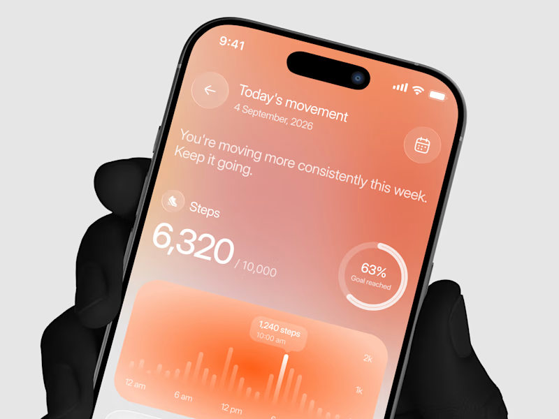
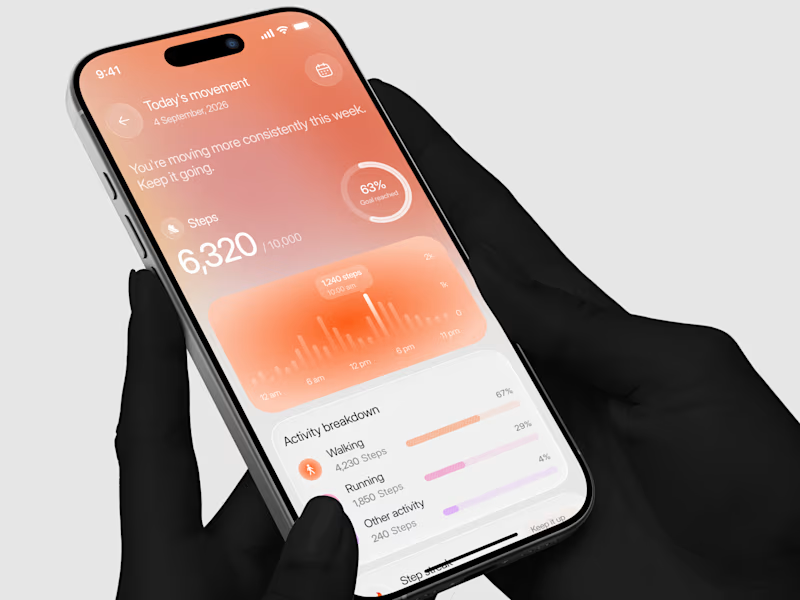
Designed a step tracking screen where you can see your daily progress and weekly trend in one glance.
Same screen, two shots. Which one would stop your scroll? 👀

11 voted
73%
4 voted
27%
15 votes
Closed


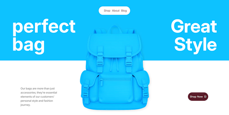
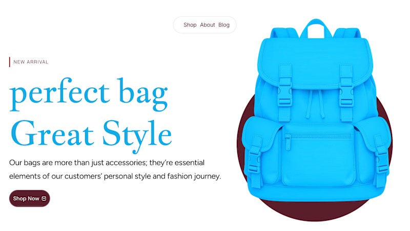
✨ Two Hero Concepts. One Bag Brand. Which One Wins? 👜
Exploring two different visual directions for Vellato, a fictional bag brand designed around everyday style, bold aesthetics, and modern fashion.
🔵 Option A: Bold Vibrant
🤍 Option B: Clean Editorial
If you were designing the digital experience for Vellato, which direction would you choose?
Option A or Option B?
Drop your vote in the comments! I'd love to hear which one catches your eye and why.

3 voted
60%
2 voted
40%
5 votes
Closed
Option A: Bold is great choice but you need make the blue tape darker to increase contrast ❤️❤️
Great job Orlerx🔥🔥