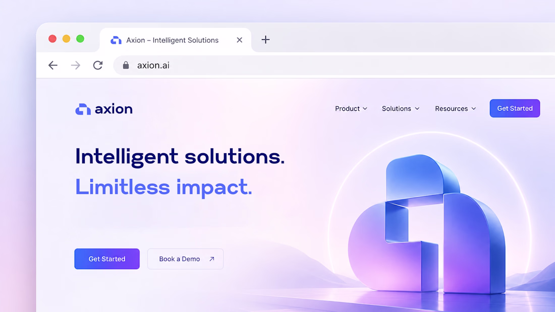
The network for creativity
Join 1.25M professional creatives like you
Connect with clients, get discovered, and run your business 100% commission-free
Creatives on Contra have earned over $150M and we are just getting started
Back to feedPost
Should brands be beautiful, or impossible to ignore?
When I designed the identity for Sandwich, an advertising agency, I quickly realized that a polished, predictable brand would be the wrong answer.
Inspired by the tight structure of a sandwich, I knew the identity had to feel bold, loud, and unapologetic. The logo and overall identity needed to grab attention.
That is what I find interesting about Neo Brutalism. It strips away the filters and lets the message hit harder with high contrast type and bold colors.
As it's hard to replicate with AI, do you think Neo Brutalism is a lasting design direction?
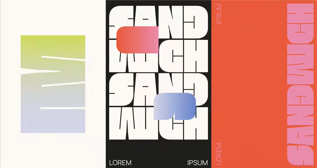
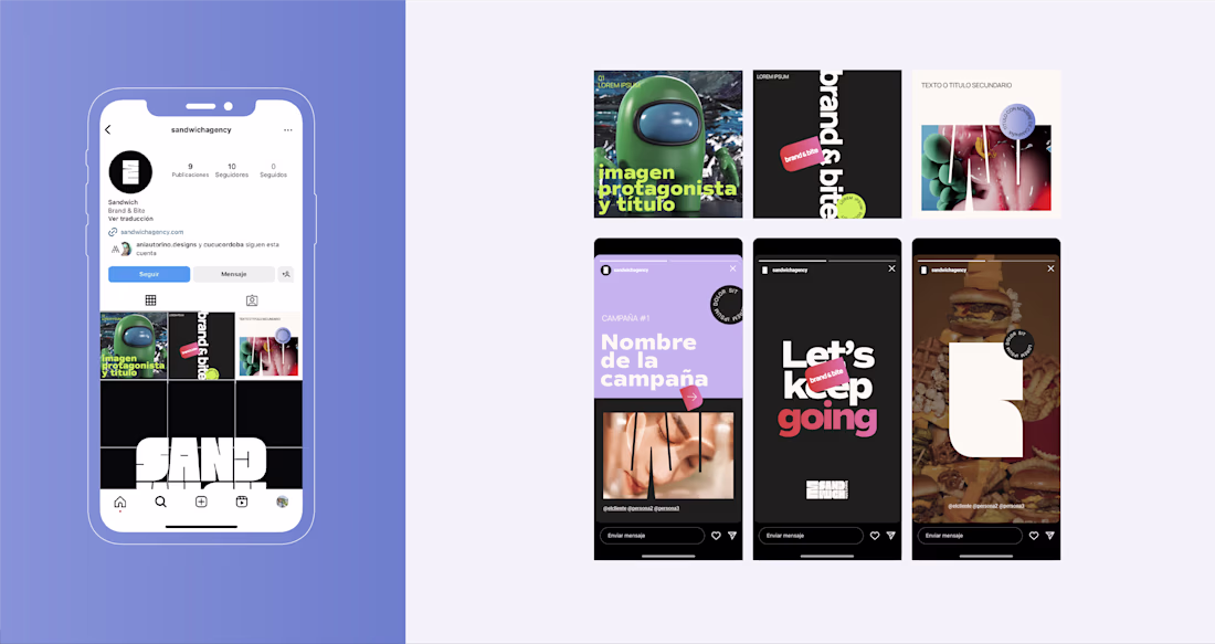
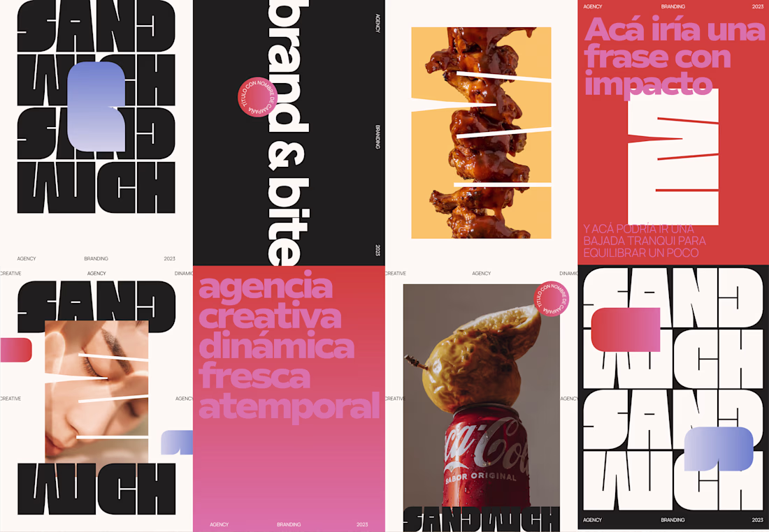
The stacked type treatment on the Sandwich identity is doing a lot of heavy lifting. Neo Brutalism works really well for an ad agency because the rawness actually signals confidence, which is exactly what clients want to buy. As a trend it may peak, but that kind of bold...
Cool
love this Anita!
Neat!
Amazing work🔥👏👏
Great choice for headline typography
Amazing
The network for creativity
Join 1.25M professional creatives like you
Connect with clients, get discovered, and run your business 100% commission-free
Creatives on Contra have earned over $150M and we are just getting started
Related posts
Recently wrapped up brand identity design for SaaS startup

smart design!
First Impressions: Brand's Make-or-Break Moment
Kevin Stirtz said, "Every contact we have with a customer influences whether or not they'll come back." Guess what? It's 100% true.
This is one quote I love so much. When working on a brand’s strategy, we always develop customer touchpoints, those moments where people first get to know your business. It could be through social media posts, a recommendation from a friend, billboards, ads, or your website.
These first touchpoints matter a lot. Many starting businesses overlook them, not realizing how much branding plays a role here. It’s often one of the biggest decision-making stages for customers. If the first contact feels off or rude, most people (including me) won’t go further.
That’s why first impressions are so important to me. I personally take time to respond to every comment and reply across my socials, because those are often people’s first contact with my brand.
Branding lays the foundation for these moments. While marketing and responses to enquiries are important, consistent branding and messaging ensure your brand feels the same across every touchpoint. It takes multiple interactions before someone decides to buy, and inconsistent branding can cause you to lose them before that point.
At Donatus, we dive deep into your business to shape first impressions and perceptions exactly the way you want, using design as the tool.
Want to work with us? Send a DM or email✉️to info@donatus.agency.
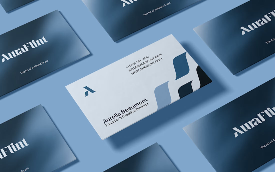
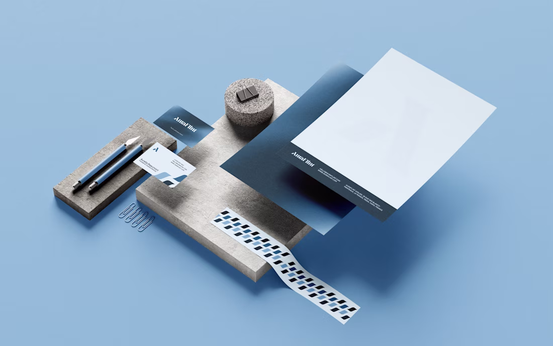
Logo Design & Branding for AuraFlint Atelier. ©2025

This is very apt, first impression is everything.
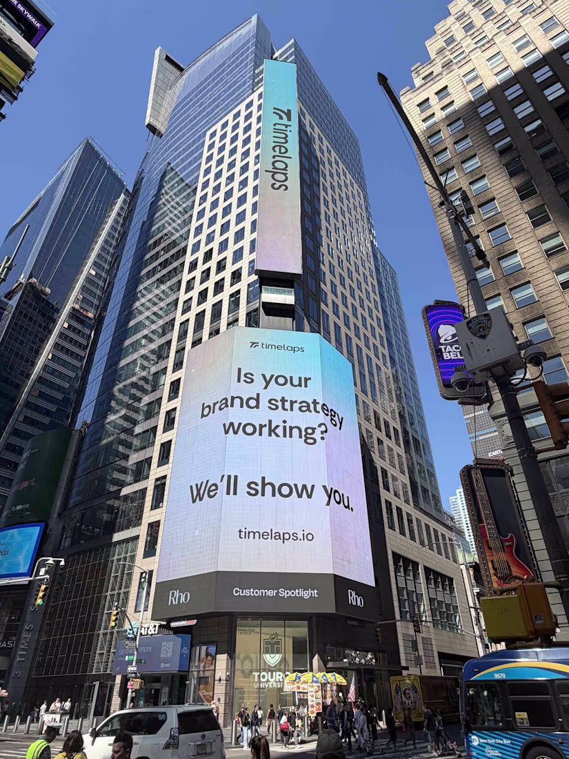
Earlier this week, Timelaps, a brand designed and developed by BrightStudios has been featured on a billboard next to Nasdaq.
Always an incredible feeling
PS full case study is available over on our profile
I saw this somewhere today (most likely on linkedin) and I knew I've seen this name/company somewhere.. now I remember. Well deserved! 🤘 🐐
Challenges
View allTrending
Claude
Claude has entered the design space. How are you using Claude Design?
Contra University
Learn from expert creatives how to earn more using next-gen AI tools.
MagicPath
The canvas is infinite, and exploration is becoming the workflow. How are you using MagicPath?
creativeaiflow
Creative AI workflows are evolving. What tools do you use, and what are their strengths and weaknesses?
freelancerlife
Freelancer life is wins, pivots, and everything in between. What’s yours right now?