The network for creativity
Join 1.25M professional creatives like you
Connect with clients, get discovered, and run your business 100% commission-free
Creatives on Contra have earned over $150M and we are just getting started
Back to feedPost
Taste Test

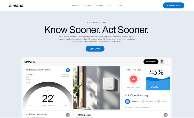
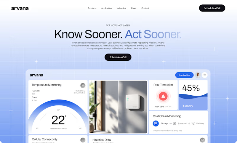
Worked on two hero directions for Arvana. Both show the same dashboard UI but the background treatment changes everything.
Which one do you click? 👇

6 voted
18%
27 voted
82%
33 votes
Closed

Blue Gradient

🔥

Blue gradient was better Farida 🎉🎉🔥🔥

Blue Gradient for sure! 🔥 It makes the dashboard pop and matches the “Know Sooner. Act Sooner.” urgency better. Flat Grey feels a bit too corporate for an IoT product like Arvana. The 22° temp card and 45% humidity card get much more focus with the blue background. Great work on both though!


Blue Gradient Dominate the Flat Grey...!! Nice work Farida.

I believe gradient colors catch everyone's eyes for good

Flat grey does it for me

Blue Gradient gets my vote. It gives the dashboard more depth and makes the hero feel noticeably more premium.


Blue Gradient for me. The soft blue light makes the site feel modern, fresh, and tech-forward right away.

Wild how much the background changes things with the same UI. The gradient pulls me in more, but flat grey feels calmer.

Blue gradient for me. It adds depth behind the dashboard card without fighting the headline.

love the detail in the matching gradient in 'act sooner' on blue!

Flat grey for me, lets the dashboard do the talking

The blue gradient gets my vote. It makes the white cards and the data charts pop perfectly. It feels like a much more premium software product.

Flat grey one

Outstanding Work❤️
The network for creativity
Join 1.25M professional creatives like you
Connect with clients, get discovered, and run your business 100% commission-free
Creatives on Contra have earned over $150M and we are just getting started











Related posts


A little peek at the brand work we did for Elio Mortgage.
A warm, approachable identity full of warm vibrant colors paired with soft sun rising inspired gradients, inner glows and custom illustrations & more. Loved this direction!
Full case study coming soon, from process to final identity.
Plenty of logo explorations to share too!


That color palette takes the whole identity to a different level!! I loove it.

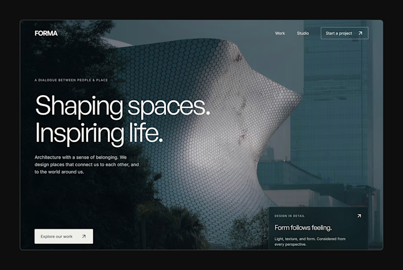
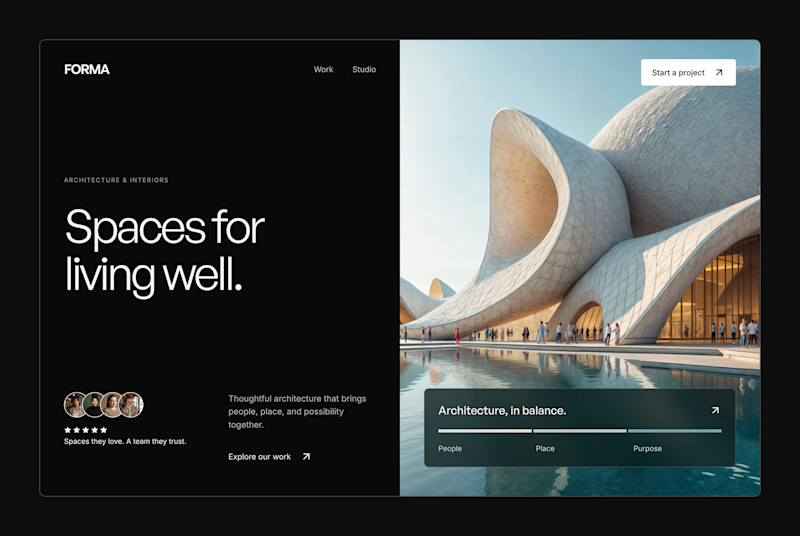
Design Exploration: Hero Section of Architecture Website. Which one do you think much better?


12 voted
43%
16 voted
57%
28 votes
Closed

