The network for creativity
Join 1.25M professional creatives like you
Connect with clients, get discovered, and run your business 100% commission-free
Creatives on Contra have earned over $150M and we are just getting started
Back to feedPost
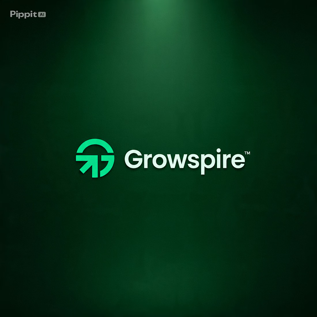
How do you design a brand that represents growth… without relying on the usual leaf or tree icon? 🌱🤔
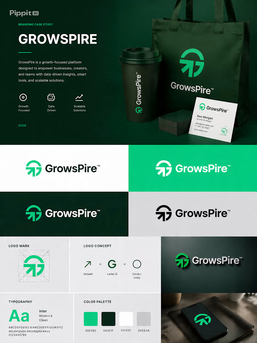
That's the creative challenge I explored with Growspire.
Growth is often visualized through plants, but I wanted this identity to feel more strategic, modern, and future-focused rather than predictable. Instead of following common symbols, I focused on upward movement, clean geometry, balanced proportions, and a minimal mark that communicates ambition, progress, and momentum.
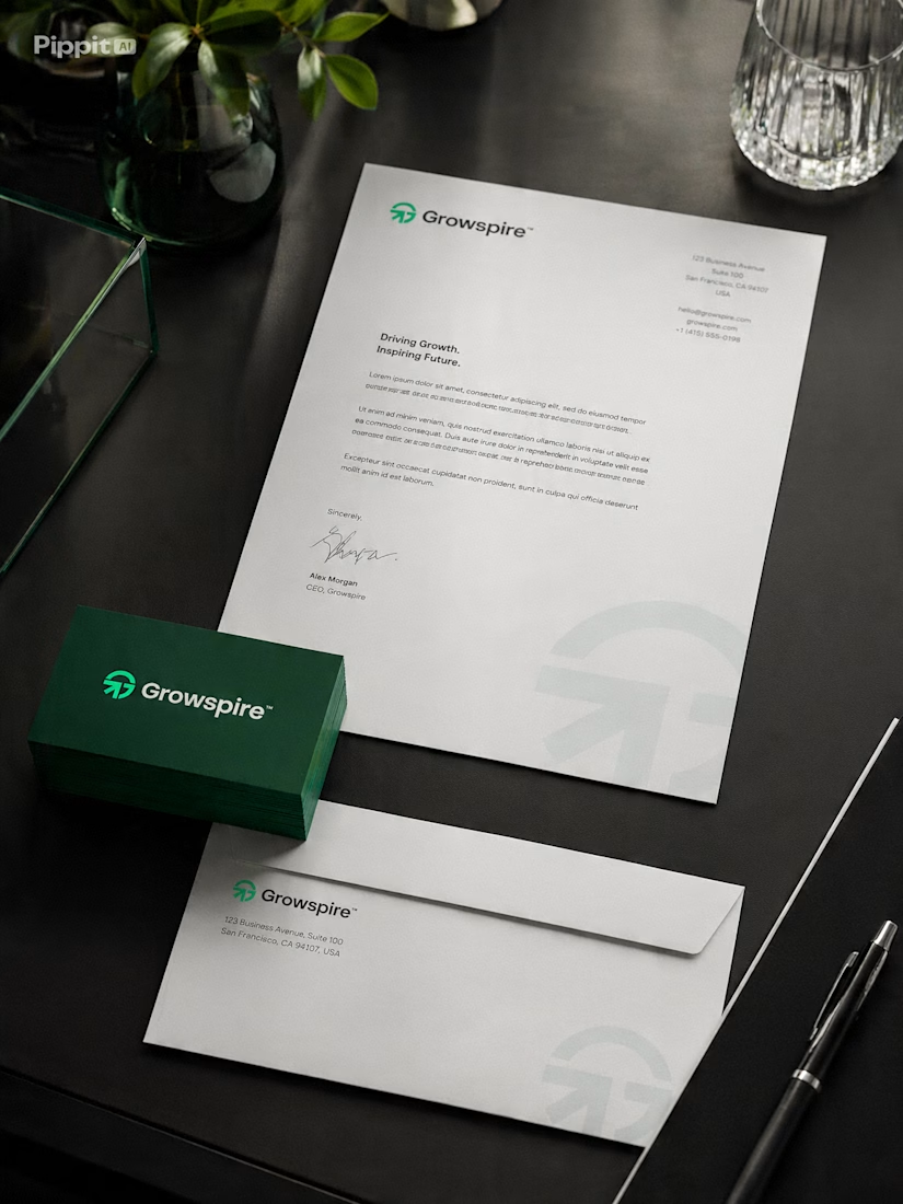
Every curve and angle was carefully refined to create a logo that feels timeless, scalable, and instantly recognizable across digital and print applications.
This is more than just a logo—it's the foundation of a brand built to inspire confidence, innovation, and long-term growth.
I'd love to hear your thoughts... If you had to communicate growth without using a leaf, what symbol or concept would you start with? 💬🌿


Beautiful execution.


Thanks Sir 😊

lovedit!
Thank You so much 🙌

Great work
Thanks Maam ♥
The network for creativity
Join 1.25M professional creatives like you
Connect with clients, get discovered, and run your business 100% commission-free
Creatives on Contra have earned over $150M and we are just getting started
Trending
retrofuturism
Share your favorite designs from the past exploring the distant future. Or your own take on the aesthetic 🚀
halftone
Dots. Texture. Grain. Let's see your designs using the halftone technique.

Midjourney
Creatives are showing off what they're making with Midjourney.
colorgrade
Video editors sound off: How do you enhance the mood of your video in color grading?
Related posts

A full brand identity for Down Bad Denim Co., a premium small-batch denim label specialising in embroidery, rhinestone embellishments, and statement-making fashion.
The brief called for a visual identity that feels expressive, fashion-forward, and unmistakably premium — equally at home in a boutique window and on a social feed.
We built a complete brand system covering the logo suite, typography, color palette, packaging, and label design. Every decision was made to match the quality and boldness of the product itself.

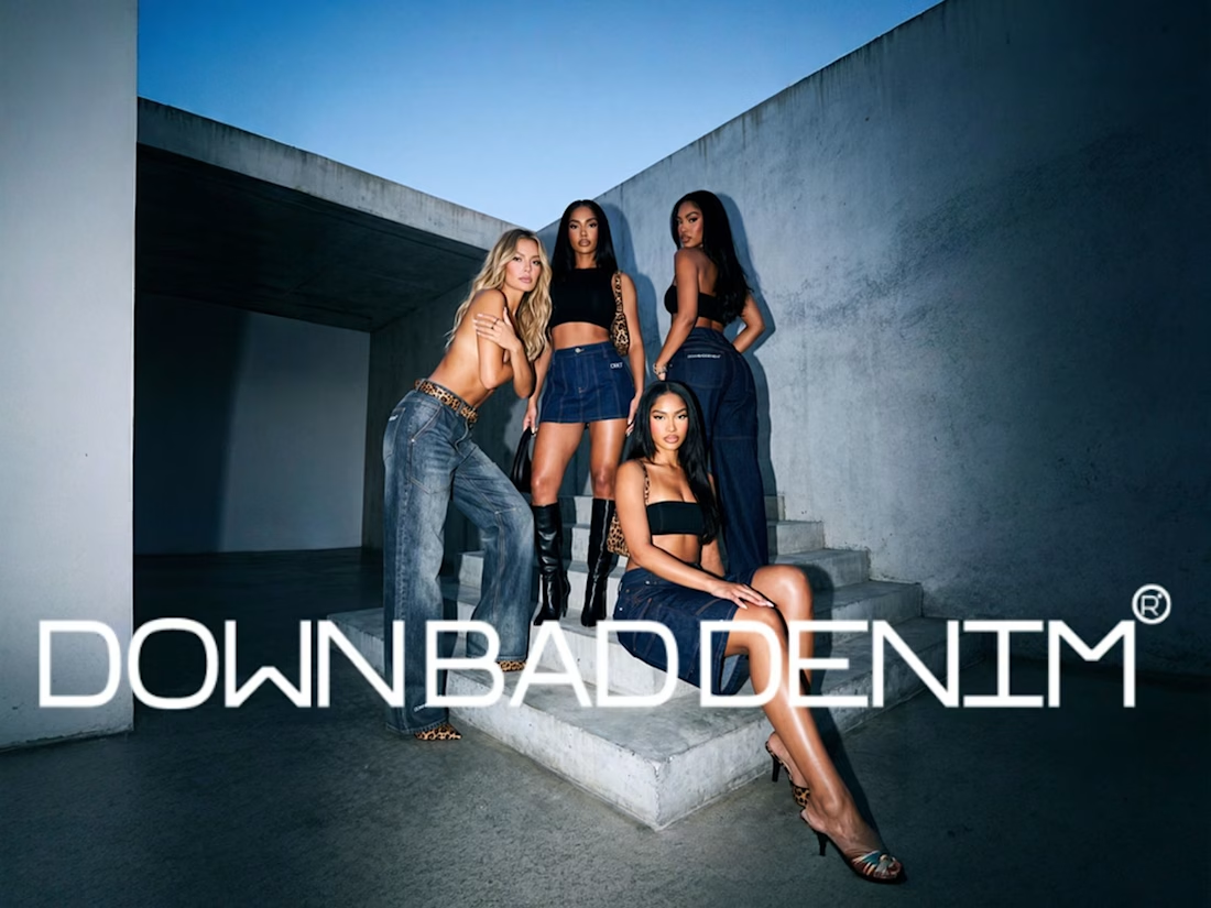
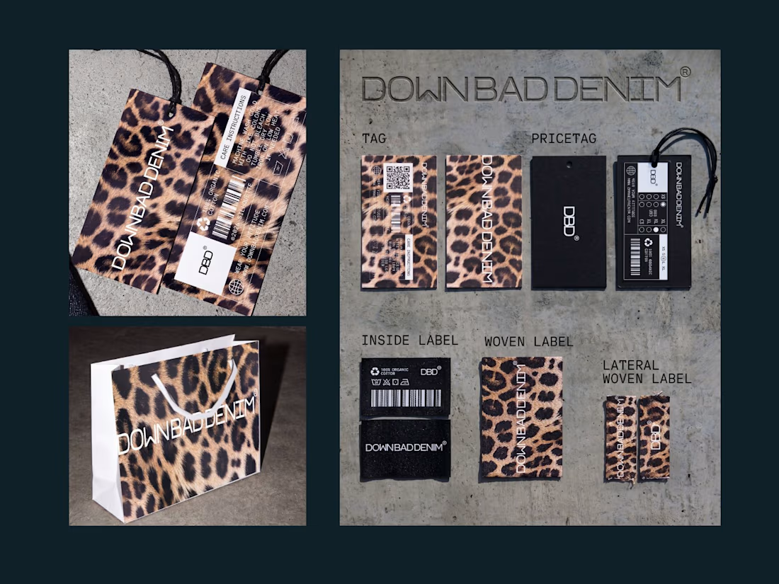

The leopard print carrying through the packaging and label design, not just the apparel, is what makes this feel like a real system instead of just a logo with some product shots attached. Did the client come in with rhinestones as a non-negotiable, or did you push for that during the process?

Branding & Hero Animation for Newly.app — AI App Builder
End-to-end branding and hero section design concept for an AI platform that turns ideas into native iOS and Android apps without writing a single line of code.
What we did:
→ Brand Identity: Visual language, color palette, and typography system.
→ Hero Section: Animation concept built around the metaphor of [insert your metaphor, e.g., "ideas transforming into live products"].
→ Motion & UX: Micro-interactions, transitions, and scroll behavior.
The Challenge:
Visually conveying the speed and "magic" of AI while maintaining a professional, tech-forward, and trustworthy image for founders and entrepreneurs.
The Result:
A high-impact hero animation that explains the product's core value proposition in under 3 seconds—capturing the feeling of [insert emotion, e.g., "turning a raw idea into a shipped product with total control"].
Tools: Figma, After Effects, Cinema 4D
Client: Newly


That hero animation is really clean. Love how quickly it shows what the product does.

A few years ago, I was brought in to design the brand identity and visual system for Freedom Church.
Recently, we came back to the logo for one more round of refinement.
There had always been something about it that felt just slightly off to me. I actually mentioned it during the original process, but at the time church leadership preferred the earlier version, so that’s the direction we kept.
This time, we went back and forth on the smallest details and I started digging into the actual geometry of the mark. The curves, spacing, weight, balance, and how each piece interacted with the others.
In the Illustrator screenshot, the white fill is the newly refined logo and the black outline behind it is the previous version. The differences are subtle, but when you see them together, they completely change how balanced the mark feels.
That refinement eventually became the app icon you see in the other image.
And now I genuinely can’t stop staring at it.
There are always things you can tweak in design, but this might be one of the rare times where I look at a logo and think: yeah, that’s it. It feels absolutely perfect now.