The network for creativity
Join 1.25M professional creatives like you
Connect with clients, get discovered, and run your business 100% commission-free
Creatives on Contra have earned over $150M and we are just getting started
Back to feedPost

A few years ago, I was brought in to design the brand identity and visual system for Freedom Church.
Recently, we came back to the logo for one more round of refinement.
There had always been something about it that felt just slightly off to me. I actually mentioned it during the original process, but at the time church leadership preferred the earlier version, so that’s the direction we kept.
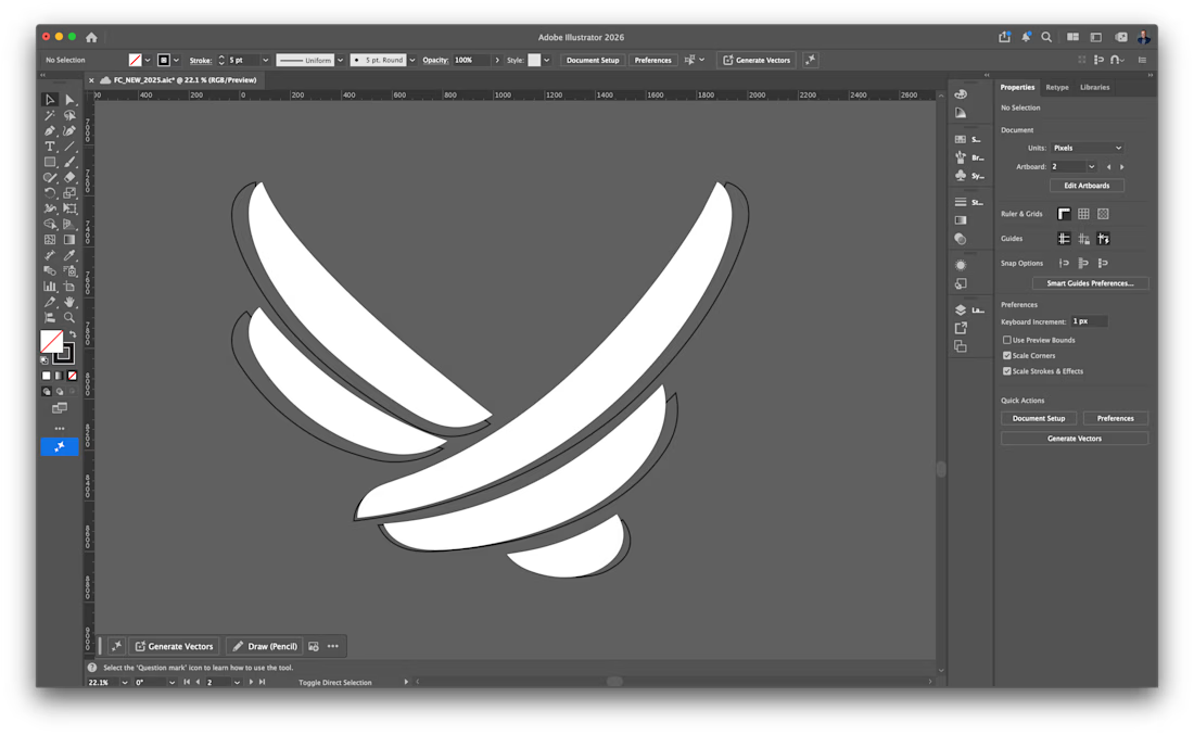
This time, we went back and forth on the smallest details and I started digging into the actual geometry of the mark. The curves, spacing, weight, balance, and how each piece interacted with the others.
In the Illustrator screenshot, the white fill is the newly refined logo and the black outline behind it is the previous version. The differences are subtle, but when you see them together, they completely change how balanced the mark feels.
That refinement eventually became the app icon you see in the other image.
And now I genuinely can’t stop staring at it.
There are always things you can tweak in design, but this might be one of the rare times where I look at a logo and think: yeah, that’s it. It feels absolutely perfect now.




Superb premium.
The network for creativity
Join 1.25M professional creatives like you
Connect with clients, get discovered, and run your business 100% commission-free
Creatives on Contra have earned over $150M and we are just getting started











Related posts

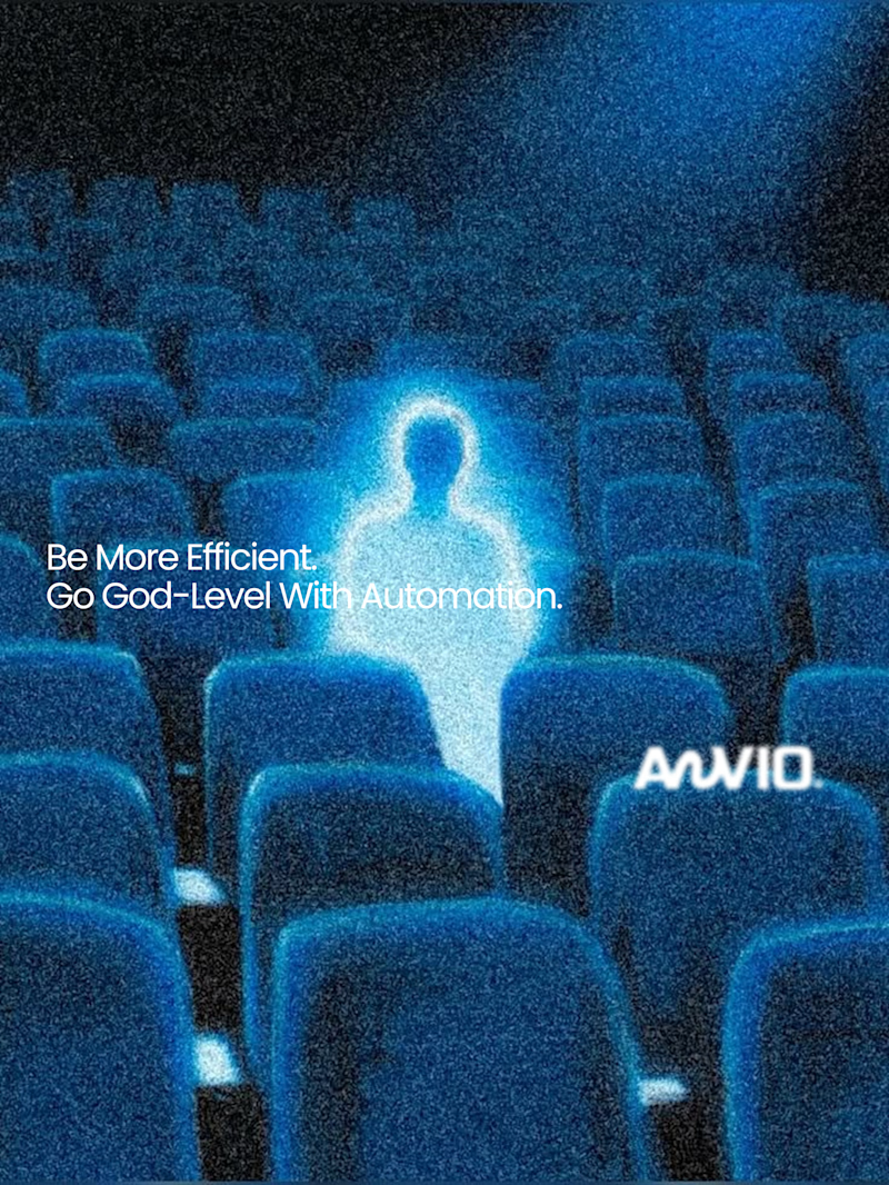
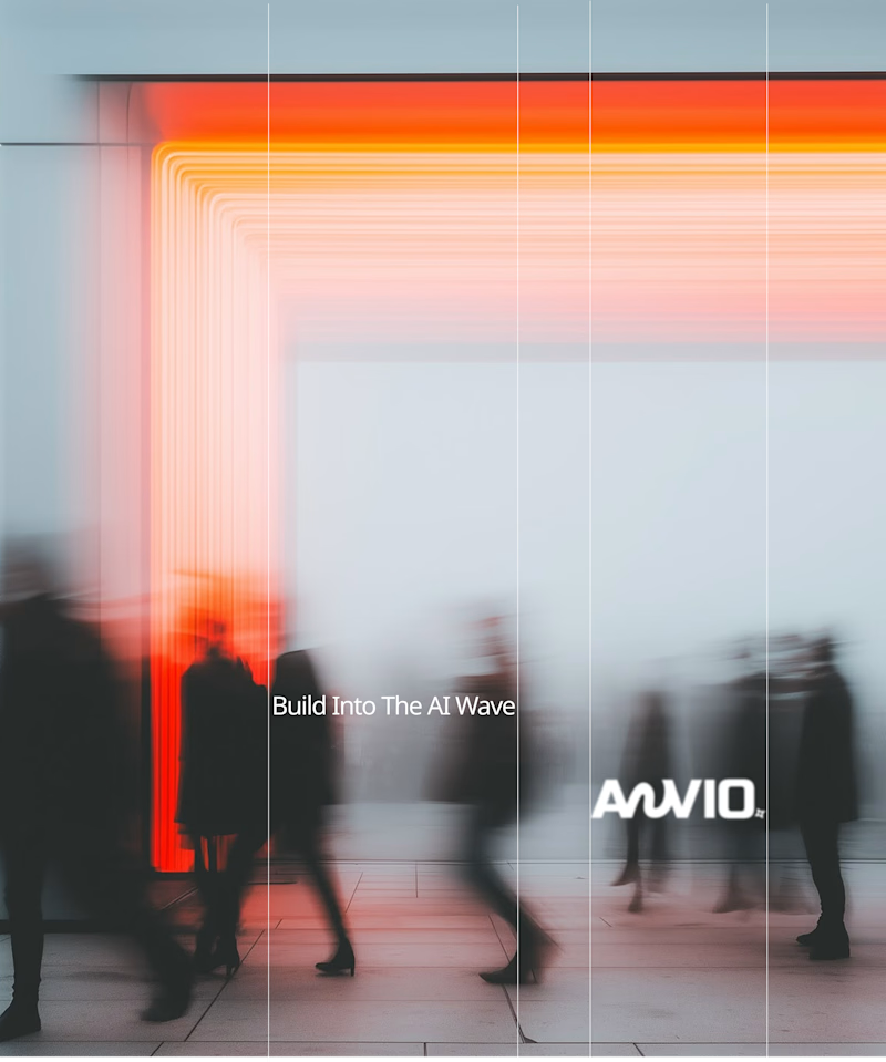
Which creative direction better communicates a Tech-Forward AI Brand Identity for anvio.online ?
25 voted
44%
32 voted
56%
57 votes
Closed

Fast vibrant energy gets my vote. The warm glow feels more human, which is nice for an AI brand.

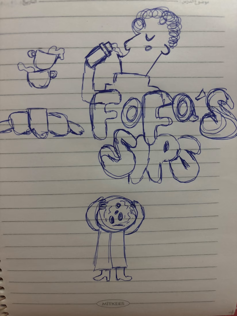
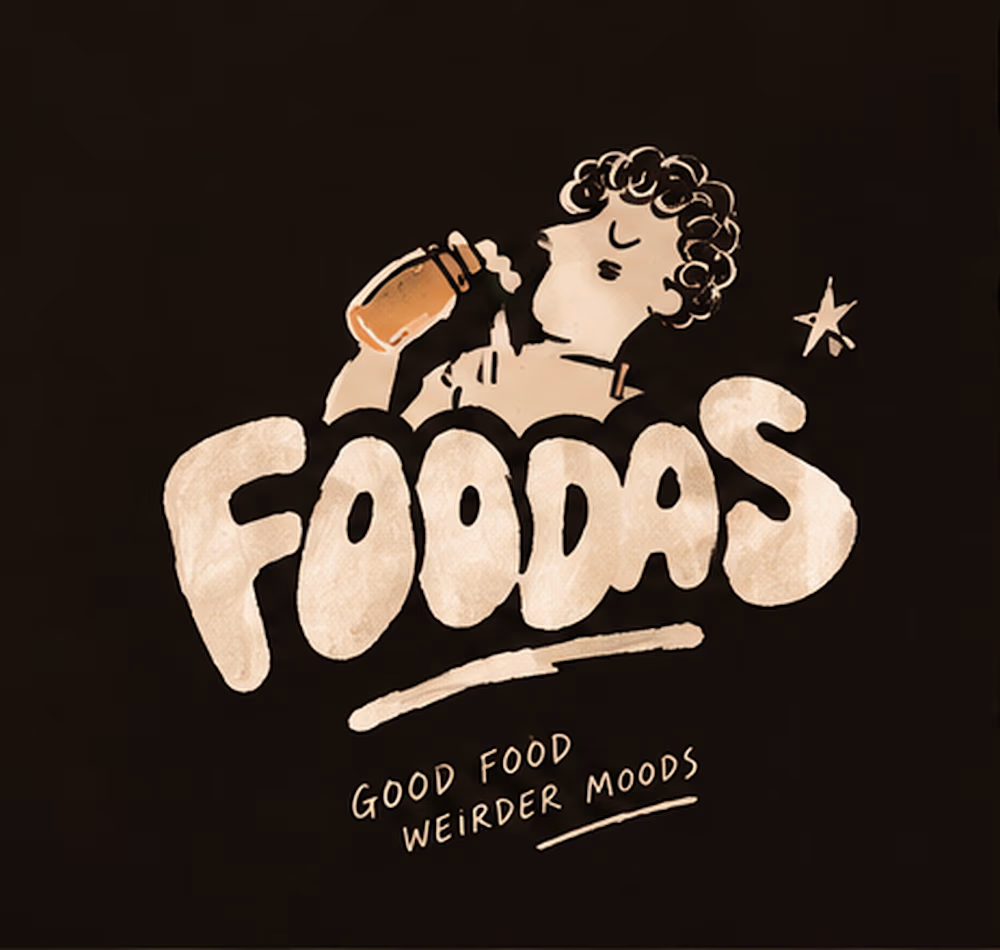
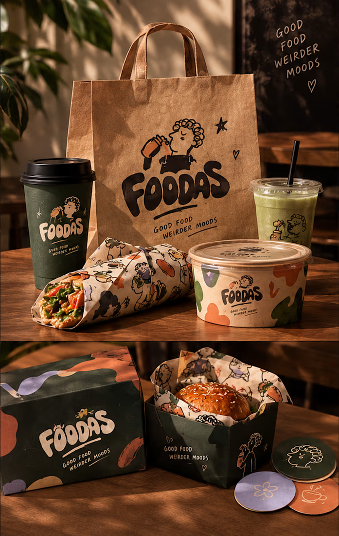
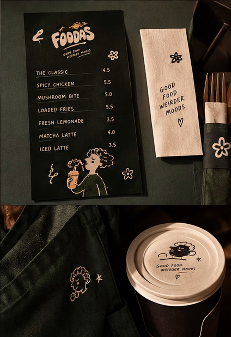
I turned one of my notebook doodles into a whole brand identity. And honestly this was way more fun than I expected I usually work on UI/UX and digital products so I wanted to take a step back from screens and explore something completely different: illustration-led branding.
I took my original FOODAS sketch and built an entire visual world around it from the logo and mascot illustrations to the color palette packaging, cups, and menus
The goal wasn't to make it look perfectly polished and predictable I wanted it to feel playful, a little weird, and still premium.
Now I'm curious about one thing:
Can playful, imperfect illustrations make a brand feel more premium or do you think premium branding needs to be more minimal?
I have a feeling designers will disagree on this one



ERA Coffee brand
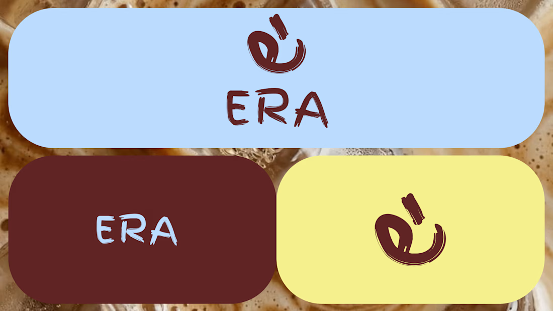
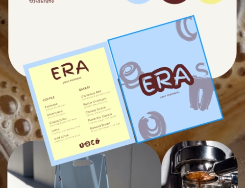
ERA Coffee is a contemporary café concept based in Panama, created around the idea of making everyday moments feel special. Its visual identity combines bold and vibrant tones blended together with expressive typography to create a modern brand that represents an era.
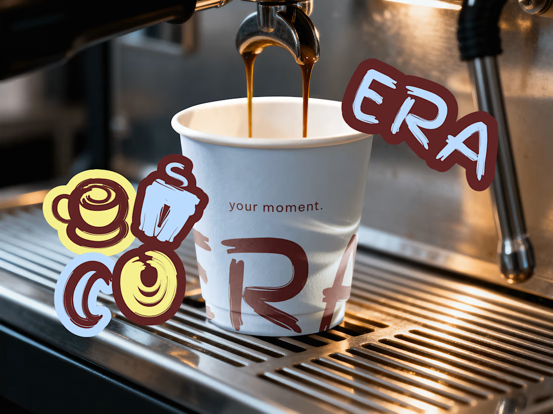
Premium branding