The network for creativity
Join 1.25M professional creatives like you
Connect with clients, get discovered, and run your business 100% commission-free
Creatives on Contra have earned over $150M and we are just getting started
Back to feedPost
Taste Test


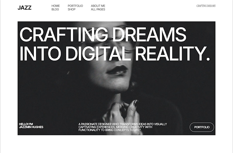
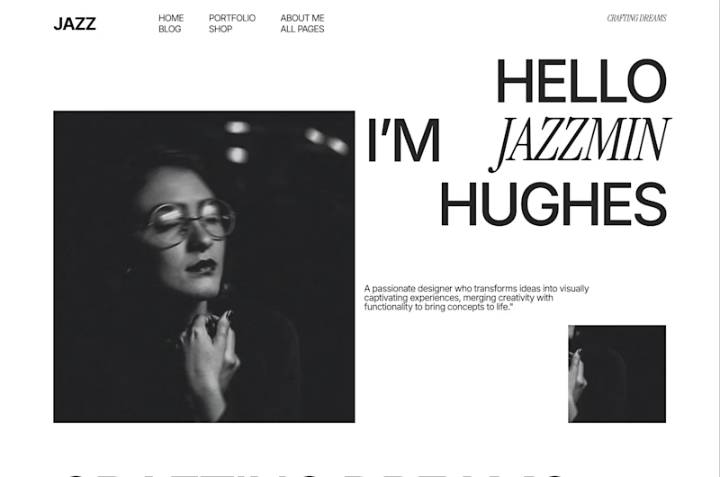
You’re looking for a designer and land on one of these.
Same person, same photo, two very different introductions.
Which one makes you want to see their work?


70 voted
52%
64 voted
48%
134 votes
Closed


the two intros feel very different. which one won?

Definitely the bold one. The massive type makes a much stronger first impression and actually makes you want to read what comes next.

love the editorial!

Editorial gives more personal tone and all elements look clear. The bold one shows text above the main image and that is not the best approach


editorial for me

editorial 😍

I understand that creatives can go very experimental with their landing pages to stand out, but visual hierarchy should never be compromised. I would personally go with the left one. It feels more premium, intentional, and custom, while the hierarchy is clearer and the overall composition feels stronger.

i like your style, amazing

In the second version. I like that the face is exposed; the girl looks relaxed.
In the first version, I like the emphasis on the lips; it adds a mysterious touch.


You know a few seconds ago I commented complaining about the text over the face but now that you mention the mysterious touch of the lips... Yes, I can see it.

Editorial makes me want to explore further. It feels personal and approachable whereas "Crafting dreams into digital reality" sounds like a generic agency tagline.

Editorial

Editorial gets my vote. Bold wins the first second, but Editorial feels more confident and makes me want to explore the work instead of the persona. I would use Bold for a campaign landing page and Editorial as the main portfolio entrance.

tough call, but editorial won me over!


I will go for editorial

Both look great, but i prefer bold.


loveeeeeee no. 1! not even close for me 🔥

now, it totally dependes on client's taste - both are best


I’d go with Bold. It grabs attention immediately and gives the portfolio a stronger first impression. The visual hierarchy feels more confident, and the design does a better job of making you want to explore what’s underneath.

I like editorial.

editorial looks more unique to me

this one because more organized and not really doing to much


voted editorial.. the bold one tells me who you are, the editorial one shows me how you think, and that is the thing a client is actually buying
curious which one is winning with the non designers in your votes

Editorial for me

I feel like the editorial has a more premium feel

Both are amzing

The bold version hits hard. That headline grabs attention fast, and the dark contrast gives it real authority.

Editorial draws me in here. Separating the portrait from the type makes the introduction easier to scan, and the mix of serif and sans-serif gives it personality. I’d follow it with a visible first project so the introduction quickly leads into evidence of the work.

👏🏻👏🏻👏🏻

Beautiful work with a strong visual concept. The composition, typography, and overall presentation feel very polished! 👏
The network for creativity
Join 1.25M professional creatives like you
Connect with clients, get discovered, and run your business 100% commission-free
Creatives on Contra have earned over $150M and we are just getting started











Related posts

Two camera distances for the same Movable Ink cut. One leans in, one shows the whole layout. 1 or 2.
10 voted
50%
10 voted
50%
20 votes
Closed

2 is more stunning the animations feels unique and that's unbelievable 🎉🎉🔥🔥
great job Blahomyr❤️❤️

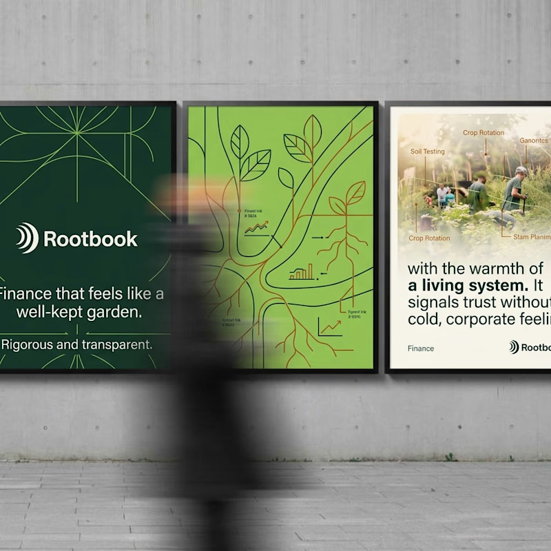
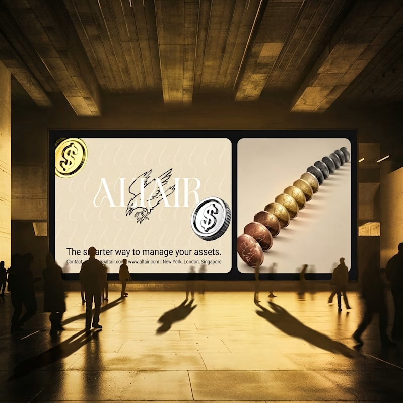
What does trustworthy finance look like to you?
A) Rootbook: Finance that feels like a well-kept garden.
B) Altair: The smarter way to manage your assets.
Two finance brands I’m designing, two completely opposite worlds. Which one gets your money?
28 voted
61%
18 voted
39%
46 votes
Closed
Rootbook wins for me. A finance brand that feels like a well kept garden is such a refreshing idea.

The team is cooking
Motion design for the logo we are making for Nation e-commerce


Wou