The network for creativity
Join 1.25M professional creatives like you
Connect with clients, get discovered, and run your business 100% commission-free
Creatives on Contra have earned over $150M and we are just getting started
Back to feedPost

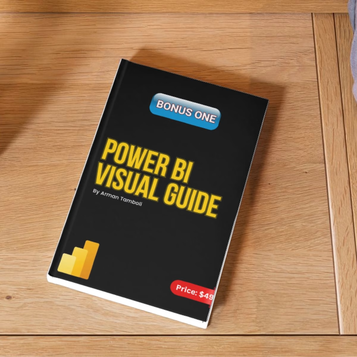
Using the wrong chart can make good data look confusing.
Most people know only 5 charts.
But there’s a right chart for almost every type of data.
Knowing which one to use can completely change how your data is understood.
Download this for FREE guide to know the importance of each chart.
The network for creativity
Join 1.25M professional creatives like you
Connect with clients, get discovered, and run your business 100% commission-free
Creatives on Contra have earned over $150M and we are just getting started








Related posts





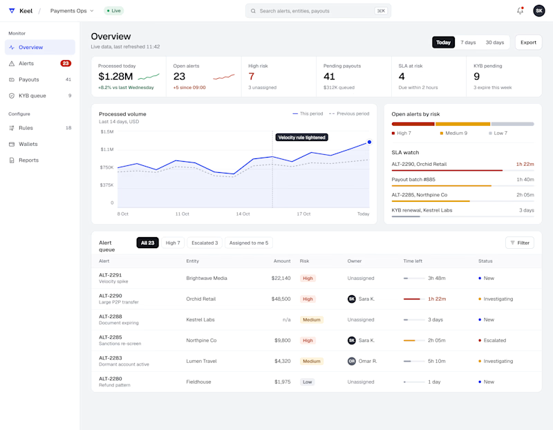
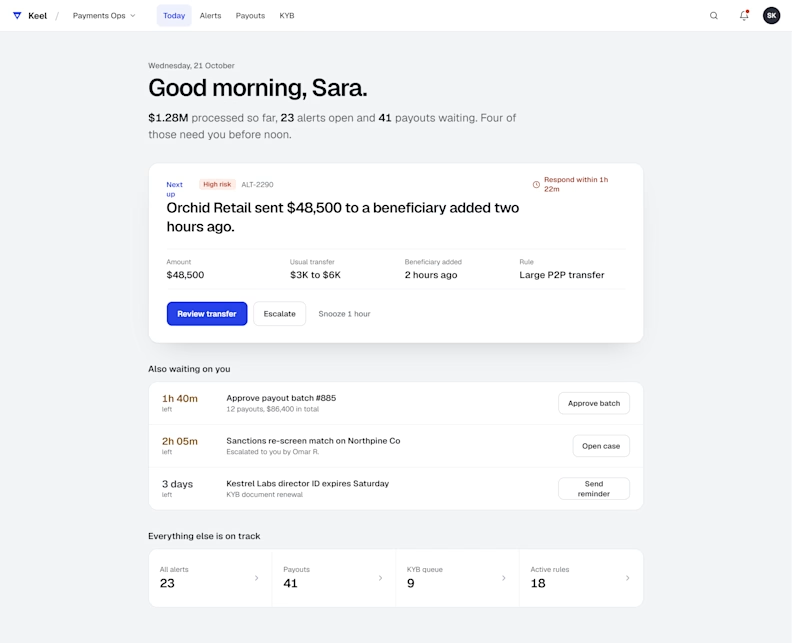
Both look great, but A feels more memorable at first glance.


Same data, two layouts. Comment A or B
2 voted
50%
2 voted
50%
4 votes
Closed

Both are fantastic. Rather than choosing have you though to offer them as toggles "focus first" to clear urgent tasks and "all in one" to track overall progress.


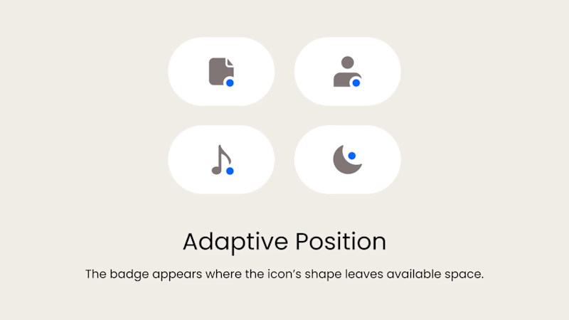
Badge Placement: Consistency or Visual Balance?
Even a small indicator can change how the entire interface feels
Adaptive Position
The badge placement changes depending on the icon’s shape and available space. The result feels more visually balanced but requires individual adjustments.
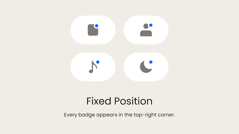
Fixed Position
The badge always appears in the top-right corner. This creates a consistent and predictable system, but on some icons it may feel disconnected or awkwardly placed.
What matters more in a design system: consistency or optical balance?
17 voted
43%
23 voted
57%
40 votes
Closed

Fixed for me. In a system, people learn where to look. I'd tweak the odd icons before breaking the rule.