The network for creativity
Join 1.25M professional creatives like you
Connect with clients, get discovered, and run your business 100% commission-free
Creatives on Contra have earned over $150M and we are just getting started
Back to feedPost
Taste Test


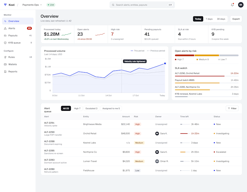
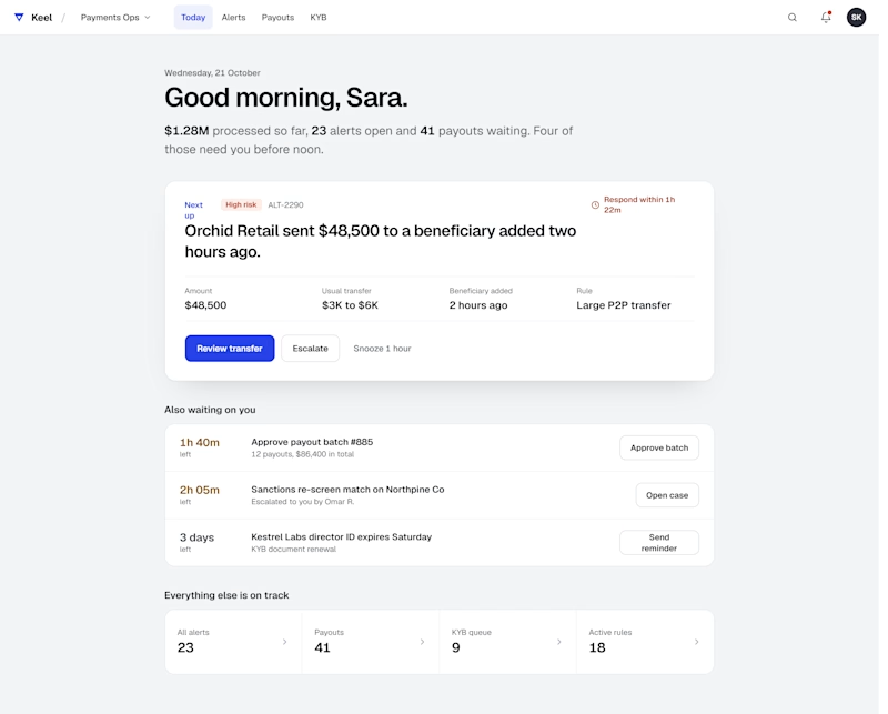
Same data, two layouts. Comment A or B
2 voted
50%
2 voted
50%
4 votes
Closed

I am with Sagar on this one. A answers the only question that matters first: what needs my attention right now. B looks calmer, but calm dashboards are the ones nobody checks. Which one did the users themselves lean toward?

All in one view

B. The focus first layout is calmer and easier to act on at a glance.


I’d go with A. It feels cleaner and makes the most important information easier to scan.

Both are fantastic. Rather than choosing have you though to offer them as toggles "focus first" to clear urgent tasks and "all in one" to track overall progress.
The network for creativity
Join 1.25M professional creatives like you
Connect with clients, get discovered, and run your business 100% commission-free
Creatives on Contra have earned over $150M and we are just getting started


Related posts

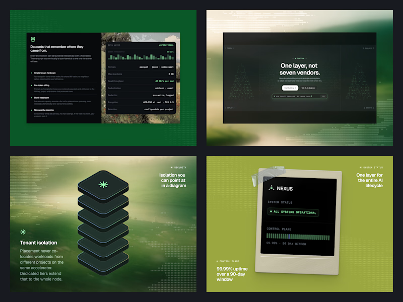
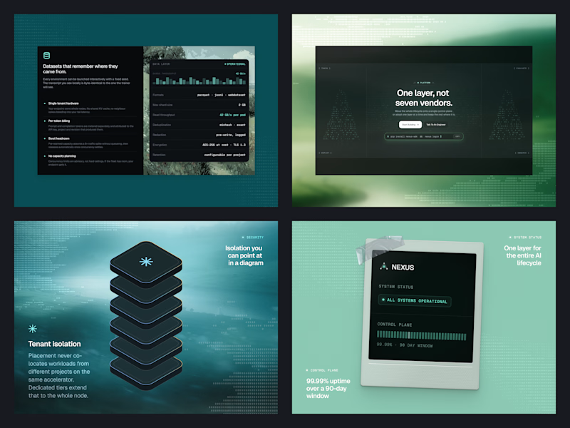
Same Nexus layout, two color moods. 🎨
A: Forest Green 🌿 feels fresh, natural, and calm.
B: Ocean Teal 🌊 feels cool, deep, and techy.
Which one are you picking? Drop A or B below! 👇
#ColorExploration #UIDesign #BrandColor #DesignPoll
0 voted
0%
2 voted
100%
2 votes
Closed
B, Ocean Teal. It sits more calmly against the dark panels, the green gets a bit loud.

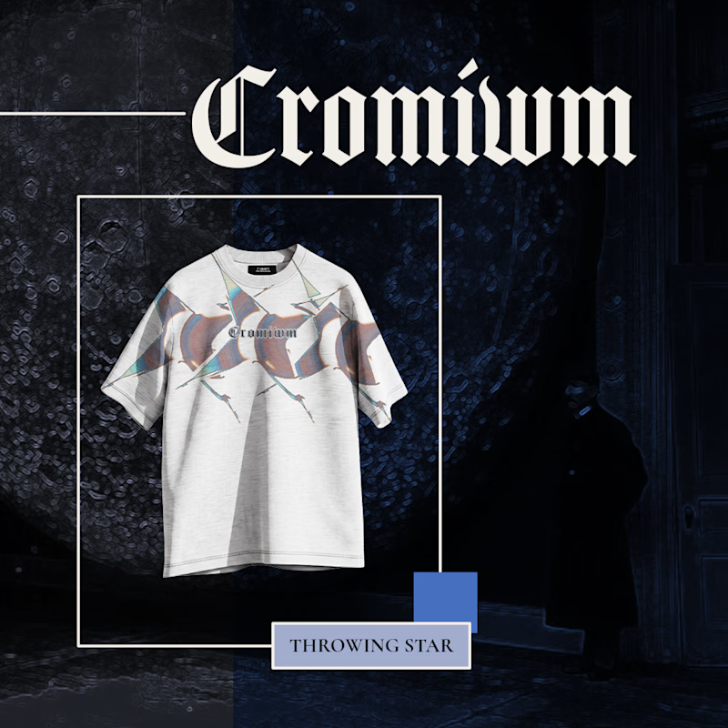
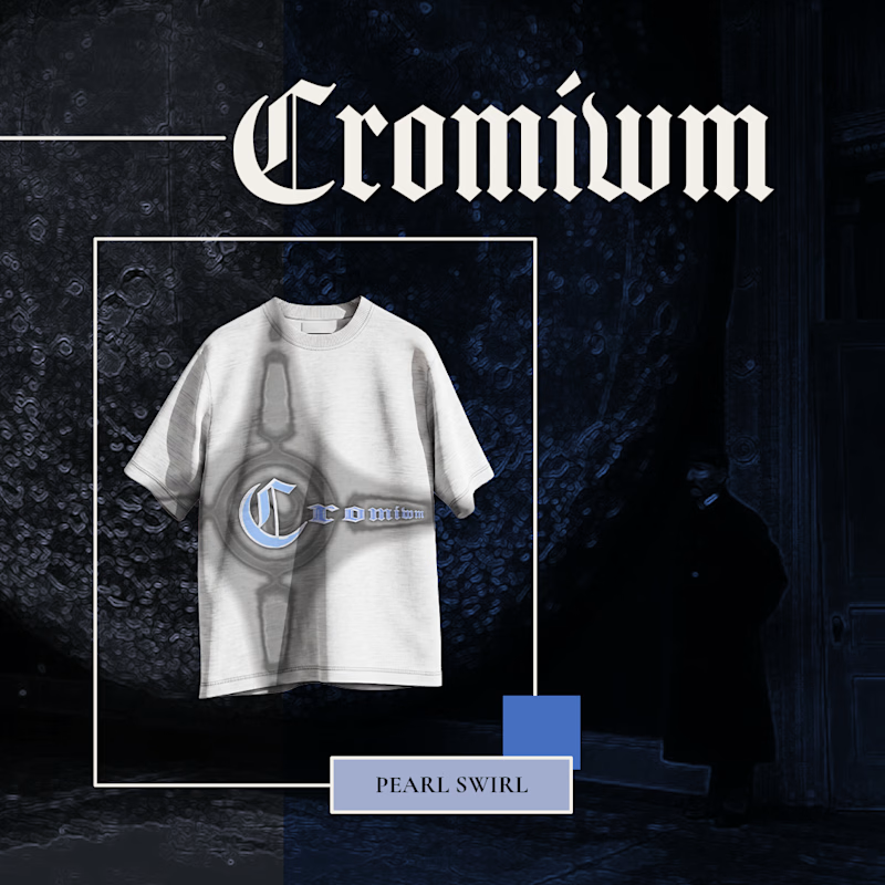

Pearl Swirl for me 🌀 That chrome emblem pairs really well with the gothic logo.

Same content, two different settings.
One designed to be seen on a big conference screen, the other experienced through a compact device. It's interesting how the same visuals can feel different depending on where they show up.
Which setting do you think brings the content to life better?
4 voted
57%
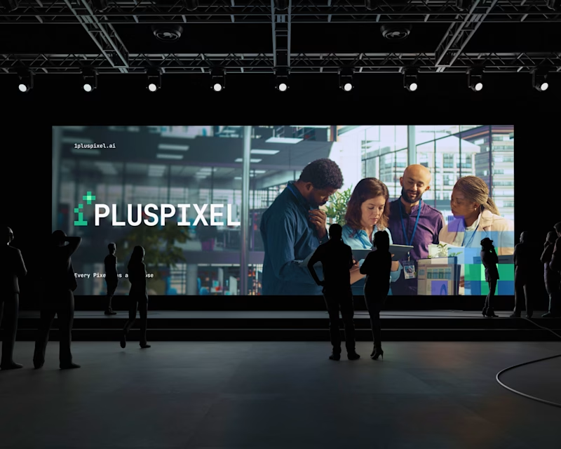
3 voted
43%
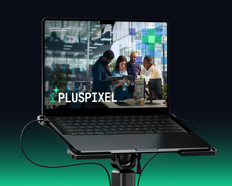
7 votes
Closed

Big screen 🔥