
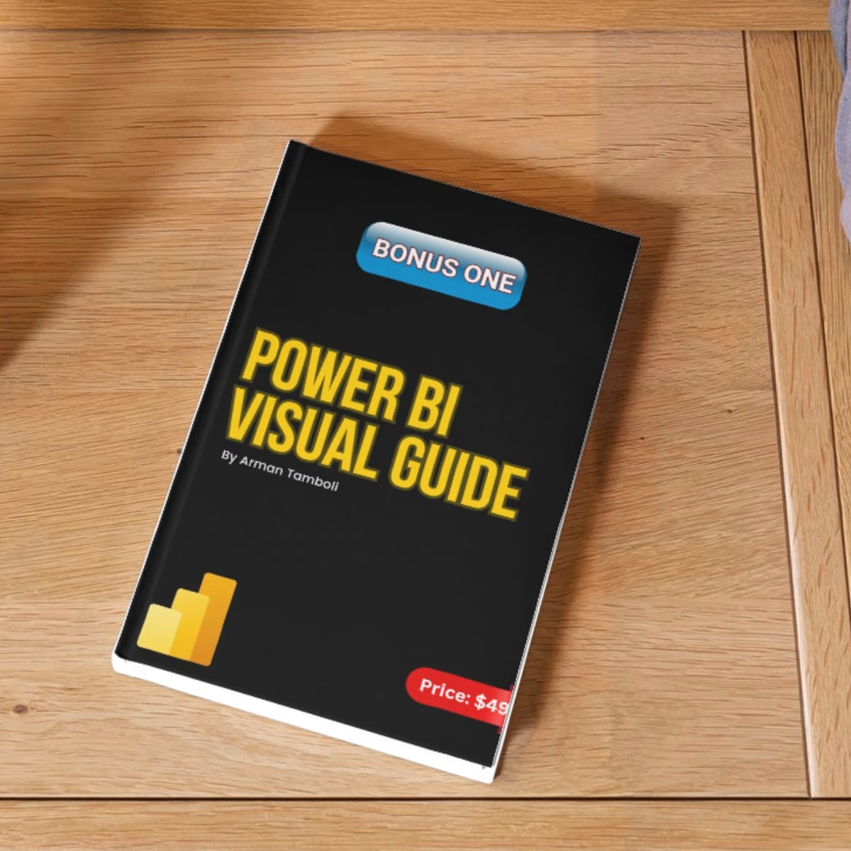
Using the wrong chart can make good data look confusing.
Most people know only 5 charts.
But there’s a right chart for almost every type of data.
Knowing which one to use can completely change how your data is understood.
Download this for FREE Guide to know the importance of each chart.
Get it for$0.00
Tags
Microsoft Excel

Tableau

Data Analyst
PowerBI
Data visualization
Product created by
Arman Tamboli Pimpri-Chinchwad, India
- 46
- Followers
Arman's other products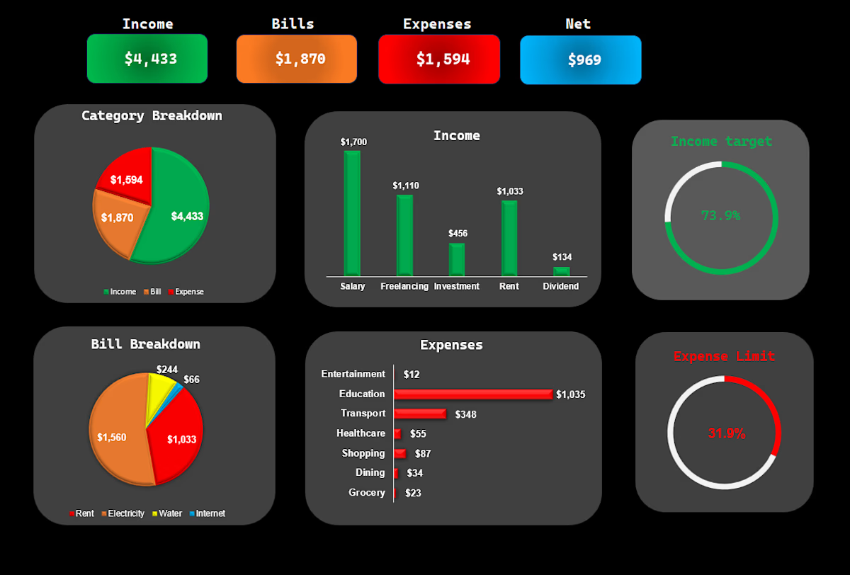
Automated Income & Spending Dashboard
$49.00
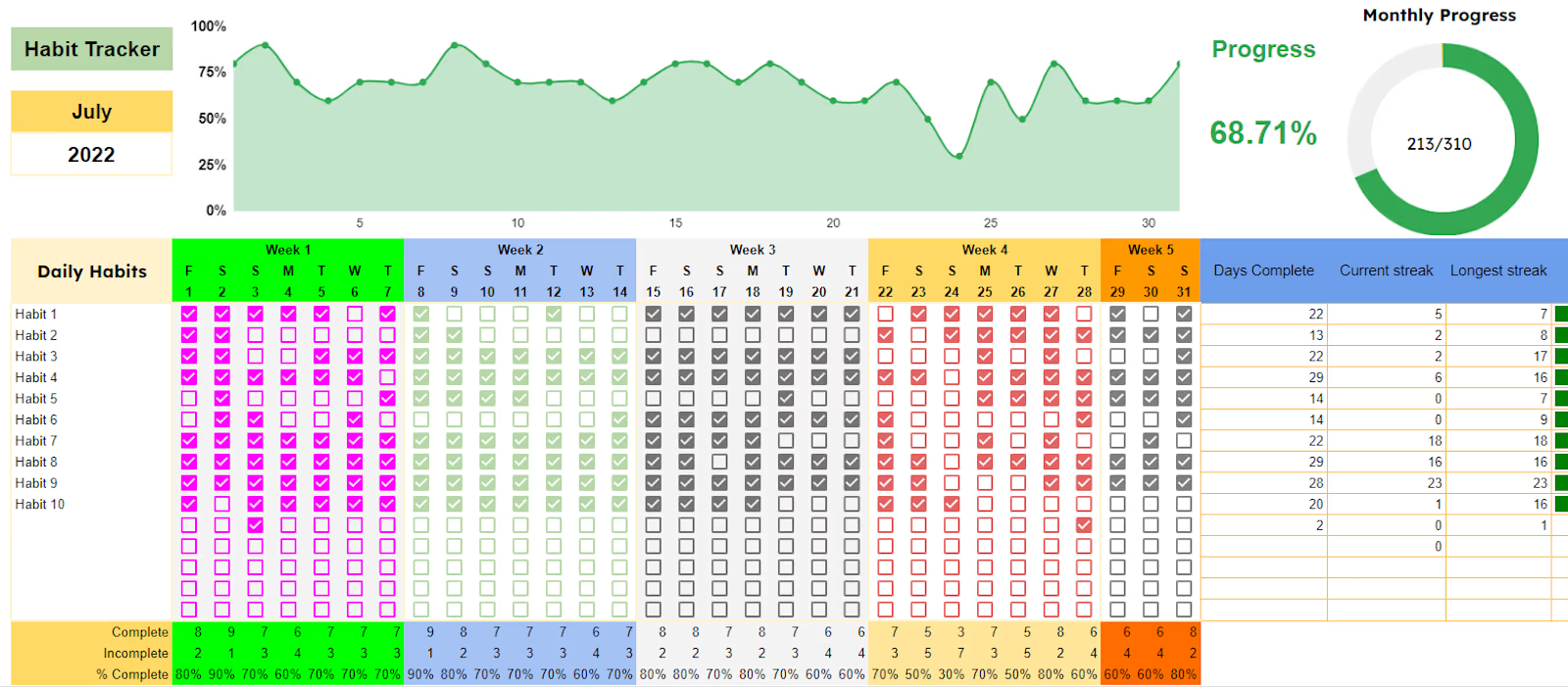
Automated habit tracker
$49.00
Get it for$0.00
Tags
Microsoft Excel
Tableau
Data Analyst
PowerBI
Data visualization
Using the wrong chart can make good data look confusing.
Most people know only 5 charts.
But there’s a right chart for almost every type of data.
Knowing which one to use can completely change how your data is understood.
Download this for FREE Guide to know the importance of each chart.
Arman's other products
Automated Income & Spending Dashboard
$49.00
Automated habit tracker
$49.00
$0.00