The network for creativity
Join 1.25M professional creatives like you
Connect with clients, get discovered, and run your business 100% commission-free
Creatives on Contra have earned over $150M and we are just getting started
Back to feedPost
Taste Test
Badge Placement: Consistency or Visual Balance?
Even a small indicator can change how the entire interface feels
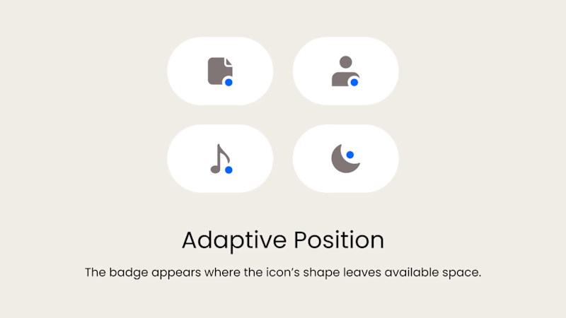
Adaptive Position
The badge placement changes depending on the icon’s shape and available space. The result feels more visually balanced but requires individual adjustments.
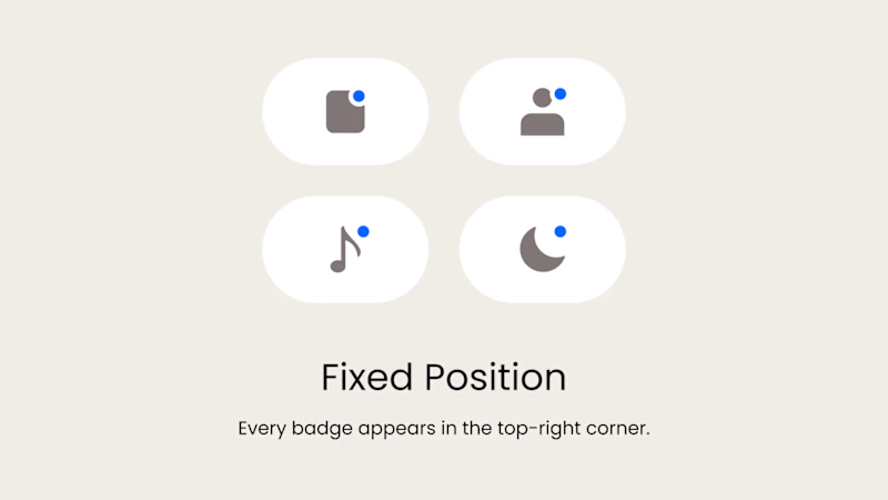
Fixed Position
The badge always appears in the top-right corner. This creates a consistent and predictable system, but on some icons it may feel disconnected or awkwardly placed.
What matters more in a design system: consistency or optical balance?
17 voted
43%
23 voted
57%
40 votes
Closed

Fixed for me. In a system, people learn where to look. I'd tweak the odd icons before breaking the rule.

Voting adaptive on this one. A badge that respects each icon's shape feels more considered, even if it takes a little extra craft per icon.

Nice breakdown, Serge!

Fixed one got my vote. Amazing

i feel like fixed is the way, to keep the consistency and make it simpler for the user to catch & understand icon meaning:)!

love the fixed position , the simplicity is top notch 😍

they are beautiful

Adaptive, but rule-bound. Consistency in a system isn't the same pixel position — it's the same logic, every time. If the offset is defined per icon shape and available space, people still learn where to look, because the rule never changes; only the geometry does. Fixed breaks...

I’d use a fixed anchor with small optical offsets for unusual icon shapes. Keeps the badge predictable without forcing every icon into the same geometry. Those exceptions could live in the component variants.

I'd go adaptive for a small icon set. Users won't notice the rule, but they will notice a badge floating awkwardly off a round icon. Optical balance wins here for me

Adaptive for me
The network for creativity
Join 1.25M professional creatives like you
Connect with clients, get discovered, and run your business 100% commission-free
Creatives on Contra have earned over $150M and we are just getting started











Related posts


Your Hero Section Has One Job: Be Clear.
You don’t need huge headlines or long explanations. You need the right image + short headline + clear offer.
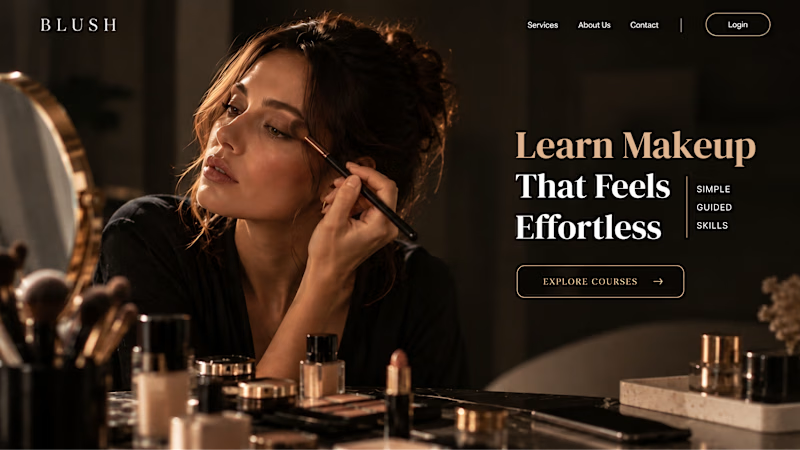
For the first version, we worked on the branding, the image and the copy together, so at first glance it’s clear: this is a makeup course, and here’s what you’ll get.
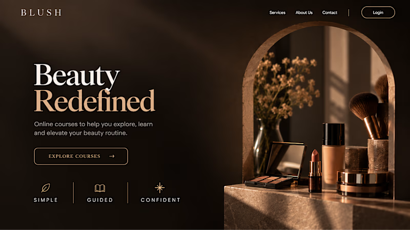
The second version is still beautiful and still feels like beauty. But what are you actually getting? A makeup course? Products? A store? That’s the problem with a Hero that looks good but isn’t thought through.
Your first screen doesn’t need to say everything. It just needs to say the right thing.

22 voted
61%
14 voted
39%
36 votes
Closed


AI can build the UI in minutes.
Bringing it up to a good standard, still needs a designer. Agree or disagree?

I see some of your work and honestly your work is really premium 🎉🎉
Great job Alex🎉🎉🔥🔥

Which colour palette would you choose for the banner design for a domain business? 🔥 Fiery or 🧊 Frosty?
20 voted
36%
35 voted
64%
55 votes
Closed

Frosty seems really cool for me!!