The network for creativity
Join 1.25M professional creatives like you
Connect with clients, get discovered, and run your business 100% commission-free
Creatives on Contra have earned over $150M and we are just getting started
Back to feedPost
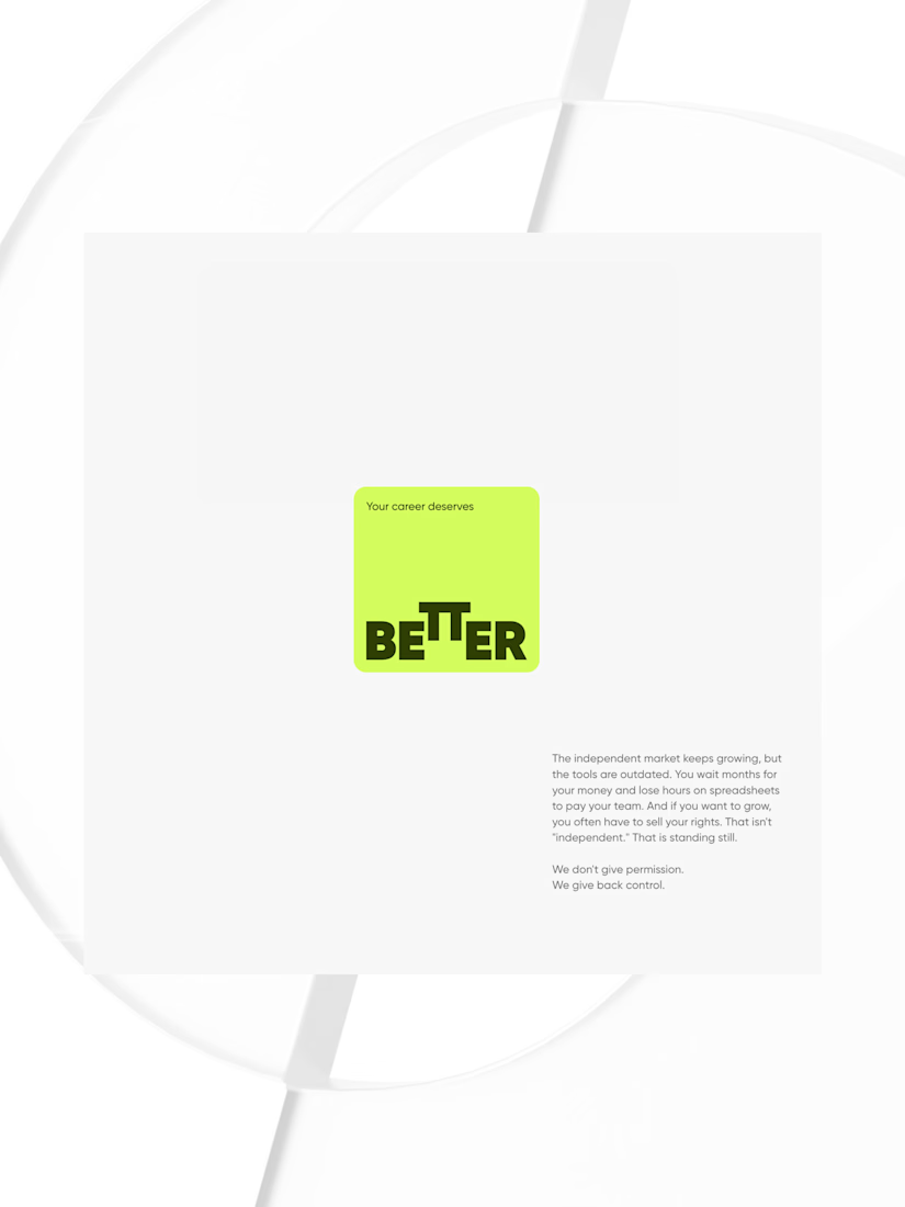
Your career deserves better. (1/2)
Easy to say. Harder to feel.
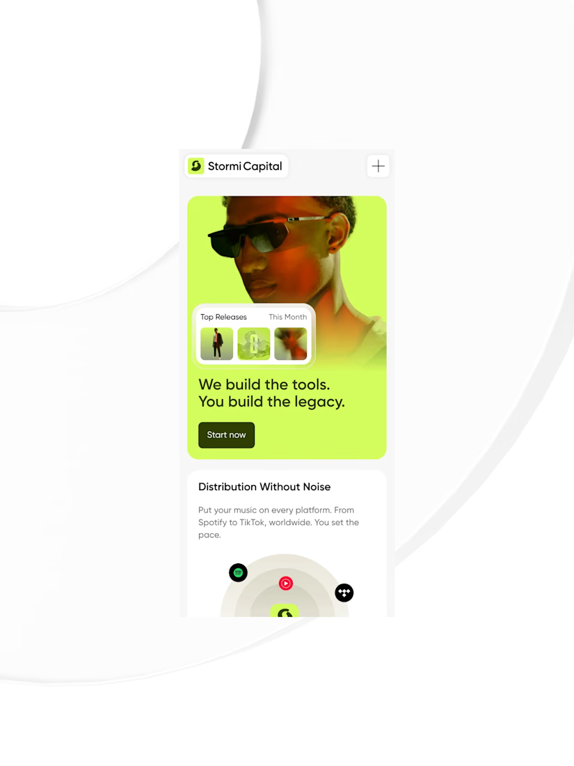
On Stormi Capital, every micro-interaction turn the promise into a feeling.


Great work

Salute to that!


Love the interactions on Stormi Capital. 🙌 You mentioned every micro-interaction turns a promise into a feeling— I’ve found that these 'feelings' are what actually reduce friction for high-intent users. 🔥
Well said Stanley, couldn't agree with you more 🫡

Glad you dig it.


Fire work
Thanks Daniel!

Vibrant Palette!

Amazing!


Nice vary nice

That'S some "bold" & creative design & layout! 👍
Yeah!

I love this!
Thanks Sharon!
You're welcome 👍


Fantastic work🔥👏👏
Thank you! Part 2 coming soon.


Nice Work

Nice Work
Thanks Subrata!

Love this!
Awesome!

Looks good!

Great layout and design @Paweł Wypych
Thanks Luciano!

Great work!
Thanks!

You cooked here
Thanks Quinn!

Amazing work!
Thanks Monica!
Dope work!
Dope - love the word!

Love luvvvvv loved it
Awwwwwwwwesome!

nice
Yes!

🔥🔥🔥
That's fire!


the typography game on this is super strong, micro-interactions feel intentional
Thanks Noah! Appreciate it!

I believe that micro-interactions can have a significant impact on storytelling.

Very cool!
The network for creativity
Join 1.25M professional creatives like you
Connect with clients, get discovered, and run your business 100% commission-free
Creatives on Contra have earned over $150M and we are just getting started






Related posts


Which feels more established to you?
22 voted
30%
52 voted
70%

74 votes
Closed


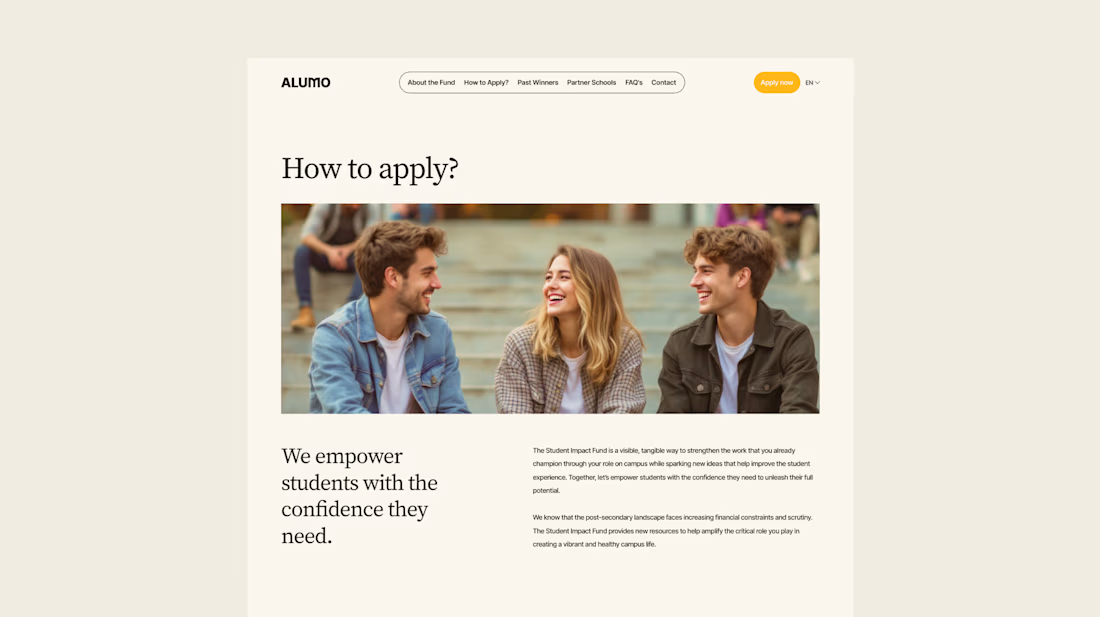
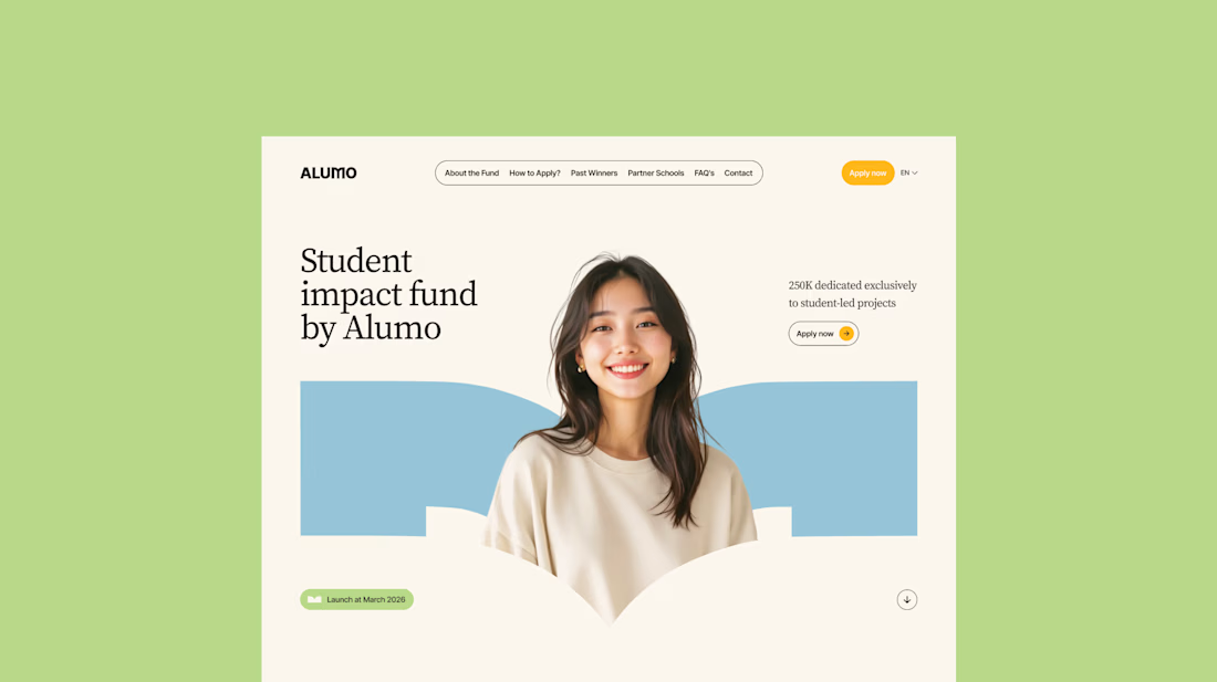
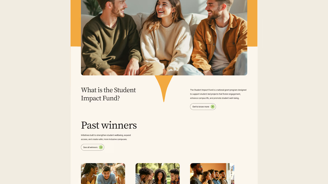
The Client: Alumo is a student impact fund that pools collective influence from influencers and partner schools to deliver a $250,000 annual grant program for student-led projects across Canada.
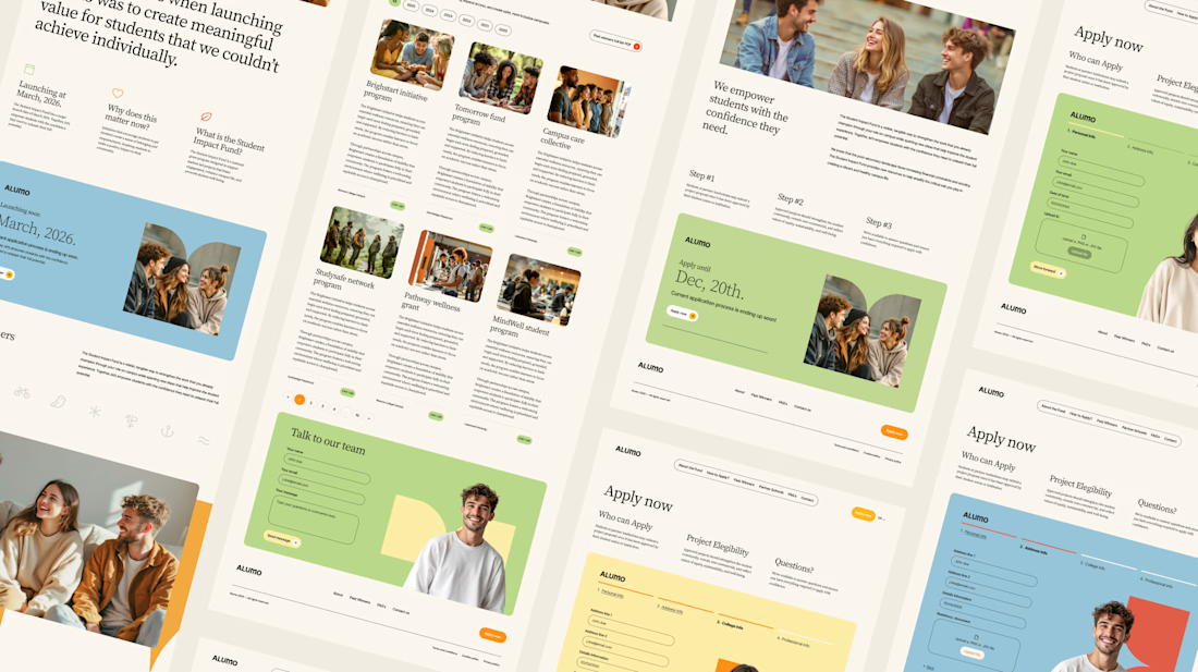
The Issue: The fund needed a website that could communicate trust and purpose to two very different audiences — students applying for grants and partner schools or influencers considering joining — while also showcasing past winners and guiding applicants through the process clearly.
The Solution: A multi-page website was designed with a warm, approachable visual identity using earthy tones, generous imagery, and clear information hierarchy. Each section — About, Past Winners, and How to Apply — was structured to reduce friction and build confidence, making it easy for students to understand eligibility and take action before the deadline.


Love how you're tackling trust + purpose for a $250K fund - that's a tough balance with two audiences. Communicating credibility for a student-led initiative across Canada is huge. Would love to see how you solved it!

New template for craft studios, pottery studios and creative workshops. Meet Handsel.
Visitors find a class, see which dates are open, nearly full or sold out, and either book through your own booking tool or send a request that lands in your inbox. Tutors, crafts, open studio plans, private groups and gift cards each get their own page, all in the Framer CMS.
16 pages, 7 CMS collections, real content, no lorem.
Get it here → https://contra.com/products/lHTpjaNx-handsel-creative-workshop-and-pottery-studio-framer-template

Omg this is very clean and creative, interactive love the text spacing and overall design concept